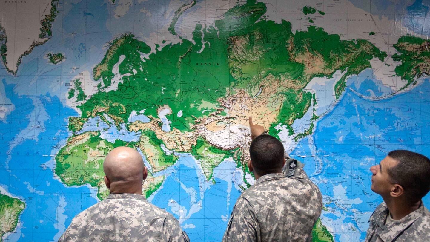
DAKAR, Senegal (AP) — On the Mercator projection, one of the world’s most popular maps, Greenland and Africa appear to be about the same size. But on the Equal Earth projection showing continents in their true proportions, 14 Greenlands would easily fit inside the African continent.
Criticism that the Mercator projection does not accurately reflect Africa’s real size is not new.
However, a recent campaign by African advocacy groups is gaining momentum online as it urges organizations and schools to adopt the Equal Earth projection, which they say more accurately displays the size of the continent of more than 1.4 billion people.
The African Union, the continent’s diplomatic organization with 55 member countries, endorsed the campaign last week in what advocates call a major milestone.
https://apnews.com/article/africa-bigger-map-mercator-campaign-equal-earth-5b6af27610a1f9cf99f6ad9180b680b9
Posted by loggy_sci
7 comments
>“Correcting the map is not only an African issue. It is a matter of truth and accuracy that concerns the entire world. When whole generations, in Africa and elsewhere, learn from a distorted map, they develop a biased view of Africa’s role in the world,” said Fara Ndiaye, co-founder and deputy executive director of Speak Up Africa.
>Mark Monmonier, a Syracuse University professor of geography, said the Mercator projection is obsolete and geographers have long advised people to not use it as a world map. “It was a useful navigation tool in the 16th century, because it has straight lines, giving navigators a line of constant direction to sail along,” Monmonier said. “But outside of that very narrow navigation application, there is no point in using it.”
The orgs behind this campaign:
[Africa No Filter](https://www.africanofilter.org/home)
[Speak Up Africa](https://www.speakupafrica.org)
The maps we know today are shipping maps, some countries are larger than they should be and some continents are smaller than they should be. America is a warped shape compared to how it should look
[No peace until the true map is used.](https://i.imgur.com/mfBBEMZ.jpeg)
But if we want to change maps, I nominate the [Authagraph method](https://i.imgur.com/kZH0ytT.gif). It puts all the distortion in the oceans, which allows it to keep the land masses’ sizes and relative locations accurate. And it also [allows the map to tessellate](https://i.imgur.com/qZ2YBEC.jpeg), which means you can make [the center of your map all sorts of places](https://i.imgur.com/0OD1eGd.gif) and keep the same landmass accuracy.
Edit: Of course, these maps are *terrible* for navigation. It would really be just for the political aspect.
I found an awesome website that keeps a straight line across the globe and you move the world around it.
can’t for the life of me remeber what it was tho
[deleted]
Doesn’t this mean that every land mass occupying the same latitude range as Africa is also undersized? So by fixing the map Africa will appear to be the same relative size and therefore won’t look any bigger because the surrounding land is also bigger? Or do they only care about how it compares to Greenland? Man Greenland is catching global strays between this and trumps threats to take over.
I mean why not but I get really tired of people making this out to be some sort of powerplay by “the West”.
The Mercator map was used because it is more useful in navigation which is what maps were made for originally.
No wonder that the most commonly printed map then became the default.
You can not accurately project a 3D object onto a 2D surface in such a way that it is useful to the user so you either make adjustments for shape or for size.
Lastly, does size really matter here?
Is it important how big Africa is? One might argue that a smaller Europe / USA makes their economic / diplomatic weight more impressive than it is on the Mercator projection while underlining that Africa despite its size is lacking in both. And yes of course I’m aware that the US and Europe bear some – if not most of the responsibility for that.
If you’re interested in just how distorted the Mercator map is, check out [https://thetruesize.com](https://thetruesize.com) an interactive map where you can move countries across the map and see how they shrink and bloat depending on their loaction on the globe.
Comments are closed.