![[OC] Making or Taking: Mapping Manufacturing & Resource Extraction](https://www.europesays.com/wp-content/uploads/2025/08/v6ivx60l9ylf1-1920x1024.png)
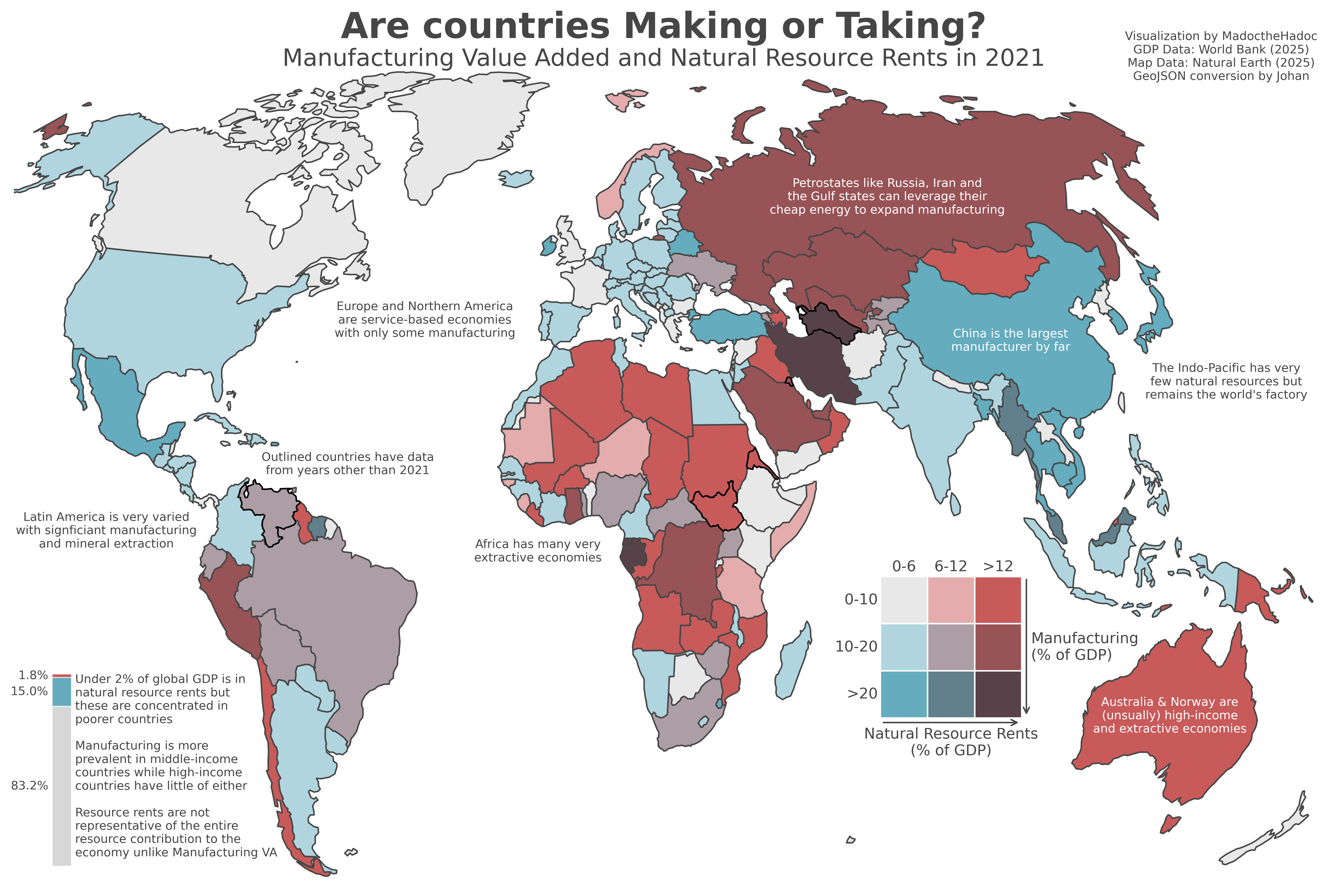
The plot is bivariate so the color encode two axes worth of information as shown in the legend.
GDP data comes from the world bank and the geodata used to plot everything comes from Natural Earth.
It's a Winkel Tripel projection (my favourite) and I made it using Python's Matplotlib library.
Please let me know what you think and what I can improve 😀
Here's the obligatory paragraph explaining the definitions before people point it out:
Natural resource rents just measure the profit of the resources, so (sale price – extraction cost) while value added in manufacturing is much more comprehensive and tries to calculate it as a sector of the entire economy. These are just the only available datasets I could find so keep in mind that if 6-12% of the economy comes from resource rents alone, this does not include the wages or taxes paid from the process of that resource extraction while in Manufacturing VA they are; Canada for instance makes it into the white category with 4.9% resource rents in 2021 but up to 20% of the economy could be considered "resource extraction" if we take a broader definition.
Posted by MadoctheHadoc
7 comments
Great work. I was recently travelling in Australia and was curious about this. I think a lot of patterns emerge from your viz. Thanks.
really nice map , but a couple of things that kill readability a bit:
-legend is too “mathy”, ppl have to decode % ranges – just slap words in the corners, like top-left = resource heavy / low manuf, bottom-right = manuf driven / low resources. makes it way faster to grok
-colors are kinda muddy in the middle, bivariate works best if the 2 axes are *really* distinct. check colorbrewer bivariate schemes, they pop more and you don’t end up with 3 shades of brown that look the same.
-map labels are overload, my eyes don’t know where to rest. i’d keep 2–3 (china, russia/gulf, africa) and dump the rest in a side note. less is more here
– title is fun (“making or taking”), but needs a boring subtitle with the data source + axis defs, otherwise ppl argue in comments about what’s being measured.
-china is the elephant but visually it melts into India/bangladesh. maybe outline top-5 manuf + top-5 resource economies with a thin border so they pop.
overall great viz, just decide if u want it to be “reddit fun” (louder colors, less text) or “serious data viz” (cleaner palette, fewer callouts). right now it’s halfway and loses some punch.
I have no idea wtf I’m looking at
the legend is both upside down & difficult to read. or maybe it’s so difficult to read that i think it’s upside down!
So if I’m reading this right, Canada is high income, but low resource extraction?
Saying that North America only has “some manufacturing” isn’t acurate. The US has the second highest industrial output in the world, second only to China.
I read a book about some furniture builder that said he went to Saudi Arabia for work and what his shop did with some equipment and 15 people took 70 guys in SA and it was almost entirely done by hand with poor quality.
He said he tried to get the most production per person in the 10 hr days whereas there was 40-50 guys bullshitting while a small group did a task.
Different worlds for sure.
Comments are closed.