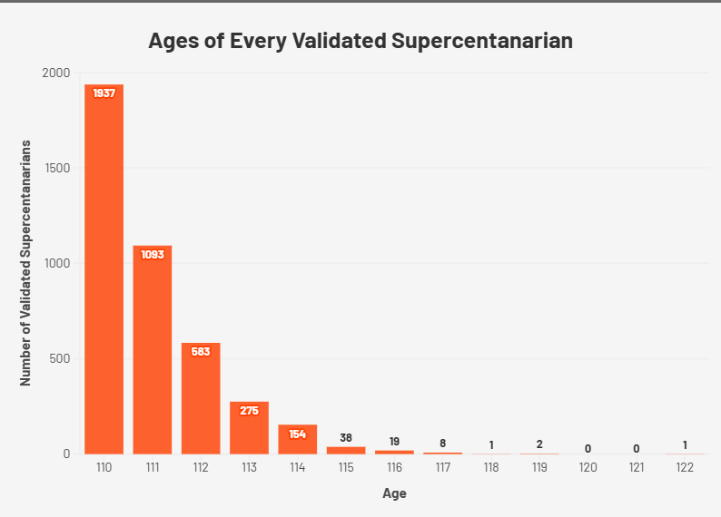
At a glance, it seems that from 110 years old, your odds of making it for another year are about 50% per year.
So, if I’m reading that right, on average if you reach one of these years, you have only about a 50% chance to make it to the next year? Crazy.
Just make it to 120 and you’re golden for years!
It will be fun to compare this chart to what it looks like in 20 years.
This really does illustrate how much of an outlier Jeanne Calment is
Imagine being 122 and attending your great grandkids retirement party.
My wife’s aunt is one of the 275 people who are alive at 113
My great grandmother died a month ago, she was 106.
“If you’re already exceptionally old, you’re very likely to die within a couple years” is my takeaway here lol
Imagine having tried to do an early retirement at 60 only to have that be the halfway point
What a nice exponential distribution.
Jesus. Imagine getting to 100 and still having 20 years to go. Hard pass.
There is a problem with the data presented on this chart. It’s somewhat misleading.
Let’s take a look at the right end of the chart. For 122, there is 1 data point at 122, and 0 data points at 120 and 121. Since you can’t teleport to the age of 122 from 119, in order to hit the age of 122, it necessitates that you must have also hit the age of 120 and 121 at some point as well. Thus, we can conclude that the data shows only the age of the supercentenarian at death.
What about the supercentenarians that are still living, though? You can’t determine what their ages will be at death, because they haven’t died yet. So instead, the data points only show their current ages. For example, suppose we have a supercentenarian at the age of 111, and she survives to hit her 112th birthday. This not only means that we have to add 1 to the 112 dataset, but we also have to subtract 1 from the 111 dataset.
Do you see the problem with that? We are comparing two different data sets here. For the dead, we are displaying the *final* age at death, but for the living, we are displaying a *temporary* age, one they will pass through before they reach their ultimate age at death. This is similar to how Jeanne Calment, our only instance at 122, had to pass through 121 and 120 and every integer under 122 to reach that point. But in the end, she only provides a single data point at 122.
This skews the data towards the left side of the chart. A data point on the chart at 110 represents both a dead person who died at 110, and a living person whose age at death is *at least* 110.
Are we absolutely certain that at least a few of these people aren’t actually vampires?
14 comments
At a glance, it seems that from 110 years old, your odds of making it for another year are about 50% per year.
So, if I’m reading that right, on average if you reach one of these years, you have only about a 50% chance to make it to the next year? Crazy.
Just make it to 120 and you’re golden for years!
It will be fun to compare this chart to what it looks like in 20 years.
This really does illustrate how much of an outlier Jeanne Calment is
Imagine being 122 and attending your great grandkids retirement party.
My wife’s aunt is one of the 275 people who are alive at 113
My great grandmother died a month ago, she was 106.
“If you’re already exceptionally old, you’re very likely to die within a couple years” is my takeaway here lol
Imagine having tried to do an early retirement at 60 only to have that be the halfway point
What a nice exponential distribution.
Jesus. Imagine getting to 100 and still having 20 years to go. Hard pass.
There is a problem with the data presented on this chart. It’s somewhat misleading.
Let’s take a look at the right end of the chart. For 122, there is 1 data point at 122, and 0 data points at 120 and 121. Since you can’t teleport to the age of 122 from 119, in order to hit the age of 122, it necessitates that you must have also hit the age of 120 and 121 at some point as well. Thus, we can conclude that the data shows only the age of the supercentenarian at death.
What about the supercentenarians that are still living, though? You can’t determine what their ages will be at death, because they haven’t died yet. So instead, the data points only show their current ages. For example, suppose we have a supercentenarian at the age of 111, and she survives to hit her 112th birthday. This not only means that we have to add 1 to the 112 dataset, but we also have to subtract 1 from the 111 dataset.
Do you see the problem with that? We are comparing two different data sets here. For the dead, we are displaying the *final* age at death, but for the living, we are displaying a *temporary* age, one they will pass through before they reach their ultimate age at death. This is similar to how Jeanne Calment, our only instance at 122, had to pass through 121 and 120 and every integer under 122 to reach that point. But in the end, she only provides a single data point at 122.
This skews the data towards the left side of the chart. A data point on the chart at 110 represents both a dead person who died at 110, and a living person whose age at death is *at least* 110.
Are we absolutely certain that at least a few of these people aren’t actually vampires?
Comments are closed.