![[OC] Where do the bikes go? Mapping the daily pulse of Mexico City’s public bike share](https://www.europesays.com/wp-content/uploads/2025/09/msjd9bcdt8nf1-1080x1024.png)

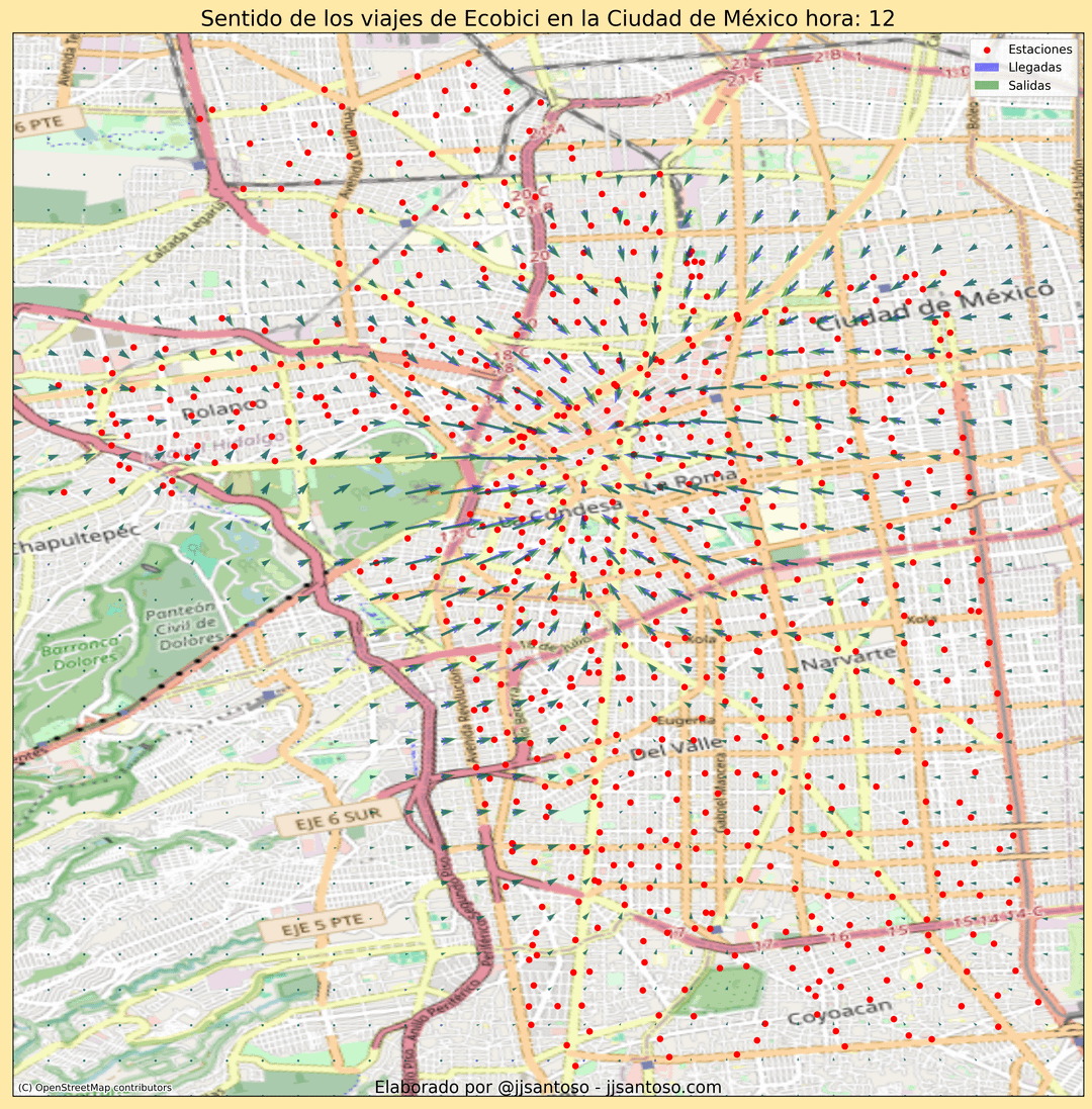
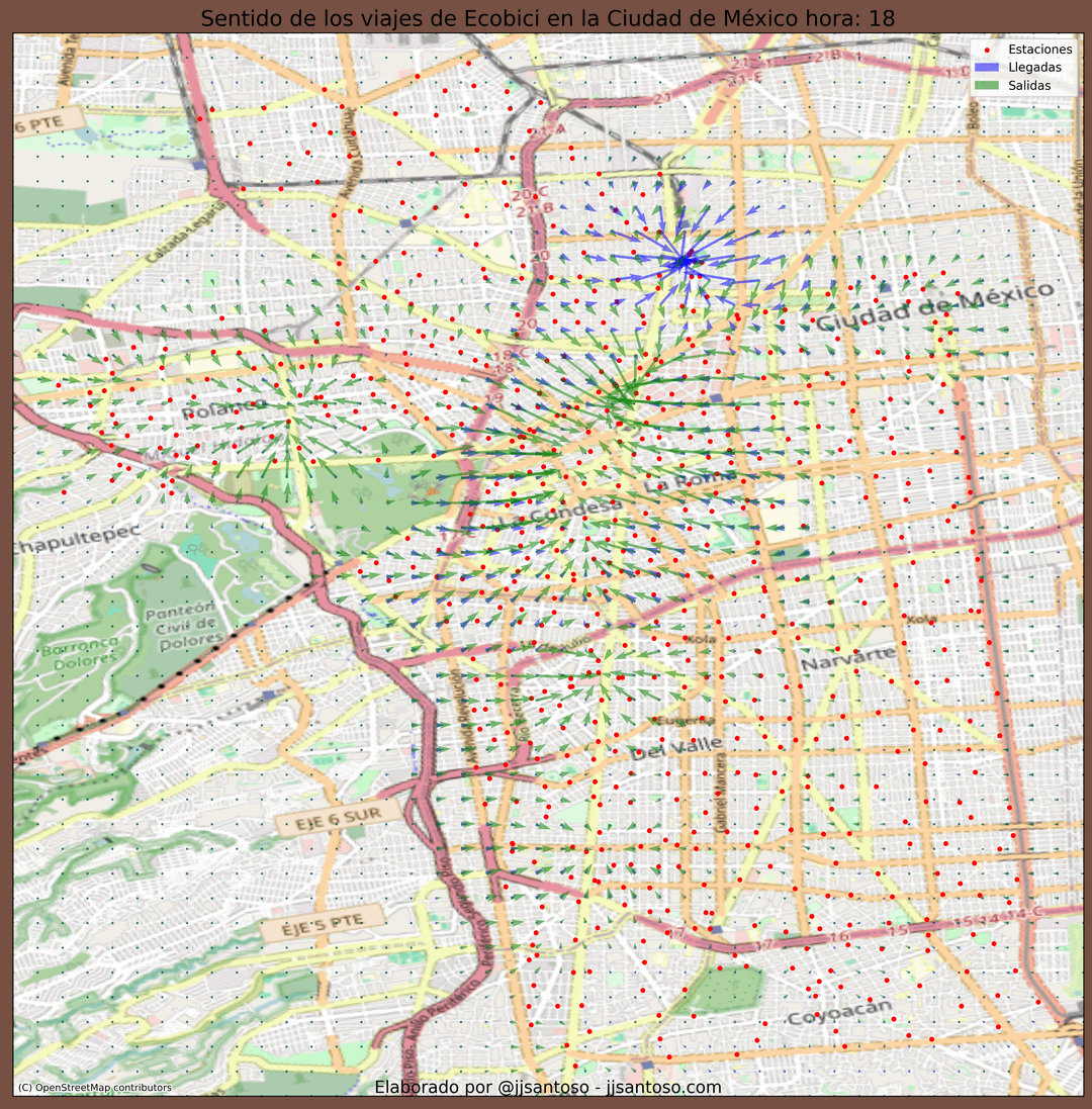
This map answers the question: Where are people mainly riding from, and where are they heading to at different times of day (08:00, 12:00, 18:00)?
How to read it:
- Red dots = bike stations.
- Green arrows point toward where trips tend to start.
- Blue/purple arrows point toward where trips tend to end.
- Longer arrows = stronger tendency. Arrows show directional pull, not exact routes.
The arrows were calculated by creating a grid over the city and measuring the average direction of trips starting or ending near each point. Each bike station acts like an “attractor,” and its influence decreases with distance. By combining all stations’ influences, the arrows show the predominant flow of rides, pointing outward where trips originate and inward where they tend to end.
Patterns: In the morning, rides flow inward from the edges toward the central area. Around midday, most trips circulate within that core. In the evening, the pattern flips: bikes flow outward again toward surrounding neighborhoods.
Code and animation: made with Python + Matplotlib https://gist.github.com/jjsantos01/db20667ef6aa6fb7462179d0e54b9d80
Posted by Affectionate-File-21
3 comments
This map answers the question in the title, too. Interesting thing w data is presenting it in a useful way. I think this one does, maybe slight confusion if you think everything is going into locations, but the legend in the upper right helps.
Nice one, It would be cool to make a gif, by hours of a day
Depends on where bike stations and subway stations are located too. You can definitely see a couple on the one map.
Comments are closed.