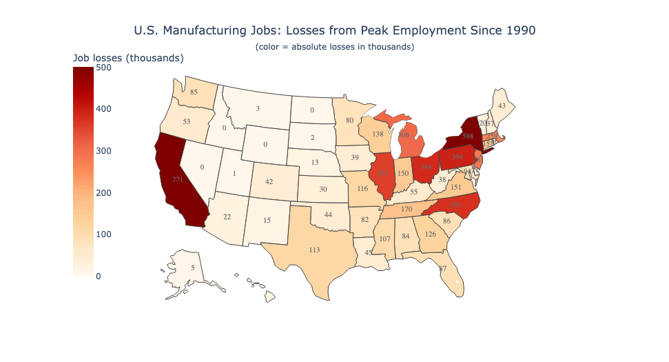
This map shows how many manufacturing jobs each state has lost from its own historical peak (in thousands). Darker = bigger absolute decline, labels show the exact loss.
Posted by DataVizHonduran
This map shows how many manufacturing jobs each state has lost from its own historical peak (in thousands). Darker = bigger absolute decline, labels show the exact loss.
Posted by DataVizHonduran
26 comments
Source: BLS data via Fred. Tools: Python and Plotly.
Why are there values on the map that exceed the range of the color/numerical scale on the left?
“Since 1990” is an important part of this data, but it’s still interesting.
William Carrier invents the air conditioner while working in Buffalo NY. Half the city leaves town.
(Okay so losing 300k population took decades, but it is ironic)
The absolute numbers are useful, but losses relative to population would look totally different, and explain a lot of the politics of the past 30 years. Maine for instance didn’t lose many manufacturing jobs when the mills shut down compared with New York, but its losses per capita tell a very different story.
Give it to us per capita too big boy.
Doesn’t this map just show the most populous states? As in https://xkcd.com/1138/
PER CAPITA OR BUST
Also it’d be interesting to compare it to office jobs growth/loss.
ah yeah, this map is only showing absolute job losses, so states like California, New York, Pennsylvania, Ohio, Michigan stand out just because they had big manufacturing bases to begin with. that hides the story for smaller states where the percentage loss was much worse, even if the raw number looks smaller.
like losing 50k in North Carolina might look lighter here, but if that’s half their manufacturing jobs it’s a way bigger local impact than California losing 771k out of millions of total jobs.
Blue states were targeted. LAWSUIT!
Must not include lumber mills because ID is 0. If lumber mills were included in the definition of manufacturing for this map, OR and WA are going to look way redder.
These are interesting, you really see the hollow out of the rust belt and it’s far west area. One thing lost in the tariff debates and ritually ignored by Corrupty the Clown and Bessent is that the US has a services foreign trade surplus. That would be interesting to look at. Trump seems to be ignorantly sabotaging our lead there in particular.
The fact that NC is red in this map is no shock. NAFTA gutted the textile industry here. We had towns’ livelihoods destroyed almost overnight. Erwin, Coats, and Dunn (great name for a country band!) had all the mills close, and the people lost their jobs. It was so
bad that when a super walmart came around 2000 the mayors of all 3 towns, the town councils, and several school bands came to the grand opening. It was then first job growth they had in a while.
California is a surprise. Other than CA, it looks a lot like the Rust Belt.
Surprised by North Carolina – anyone have more details on that?
Trump punishing blue states hard.
This is the kind of chart that seems informative, but actually makes you a tiny bit dumber when you look at it.
This is a worthless chart. In those states with huge losses, there were transitions to new industries and GDP increased. Also, the Cold War ended, which drove a lot of manufacturing losses, dumb chart.
NAFTA turned the rust belt into actual rust.
And the honest truth is a lot of the manufacturing started leaving earlier than this
That’s basically just a population map
This is totally useless as a raw number, instead of per capita. And this is such an obvious problem with it that I cannot accept that the OP didn’t fully realize that and isn’t intentionally trying to manipulate perceptions, because it’s just SO absurd to do it this way.
To be clear, I hate Trump — but you can thank Jeffrey Epstein’s other good buddy, Bill Clinton, for destroying American manufacturing with NAFTA.
I really don’t understand the obsession with manufacturing employment. California and New York are full of high paying service sector jobs in finance, design, entertainment, health care and tech.
This is extremely surprising (or just presented in a misleading way). The American ethos would suggest that Michigan was undoubtedly the worst affected.
Saw this play out in Berks County and Reading, PA, growing up.
Reading had already started to deindustrialize in the late 50s/early 60s with certain declining industries (e.g., railroads including The Reading Railroad) and locations that moved down south for cheaper labor & land (e.g., textiles and hosiery industry).
Even today, Berks County has a lot of manufacturing employment (17% of the county) but I bet in 1990 it was upper 20s/30%).
Several large manufacturers left either because they were acquired or relocated after NAFTA or China WTO admission in the late 90s through late 00s.
The large Parish Manufacturing plant (part of Dana Corp) closed in 2000. Been there for nearly a century.
They made several car parts including light truck frames. You still a lot of local trade service trucks with the Reading tailgate driving around the Philly area. Those trucks are at least 25-30 years old and likely have had every component replaced including the engines and power trains.
This all played a key role in Reading really hitting the skids. It bottomed out in the mid-2010s financially and entered into state receivership (Act 47) from which they only recently emerged a few years ago. City still has incredibly high poverty rates and no clear future.
Comments are closed.