
This is a follow-up to this post: https://www.reddit.com/r/belgium/comments/1naxr21/an_attempt_at_an_improved_nmbs_screen/
First of all, I would like to thank everyone for your feedback and upvotes. The following points are things I have changed or not changed, and why.
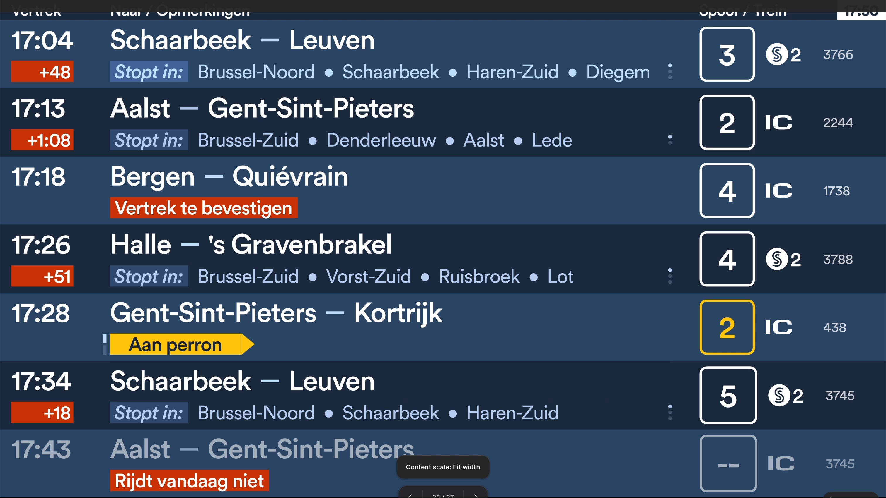
- Many of you said that the animations were too distracting and busy. In hindsight, I understand your reaction and have addressed this issue. I removed the horizontal scroll and placed the list of intermediate stations below each other. This scrolls vertically per line. I also added a small indicator next to the line so that you know which line is being displayed.
- The delay animation was also far too flashy with red and white, so I was asked to leave it in one colour, which I did. To still be able to distinguish between delays and expected departures, I put the latter in italics.
- In general, the animations were also completely out of sync. I fixed this by triggering all animations in a loop every 6 seconds. In the video, these may feel a little out of sync due to the limitations of Figma prototyping. Because I still have my doubts about the vertical scroll animations, I created a stricter version that no longer has any animations. You can view it here: https://imgur.com/a/depart-screen-without-animations-ASmgYjR
- It was also said that removing the intermediate stops when a train is at the platform is devils, so I came up with a solution. Both pieces of information are displayed, but using the same cycle as for intermediate stops, only between the train's status and the intermediate stops. To achieve this, I emphasise the status by displaying it for longer. The reason I did not choose to show the status at the location of the delay is because I have heard from many people that they find it annoying when the delay disappears when a train arrives or is at the platform. And to avoid the scenario of someone walking through the station and wanting to know quickly whether their train is already there, I took another look at the large LCD screen used in large stations. There, they use a flashing dot to show that a train is arriving or is at the platform. I have brought that back here, but in the track number.
- I kept the main column because otherwise there simply wasn't enough space to display the time. In principle, “departure, to/comments, track/train” could also be replaced by something else, but I've left it as it is for now.
- I left in the label “stops at” because otherwise there could be confusion during the cycle between “aan perron” and the intermediate stops. I did make it darker and smaller because it was said that it felt rather busy.
- I also aligned the train numbers.
by Lost-Quality-3161
16 comments
As someone who hasn’t taken the train in almost 10 years, this screen is much busier than what I remember from back then. There is a lot going on and I don’t think the fonts and colors are the best for readability.
If you figure out a way to inclued French and Dutch for the Brussel region. You could send it to the NMBS and hope they take over your design.
Vertrek te bevestigen kinda useless
I like it.
It is quite nice!
Unrealistic, the train to Bergen and Quiévrain from Brussel Centraal leaves at :10 (if I remember correctly)
Also, need more trains since with all those delays that are all too common at Brussel Centraal you don’t know where your train is supposed to leave if you are at the station 5 minutes before your train is supposed to leave and maybe that one is one time
What bothers me is the animation. Please make it all go down, not half down and half up.
Left to right,
Top to bottom.
Consistency.
You’re cramming a lot of info on a small screen, but it’s still readable if you use this every day and know what everything means.
Is ‘haltes’ niet beter dan ‘stopt in’?
Of bovenaan naar/stopt in of naar/haltes zetten en het label weg.
Can you incorporate memes? It also needs a dedicated space for advertising. With the right motivation, we could turn Brussels into Night City
A Bloomberg terminal is more intuitive than this, I’m very sorry.
Can you make for STIB also ? 😅😅
This is incredibly realistic, only one train on time!
The signs are amazing compared to the new app. God fucking damn it.
Too much, remember this is just a list
On the individual boards there’s the info u added already
* As said by others, animations need to always move in the same direction.
* Move the train number to after the destinations, in line, where there’s emtpy space atm. The dedicated column it has now takes up an enormous amount of screen space for no reason. Font and color can stay the same to differentiate from the destinations.
* Building on this, move the track numbers to where the train numbers were and align all they way to the right with the same margin from the screen border as the departure times. This way, content position and margins are the same on both sides of the screen which looks better. Current design is unbalanced.
* The “aan perron” notice is useless in its current form. It needs to be visible all the time, not buried behind other info. Travelers do not have the time to wait for several animation cycles to see what’s going on when the train is already there and they’re running late. I like the flashing track number as a solution, but what are you going to do when there’s a track change? Flash it in red, maybe?
* People cannot see the tiny bar that’s supposed to indicate that there’s more info (e.g. “aan perron”) on the line which shows all stops. There’s also already another set of dots to indicate that it will scroll to show the remainder of the stops. I don’t think it’s a good idea to mix between different kinds of information on this one line, I’d just keep it reserved for train stops only to avoid confusion.
* Don’t make content semi-transparent, even when the train is cancelled. The “rijdt niet” notice is enough of a cue. People with bad vision will thank you 🙂
These are just suggestions, design is subjective!
But what if the input data is itself unreliable, you can have the most readable screen but if the data is wrong or delayed it doesn’t matter.
Comments are closed.