https://www.behance.net/gallery/13616977/Walloniabe
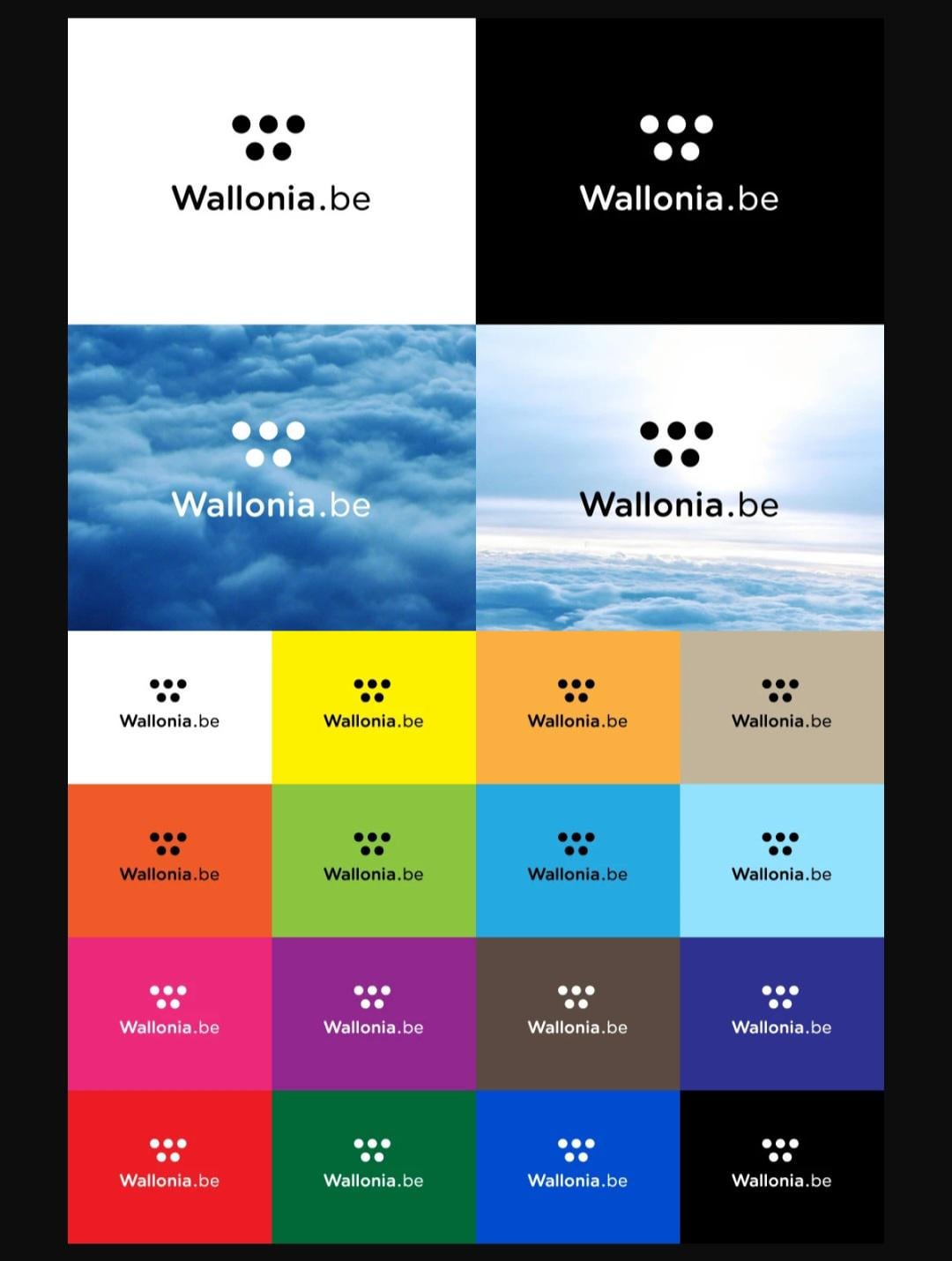
The 5 dots represent the 5 ends of the letter W. And it was a process that ended up costing 1 million euro's to finish.
Further explanation to why. Is in the link.
If someone knows a high placed minister in Flanders . Could you let him/her know that I possess the knowledge and materials to make 3 dots for only 100.000 euro's? Which would represent the ends of the V.
I can even give even give them 3 seperate colors. Each one respresenting a color of our flag.
by DogsRnotPeanuts

12 comments
Did we ever end up using this anyway?
But yes, another blatant example of corruption.
Wallonia just really, really, really wanted to showcase they are against bullying. They even added another dot to Ketnet’s logo.
That is one way of spending a shit load of money and not getting anything meaningful in return.
That’s just typical Walloon behaviour, isn’t it? Pissing away money they don’t have…
200k per dot, easy money for the designer
Someone had a friend that’s a graphic designer…
Dot´s money not well spent IMO.
I’ll start to make some logo, I can go up to 6 points for a million euros, a bargain!
1mill?? I would’ve made it for half of that…
Putting aside this particular design:
I dream of one, unified visual design for all ministries and public agencies in Belgium, like in Netherlands or Czechia. One, simple, clean design. Would be amazing.
Port of Antwerp paid half a million of euros for more or less the same logo they already had. But mostly it’s not only simply the design of the logo itself.
In Flanders, we would already pay a significant portion of that amount just to have Deloitte or another consulting firm conduct a study before even assigning the project to a marketing studio.
SPRINGFIELD = GOOD
Comments are closed.