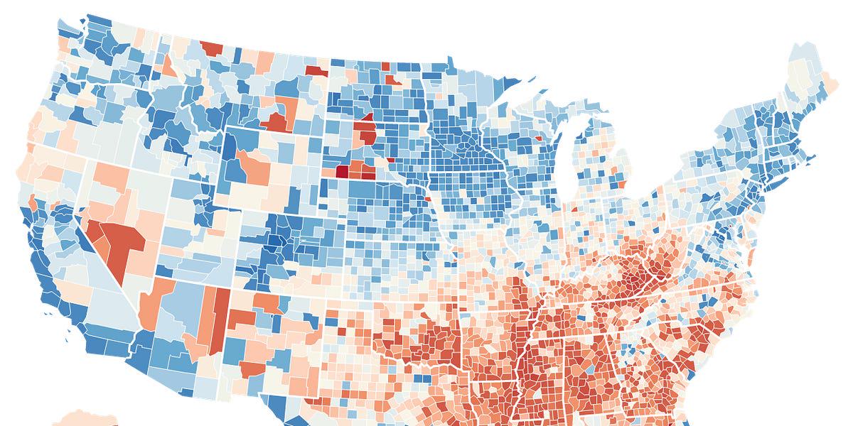
I'd love a map that showed detailed health or life span with overlay of hospital quality and maybe other healthcare data such as MD's per person.
Posted by WiseDarling
I'd love a map that showed detailed health or life span with overlay of hospital quality and maybe other healthcare data such as MD's per person.
Posted by WiseDarling
9 comments
Now overlay African American population
Southern lifespans would be longer if they just ate less. Don’t eat like your healthcare is free.
areas with greater rates of poverty, addiction, and obesity have shorter lifespans. whoda thunk??
The red spots outside the confederacy are likely Indian reservations.
Now overlay obesity rates. The South eats like shit for the most part. Source – from there.
It’s really simple. Pro worker and pro public policies lead to longer lives while Pro capital states lead to shorter ones.
See that little orange corner in SW Oregon? There’s no healthcare there. His only option for a PCP is a naturopath. The nearest hospital is 75 miles away.
Rural healthcare is already terrible and it’s about to be a complete disaster.
South Florida outlining because people don’t move there until they’re already 65
Wait a second … you’re telling me that Alabama and Mississippi are at the bottom of the list! Impossible!!! 🙂
Comments are closed.