![Men Appear ~3× More Than Women in Instagram Photos from 14 Major News Outlets (150 k+ Posts Analyzed) [OC]](https://www.europesays.com/wp-content/uploads/2025/09/a5y6zs042lqf1-1512x1024.png)
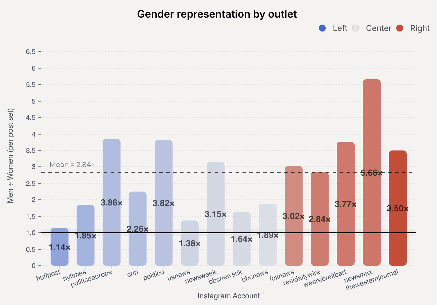
Using an OWL-ViT object detector, I analyzed 150k+ Instagram posts from 14 news outlets to estimate how many men vs. women appear in photos (not videos).
Overall, these images feature approximately 3 men for every 1 woman, with some outlets having an even higher ratio.
Bars are ordered by external bias score (Left → Right), using ratings from Ad Fontes Media.
Link to page with more details and methods: nickykhorasani.com/projects/advanced_gender_portrayal_metrics
Posted by IndustryAdventurous5
15 comments
Well yeah, that’s because major figures such as POTUS and billionaires are historically men. And they make the news cycle constantly
Why do I immediately pretend those are fingers flipping me off center and right?
This isn’t beautiful or interesting.
We have enough women hoeing in other posts
So just relax
It needs to explain on the chart what the data represents: Apparent gender of people in images on Instagram. Secondly, it needs to be more obvious which direction is more men vs. more women, up or down.
Does this data hold up if prominent political figures are excluded?
New York times isnt left wing, I fear you only have a very basic understanding of politics
Newsmax looks like an outlier. Remove it and what are the ratios?
Interesting digging into the actual data.
The majority of posts are overwhelmingly happy, which i did not expect.
Some feedback on your Reddit post, is that I feel like you have shared the least interesting part of your findings and shared in a way that did not really tell us why it was important.
That being said your actually research is fantastic and the paper itself is clear and easy to follow.
As a man, I go to Instagram to not look at news.
This is not beautiful because it’s not symmetric. You should pick a plot where “men appear twice as frequently as women” looks symmetric to “women appear twice as frequently as men”. And also “the difference between men appearing 2x to 4x is visually the same as the difference between women appearing 2x to 4x”.
You will not achieve that with a simple division. You need to pick a different calculation and a different graph.
I am surprised because everyone knows that women generate more clicks.
You might want to double check the methodology of the source you use for the coloring. This makes it seem like fox news is some bastion of moderation that leans slightly to the right and the huffington post is some sort of trotzkyist rag printed in someone’s mum’s basement.
This shouldn’t be surprising. Men make up the vast majority of governors, senators, representatives, corporate CEOs, and so on. Men make up the vast majority of political leaders worldwide. So the people in the news are far more likely to be men.
It’s interesting why the right wing news sources skew more male than the left wing news sources, but we don’t have any data as to why this is.
News outlets post on Instagram? Why?
Comments are closed.