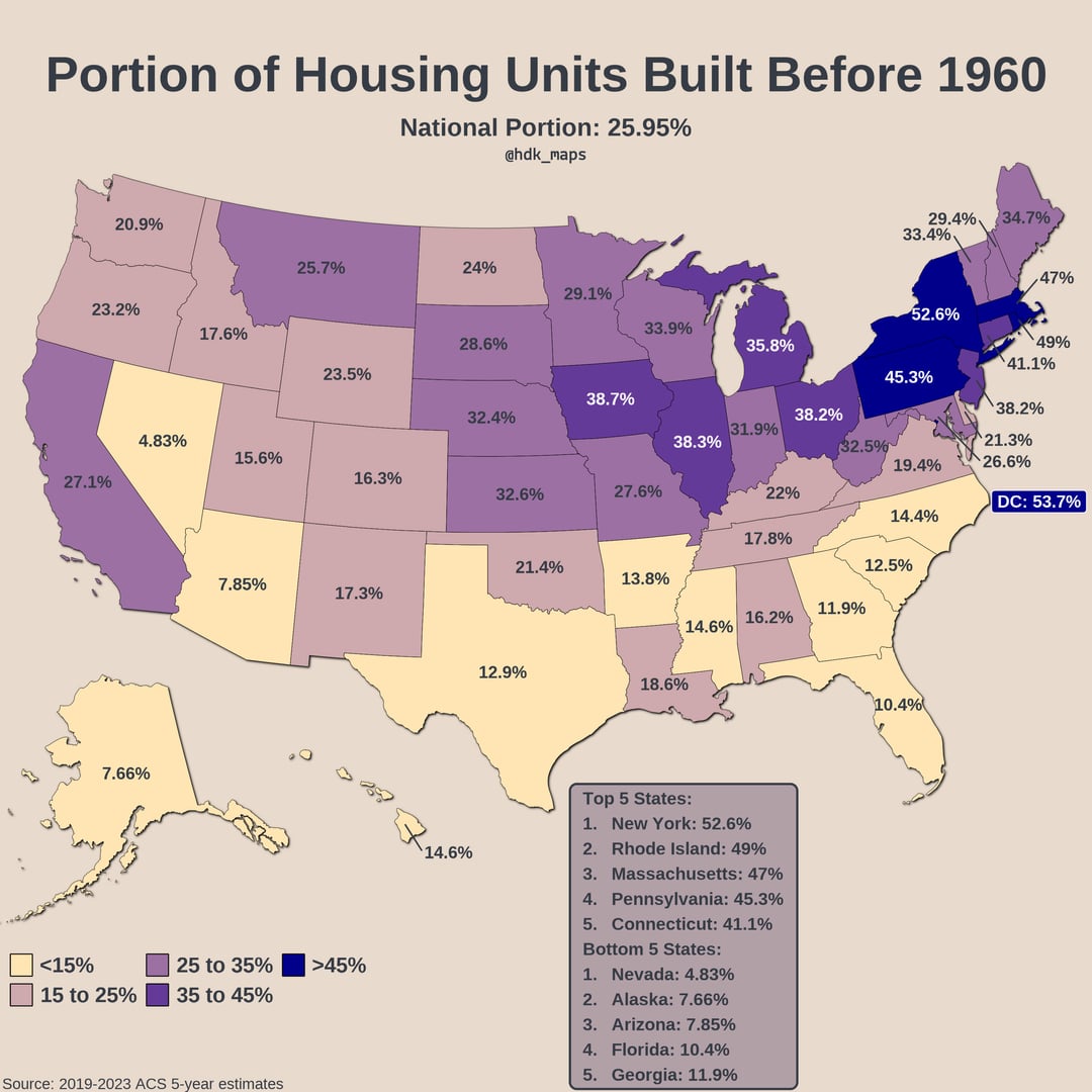
Data: 2019-2023 American Community Survey accessed via API using tidycensus package in R
Tools: R (packages: dplyr, ggplot2, sf, usmap, tools, ggfx, grid, scales)
Good job finding a map where Minnesota and Utah are not outliers.
California really shouldn’t be such an outlier here. Hopefully they learn to build again.
Anyone able to explain to a non-american why the largely rural midwest (Kansas, Missouri, Iowa and Nebraska) stick out in comparison to the southern neighbours (Oklahoma, Tennessee, Arkansas ect.)
Fayette County (the one directly East of Memphis) would probably have similar stats if you did it for 2000. It used to be nothing but farmland, but now it’s $200-400k cookie cutter homes.
neat viz, you can literally see the post-WWII boom baked into the map
This is basically a map of how good the cities are in those states.
At least in NY (and I think PA’s case), the counties with the most pre-1960 construction are areas of the state that either declined/stagnated in the decades since. The outlier is NYC, which was already built up and enacted aggressive regulation limiting redevelopment afterwards. It’s also important to note NYC was experiencing population decline in the 1960s and didn’t fully recover it’s previous population until the 2010s.
Would like to see the portion of housing stock built in the last 5 years.
Another map that’s just a population map, except it’s in the past!
Ordinary, not beautiful. One datum that needs context to be useful.
Ahh reminds me of the days of living in apartments built in the 1920s or 30s and paying stupidly high gas bills for radiators that didn’t even work, and smashing my fingers in a spring-loaded birdcage elevator door. Love you, Boston.
It’s interesting you can see Portland but not Seattle
![[OC] Portion of Housing Units Built Before 1960](https://www.europesays.com/wp-content/uploads/2025/09/6cyeytqi6qqf1-1080x1024.jpg)
13 comments
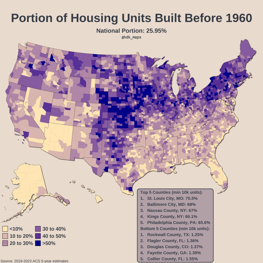
Data: 2019-2023 American Community Survey accessed via API using tidycensus package in R
Tools: R (packages: dplyr, ggplot2, sf, usmap, tools, ggfx, grid, scales)
Good job finding a map where Minnesota and Utah are not outliers.
California really shouldn’t be such an outlier here. Hopefully they learn to build again.
Anyone able to explain to a non-american why the largely rural midwest (Kansas, Missouri, Iowa and Nebraska) stick out in comparison to the southern neighbours (Oklahoma, Tennessee, Arkansas ect.)
Fayette County (the one directly East of Memphis) would probably have similar stats if you did it for 2000. It used to be nothing but farmland, but now it’s $200-400k cookie cutter homes.
neat viz, you can literally see the post-WWII boom baked into the map
I wonder if this could be predicted from historic population data. Places that have had population growth recently will have newer houses. In the county-level data the dark blue places are places that aren’t at their historic population peak – there’s a resemblance to [this map.](https://www.reddit.com/r/MapPorn/comments/1asp8w3/the_decade_every_us_county_peaked_in_population/)
This is basically a map of how good the cities are in those states.
At least in NY (and I think PA’s case), the counties with the most pre-1960 construction are areas of the state that either declined/stagnated in the decades since. The outlier is NYC, which was already built up and enacted aggressive regulation limiting redevelopment afterwards. It’s also important to note NYC was experiencing population decline in the 1960s and didn’t fully recover it’s previous population until the 2010s.
Would like to see the portion of housing stock built in the last 5 years.
Another map that’s just a population map, except it’s in the past!
Ordinary, not beautiful. One datum that needs context to be useful.
Ahh reminds me of the days of living in apartments built in the 1920s or 30s and paying stupidly high gas bills for radiators that didn’t even work, and smashing my fingers in a spring-loaded birdcage elevator door. Love you, Boston.
It’s interesting you can see Portland but not Seattle
Comments are closed.