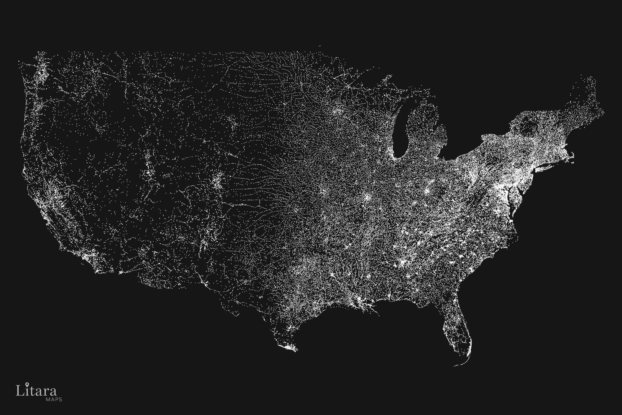
Hey everyone! Thanks for checking out my project. Let me provide a little more context on what you’re seeing 🙂
– Data Source: OSM dataset, filtered for all nodes tagged as place (city, town, village, hamlet). This resulted in over 97,000 unique localities.
– Tool: my custom script.
– Process: The script plots a single white dot for each locality at its precise geographic coordinates.
The size of all dots is the same – whether it’s New York City or a tiny hamlet in Nevada. This isn’t a map of population size, but of settlement presence.
For me it feels less like a map and more like staring at the galaxy 🙂 I found it really beautiful Art and wanted to share with a community that might appreciate it. Happy to answer any questions!
I misread this as “I visited all 97,000+ localities” and I was about to calculate the incredible impossibility of doing so…
I mean, visualization is still impressive regardless, but wow.
Crazy how Nevada’s outline is pretty visible. It’s an empty state.
Can you provide a link to the original high resolution version? It drives me crazy how Reddit recently started down-rezing images. Thank you!
This is why I like living in the west.
It’s interesting how you can see the railroads especially in the western US since almost all of the towns out there were built around them
I can see parts of the UP, MoPac, Great Northern, Northern Pacific, Rock Island, CB&Q, Rio Grande, and more.
And the states in the middle are supposed to decide the election? 😒
Is it just me, or are Queens and Brooklyn missing?
I like how you can see the results if manifest destiny
This is super cool! I lived in one of those regions without any dots whatsoever in southeastern Nevada. It seemed like a long ways to any town, as in, 120 miles to a stoplight, but this sorta rubs it in.
I think it’s really cool, but it would be interesting if it showed some population variance through another dimension such as color. Do you think you can do a version with different colored dots for 100+, 1000, etc?
The brightest place on earth, Las Vegas, is missing
Love seeing New York’s blue line pop this hard, I criticize that state a lot but the hard decision to never let it become a national park was the right one.
![[OC] I visualized all 97,000+ localities in the contiguous USA.](https://www.europesays.com/wp-content/uploads/2025/09/6iwtl4t3drrf1-1920x1024.jpeg)
14 comments
Hey everyone! Thanks for checking out my project. Let me provide a little more context on what you’re seeing 🙂
– Data Source: OSM dataset, filtered for all nodes tagged as place (city, town, village, hamlet). This resulted in over 97,000 unique localities.
– Tool: my custom script.
– Process: The script plots a single white dot for each locality at its precise geographic coordinates.
The size of all dots is the same – whether it’s New York City or a tiny hamlet in Nevada. This isn’t a map of population size, but of settlement presence.
For me it feels less like a map and more like staring at the galaxy 🙂 I found it really beautiful Art and wanted to share with a community that might appreciate it. Happy to answer any questions!
I misread this as “I visited all 97,000+ localities” and I was about to calculate the incredible impossibility of doing so…
I mean, visualization is still impressive regardless, but wow.
Crazy how Nevada’s outline is pretty visible. It’s an empty state.
[Rule 1](https://www.reddit.com/r/dataisbeautiful/wiki/rules/rule1): “If the visualization features spatial data, geographic position alone is not sufficient. **It must be more than dots on a map.**”
Can you provide a link to the original high resolution version? It drives me crazy how Reddit recently started down-rezing images. Thank you!
This is why I like living in the west.
It’s interesting how you can see the railroads especially in the western US since almost all of the towns out there were built around them
I can see parts of the UP, MoPac, Great Northern, Northern Pacific, Rock Island, CB&Q, Rio Grande, and more.
And the states in the middle are supposed to decide the election? 😒
Is it just me, or are Queens and Brooklyn missing?
I like how you can see the results if manifest destiny
This is super cool! I lived in one of those regions without any dots whatsoever in southeastern Nevada. It seemed like a long ways to any town, as in, 120 miles to a stoplight, but this sorta rubs it in.
I think it’s really cool, but it would be interesting if it showed some population variance through another dimension such as color. Do you think you can do a version with different colored dots for 100+, 1000, etc?
The brightest place on earth, Las Vegas, is missing
Love seeing New York’s blue line pop this hard, I criticize that state a lot but the hard decision to never let it become a national park was the right one.
Comments are closed.