Methods for data exploration can be characterized as univariate (considering one variable at a time) or multivariate (examining multiple variables simultaneously)64. Data exploration begins with the preparation of descriptive statistics. Although univariate methods can also be used in this step, it is important to keep in mind that omics data are, in essence, multivariate.
Descriptive statistics
Descriptive/Summary statistics summarize the basic properties of the dataset. At this step, measures of central tendency are estimated, so-called location parameters, which refer to a typical lipid or metabolite concentration value for each biological group, a center of each distribution. Depending on the shape of a distribution, the most typical value within a biological group can be reflected by the mean (symmetric distributions only) or the median and the mode (better for skewed distributions) (Fig. 2)65,66,67. The typical value representing a biological group is usually presented together with a measure of dispersion, for example, standard deviation (SD), variance, range, interquartile ranges (IQR)65,67, or the coefficient of variation (SD relative to mean)67,68. Quartiles (25% percentiles) split the data into four equal parts (Q1-4) after listing them in ascending order. Deciles (10% percentiles – p10, p20, p30, etc.) are computed similarly to quartiles and split data into ten equal parts67. Summary statistics can also contain information on contingency tables (for presence-absence analysis) and parameters characterizing the distribution shape, like skewness and kurtosis67. This analysis allows the detection of potential outliers and implies sample distribution properties. The initial investigation of relationships among variable concentrations is also a part of summary statistics. Here, covariance can be applied to indicate how and in what direction concentrations of two lipids or metabolites change together. Correlation analysis is often performed in lipidomics and metabolomics, which measures the direction and strength of a relationship. Correlation ranges between –1 and 1, indicating a strong negative or positive linear relationship, respectively, while a correlation close to 0 indicates no linear relationship exists between two concentrations67,69. The Pearson correlation can be calculated for normally distributed samples of populations, but it is sensitive to outliers. Instead, Spearman’s rank correlation should be used, also for skewed distributions67,70.
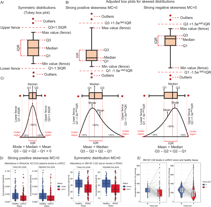
Construction of (A) the classic Tukey box plot for symmetric distributions and (B) adjusted box plots for skewed distributions. Traditionally, box plot whiskers extend to minimum and maximum values before the fence border. Points above fences are considered outliers (global minimum/maximum values representing the complete concentration range). C Relationship between sample distribution and box plot shape. D Comparison of the number of outliers as visualized in Tukey and adjusted box plots for data with positive skewness (on the left side – ccRCC study125) and symmetric distributions (based on healthy controls – on the right side – PDAC study126). E Box plots for paired observations – with lines connecting paired samples. On the right side – a violin box plot is presented.
Graphical representation of descriptive statistics using box plots
Box plots co-plotted with dot plots thoroughly and unambiguously depict individual lipid or metabolite distributions, while other types of plots can be used for accompanying or extending descriptive statistics (see GitBook). A typical Tukey box plot is shown in Fig. 2A. This plot presents outlying values above fences (defined as Q3 + 1.5·IQR and Q1 − 1.5·IQR for upper and lower, respectively), minimum and maximum values (highest and lowest values before the upper and lower fence – corresponding to whiskers’ length), first and third quartiles, and median71,72. The classic Tukey box plot accurately depicts samples characterized by symmetric, normal-like distributions. However, skewed distributions are better captured using adjusted box plots (Fig. 2B), which are not commonly used in lipidomics and metabolomics, even though they are available in R packages like robustbase71 or litteR73. Box plots for skewed distributions redefine the lengths of whiskers (upper and lower fences) to use a robust statistic that measures skewness, known as the medcouple (MC) – a scaled median difference between the values of the left and right half of distribution. For MC ≥ 0 (positive skewness), the box plot model is defined as Q3 + 1.5e3MCIQR (upper fence) and Q1 − 1.5e−4MCIQR (lower fence), while for MC Q3 + 1.5e4MCIQR (upper fence) and Q1 − 1.5e−3MCIQR (lower fence) (Fig. 2C, D). For data following the symmetric distribution (e.g., Gaussian), MC = 0, and the adjusted boxplot reverts to the standard Tukey box plot (Fig. 2D)71. Box plots are frequently co-plotted with dots corresponding to every data point to give better insight into the sample distribution. To keep the figure informative and reflective of the actual data, transparency, color, or fill color settings can be adjusted, and horizontal jitter added to avoid overplotting (Fig. 2D). In the case of paired samples (e.g., the same subjects measured twice – see Fig. 2E), data points corresponding to the same patient can be connected by lines for clarity. An inventive solution is a hybrid of a density plot with a box plot, known as a violin plot74, which preserves even more of the data structure (Fig. 2E, plot on the right). The accompanying GitBook presents a variety of box plots along with the corresponding R/Python scripts.
Univariate statistical methodsFold change
After measures of central tendency are calculated for each group, a fold change can be computed. Fold change is the ratio of two mean concentrations (usually presented as log2 or log10 value) of lipids/metabolites in a condition related to the control condition. The ratios of medians or modes can be used for skewed distributions.
Statistical tests for comparing two biological groups
Statistical tests are broadly applied to compare outcomes between biological groups, e.g., differences in mean concentrations of lipids/metabolites in the control and disease groups. The tests can be parametric or non-parametric. The former covers all tests that make assumptions about the distribution from which the sample data is drawn. The latter can be considered distribution-free tests and are not restricted by assumptions on the nature of the sampled population42,69.
The t-test is a parametric test to compare the location (i.e., mean) of two random samples of continuous variables. If two samples are independent, the unpaired t-test is used. In contrast, if measurements involve, e.g., subjects pre- and post-intervention, a paired t-test is applied42,69,75. While the latter assumes that differences between pairs of values are approximately normally distributed, the former requires the sampled concentration of both variables to come from the normal distribution with the same spread69,75 (variance, testable using an F-test, for example) (Fig. 3A). Welch’s t-test is used if the variances of the two groups are different (Fig. 3A)70,75. The t-statistic determines the test outcome, i.e., whether to reject or not the null hypothesis. This statistic is a scaled difference between the sample-estimated means, which, under the null hypothesis, follows a Student’s t-distribution (akin to the normal distribution but with heavier tails; Fig. 3C, D – example 1). The null hypothesis can be that one mean is greater (or smaller) than the other (one-sided test – only the probability mass in one tail of the t-distribution is assessed) or test whether either is true (i.e., the means are not equal; two-sided test – both tails are considered) (Fig. 3D – example 1). Importantly, at the same significance level α, the one-sided test is more sensitive69. However, as the direction of differences is often unknown, the two-sided t-test is generally more suitable for metabolomics and lipidomics.
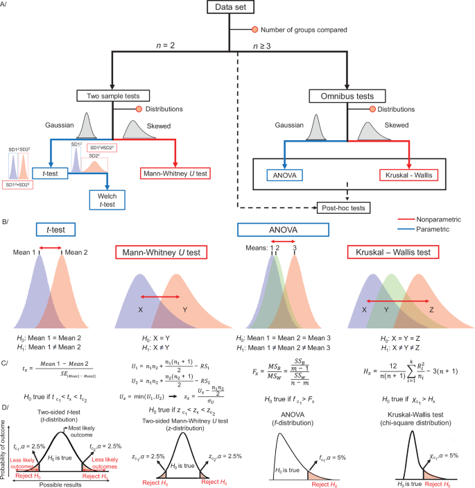
A Roadmap for selecting basic common statistical tests and B their null and alternative hypotheses (H0 and H1). C, D Definition of the test statistics and conditions for rejecting H0. Figure prepared based on information from B. Rosner’s Fundamentals of Biostatistics69.
The appropriateness of the t-test for lipidomics and metabolomics data is debatable. In general, if its assumptions are met, it is more powerful than its non-parametric counterparts76. However, its results may no longer be robust if assumptions are violated, typically in the form of heteroscedasticity (presence of outliers or skewing) or unequal, small sample sizes42 (e.g., t-test is robust even for highly skewed data76. In turn, the application of non-parametric tests is almost always reasonable. Although non-parametric tests are less powerful to pick up an effect, the null hypothesis is rarely falsely rejected.
A distribution-free test, such as the Mann–Whitney U test (also known as Wilcoxon rank-sum test), is typically a superior option in the presence of outliers42 (Fig. 3A). The Mann–Whitney U test assesses the null hypothesis that two collected samples come from the same distribution (Fig. 3B). In the first steps of the Mann–Whitney U test, all observations are pooled and sorted, and ranks are assigned. Ties (e.g., identical concentrations) are resolved by re-assigning the average of the initially assigned ranks to tied values67. Then, the sums of ranks are calculated (RS1, RS2) and used to compute the U-statistic for both groups. The smallest U value is used for the two-sided Mann–Whitney test (Ux) (Fig. 3C). Similarly to the t-test, the two-sided test is more suitable for lipidomics and metabolomics data, hence, only this case is discussed further. The p-value can be obtained based on Z-statistics (Fig. 3C, D), as U can be approximated to the normal distribution. Z-statistics can be computed based on Ux, the expected value of U (\(\frac{{n}_{1}\cdot {n}_{2}}{2}\)), and the standard error of U (σU or σUcorr for ties) (Fig. 3C, D). The null hypothesis is accepted or rejected based on the critical z-values (zc)67.
Statistical tests for comparing three or more groups
If the study involves multiple groups, e.g., healthy volunteers and patients split into different disease stages, the omnibus test is computed for comparing all groups simultaneously. A single omnibus test allows for maintaining type I error (i.e., incorrect rejection of the null hypothesis) at the significance level α = 0.05, in contrast to performing repeated t-tests.
The parametric extension of the classical t-test for comparing multiple groups is the one-way analysis of variance (ANOVA). The one-way ANOVA tests the influence of one categorical variable (e.g., health status) on one continuous variable (e.g., lipid concentration). Similarly to the t-test, ANOVA assumes that all samples are drawn from populations with at least a symmetric distribution and approximately similar variances and that samples in each group are independent69,77. ANOVA relies on estimation of the so-called F-ratio. Assume m is the total number of groups and n the total number of data points in the dataset. Initially, means for all groups and the overall (grand) mean are computed. The variability between groups is then calculated as the sum of squared differences (SSB) between the group mean and the grand mean, weighted by the number of observations in each group. The variability within groups is the sum of squared differences (SSW) between every data point and its respective group mean. The total variability (SST) can then be described as the sum of SSB and SSW. The mean sum of squares between groups (MSB), i.e., variance, is simply SSB divided by the degrees of freedom for groups, i.e., m – 1. SSW divided by the difference of the total number of data points and the total number of groups (n – m) is the mean sum of squares within groups (MSW). Finally, Fx is the ratio of the mean sum of squares between groups (MSB) vs. within groups (MSW) or variance between groups to variance within groups (Fig. 3C, example − 3)67,69,78. Under the null hypothesis (no difference in means), the F-ratio follows F-distribution (Fig. 3D, example − 3)69. If the obtained Fx is higher than a critical value at α = 0.05 (fc), the variation between groups is higher than the variation within the groups, and the null hypothesis is rejected, indicating that at least one mean differs significantly from the others. Next, post hoc tests can be performed to find which means differ77,79. Many post hoc tests are similar to classic t-tests in their mathematical assumptions, computations, and null hypothesis (no difference in means). However, applying multiple tests (one comparison per pair of groups) again increases the chance of type I error occurrence. Therefore, most post hoc tests contain a correction, e.g., a more conservative cut-off compared to the t-test, which allows for maintaining the initial level of significance (e.g., 0.05)79. Tukey’s Honest Significant Difference (HSD) post hoc test is frequently used and efficiently controls type I errors even without ANOVA. Hence, if a research question concerns multiple comparisons solely, post hoc tests can also be applied directly.
A non-parametric Kruskal-Wallis test can be applied if the assumptions of ANOVA are not met, particularly regarding the distribution of samples67,69. As an extension of the Mann–Whitney U test, it requires three or more independent groups and a continuous dependent variable (the measured variable, e.g., concentration of a lipid or metabolite). The Kruskal-Wallis test examines if the rank sums of the observations differ between groups69,80. If the shape and scale of the sampled distributions are similar, the null hypothesis can be simplified to equality between group medians. In the Kruskal-Wallis test, ranks are assigned to all dependent variables ordered from the smallest to largest, ignoring groups. Then, a rank sum is calculated for each i-th group (Ri) along with the mean rank sum (\(\frac{{R}_{i}}{{n}_{i}}\), with ni the number of subjects in the group). Based on the mean rank sum, the total number of observations in all groups (n), and the total number of groups (k), the test statistic Hx is computed according to the formula in Fig. 3C, D (last example)67,69,80. For large sample sizes, it is possible to rely on the approximation of H to χ2 distribution (chi-squared distribution). The null hypothesis is rejected if the test statistic exceeds the critical χ2 value (p α = 0.05)69. Dunn, Nemenyi, or Conover posthoc tests can be used afterward81.
Graphical representation of statistical tests
The resulting fold changes and test statistics for a set of molecules can be visualized using a volcano plot (see GitBook or Fig. S3A). This typically plots a log-transformed measure of effect size (e.g., log fold change) on the x-axis and a negative log-transformed measure of statistical significance on the y-axis (usually –log10(p)). This way, the most strongly dysregulated features between the two groups appear in the top-left and top-right corners of the plot. They are often labeled, allowing effective presentation of large omics data distributions and highlighting of essential results.
Additional box plots, bar charts, or dot plots are often generated for the most interesting variables with p-values indicated explicitly or implicitly via a variable number of symbols (e.g., asterisks) above bars, box plots, and dots (see GitBook or see below).
Lipid maps and fatty acyl-chain plots
Although lipidomic data are complex, it is possible to specifically visualize their biochemical and structural associations. The specificity of lipidomic data, when compared to other omics techniques, lies in the availability of structural information in the names of lipid molecules. Typically, the lipid name contains details about the specific lipid subclass and the composition of fatty acyl chains within its molecule. This information, when coupled with statistical analysis, can serve as the foundation for visualization approaches based on lipid structural information and classification. One option is to visualize systematic changes in the entire lipid classes using lipid networks (sometimes called lipid maps). It is then possible to further focus on structural aspects of lipids, such as carbon chain lengths and the number of double bonds in their fatty acyl chains.
As for lipid networks, these are usually constructed using Cytoscape82 [https://cytoscape.org/], where each lipid is assigned a node and an edge identifier, where edges connect the nodes. Central nodes usually represent lipid classes and subclasses, which are connected to individual lipid nodes by edges. The nodes can be plotted to reflect different statistical variables, usually differences are color-encoded (effect size like fold change or Cohen’s D), while another plotting parameter can reflect the magnitude (p-value of different statistical tests, area under the curve (AUC)). With this visualization, it is possible to observe systematic changes in entire lipid classes and subclasses, which are often more important than changes in a single individual lipid. Examples of this visualization can be found in Fig. S3B and in the GitBook, which also includes references to articles.
Another type of visualization is a fatty acyl chain structure plot, where the x- and y-axes reflect, respectively, the number of carbons and double bonds in fatty acyl chains. These plots are used to visualize the structural composition of lipid classes, which is essential since lipids typically exhibit class-specific patterns in living organisms. Specifically, within a class, either the entire class adheres to a specific pattern, or there is a noticeable trend toward specific lengths/saturation of lipids. Given the potentially large number of lipids within a class, these patterns may not be apparent through the inspection of individual lipids alone or using lipid networks. In this context, the visualization of fatty acyl chain structure plots proves helpful, providing a rapid overview of the structure of the altered lipids and their trends. Examples of this visualization are in Fig. S3C and the GitBook.
Multivariate statistical methods
Multivariate statistics can be divided into unsupervised and supervised methods based on whether the approach requires labeled data during training2,70. We will focus on the most popular methods.
Unsupervised dimensionality reduction using principal component analysis
Lipidomics and metabolomics data are high-dimensional (i.e., many measured molecular species), hampering visualization and analysis. Concentrations for several molecules are often correlated. However, as a result, dimensionality reduction methods allow to summarize this apparent high-dimensional dataset (e.g., 800 lipids) in a low-dimensional space (e.g., 2D or 3D plots) using new uncorrelated variables (components)83. While reducing the number of variables, dimensionality reduction aims to keep as much of the meaningful patterns of the original data as possible70,83.
PCA remains one of the most popular ways of visualizing lipidomics and metabolomics data64,70. In PCA, a matrix containing the centered and eventually also scaled lipidomics or metabolomics data (D) is decomposed into two orthogonal matrices: so-called score (S) and loading (L) matrices (Fig. 4A)40,70,83. PCA essentially performs a linear transformation of the data into a new coordinate system, where most of the variation of the data occurs along a few axes, called the principal components (PC). These PCs are linear combinations of the original variables, and each subsequent one explains a smaller portion of the total variance in the data than the preceding one (Fig. 4)70,83. Figure 4B shows an example 2D representation (low dimensional representation), known as a score or PCA plot, where PC1 (x-axis) is plotted against PC2 (y-axis). Single points represent samples (observations). In Fig. 4B, two biological groups are presented using blue and red colored points, corresponding to controls and patients with gout, and the yellow dots represent pooled plasma samples (quality control, QC). As PCA is a linear transformation, distances in PCA plots are meaningful because similar samples will cluster together, while divergent samples will separate. In Fig. 4B, looking at the score plot along PC1, the separation between gout patients and healthy volunteers is observed (red dot vs. blue dots). Hence, we summarize that the main source of variance, accounting for 42.0% of the total variance, separates samples along PC1 according to health status (healthy controls vs. gout patients). Notably, removing the QC samples from the PCA analysis does not affect the variance explained by PC1 (41.96% vs. 41.98%). The percentage of the total variance explained by each PC is usually presented using a scree (or elbow) plot (Fig. 4C). A benefit of PCA is that the PCs can often be interpreted by looking at their loadings, which represent the relative contribution weights of the original variables to PC (Fig. 4D). The sign of a loading indicates a positive (negative) influence of the respective input variable on the PC70. The PCA analysis shown in Fig. 4 can be reproduced using the R script provided in the GitBook. An informative visualization based on PCA is the biplot. It combines the scores and loadings into one graph.
However, PCA is sensitive to differences in variance (scale) among variables in a dataset. Therefore, most lipidomics and metabolomics data require preprocessing, e.g., log transformation to stabilize the variance, centering (subtracting the mean), and scaling40,84. PCA can be used to visually inspect whether biological groups are separated in the data. Complex datasets visually represented using PCA can be checked for confounders by inspecting sample distribution patterns, e.g., biological, like age- or gender-related differences, or technical, including batch effects or differences between collection sites. PCA also serves as a tool for assessing analytical method stability, e.g., by including balanced pooled QCs (from all samples measured within the sequence) to observe if they cluster in the middle of the PCA score plot. The clustering of QC samples in Fig. 4B demonstrates the integrity of the selected dataset.
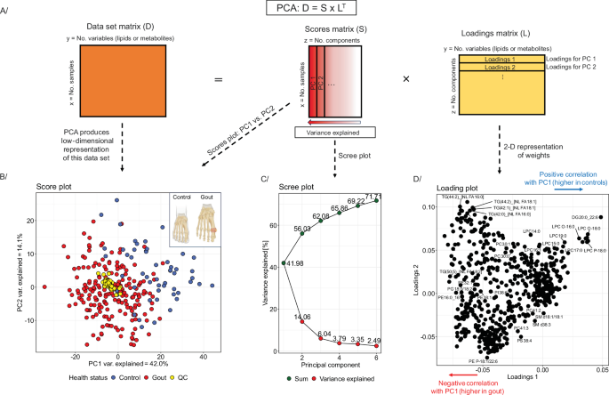
A Principal Component Analysis – decomposition of a data matrix into a score matrix and a loading matrix. B Score plot presents an example PCA for a dataset composed of lipid concentrations analyzed via the liquid chromatography-mass spectrometry (LC-MS) in plasma samples from patients with gout vs. healthy controls (gout – red dots, healthy controls – blue dots, QC samples (data integrity) – yellow dots). Created in BioRender. Dehairs, J. (2025) https://BioRender.com/hcmf66r. C Scree plot representing the (cumulative) variance explained by each component. D Loading plot for the example dataset. The data sethas been published by Kvasnička et al. in their manuscript Alterations in lipidome profiles distinguish early-onset hyperuricemia, gout, and the effect of urate-lowering treatment127.
Unsupervised dimensionality reduction with non-linear techniques
Other dimensionality reduction techniques, primarily used for visualizing high-dimensional data, are t-SNE (t-Distributed Stochastic Neighbor Embedding)85 and UMAP (Uniform Manifold Approximation and Projection). In contrast to PCA, these techniques are non-linear. Interest in applying t-SNE and UMAP has recently increased in the -omics field, especially for transcriptomics and genomics data.
The t-SNE algorithm has two stages. First, a high-dimensional dataset X = {x1, x2, …, xn} is randomly embedded into a low-dimensional (2D or 3D) dataset Y = {y1, y2, …, yn} (Fig. 5B)85. For both the high- and low-dimensional spaces, the pairwise distances of the data points are converted into joint probabilities that represent similarities (Fig. 5A, B)85. For high-dimensional data points xj and xi, similarity is computed as the conditional probability pj|i under a Gaussian distribution centered around xi (Fig. 5A). For data points that are close together in the high-dimensional space, pj|i is relatively high, whereas for data points that are more distant, pj|i will be extremely small85. In the low-dimensional space, the pairwise distance of data points yj and yi, is modeled using the conditional probability qj|i under a Student-t distribution with one degree of freedom (also known as Cauchy distribution; Fig. 5B)85. If the low-dimensional data points yj and yi correctly model the similarity between xj and xi, then the conditional probabilities pj|i and qj|i must be as close to each other as possible85.
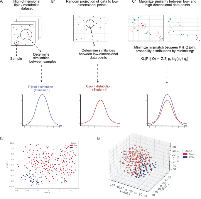
A–C t-Distributed Stochastic Neighbor Embedding algorithm. A The high-dimensional dataset needs to be projected into a low-dimensional representation. A, B Pairwise distances of high- and low-dimensional data points are converted into similarities using the joint probability distributions P (Gaussian) and Q (Student-t), respectively. C The low-dimensional representation that best resembles the high-dimensional dataset is found by minimizing the KL divergence between the two joint probability distributions. D, E 2D & 3D t-SNE scatter plots for a dataset composed of lipid concentrations analyzed via the LC-MS in plasma samples of patients with gout (red dots) and healthy subjects (blue dots). Created in BioRender. Demeulemeester, J. (2025) https://BioRender.com/sg7f248. The dataset has been published by Kvasnička et al. in their manuscript Alterations in lipidome profiles distinguish early-onset hyperuricemia, gout, and the effect of urate-lowering treatment127.
Based on this consideration, the second stage of the algorithm aims to find a low-dimensional data representation that minimizes the mismatch between the two joint probabilities: pij and qij (Fig. 5C). The latter is achieved by minimizing the Kullback–Leibler (KL) divergence between the joint probability distribution P, for the high-dimensional space, and the joint probability distribution Q, for low-dimensional space as follows: \({{KL}}({{P}}||{{Q}})={\sum }_{i}{\sum }_{j}{p}_{{ij}}\log \frac{{p}_{{ij}}}{{q}_{{ij}}}\)85. In essence, the low-dimensional data points are shifted to minimize the mismatch between the low- and high-dimensional spaces (Fig. 5C).
UMAP essentially is similar, it first constructs a high-dimensional graph representation of the data and then optimizes a low-dimensional graph to be as structurally similar to this as possible. Two key theoretical components of UMAP are local manifold approximations and simplicial sets/complexes. UMAP assumes the high-dimensional data approximately lie on a lower-dimensional manifold, i.e., a topological space that locally resembles Euclidean space near each point.
To construct a topological representation (essentially, a weighted graph) for the high-dimensional data, UMAP combines their local fuzzy simplicial set representations (Fig. 6B)86. These are topological spaces constructed by gluing together combinatorial building blocks called simplices, where the fuzziness represents a decreasing likelihood of connection. A k-dimensional simplex or k-simplex is formed by taking the convex hull of k + 1 independent points87 (Fig. 6A). For the low-dimensional data, the local manifold approximation is simply \({{\mathbb{R}}}^{d}\) (d is Euclidean space dimension). Similar to the high-dimensional data, by combining fuzzy simplicial sets, an equivalent topological representation is constructed for the low-dimensional data (Fig. 6C)86. UMAP then optimizes the layout of the data representation in the low dimensional space, by minimizing its cross-entropy with the high-dimensional representation, to maximize structural similarity between the two topological representations (Fig. 6D)86.
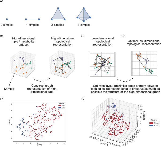
A–D Uniform Manifold Approximation and Projection algorithm. A Examples of simplices. B High-dimensional topological representation. C Low-dimensional topological representation. D The layout of the low-dimensional topological representation is optimized to maximally preserve the structure of the high-dimensional graph. E, F 2D & 3D UMAP scatter plots for a dataset composed of lipid concentrations analyzed via the LC-MS in plasma samples of patients with gout (red dots) and healthy subjects (blue dots). Figure adapted from86,87 and Created in BioRender. Demeulemeester, J. (2025) https://BioRender.com/xcvtpps. The dataset has been published by Kvasnička et al. in their manuscript Alterations in lipidome profiles distinguish early-onset hyperuricemia, gout, and the effect of urate-lowering treatment127.
Comparison of unsupervised dimensionality reduction techniques
Unsupervised dimensionality reduction techniques vary in computational efficiency, scalability, and ability to preserve data structure. PCA is computationally efficient and scales well with large datasets. t-SNE, while powerful for visualization and revealing local clusters, can be computationally intensive and slow on large datasets. UMAP strikes a balance, offering speed and scalability while preserving more structure than PCA. In addition, compared to t-SNE, UMAP preserves more of the global structure of the data while still capturing local patterns. On the other hand, PCA results are easier to interpret because they come from a linear transformation. t-SNE and UMAP, being non-linear, produce results that are more complex to interpret but can reveal more intricate structures.
Supervised data exploratory methods based on Partial Least Squares analysis
Supervised dimensionality reduction methods like Partial Least Squares (PLS) and Orthogonal Partial Least Squares (OPLS) can be considered as linear regression with latent variables, here constructed to achieve maximal covariance between the covariates and the response. As a result, compared to regular linear regression, (O)PLS can deal with high-dimensional data containing many, possibly correlated variables and a limited number of samples. These models can be applied to regression tasks, feature selection, and classification (i.e., PLS-Discriminant Analysis, DA)33,70,88, making them particularly useful for exploring lipidomics and metabolomics data.
PLS consists of five steps: (i) centering and eventually also standardization of variables, (ii) dimensionality reduction (computation of linear combinations of predictors and responses), (iii) fitting a linear regression model using PLS components, (iv) model parameter tuning, and (v) model application (Fig. 7). PLS starts from a data matrix of measured concentrations (X) and a vector containing sample class labels (the classification case), or continuous response variable (Y). Both should be centered and scaled. PLS iteratively finds the directions (latent variables, LV, marked as T in Fig. 7) in the X space that explain the maximum variance in Y (as opposed to PCA, which finds the axes of maximal variance within X). Models can be tuned using k-fold cross-validation or leave-one-out cross-validation (LOOCV) (see below), i.e., how many PLS components should be kept in the final model to achieve the best performance (Fig. 7)33,70,88,89.
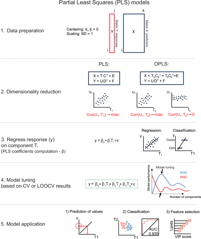
X denotes the matrix of predictors – with lipid or metabolite concentrations; Y is the vector of responses; T and U – are scores for X and Y; C and D are loadings for X and Y, respectively; E and F are residual matrices. For OPLS, the scores and loadings are additionally split into predictive (p) and orthogonal (o) parts. If Y is a vector, no decomposition is needed in step 2.
In 2002, OPLS was published90,91, which uses so-called orthogonal signal correction to maximize the explained covariance within the first LV (Tp). In turn, the orthogonal LVs (To) cover the variance that is not correlated to the response variables (orthogonal variance) (Fig. 7). In effect, OPLS allows for separate modeling of variations of predictors in X correlated and uncorrelated to class labels stored in Y. This can improve the model interpretability70,90,91.
Before building PLS models, data should be split into training, testing, and validation sets88. Usually, most data points are allocated to the training set. Several techniques are used for model training and tuning to avoid overfitting70,88,92. One of the most popular is k-fold cross-validation, which splits the data into k equal parts, where k−1 parts are used for training, and one part is used to test the model. The process is repeated k-times, and the final number of components in the PLS model is decided based on model performance calculated as the sum of squared differences of observed and predicted response values from k-fold cross-validation. For smaller datasets, LOOCV can be applied. Here, one observation is left out, and the rest is used for model training. The process is repeated until every single observation has been left out once for testing. The performance of the models can then finally be assessed using a validation set, which has not been used during the training-testing procedures88,92. In PLS-DA (or OPLS-DA), the group labels are predicted for every sample, and probability ranging between 0 and 1 is assigned88. In a two-class classification problem, 0 refers to controls, and 1 to conditions. A cut-off is selected, usually equal to 0.5, and all values below 0.5 belong to controls, while above 0.5 to condition.
PLS can yield informative visualizations. A score plot can be obtained from two LVs of (O)PLS-DA93 (see GitBook), or similarly to PCA – a biplot94. A performant (O)PLS-DA classifier will separate biological groups in its score plot. The discriminating features the model has revealed can be presented using variable importance plots (VIP)70 or the S-plot for OPLS-DA (see GitBook)95. The S-plot is a scatter plot depicting covariance (y-axis) and correlation (x-axis) between the measured lipid or metabolite concentrations and the predictive scores. The molecules that are farthest from the origin are considered to be most important for discriminating between groups (see GitBook)95. A loading plot presenting weights for two selected LVs can also be shown94. For (O)PLS-DA, a receiver operating characteristic (ROC) curve can show classifier performance across a range of threshold values. The greater the area under the curve, the better the classifier (AUC = 1 indicates perfect classification) (see GitBook)96.
Hierarchical clustering analysis
Clustering is broadly used in lipidomics and metabolomics to investigate similarities and differences between groups of samples or features. For simplicity, we focus on sample clustering (data points, observations), but these concepts may readily be applied to features, too. In the first step of clustering, a distance matrix is computed, containing the pairwise distances between all samples. The most used is Euclidean distance, i.e., the length of a straight line connecting one sample to the other. Hierarchical clustering is an algorithm for grouping similar objects into clusters. Generally, two types of hierarchical clustering are distinguished: agglomerative and divisive (Fig. S1A). The former starts with every observation as a separate cluster and iteratively combines the closest clusters until only one remains. The latter approach starts with all observations in one cluster and iteratively splits them until each observation forms its own individual cluster. Among the myriad of criteria for deciding which clusters to merge in agglomerative clustering, Ward’s linkage is popular for agglomerative clustering of lipidomics and metabolomics data, as it seeks to iteratively merge those clusters that minimize within-cluster variance70.
Graphical representation of clustering analysis
Hierarchical clustering can be visualized using dendrograms. These consist of branches; samples on the same branch belong to the same cluster (Fig. S1A, B). The most common are rectangular dendrograms plotted vertically or horizontally (Fig. S1A), but circular (Fig. S1B) or triangular dendrograms can also be used97,98. Dendrograms are frequently plotted alongside heat maps of lipids or metabolites of interest70 with the smallest p-values, the highest weights in PCA, or VIP scores from supervised approaches like (O)PLS. Using heat maps, trends for sample clusters can be readily captured if clustering is applied to features, too (Fig. S1C, D).