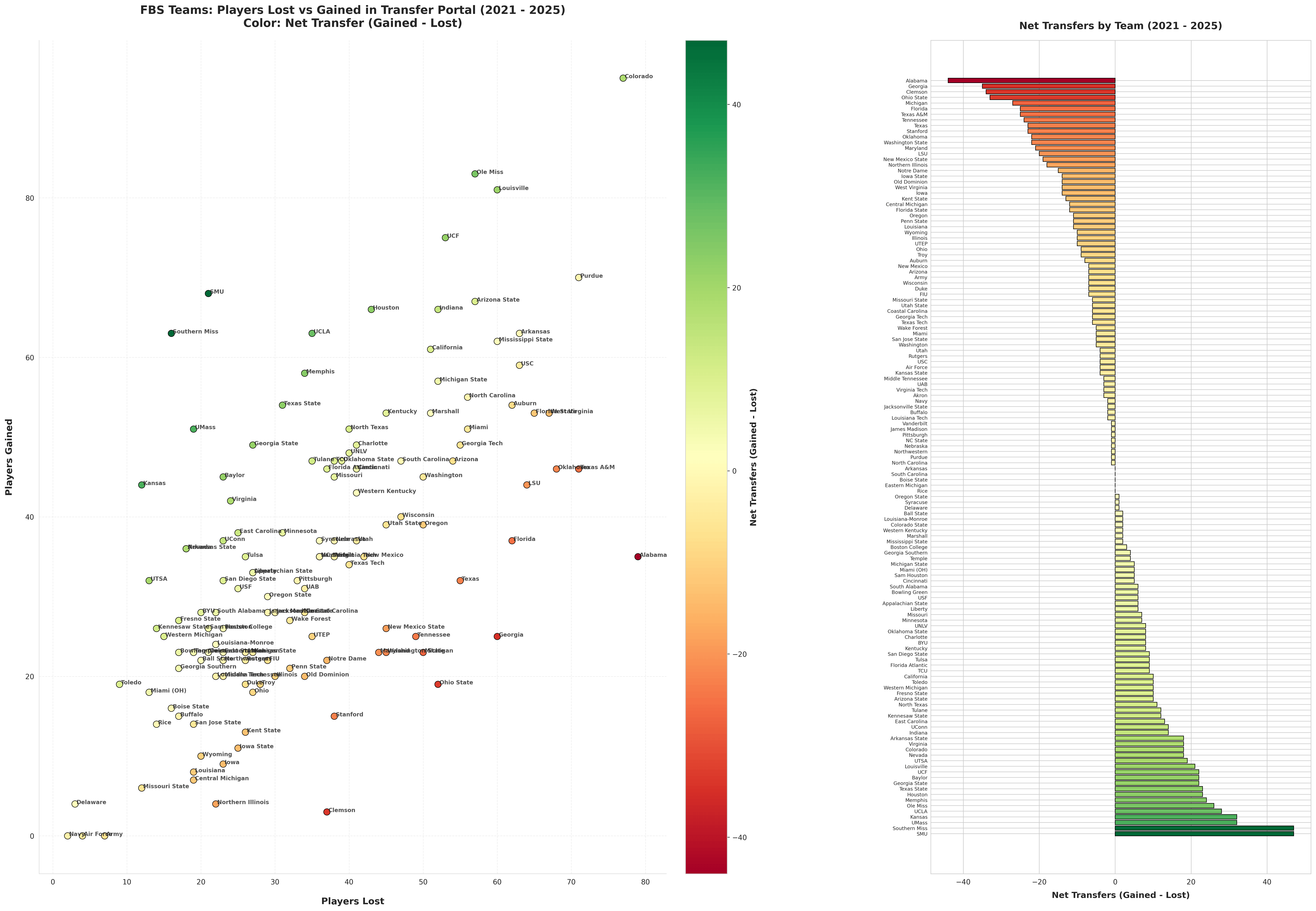
This chart shows FBS college football teams’ activity in the NCAA transfer portal from 2021 to 2025. The left chart plots each team’s number of players lost (horizontal axis) and gained (vertical axis) through the transfer portal, with the color of each dot representing that team’s net transfer difference (gained minus lost). The right chart ranks all teams by their net transfer difference.
Data source: 247sports.com
Database & Data Viz Tool: formulabot.com/cfb-transfers
The link provide a database of all college football transfers from 2021 to 2025, compiled from 247Sports.com, including recruiting information, previous schools, and transfer destinations.
Posted by No-Comfortable-9418
2 comments
how much of that net transfer balance actually translates to on-field success? like, do teams with big positive net gains actually improve their win totals, or are they just cycling depth players?
Great chart. This alone shows why there is more parity in CFB and why Clemson sucks. Good players not getting playing time aren’t waiting around at blue bloods and Clemson is losing players but not filling the holes.
Comments are closed.