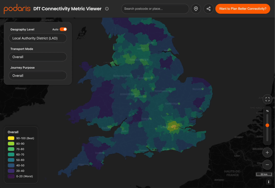
Unfortunately it’s UK-only, but vibe-coding it was really fun! If you live in the UK, see how well your Output Area compares to the rest of the country. Try it out at https://labs.podaris.com/dft-connectivity-metric/ !!!
Some features to try out:
– Dark/light mode toggle in the info/about menu
– Borderless mode toggle in the info/about menu
– Auto mode toggle for geography level selection
– Search for postcode or address
– Locate me button
– Full screen mode
– Opacity slider
– Painstakingly designed drawer-based interface for mobile web
Posted by picrazy2
7 comments
Will Northern Ireland and Scotland get data eventually?
This is very cool, thank you.
That’s excellent.
It is amazing how much data like this is freely available. I was briefly involved with a project looking at rivers in England, and was very impressed with how much data the government and other agencies provide.
Interesting to see that TfL was right about the worse connectivity of my specific area, notably worse than surrounding districts in sw London
nice, i like the round ui and the infoboxes (i think that’s what it’s called)
That’s cool. I think the highest layer of data isn’t really useful here, I would scrap it. To be honest, you might just display the data as a single layer on the map, as it’s not particularly fine so should load up ok?
What is it showing though?
Comments are closed.