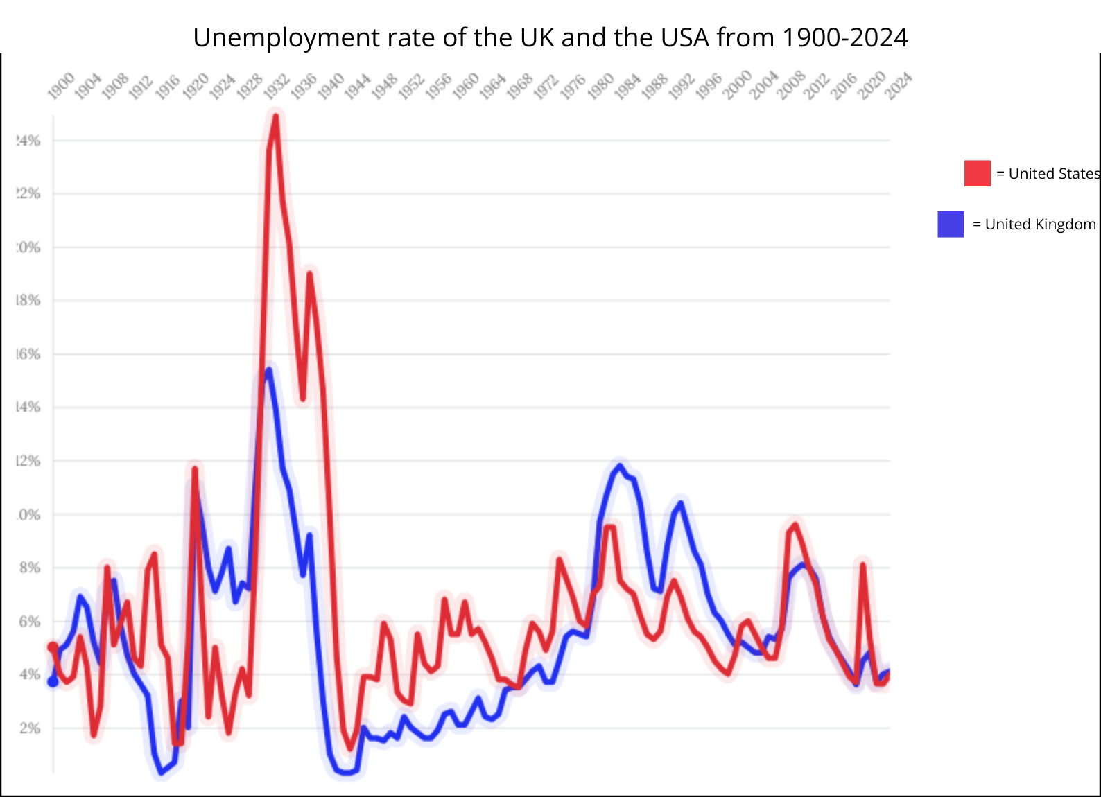
![Unemployment rate of the UK and the USA from 1900 - 2024 [OC]](https://www.europesays.com/wp-content/uploads/2025/11/hs98ffdn2gzf1-1588x1024.png)
This is the first graph ive ever made so i hope you like it 😀
Any constructive criticism is welcome
Sources:
https://www.macrotrends.net/global-metrics/countries/gbr/united-kingdom/unemployment-rate
https://fred.stlouisfed.org/series/UNRTUKA
https://www.statista.com/statistics/269959/employment-in-the-united-states/
https://www.statista.com/statistics/1315397/united-states-unemployment-number-rate-historical/
Tools used:
Flourish
Canva
Posted by HungerGamesPerson
9 comments
Since this graph ends at 2024;
2025 USA: 4.3%
2025 UK: 4.8%
Anecdotally my prospective job market (tech) is currently seeing big layoffs, I know quite a number of people that are taking ~30% pay cuts and others not expecting to find jobs until Q1 2026. While these cuts aren’t directly tied to over hiring during COVID, companies have slimmed down since that time.
I’m curious about the post-AI-bubble pop, and how large that spike will be
You’ve cut off some of the y axis in the image (I’m seeing zero instead of 10). One thing to check when presenting this is whether the definitions of unemployment are consistent… For example is one based on a labour force of 16 and over and another is 16 to 65, do both have the same ‘job search requirements’ to be counted as unemployed or not in the labour force.
Does count total % inactive? In the UK a large number of people have been dropped from the survey due to no longer looking for work
Congrats on your first chart.
I’m questioning how comparable this data is.
First, the United States government did not implement a uniform, relatively-consistent measurement of “unemployment” until the middle of the Great Depression. So the fact that this chart shows US unemployment rates going back to the 1900 is suspicious.
Second, the OECD publishes time series for economic measurements like unemployment that are specifically intended to be comparable. [This chart shows the UK and US unemployment time series from the OECD](https://fred.stlouisfed.org/graph/?g=1NFBQ):
https://preview.redd.it/ep9b41fk1hzf1.png?width=1320&format=png&auto=webp&s=59fff0d7acf089dde553c9c8d2cef91ad50b6209
The US time series starts in 1955, but the UK series does not start until 1983. This suggests to me that there may be signifiant definitional differences in how OP’s chart measures unemployment before 1983.
Notably, 1983 is around the time in OP’s chart when the US’s unemployment rate goes from being consistently above the UK to consistently below the UK.
[Here are the comparable OECD unemployment series from 1983 to now](https://fred.stlouisfed.org/graph/?g=1NFBX).
When America sneezes, Britain catches a cold
Interesting that the years where the UK exceeded the US were mostly under Thatcher.
Incredible how correlated these are
Could do with faint vertical lines so that one can match the peaks to the year easily.
Comments are closed.