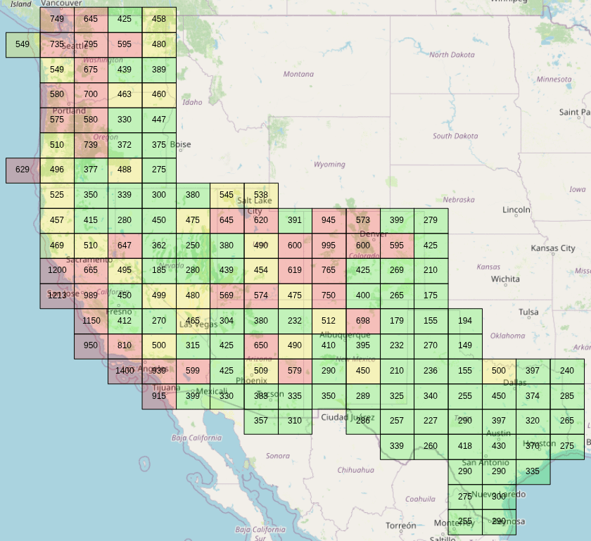
I've been priced out of my native southern California, and I couldn't find a good tool to visualize median home prices so I built one for myself, and then decided to take a little extra time to stick it on a cheap web host for others to play with.
This tool shows *all* zillow home listings for a subset of states[1], and calculates the median price for all home listings within each color coded tile. There are 558224 listings which were collected using hasdata.com on 9/28/2025.
The frontend is react and OpenLayers, backend is flask, and the server is a 1 core hostinger vps (we'll see how it holds up!). It's a little rough around the edges, but hopefully someone finds it useful.
[1]: States collected: Washington, Oregon, California, Nevada, Utah, Colorado, New Mexico, Texas
Posted by f33tpix
13 comments
Nevada National Security Site or….Kansas… choices choices
People say CT is an expensive state but i couldn’t afford to live as an OINK (one income no kids) on the west coast
What are the units on these figures?
Ignore this.
What a fucked up grid/heat map.
Fun fact: Those squares are called Quadkeys
But I heard Trump is coming out with 50-year mortgages to help lower the monthly mortgage payment so hopefully that will save us from having to rent for the rest of our lives
What the hell are these random blocks
The view shown in your thumbnail isn’t very useful, but the tool is actually pretty cool when zoomed in more on a metro region.
I like that you can manually set the color-code gradient to values of your choice, but it would also be nice if there was a mode that would automatically set them based on the data distribution. Help give you a sense of the relative affordability across the region (rather than the absolute affordability), without having to scan the whole map first to get an idea of the ranges.
So only nice area are for the rich now.
Completely useless when not adjusting for incomes. Sure houses are cheap in Missouri, but incomes are substantially lower too.
Why not use do this by county?
Starting with a 1 is either really good or really bad
Here is a similar map for Japan:
https://porty.co.jp/data/price/map
Comments are closed.