
I know, I know. Here comes this guy saying that I should add more to my plate. I can’t deny that there’s effort involved, but I plan to make a case that you should collect, analyze and act on a wide range of data about your students, their participation and their performance in your classes.
Here’s why.
Data Grants Your Tenure and Promotion Applications Power
Proving your abilities as an educator is the primary aim for many faculty positions, but how do we effectively measure that? Teaching evaluations have known biases, and the pressure to get good marks from students incentivizes lowering expectations or even ignoring academic integrity violations. The best metric is often third-party evaluation, but fellow faculty may not be available, or your institution may not have a teaching and learning center with available staff.
However, if you tap your class data, you can showcase how specific interventions made an impact on student growth across time. Tracking student office/review visits and pairing these with class outcomes to display the difference from your mentorship and instruction is an easy start.
Your tenure and promotion evaluators are human and likely fall into the following pattern (like many of us do): They love pictures/graphs, they like numbers and they tolerate words. Busy people are far easier to reach with graphical displays of your teaching accomplishments. Good data visualization makes people focus on your numbers, and if those look good, they’ll pay greater attention to your text.
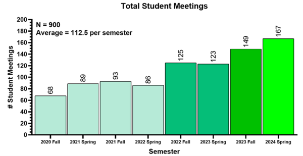
Let’s see how this can play out if I want to cite that I have done an excellent job meeting with students during office hours:
“I have dedicated myself to student learning and mentorship by meeting frequently during office hours.”“I have completed 900 student meetings across my first four years, making for an average of 112.5 meetings per semester.”[Bar graph displaying each semester across the X-axis and the number of meetings on the Y-axis, with each bar annotated with the exact number, and each bar color coded from blue to green, getting brighter for higher numbers and displaying an upward trend]
That said, I know that I’m asking you to go above and beyond to learn data visualization. It’s not in our contract, but it’s a critical component of reaching readers and telling your story. Equally, quantitative accomplishments may serve as a shield if your tenure application comes under severe scrutiny.
Data Identifies Opportunities for Student Success Interventions
As you accrue class outcome data across time and pair it with student information, you may uncover drivers of student failure and drivers of student success. Identification of sensitive/at-risk student populations may allow you to intervene on their behalf before they experience the statistically predicted fall. Heavy employment commitments, lower GPAs or financial insecurity come to mind as risk factors. Data can inform you to alert these students of the population they fall into and direct them to resources. Often, an invite to chat in office hours does wonders. More aggressive interventions include tutor pairings, study/attendance plans or specific practice sessions.
Can you see how tracking the success of these interventions helps the initial case I made for analyzing data for tenure? True teaching effectiveness doesn’t come from funny lectures; it comes from experiments that validate your effective interventions.
Data Identifies Students With Positive Qualitative Stories/Circumstances
Building more data, you’ll soon encounter scenarios where students with the odds stacked against them manage to win big. Phenomenal! Finding these students who break the statistical mold grants you several things:
You can learn their habits and how they pull this off.You can (anonymously) share the student’s story in current and future classes to give hope to students similarly mired in tough circumstances.You may identify students who can serve as future peer mentors or TAs.
The flip side of this point is when the data identifies students who should be performing well and are not. Early intervention here to identify and potentially assuage causal issues may reveal blind spots about their approach (or yours).
Data Shows Your Students Their Future
Educators may underestimate the power of sharing data, especially when the outcomes of certain measurements may seem obvious (guilty). But one of my best students once reflected how powerful it was to see the effects of attendance displayed graphically with statistical significance on the first day of our class: “I had never seen that from a professor before.”
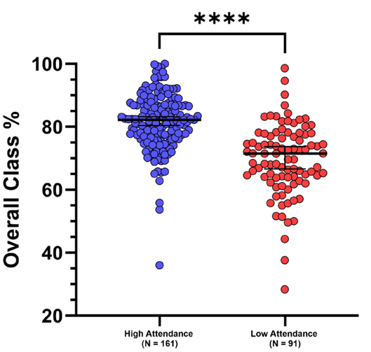
Faculty can use such data about past student performance to share why we approach a class the way we do. This practice honestly and effectively sets the stage for class expectations—far better than text and pronouncements alone:
“You should all come to class because it’ll benefit your grade.”“Higher-attending students have a median grade of 82 percent in the class.”[Graph showing attendance stats for final class outcomes]
Data Informs the Public
Yes, that sounds strange. It’s not our direct job to communicate outside of campus—but unless you’ve been living in a bubble, things are changing. Parents, community members and future students are examining higher education with a critical lens given the increasing cost. This is the toughest ask, but data and visualizations can serve as the foundation for outreach. The contemporary mischaracterization of faculty may continue if our voice doesn’t enter the chat.
If you’re reading this, you’ve likely created amazing projects, boosted student learning or completed crucial research. Share it. Even showcasing the basics of our day-to-day work can help, something as simple as a graph that displays the number of students per course that we lead.
Data That You Can Collect
Pre-class data: You could collect data on students’ GPA, financial stress/status, employment status/hours, first-generation status and any custom categories that you believe will be able to yield insightful connections later on.Live data: You could track attendance, exam/project scores, office hour and review visits, overall percentage grades, engagement with the learning management system, and the utilization of any specific class resources that you monitor.
Of course, for any data collection you’ll need to use a standard consent form—my institution’s Institutional Review Board had a great template I could use.
Start small and scale up. The key is to stay consistent across cohorts and time. Patterns and findings will emerge. You should seek approval from an IRB if you plan to publish findings—it may be worth a conversation with your IRB office before you share any data with the class—but any metrics collected for the purpose of educational improvement are fair game, and an excellent starting point. Ultimately, this can hopefully lead to a strong quantitative base you can use to highlight qualitative accomplishments and boost student success.
A note for adjuncts: Keep it brief. Attendance plus outcomes is a strong start.
All that said, education can’t be boiled down to an Excel spreadsheet. The open exploration of knowledge, the creativity and curiosity, and the powerful mentorship communities we foster in our classrooms go beyond analysis.