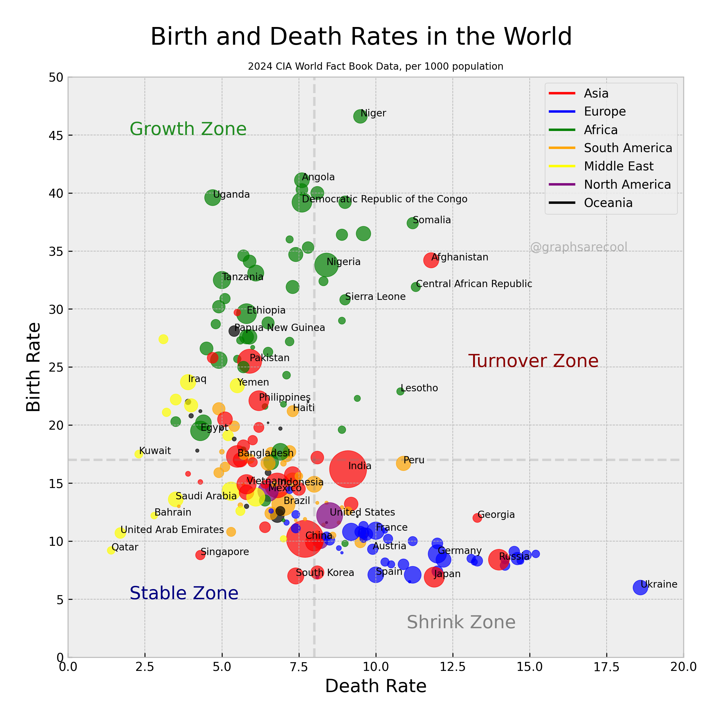
Birth and death rates are 2024 numbers listed as per 1000 people. A handful of countries are named as well. Dashed lines are global means for birth and death rates. All data from CIA World Factbook.
Posted by graphsarecool
![2024 Birth and Death Rates by Country [OC]](https://www.europesays.com/wp-content/uploads/2025/12/npx1ucaen96g1-1920x1024.png)
Birth and death rates are 2024 numbers listed as per 1000 people. A handful of countries are named as well. Dashed lines are global means for birth and death rates. All data from CIA World Factbook.
Posted by graphsarecool
11 comments
Source: https://www.cia.gov/the-world-factbook/countries/. Tools: numpy, matplotlib.
Damn. Sad face for Ukraine.
🙁
Let’s go Niger and Nigeria!!
All relatively developed countries are cooked.
Is this a living example of the famous experiment of mice utopia universe no.25? If so, it is not good
Interesting idea for a plot.
I feel like because both axes are in the same units, their scale should also be the same. Line y = x is meaningful, it’s no change in population number (from stable to high turnover), and it’d be natural to be at 45 degrees to the axes.
More, the dashed lines around x = 8, y = 17 are medians? Are those medians by number of entries (countries) on both sides or does it take into account the size of the countries?
Edit: I missed the clarification in the description. Still, I think medians would be more appropriate because distributions of countries I suspect to be non-symmetrical.
Moreover, cutting into those 4 zones should not be done by median lines. Eg. Indonesia around (6, 15) is growing (15 > 6), even if in ‘stable’ area.
I’d also change lines in the legend to some rectangles.
This would be awesome as a time series, watching the bubbles grow and shrink and move around the map…
What does turnover zone mean?
I don’t understand the dotted lines. I would think the line that determines whether a country is growing or shrinking would be the diagonal x=y line. “Stable” could be a zone bounded by lines y=x+3 and y=x-3 up to a certain cutoff at which point I suppose it switches to turnover in your system. Right now a country with a death rate of 7 and a birth rate of 1 would be considered stable.
I don’t understand the dotted lines. I would think the line that determines whether a country is growing or shrinking would be the diagonal x=y line. “Stable” could be a zone bounded by lines y=x+3 and y=x-3 up to a certain cutoff at which point I suppose it switches to turnover in your system.
Right now a country with a death rate of 7 and a birth rate of 1 would be considered stable. Similarly your zones put South Korea in stable and United States in Shrink. Which of those countries should be in any reasonable shrink zone? That should tell you that the zones shouldn’t be perpendicular to the axes
Wow. We can visualize demographic transition as a crescent
nice plot. i plotted the y=x line in my head to visualize the threshold, could have been another dashed line
Comments are closed.