![[OC] NFL Team Finishes Within Division, 2015-2024](https://www.europesays.com/wp-content/uploads/2025/12/jnxuc8zsg28g1-1920x1024.png)
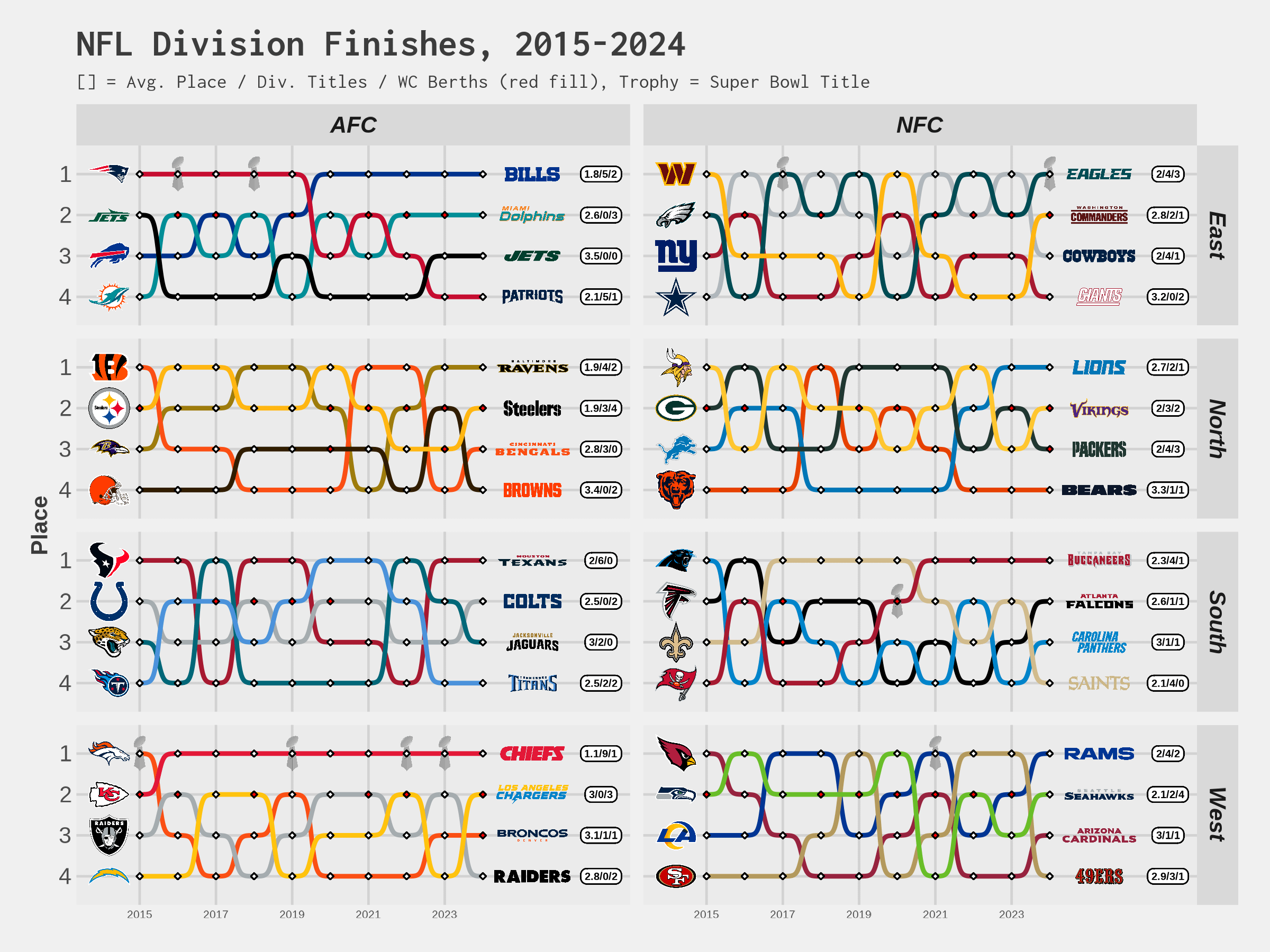
Something for the NFL enjoyers in here. Since last weekend included Patrick Mahomes tearing his ACL and the Kansas City Chiefs fully falling out of playoff contention, I thought I'd share this chart of team division finishes, which gives a peek into how consistently successful KC has been over the 10 prior seasons. For context, Mahomes took over as the starter in 2018.
It was my first crack at a bump chart, and I probably tried to cram too much in, but it at least feels like a fun way to visualize the info.
Data source: Pro Football Reference
Tools: R
Posted by numbers_in_figs
9 comments
ItŌĆÖs nice to see a picture that explains so simply why everyone is happy about the Chiefs this year.
Is anyone as much “If you’re not first, you’re last” as the 49ers?
NFC appears more chaotic, AFC appears more regular with upsets.
As a New Yorker, this graph shows everyone what IŌĆÖve been watching for a decadeŌĆ”
Why does Cowboys play in the NFC-East?
It’s so interesting when you see this and you watch things like hard knocks and see behind the scenes and how much the owners and GMs play a part on if the team is successful. Some teams are chaotic and some teams are steady near the top and how some teams are so sporadic and who the owner and their GM decisions play such a large part in the teams or lack of it
Oh thatŌĆÖs neat, if you just go across the graph between the Niners logos it looks like my heartbeat every time they lose a Super Bowl in the most heartbreaking fashion possible.
I know it’s the NFC South, but seeing Tampa still as flat in a similar fashion that KC, Buffalo, and New England is very enlightening
Cool visual. Can you go back another 20 years?
Comments are closed.