![[OC] Age, Term Length, and Lifespan of US Presidents](https://www.europesays.com/wp-content/uploads/2025/12/pgtgx41f8k8g1-1920x1024.png)
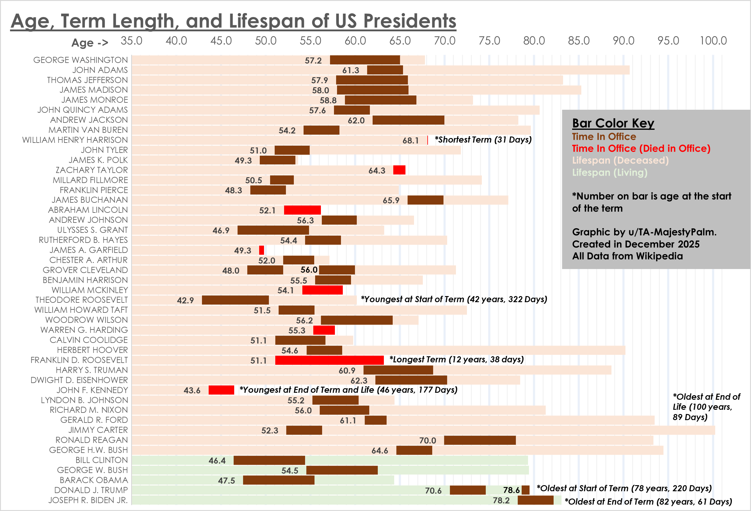
Graphic by me, created using Excel. All data from Wikipedia here: https://en.wikipedia.org/wiki/List_of_presidents_of_the_United_States_by_time_in_office and here: https://en.wikipedia.org/wiki/List_of_presidents_of_the_United_States_by_age
Posted by TA-MajestyPalm
18 comments
All in a nice colour of shit.
I like this one. Simple and illustrative with a design that reads nicely top-to-bottom. It tries to say nothing more and nothing less than what the data do.
If I had to give a *possible* note for possible improvement to design, it’s that there is maybe a lot of empty space in the bars that could be utilized for a second version. An interesting use would be a color-coded indication of when and in what capacity the various people started their political/executive career; so one color for military officer, another for state office, another for multinational executive, etc. It may end up being too distracting from the basic concept though, or add a tiny bit of subjectivity.
And even though the data is widely available, I would still strongly recommend putting date of creation and data source(s) on the graphic itself. Overall, good job.
Interesting plot. now make it beautiful. Start with a color pallet.labelling looks sloppy overall. You dont have to show who died in office with a new color. Our eyes can see when the bold bar hits the end of their life….That’s a start. Have a go at it.
I really like this. A ton of information
This is actually a good visualization unlike other ones usually posted here. Thanks for sharing!
It is quite interesting to see how many presidents of the past didn’t even live to the age where Biden or Trump got into the office.
Kennedy didn’t reach end of term. Should be terminated by death, period. Stating end of term and life is incorrect.
What was the age expectancy like when John Adams was around? Reaching 90+ years back in the late 1700s must’ve been something.
I didn’t realize there were THAT many presidents that have died in office
7 seems like a lot
And we’re getting really close to making it 8
Nifty. Maybe not including the fractional ages aside from the tie breaker would make it a little cleaner.
Kind of crazy how we went from Clinton and Obama who were decently young to Trump and Biden who are by far the oldest presidents in history of America. They are both 8 years ahead of Reagan, who’s already an outlier.
This is a really well designed visualization!
One small note: red/green combinations should be avoided when possible due to color blindness. For this visualization in particular, simulated protanopia makes the pale green and pale red practically indistinguishable.
I actually learned something new from this guide. I’d always heard JFK Jr was the youngest President, but he was only the youngest at the end of his term. Teddy Roosevelt was actually the youngest to be elected.
I knew Reagan was the oldest at the time but didn’t realize he was almost as old as the oldest-upon-leaning-office prior to that (Ike).
Great chart.
The constitution has a minimum age. It also needs a maximum age.
70 seems like a good cutoff
I misread this as “Age, arm length, and term span”
For comparison, [here](https://www.reddit.com/r/dataisbeautiful/comments/1hxg4hw/oc_timelines_birth_to_death_of_us_presidents/) is another post with the same data.
Comments are closed.