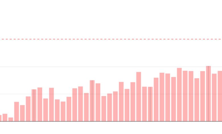
In 2025, Spain was quite literally living on the map. Every month brought new events that demanded not just explanations, but clear visuals. Wars, disasters, and shifts in society—all became easier to grasp when fresh charts, satellite images, and infographics appeared. Even the most complex processes, from global supply chains to local floods, suddenly felt more tangible and understandable.
This year, visualizations have become an essential part of the news. They helped explain why the streets of Valencia flooded again, how the rental housing market is changing, and what’s happening with the climate. Maps and charts not only illustrated the facts, but also sparked new questions: who is enrolling in universities, where do young people vote differently, and why are solar panels appearing even in unexpected places?
Geopolitics and globalization
The world in 2025 turned out to be more interconnected than it seemed before. The journey of an ordinary Nintendo Switch console—from factory to store—became a clear example of how global markets operate. Charts showed how steel from conflict zones ends up in the products we hold in our hands. Wars that once seemed distant suddenly became a part of daily life through supply chains and economic ties.
Spaniards realized that globalization is not an abstraction but a reality affecting prices, jobs, and even what ends up on store shelves. Maps helped explain how events abroad impact everyday life in Spain. Visualizations made complex processes simple and clear—and sometimes unexpectedly personal.
Breaking Down the Urgent
Whenever something major happened, explanations followed quickly. Why did the power go out in several regions? How is a new Pope chosen? These and other questions were answered not just with text, but also with diagrams that instantly put everything into context. Visual materials became the main tool for understanding urgent news.
By 2025, reaction speed became critical. People expected not just facts but explanations they could see. Charts and maps helped make sense of complex topics in minutes, not hours. This changed the way information was delivered: now, clarity was just as important as accuracy.
Spain by the Numbers
Statistical snapshots of Spanish life sparked special interest. How is rent changing? Why are more young people choosing right-wing parties? Which districts have the most students? Answers to these questions appeared as interactive maps and infographics. Spain saw itself from a new perspective—not just through news, but through data.
By 2025, it had become clear: statistics are more than just dry numbers. Behind every graph were real people’s stories, their choices, and changes. Maps revealed where prices were rising and where new universities were opening. Visualizations helped people grasp how the country was evolving—and why it mattered to everyone.
Climate and the Future
The year was marked not only by events, but also by changes in nature. Solar panels became a symbol of transformation: they were installed on rooftops, in fields, and even at bus stops. But at the same time, desertification was advancing—the encroaching sand became more apparent, and temperatures in some regions surpassed previous records.
Graphs illustrated shifting climate patterns and what they meant for the future. In 2025, the planet crossed the 1.5-degree warming threshold, sparking discussion at all levels. Maps highlighted new risk zones, and infographics showed where and how people could adapt to these changes.
Disasters and Risks
Floods in Valencia were once again a reality. This time, computer simulations were used to analyze the city’s streets—showing where water would flow, which homes would be threatened, and how the landscape could change. Risk maps became essential tools for both rescuers and residents, and made people reflect on the city’s future.
Wildfires in Spain and abroad—for example, in Los Angeles—also became a focal point for visual reporting. Satellite images, fire spread animations, and evacuation maps all helped convey the scale of the disaster and its causes. By 2025, it became clear: disasters require not only a response but also an understanding of how to prevent them.
Intriguing details
Not every event was serious. Sometimes maps and charts answered unexpected questions: who will win Eurovision, how to properly watch a solar eclipse, or why a new skyscraper is being built in Benidorm. Visualizations became a way not only to inform, but also to entertain, surprise, and spark discussion.
By 2025, a visual approach to news had become the norm. Charts appeared not only online, but also in newspapers, on TV segments, and even on city screens. Spain saw that behind every news story stood a narrative you could not just read, but also see.
