

Data source: https://people.physics.anu.edu.au/~ecs103/chart/ I used python to transform the data into something I can import into CAD, then wrote a custom script to generate all of the print groups and connections.
This is a repost with updates to fit community guidelines.
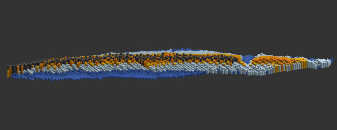
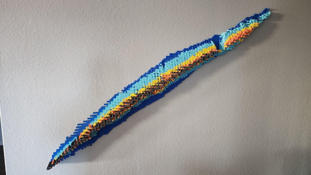
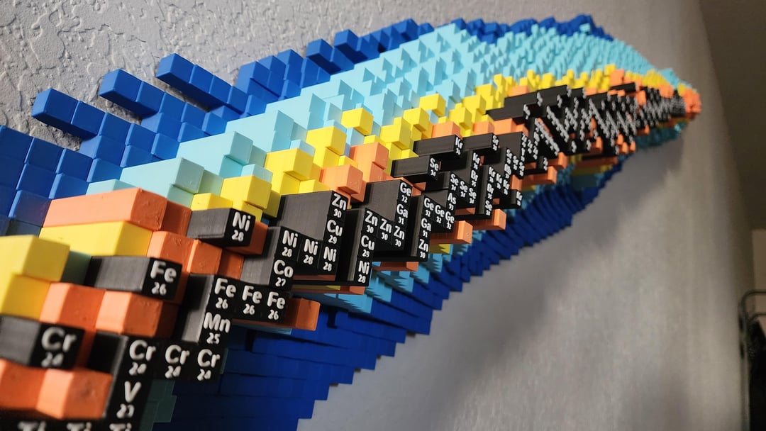
I turned the nuclide chart into a piece of 3D printed wall art.
This chart shows the half life of each isotope from the periodic table. On the vertical axis is the number of protons and on the horizontal is the number of neutrons. The height of each column corresponds to the half life. The height is not on a linear or logarithmic scale but rather a custom scaling to give a more interesting shape. The different color sections correspond to the length of the half life. The half lives are: dark blue – less than a second, light blue – less than a minute, yellow – less than a day, orange – more than a day, black – stable.
I watched BobbyBrocolli's video that included the nuclide chart and thought it would be really cool to put it on my wall. (Youtube links are not allowed, search "The man who tried to fake an element")
This is about 8ft long, weighs roughly 9kg, and took about a month to print.
If anyone wants one of their own, I am selling the printed version on Etsy for $800 (updated price thanks to feedback on the last post): https://www.etsy.com/listing/4397642068/customizeable-3d-nuclide-chart and the files on Cults3D for $30: https://cults3d.com/en/3d-model/art/3d-nuclide-chart-wall-art
Posted by wingsandstache
3 comments
You should have glued it down to a piece of painted wood and hung it up. It could have been a cool art piece. But it is cool nonetheless.
met with silence from the silence community
I remember spending days walking various decay paths of isotopes for school.
Comments are closed.