Another year. It passed extremely fast and yet, painfully slow. Despite developing tech that some think might take over our day-to-day work, data things got made by people this year. These are my favorites.
Alyssa Mungcal, Amanda Chai, Chee Wei Xian, Ernest Ong, Khoo Zi Qi, Stephanie Adeline, and Tang Hao Liang for The Straits Times
Inside the Confusing World of Women’s Clothing Sizes
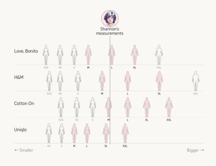
They approached the topic from several angles with 3-D models, data collection, and sizing charts. Adding to the visualization genre of variable clothes sizes, this piece helped me appreciate the process that is women’s shopping. [See the Project / On FlowingData]
Aatish Bhatia, Francesca Paris, and Rumsey Taylor for The New York Times
Your Zodiac Sign Is 2,000 Years Out of Date
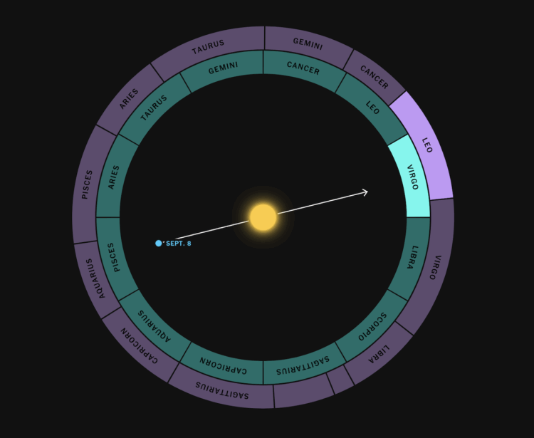
The visualized shifts in time changed my perception of zodiac signs forever. I’m exaggerating. But this piece came at a welcome time during the year. [See the Project / On FlowingData]
Simon Scarr, Vijdan Mohammad Kawoosa, and Sudev Kiyada for Reuters
How California fights fires from the skies
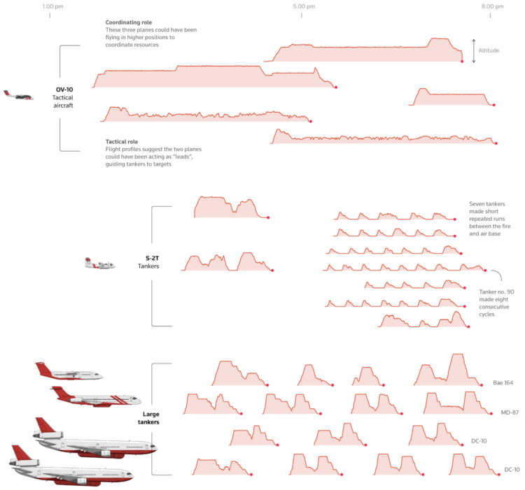
Wildfires hit Southern California fast and hard. This piece illustrated, with maps, charts, and diagrams, how firefighters organized to fight the fires. As a Californian, I appreciated the timeliness. [See the Project / On FlowingData]
Alvin Chang for The Pudding
30 minutes with a stranger
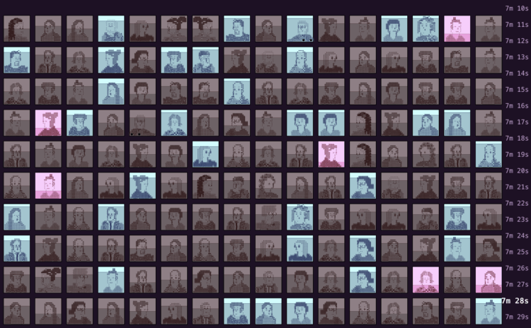
I am continually impressed by the connection between abstract data and reality. Chang understands and knows how to help you see the individual data points in the field of aggregates. [See the Project / On FlowingData]
Maya Claire
Museum of All Things
We use Wikipedia as a reference to look up specific facts but there is also an exploration phase that sends us down rabbit holes. Claire turned the rabbit hole into an infinite museum. [See the Project / On FlowingData]
Ally J. Levine, Soumya Karwa, and Travis Hartman for Reuters
Eroding Protections for Public Lands
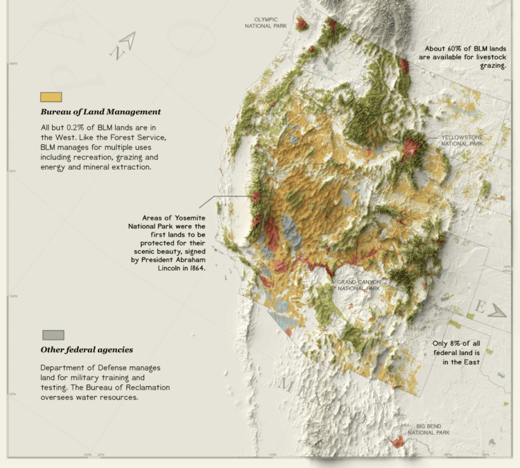
The key to my visualization heart is through vintage feels that look like they came from a 19th century statistical atlas. [See the Project / On FlowingData]
J. David Goodman, Malika Khurana, Bora Erden, Marco Hernandez, Yuhan Liu, Karthik Patanjali, Bedel Saget, and Charlie Smart for The New York Times
Swept Away
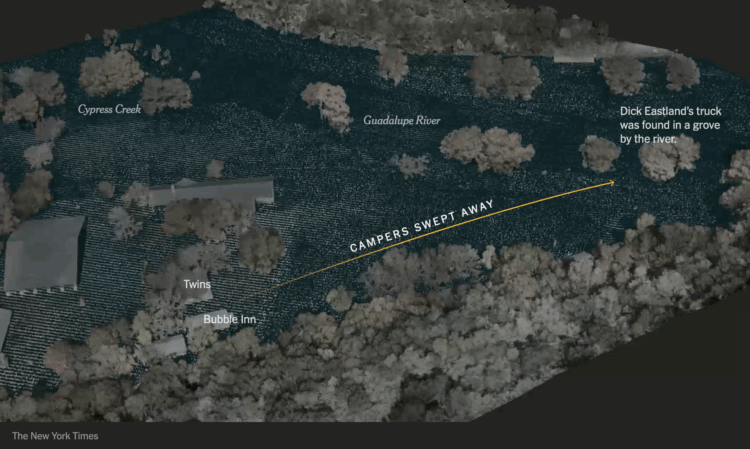
A reconstruction of the flooding at Camp Mystic provided perspective on multiple levels. [See the Project / On FlowingData]
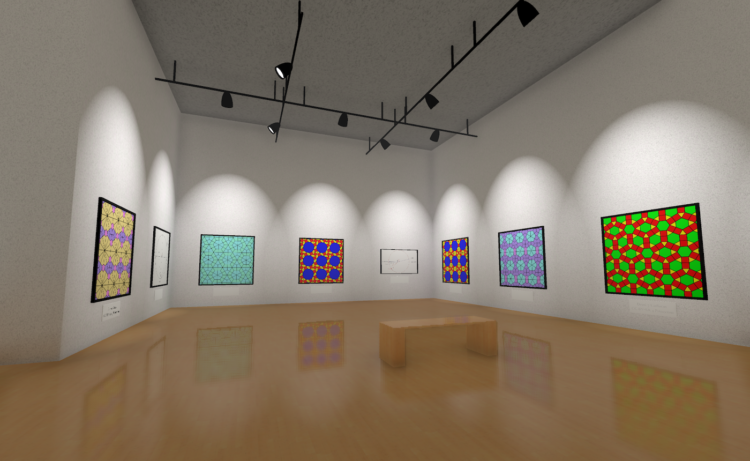
Neal Agarwal, Julius Csotonyi, Aleix Ramon, and Iratxe Ibaibarriaga
Size of Life

The illustrations. The music. The sound. The interaction. It all comes together to present a familiar topic, beautifully executed. [See the Project / On FlowingData]
Phoebe Weston, Ana Lucía González Paz, Prina Shah, and Antonio Voce for The Guardian
Bird migration is changing. What does this reveal about our planet? – visualised
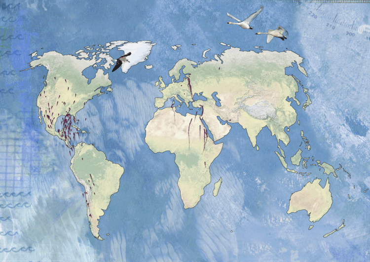
Animated maps, illustrations, and sounds help you understand flight of the birds. [See the Project / On FlowingData]
Matthew Wilcock
Motorway Cycle XI
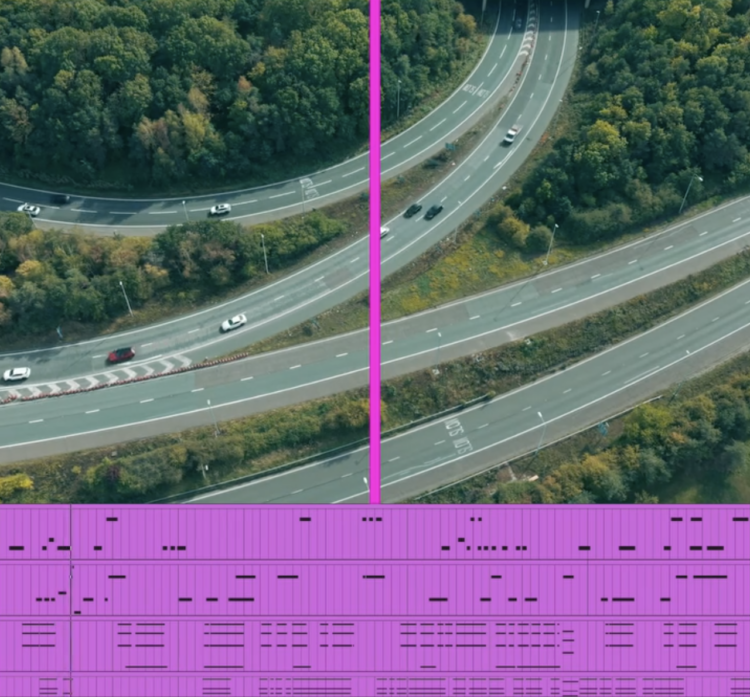
Wilcock transforms everyday movements into music. It is one thing to sonify data and another to turn it into calming tunes. [See the Project / On FlowingData]
Happy new year. Let’s make it a good one.
See the best of the best from previous years: 2008, 2009, 2010, 2011, 2013, 2014, 2015, 2016, 2017, 2018, 2019, 2020, 2021, 2022, 2023, and 2024.