In an era where organizations generate enormous volumes of data, understanding that information in real time is vital for decision-making. Data visualization tools turn complex data into clear, accessible visuals that reveal patterns, trends, and actionable insights. These tools bridge the gap between raw analytics and strategic understanding, helping businesses of all sizes make smarter choices.
For companies seeking expert support with implementation and strategy, collaborating with a data visualization consulting company can ensure that the right tools, integrations, and dashboards are chosen to match business objectives.
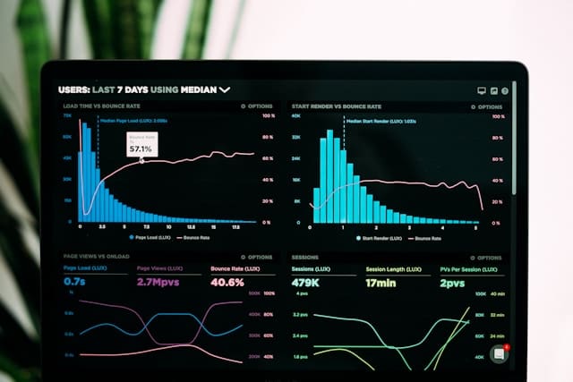
Data visualization tools are platforms or software that convert raw datasets into visual formats such as dashboards, graphs, and charts. They help users interpret data more intuitively, identify inefficiencies, and forecast outcomes.
An effective data visualization tool is easy to use for both technical and non-technical users:
It supports team collaboration through shared dashboards and real-time updates.
It allows customization of layouts, styles, and colors to match brand or analytical needs.
It provides interactive features like filtering, zooming, and drilling down for deeper insight.
It must also scale efficiently as data grows and ensure high standards of data security.
Power BI
Developed by Microsoft, Power BI stands out for its seamless integration with Excel, Azure, and SQL databases. It offers real-time analytics, customizable dashboards, and AI-powered insights. Businesses benefit from its strong data governance, advanced modeling tools, and interactive visual storytelling features. Power BI also enables secure data sharing across departments, making it one of the most comprehensive enterprise solutions available.
Tableau
Tableau remains a leader in business intelligence thanks to its robust visualization capabilities and intuitive drag-and-drop interface. It connects to nearly any data source, including cloud services, spreadsheets, and APIs. Tableau’s strength lies in its ability to handle large datasets efficiently while maintaining design flexibility. It’s widely used for building highly interactive dashboards and performing deep analytical exploration.
Zoho Analytics
Zoho Analytics provides a user-friendly, cloud-based environment with over 250 data connectors. It automates report generation, delivers AI-assisted insights, and supports strong team collaboration features. Ideal for small to mid-sized organizations, Zoho balances affordability with advanced visualization tools, enabling businesses to transform raw data into practical intelligence without heavy infrastructure.
Google Looker Studio (formerly Data Studio)
Google Looker Studio helps teams create interactive, shareable reports using live data from BigQuery, Google Sheets, and other services. Its integration with Google’s ecosystem makes it especially useful for digital marketing and e-commerce analytics. The platform’s intuitive interface, built-in templates, and real-time collaboration capabilities make it accessible for both beginners and data professionals.
Qlik Sense
Qlik Sense distinguishes itself with associative data modeling, which allows users to explore relationships between data points freely. Its AI-powered insights, self-service analytics, and scalability make it suitable for enterprise environments. Qlik’s strength lies in revealing connections that traditional query-based tools might miss, promoting discovery-driven analysis and innovation.
Sisense
Sisense is known for embedding analytics directly into applications and workflows. Its unique in-chip technology speeds up data processing, enabling users to visualize information instantly, even across massive datasets. Sisense supports both cloud and on-premises deployments and offers strong customization for developers who want to integrate analytics into client-facing platforms.
Selecting the right visualization platform depends on organizational size, goals, and technical requirements. While Power BI and Tableau cater to enterprises with complex data environments, tools like Zoho Analytics or Looker Studio provide flexibility for smaller teams. Qlik Sense and Sisense are often favored by companies prioritizing scalability and embedded analytics.
When evaluating tools, consider the following factors:
The tool should integrate easily with your existing data sources and infrastructure.
The platform should support real-time data refresh to maintain up-to-date insights.
The interface should be user-friendly for both analysts and non-technical users.
The solution must offer scalable architecture capable of growing with your data needs.
The tool should include strong data governance and security to protect sensitive information.
Conclusion
Data visualization tools have become indispensable for turning raw data into clear, actionable intelligence. Whether you’re managing enterprise-wide analytics or small business reporting, the right platform will enhance understanding, streamline workflows, and strengthen decision-making.
In 2025, the focus is no longer just on creating static visuals but on enabling real-time exploration and collaboration. By choosing a tool that aligns with your organization’s needs, you can transform information into a strategic advantage, unlocking faster, smarter, and more informed decisions across every level of business.
The New Jersey Digest is a new jersey magazine that has chronicled daily life in the Garden State for over 10 years.