iframe[id^=“datawrapper“],
.is-empty + iframe[id^=“datawrapper“],
p + iframe[id^=“datawrapper“] {
margin-top: 20px;
}
/* CON-1897 Anpassung [mobil]: Umpositionierung Buttons Partner */
[data-layout=“mobile“][data-state=“is-loggedout“]
.m-menu.m-menu–bottom
> .m-icon–cleverpush-container,
[data-layout=“mobile“][data-state=“is-loggedin“]
.m-menu.m-menu–bottom
> .m-icon–cleverpush-container {
display: none !important;
}
[data-layout=“mobile“]
.mod-header
> .m-wrapper
.m-menu–bottom
> .m-item-abo {
height: 35px;
border-left: 1px solid rgba(255, 255, 255, 0.3);
border-right: none;
right: 18px;
position: relative;
}
[data-layout=“mobile“]
.mod-header
> .m-wrapper
.m-menu–bottom
> .m-item-abo
a {
padding-right: 2px;
padding-left: 2px;
padding-top: 26px;
}
[data-layout=“mobile“]
.mod-header
> .m-wrapper
.m-menu–bottom
> .m-item-abo
span {
background-color: #e5007d;
padding: 0px 9px;
border-radius: 64px;
color: #fff;
font-family: „Roboto Condensed“;
font-size: 18px;
}
@media only screen and (max-width: 550px) {
.mod-header > .m-wrapper .m-menu–top > .m-item.m-item–ok {
margin-right: 50px;
}
.mod-header > .m-wrapper .m-menu–bottom {
transform: translateX(0) !important;
top: 0;
right: 61px;
width: 44px;
padding-right: 0 !important;
border-top: none;
height: 45px !important;
background-color: transparent !important;
}
}
/* EGM-1104 [Google News] Folgen-Button einbauen */
.m-follow .social.gn a {
width: 100%;
height: 100%;
background-image: url(https://www.krzbb.de/staticcontent/common/img/social-google-news.png);
background-size: contain;
}
/* Anpassung Suche */
.search-form {
background: #fce5f2 !important;
}
fieldset.search-filter legend {
border-color: #e4007b !important;
}
/* Anpassung Decoy PW Logo */
[data-layout=“desktop“] .container-main .read-more img,
[data-layout=“tablet“] .container-main .read-more img {
margin-left: 6px;
}
/* DEV-1570 Bei uns daheim Anpassungen*/
[data-tags*=“Bei_uns_daheim“] .appetizer-kicker:before,
[data-tags*=“Bei uns daheim“] .appetizer-kicker:before,
[data-tags*=“Bei_uns_daheim“] .article-kicker:before,
.mod-ressort-bei-uns-daheim .header h4 a:before {
content: „“;
background-image: url(https://www.stuttgarter-nachrichten.de/staticcontent/stuttgarter_nachrichten/common-resp18/svg/bei-uns-daheim-logo.svg);
background-size: contain;
background-repeat: no-repeat;
position: relative;
top: 5px;
height: 22px;
width: 100px;
display: inline-block;
margin-right: 5px;
}
[data-tags*=“Bei_uns_daheim“] .appetizer-kicker:before,
[data-tags*=“Bei uns daheim“] .appetizer-kicker:before {
top: 6px;
}
.mod-ressort-bei-uns-daheim .header h4 a:before {
height: 30px;
width: 120px;
}
[data-layout=“mobile“] .mod-ressort-bei-uns-daheim .header h4 a:before {
height: 25px;
}
.mod-ressort-bei-uns-daheim .header h4 a,
.mod-ressort-bei-uns-daheim .header h4 a:hover {
color: #adc32b;
}
[data-alias=“/lokalnachrichten“] .mod-ressort-bei-uns-daheim {
margin-bottom: 20px;
}
/* Anpassung Navi + Bei uns daheim Ebenen*/
.mod-nav .m-menu–1 > .m-links {
z-index: 51;
}
[data-layout=“desktop“] .mod-nav .m-menu–3.is-open,
[data-layout=“tablet“] .mod-nav .m-menu–3.is-open {
left: 33%;
width: -webkit-fill-available;
width: -moz-available;
box-shadow: 0 0 50px -10px #454545;
}
[data-layout=“mobile“] .mod-nav .m-menu–3.is-open {
bottom: 0;
}
/* SALE-170 Anpassung Bündigkeit*/
[data-layout=“desktop“] .ad .item,
[data-layout=“tablet“] .ad .item {
padding-top: 10px;
}
/* SALE-188 MHS Digital zu swmn Logo umtauschen */
html:not([data-layout=“mobile“]) a.mhsd-partner-link:not([dark]):before,
html[data-layout=“mobile“] a.mhsd-partner-link:not([dark]):before {
content: url(/staticcontent/common/svg/swmn_80_dark.svg);
}
/* EGM-1451 SWMN-Logo reduzieren */
html[data-layout=“mobile“] a.mhsd-partner-link:not([dark]):before {
content: „“;
display: inline-block;
width: 41px;
height: 9px;
background-image: url(„/staticcontent/common/svg/swmn_80_dark.svg“);
background-size: contain;
}
[data-layout=“mobile“] .mod-header .m-wrapper li a.mhsd-partner-link {
position: relative;
}
iframe[src*=“youtube“] {
max-width: 100% !important;
width: 100%;
height: auto;
aspect-ratio: 16/9;
}
/* EGM-1718 – Themenlinks */
.art-tags {
border-top: 1px solid #cdcdcd;
border-bottom: 1px solid #cdcdcd;
padding-top: 16px !important;
margin: 16px 0;
max-width: calc(100% – 40px);
position: relative;
left: 20px;
}
.art-tags a {
color: var(–color-bodytext);
font-size: 16px;
line-height: 26px;
background-color: transparent !important;
margin: 0 20px 20px 0 !important;
padding: 0;
border-bottom: 3px solid var(–color-primary);
display: block;
float: left;
}
[data-layout=“mobile“] .art-tags {
max-width: 100%;
left: 0;
}
/* GROW-436 – Themenlinks */
.most-read {
gap: 14px !important;
margin: 30px 0 0;
display: flex !important;
flex-direction: column;
}
.most-read .appetizer-bottom-wrapper,
.most-read figure {
display: none;
}
.most-read .item {
width: 100% !important;
margin-bottom: 0 !important;
border-bottom: none;
padding-top: 0 !important;
padding-bottom: 0 !important;
}
.most-read .item:after,
.most-read .item + .item:before {
display: none !important;
}
.most-read .appetizer-title {
font-size: 18px !important;
line-height: 23px !important;
margin-bottom: 0 !important;
width: 100% !important;
padding-left: 0 !important;
padding-right: 0 !important;
}
.most-read .appetizer-kicker {
font-size: 17px !important;
line-height: 25px !important;
width: 100% !important;
padding-left: 0 !important;
padding-right: 0 !important;
margin-top: 0 !important;
}
.most-read h4 {
color: var(–color-bodytext);
font-size: 16px !important;
font-weight: 700;
line-height: 26px;
margin-bottom: 2px !important;
border-bottom: none;
padding-bottom: 16px;
border-bottom: 1px solid #cdcdcd;
display: block;
}
]]]]]]]]]]>]]]]]]]]>]]]]]]>]]]]>]]>

a { display: inline-block; background: none; color: unset; -webkit-transition: none; display: flex; width: 85%; }]]]]]]]]]]>]]]]]]]]>]]]]]]>]]]]>]]>
div {
flex: 1 1 100%;
width: 100%;
}
[data-layout=“mobile“] .snippet .mod-banderole .text-box .lnk-wrap {
display: flex;
justify-content: flex-end;
width: 100%;
}
[data-layout=“mobile“] .snippet .mod-banderole .text-box .lnk-wrap.hide-mobile {
display: none;
}
[data-layout=“mobile“] .snippet .mod-banderole .text-box .btn {
width: 100%;
padding: 14px 0;
margin: 20px 0 0 0;
border-bottom: 0;
height: 55px;
}
[data-layout=“mobile“] .snippet .mod-banderole .text-box .text {
font-size: 16px;
}
[data-layout=“mobile“] #snippet-bwvo.snippet .mod-banderole .btn {
font-size: 18px;
}
[data-layout=“mobile“] .snippet .mod-banderole .text-box .text.hide-mobile {
display: none;
}
[data-layout=“mobile“] .snippet .mod-banderole .text-box .text.hide-desktop {
display: block;
color: #25282A;
}
[data-layout=“desktop“] .snippet .mod-banderole,
[data-layout=“tablet“] .snippet .mod-banderole {
cursor: auto;
}
.snippet .mod-banderole .icon-box {
background: #fff;
padding: 14px 10px;
display: flex;
align-items: center;
width: 99px;
justify-content: center;
}
[data-layout=“mobile“] .snippet .mod-banderole .icon-box {
width: 78px;
}
.snippet .mod-banderole .icon-box img {
height: 27px;
}
.snippet .mod-banderole .logo-box {
background: #fff;
padding: 14px 15px;
display: flex;
align-items: center;
}
.snippet .mod-banderole .logo-box img {
width: 69px;
}
[data-layout=“mobile“] .snippet .mod-banderole .logo-box img {
width: 58px;
}
[data-layout=“desktop“] .snippet .mod-banderole .text-box,
[data-layout=“tablet“] .snippet .mod-banderole .text-box {
padding: 12px 39px 12px 20px;
}
[data-layout=“desktop“] .snippet .mod-banderole .text-box .hide-mobile,
[data-layout=“tablet“] .snippet .mod-banderole .text-box .hide-mobile {
display: block;
}
[data-layout=“desktop“] .snippet .mod-banderole .text-box .hide-desktop,
[data-layout=“tablet“] .snippet .mod-banderole .text-box .hide-desktop {
display: none;
}
[data-layout=“desktop“] .snippet .mod-banderole .text-box .lnk,
[data-layout=“tablet“] .snippet .mod-banderole .text-box .lnk {
border-bottom: 2px solid #4d555a;
text-decoration: none;
color: #4d555a;
}
[data-layout=“desktop“] .snippet .mod-banderole .text-box .btn,
[data-layout=“tablet“] .snippet .mod-banderole .text-box .btn {
padding: 10px 16px;
border-bottom: 0;
height: 41px;
}
[data-layout=“desktop“] .snippet .mod-banderole .text-box .text,
[data-layout=“tablet“] .snippet .mod-banderole .text-box .text {
padding-right: 25px;
}
#top-of-page .wtc-wg-plugilo-connector {
z-index: 2147483647 !important;
}
.snippet .mod-banderole .snippet-close {
height: 20px;
width: 20px;
position: absolute;
right: 0;
top: 0;
background: #fff;
display: block;
z-index: 3;
cursor: pointer;
}
[data-layout=“desktop“] .snippet .snippet-close,
[data-layout=“tablet“] .snippet .snippet-close {
height: 25px;
width: 25px;
}
[data-layout=“mobile“] .snippet .mod-banderole .text-box .title-wrap {
display: flex;
justify-content: space-between;
}
[data-layout=“mobile“] .snippet .mod-banderole .text-box .title-wrap .title {
display: flex;
flex-direction: column;
font-weight: 700;
align-items: flex-start;
font-size: 22px;
line-height: 24px;
margin-bottom: 5px;
width: 100%;
}
[data-layout=“mobile“] .snippet .mod-banderole .snippet-close {
position: relative;
background: 0 0;
width: 47px;
height: 44px;
display: flex;
align-items: center;
justify-content: center;
margin: -12px -12px 0 0;
}
[data-layout=“mobile“] .snippet .mod-banderole .snippet-close svg {
height: 30px;
width: 30px;
stroke-width: 2px;
}
[data-layout=“mobile“] .snippet .mod-banderole .snippet-close path {
stroke: #25282A;
}
[data-layout=“mobile“] .snippet .mod-banderole .icon-box,
[data-layout=“mobile“] .snippet .mod-banderole .logo-box {
display: none;
}
[data-layout=“mobile“] .snippet .mod-banderole .text-box .title-wrap .title img {
height: 22px;
width: auto;
margin-bottom: 15px;
}
[data-layout=“mobile“] .snippet.engagement .mod-banderole .text-box .title-wrap .title img {
margin-right: 10px;
}
[data-layout=“mobile“] .snippet.engagement .mod-banderole .text-box .title-wrap .title {
flex-direction: row;
margin-bottom: 0;
}
]]]]]]]]]]>]]]]]]]]>]]]]]]>]]]]>]]>
Das Beste aus Böblingen.
Mit KRZ Plus unbegrenzt Inhalte des Böblinger Boten lesen.
Das Beste aus Böblingen. Mit KRZ Plus unbegrenzt Inhalte
des Böblinger Boten lesen.
Deutschland Bilder des Tages
dpa 10.08.2025 – 01:57 Uhr
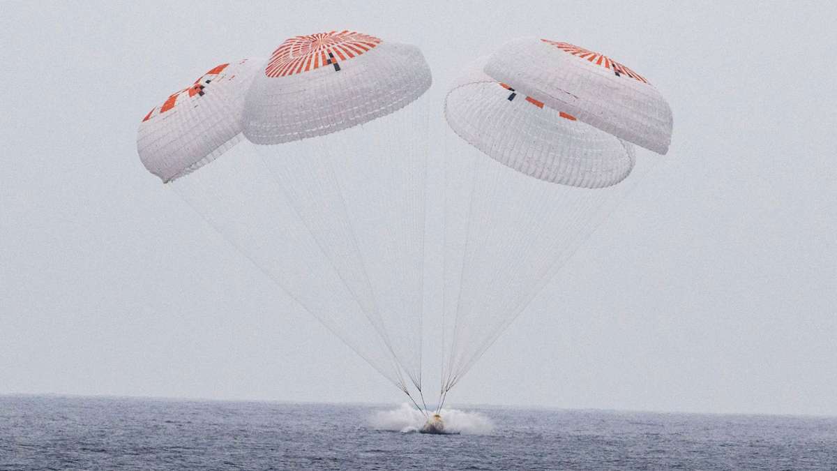
 In diesem von der Nasa via AP zur Verfügung gestellten Bild gleitet die SpaceX-Kapsel mit vier Astronauten an Bord am Samstag vor der südkalifornischen Küste an Fallschirmen in den Pazifik. Foto: Keegan Barber//Nasa/dpa
]]]]]]]]>]]]]]]>]]]]>]]>
]]]]]]]]>]]]]]]>]]]]>]]>
]]]]]]]]>]]]]]]>]]]]>]]>
Weitere Themen
.m-wrapper {
padding-bottom: 30px;
}
]]]]]]]]]]>]]]]]]]]>]]]]]]>]]]]>]]>
]]]]]]]]>]]]]]]>]]]]>]]>