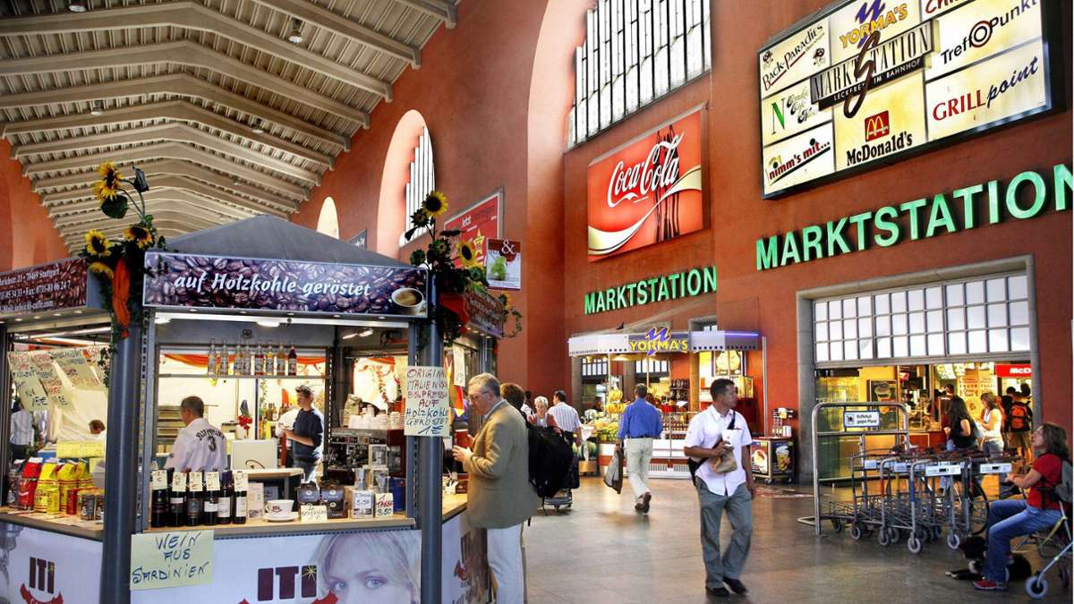
 Ehe es mit dem Umbau und der Sperrung losging, gab es im Stuttgarter Hauptbahnhof allerlei Gastro-Angebote. Foto: Horst Rudel
Der neue Stuttgarter Hauptbahnhof soll einen Foodcourt bekommen. Doch wie verpflegt man sich andernorts, ehe man den Zug besteigt. Ein Blick in die Welt der Bahnhofsgastronomie.
]]>
Noch weiß man nicht viel darüber, welche Geschäfte und Gastronomien den Reisenden im neuen Stuttgarter Bahnhof erwarten werden. Immerhin eines ist klar: in die Fläche des ehemaligen Reisezentrums neben der großen Schalterhalle zieht ein sogenannter Foodcourt ein, also eine Ansammlung von Imbissständen.
]]>
]]> Weiterlesen mit 
Unsere Abo-Empfehlungen
Von hier, für die Region,
über die Welt.
* anschließend 9,99 € mtl.
- Zugriff auf alle Inhalte der EZ im Web
- Unkompliziert kündbar
* anschließend 9,99 € mtl.
Bereits Abonnent? Anmelden
div,
#paywall–offerlink span {
pointer-events: none;
}
#paywall–offerlink {
display: inline-block;
}
.article-body .mod-paywall {
margin-top: -119px;
}
@media only screen and (max-width: 550px) {
.article-body .mod-paywall {
margin-top: -210px;
}
.container-main .flexbox .offer .price {
font-size: 24px;
}
}
.container-main {
padding: 0 20px;
color: #1c1c1c;
line-height: 1.3;
background: var(–accent-paywall) var(–background-paywall) no-repeat left top;
text-align: center;
background-size: cover;
}
.container-main .read-more {
width: 350px;
height: 32px;
background-color: #fff;
border-bottom-left-radius: 26px;
border-bottom-right-radius: 26px;
text-align: center;
margin: 0 auto;
font-size: 18px;
font-weight: bold;
display: flex;
justify-content: center;
align-items: center;
}
.container-main .read-more img {
width: 54px;
margin-top: -2px;
margin-left: 4px;
}
.container-main p.title {
/* color: #fff; */
font-size: 18px;
margin-top: 20px;
}
.container-main h2.title {
font-size: 24px;
/* font-family: „Roboto Slab“; */
/* color: #fff; */
max-width: 380px;
margin: 8px auto 42px !important;
}
.container-main .flexbox {
display: flex;
justify-content: center;
align-items: flex-end;
gap: 10px;
}
.container-main .flexbox .offer {
width: 235px;
max-width: 253px;
background-color: #fff;
border: 3px solid #fff;
border-radius: 20px;
position: relative;
flex: 1 1 0px;
}
.container-main .flexbox .offertext {
width: 235px;
flex: 1 1 0px;
margin-top: 20px;
}
.container-main .flexbox .offer.active {
width: 245px;
background-color: var(–accent-paywall-highlight);
border-color: var(–accent-paywall-highlight);
}
.container-main .flexbox .offer .rabatt {
width: 60px;
height: 60px;
padding: 17px 0 0;
background-color: var(–accent-paywall-highlight);
color: #fff;
font-size: 18px;
position: absolute;
top: -38px;
right: -31px;
border: 2px solid #fff;
border-radius: 30px;
}
.container-main .flexbox .offer .head {
background-color: #fff;
height: 35px;
color: var(–accent-paywall);
font-size: 24px;
font-weight: bold;
text-align: center;
margin-top: 2px;
border-radius: 20px;
}
.container-main .flexbox .offer.active .head {
background-color: var(–accent-paywall-highlight);
height: 38px;
color: #fff;
margin-top: 4px;
}
.container-main .flexbox .offer .content {
background-color: var(–background-paywall-offers);
padding: 12px 10px 12px 10px;
width: 100%;
height: 165px;
font-size: 15px !important;
color: #4D555A !important;
line-height: 1.3;
text-align: center;
margin-top: 0px;
border-bottom-left-radius: 20px;
border-bottom-right-radius: 20px;
}
.container-main .flexbox .offer.active .content {
height: 182px;
padding-top: 30px;
}
.container-main .flexbox .offer .price {
color: var(–accent-paywall);
font-weight: bold;
font-size: 45px;
display: block;
margin-top: -4px;
}
.container-main .flexbox .offer .price>small{
font-size: 22px;
vertical-align: top;
}
.container-main .flexbox .offer.active .price {
color: var(–accent-paywall-highlight);
}
.container-main .flexbox .offer .raquo {
width: 34px;
height: 34px;
padding: 5px 0 0;
background-color: #fff;
color: var(–accent-paywall);
font-size: 46px;
line-height: 0.4;
/* font-weight: bold; */
position: absolute;
bottom: -17px;
border-radius: 17px;
left: 0;
right: 0;
margin-left: auto;
margin-right: auto;
}
.container-main .flexbox .offer.active .raquo {
background-color: var(–accent-paywall-highlight);
color: #fff;
}
.container-main .flexbox .offer::after {
color: #fff;
content: „Zum Angebot“;
font-size: 15px;
width: 100%;
text-align: center;
position: absolute;
left: 5px;
line-height: 20px;
bottom: -40px;
}
.container-main .flexbox .offer.active::after {
color: var(–accent-paywall-highlight);
}
.cd_stoerer .container-main .flexbox .offer.active::after{
color: #fff;
}
.container-main .benefits {
margin: 70px auto 25px;
display: inline-block;
}
.container-main .benefits ul {
padding-left: 0;
}
.container-main .benefits li {
padding-left: 32px;
text-align: left;
list-style: none;
line-height: 1.3em !important;
/* color: #fff; */
font-size: 16px !important;
list-style-type: none !important;
position: relative;
}
.container-main .benefits li:before {
content: „“;
width: 20px;
height: 20px;
display: block;
background-color: var(–accent-paywall-highlight);
position: absolute;
left: 0;
z-index: 0;
border-radius: 50%;
}
.container-main .benefits li:after {
content: url(/staticcontent/common/svg/Icon_Haken_white.svg);
width: 20px;
height: 20px;
display: block;
position: absolute;
left: 0;
top: 0;
z-index: 1;
}
.container-main .benefits li:first-child {
margin-bottom: 10px;
}
.container-main .tinytext {
padding-bottom: 5px;
text-align: center;
/* color: #fff; */
font-size: 12px;
}
.container-main .tinytext a {
color: #fff;
}
.container-main .tinytext a:hover {
color: #fff;
}
.container-login {
background-color: #fff;
font-size: 16px;
font-weight: bold;
height: 60px;
text-align: center;
padding-top: 20px;
line-height: 16px;
}
.container-login span {
cursor: pointer;
color: var(–accent-paywall);
}
.hidedesktop {
display: none
}
[data-layout=tablet] .hidemobile {
display: inline-block !important;
}
@media only screen and (max-width: 550px) {
.hidemobile {
display: none !important;
}
.hidedesktop {
display: block !important;
}
.mod-paywall {
margin-left: -20px !important;
margin-right: -20px !important;
width: calc(100% + 40px);
}
.container-main {
padding: 0 10px;
}
.cd_stoerer .container-main .offer-wrap{
margin-top: 30px;
}
.container-main p.title {
font-size: 16px;
margin-top: 0;
}
.container-main h2.title {
font-size: 20px;
margin-bottom: 23px !important;
}
.container-main .read-more {
width: 80%;
}
.container-main .flexbox {
gap: 5px;
}
.container-main .flexbox .offer,
.container-main .flexbox .offer.active,
.container-main .flexbox .offer {
width: unset;
max-width: 130px;
}
.container-main .flexbox .offer .price {
font-size: 24px;
margin-bottom: 2px;
margin-top: 0px;
}
.container-main .flexbox .offer .content {
padding: 12px 4px 12px 2px;
font-size: 14px !important;
line-height: 1.4;
height: 145px;
}
.container-main .flexbox .offer .head {
height: 30px;
font-size: 20px;
}
.container-main .flexbox .offer.active .head {
height: 32px;
}
.container-main .flexbox .offer .rabatt {
width: 45px;
height: 45px;
padding: 10px 0 0;
font-size: 15px;
top: -32px;
}
.container-main .flexbox .offer .raquo,
.container-main .flexbox .offer.active .raquo {
bottom: -19px;
}
.container-main .read-more img {
width: 58px;
margin-top: -3px;
}
.container-main .tinytext {
margin-top: 80px;
padding-bottom: 20px;
}
.mod-paywall .container-footer {
background: #fff;
padding: 1.5rem 1rem;
text-align: left;
font-size: 16px;
line-height: 24px;
}
.mod-paywall .container-footer p {
padding: 0;
font-size: 16px;
line-height: 24px;
margin-bottom: 12px;
}
.mod-paywall .container-footer .logo {
width: 78px;
margin-bottom: 15px;
display: block;
}
.mod-paywall .container-login {
background-color: #EEEDE9;
}
.container-main .flexbox .offer.active .content {
height: 159px;
padding-top: 25px;
}
}
.print p {
font-size: 14px;
line-height: 20px;
margin-top: 20px;
}
.print .compare {
margin-top: 5px;
}
.print .compare a {
border: 1px solid var(–accent-paywall);
background: transparent;
color: var(–accent-paywall);
padding: 9px;
box-shadow: none;
font-size: 18px;
max-width: 440px;
width: 84%;
display: block;
margin: 5px auto 0 auto;
cursor: pointer;
font-weight: bold;
text-decoration: none;
text-align: center;
line-height: 1.3 !important;
}
/* Countdown */
.countdown {
display: inline-block;
margin-bottom: 44px;
}
.countdown>p {
display: flex;
align-items: center;
border: 4px solid var(–accent-paywall-highlight);
border-radius: 50px;
background-color: #fff;
box-shadow: 1px 2px rgba(255, 255, 255, 0.25);
padding: 0px !important;
}
.countdown>p>.countdown-text {
background-color: var(–accent-paywall-highlight);
font-size: 17px;
line-height: 17px;
font-weight: 700;
padding: 5px 10px;
margin-right: 13px;
color: #fff;
border-radius: 10px 0px 0px 10px;
}
.countdown>p>span:not(.countdown-text) {
color: #1C1C1C;
font-size: 18px;
line-height: 21px;
padding-right: 4px;
}
.countdown>p>span.specialText {
padding: 10px !important;
}
.countdown>p>span.days-count,
.countdown>p>span.hours-count,
.countdown>p>span.minutes-count {
padding: 0px;
}
.countdown>p>span.minutes {
padding-right: 17px;
}
.countdown>p>span.days-count,
.countdown>p>span.hours-count,
.countdown>p>span.minutes-count {
color: var(–accent-paywall-highlight);
font-weight: 700;
}
[data-layout=“mobile“] .countdown>p>.countdown-text {
font-size: 13px;
line-height: 13px;
padding: 2px 6px;
}
[data-layout=“mobile“] .countdown {
margin-bottom: 23px;
}
[data-layout=“mobile“] .countdown>p>span:not(.countdown-text) {
font-size: 12px;
line-height: 14px;
}
[data-layout=“mobile“] .countdown>p>span.minutes {
padding-right: 8px;
}
]]]]>]]>
]]>