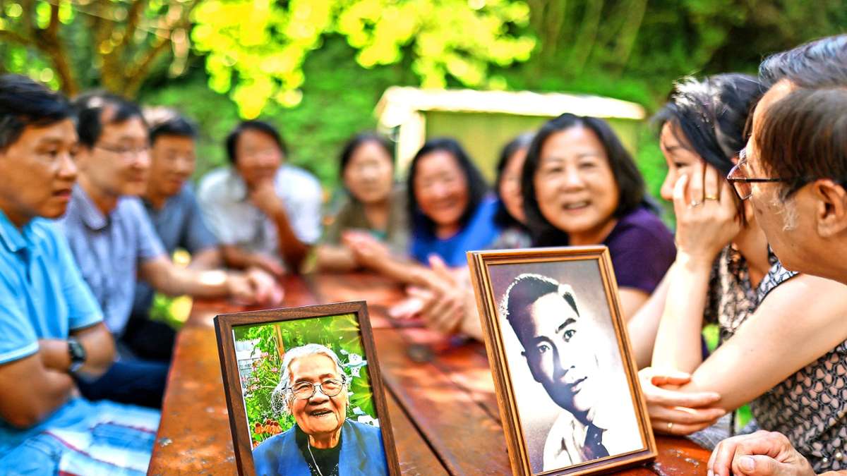
 Die zwölf Geschwister bei einem Familientreffen in Feuerbach mit Fotos ihrer Eltern Zhi Phpng Tran und Cong Ro Tran. Foto:
Thi Phong Tran schickt ihre Söhne auf eine gefährliche Flucht von Vietnam nach Baden-Württemberg. Die danken es ihr nach ihrem Tod mit einem besonderen Fest in Stuttgart.
]]>
Wahrscheinlich wäre Thi Phong Tran da oben im Himmel jetzt sehr glücklich, wenn sie auf die Schar ihrer Nachkommen blicken könnte. Auf ihre sieben Söhne und fünf Töchter. Die Enkel und die Urenkel. Wie sie zusammensitzen und erzählen, gemeinsam essen. Wie die Jungen von den Älteren wissen wollen, wie es war, als sie noch nicht auf der Welt waren. Thi Phong Tran würde sich vermutlich darüber freuen, dass ihre zwölf Kinder ein gutes Leben haben.
]]>
]]> Weiterlesen mit 
Unsere Abo-Empfehlungen
Von hier, für die Region,
über die Welt.
* anschließend 9,99 € mtl.
- Zugriff auf alle Inhalte der EZ im Web
- Unkompliziert kündbar
* anschließend 9,99 € mtl.
Bereits Abonnent? Anmelden
div,
#paywall–offerlink span {
pointer-events: none;
}
#paywall–offerlink {
display: inline-block;
}
.article-body .mod-paywall {
margin-top: -119px;
}
@media only screen and (max-width: 550px) {
.article-body .mod-paywall {
margin-top: -210px;
}
.container-main .flexbox .offer .price {
font-size: 24px;
}
}
.container-main {
padding: 0 20px;
color: #1c1c1c;
line-height: 1.3;
background: var(–accent-paywall) var(–background-paywall) no-repeat left top;
text-align: center;
background-size: cover;
}
.container-main .read-more {
width: 350px;
height: 32px;
background-color: #fff;
border-bottom-left-radius: 26px;
border-bottom-right-radius: 26px;
text-align: center;
margin: 0 auto;
font-size: 18px;
font-weight: bold;
display: flex;
justify-content: center;
align-items: center;
}
.container-main .read-more img {
width: 54px;
margin-top: -2px;
margin-left: 4px;
}
.container-main p.title {
/* color: #fff; */
font-size: 18px;
margin-top: 20px;
}
.container-main h2.title {
font-size: 24px;
/* font-family: „Roboto Slab“; */
/* color: #fff; */
max-width: 380px;
margin: 8px auto 42px !important;
}
.container-main .flexbox {
display: flex;
justify-content: center;
align-items: flex-end;
gap: 10px;
}
.container-main .flexbox .offer {
width: 235px;
max-width: 253px;
background-color: #fff;
border: 3px solid #fff;
border-radius: 20px;
position: relative;
flex: 1 1 0px;
}
.container-main .flexbox .offertext {
width: 235px;
flex: 1 1 0px;
margin-top: 20px;
}
.container-main .flexbox .offer.active {
width: 245px;
background-color: var(–accent-paywall-highlight);
border-color: var(–accent-paywall-highlight);
}
.container-main .flexbox .offer .rabatt {
width: 60px;
height: 60px;
padding: 17px 0 0;
background-color: var(–accent-paywall-highlight);
color: #fff;
font-size: 18px;
position: absolute;
top: -38px;
right: -31px;
border: 2px solid #fff;
border-radius: 30px;
}
.container-main .flexbox .offer .head {
background-color: #fff;
height: 35px;
color: var(–accent-paywall);
font-size: 24px;
font-weight: bold;
text-align: center;
margin-top: 2px;
border-radius: 20px;
}
.container-main .flexbox .offer.active .head {
background-color: var(–accent-paywall-highlight);
height: 38px;
color: #fff;
margin-top: 4px;
}
.container-main .flexbox .offer .content {
background-color: var(–background-paywall-offers);
padding: 12px 10px 12px 10px;
width: 100%;
height: 165px;
font-size: 15px !important;
color: #4D555A !important;
line-height: 1.3;
text-align: center;
margin-top: 0px;
border-bottom-left-radius: 20px;
border-bottom-right-radius: 20px;
}
.container-main .flexbox .offer.active .content {
height: 182px;
padding-top: 30px;
}
.container-main .flexbox .offer .price {
color: var(–accent-paywall);
font-weight: bold;
font-size: 45px;
display: block;
margin-top: -4px;
}
.container-main .flexbox .offer .price>small{
font-size: 22px;
vertical-align: top;
}
.container-main .flexbox .offer.active .price {
color: var(–accent-paywall-highlight);
}
.container-main .flexbox .offer .raquo {
width: 34px;
height: 34px;
padding: 5px 0 0;
background-color: #fff;
color: var(–accent-paywall);
font-size: 46px;
line-height: 0.4;
/* font-weight: bold; */
position: absolute;
bottom: -17px;
border-radius: 17px;
left: 0;
right: 0;
margin-left: auto;
margin-right: auto;
}
.container-main .flexbox .offer.active .raquo {
background-color: var(–accent-paywall-highlight);
color: #fff;
}
.container-main .flexbox .offer::after {
color: #fff;
content: „Zum Angebot“;
font-size: 15px;
width: 100%;
text-align: center;
position: absolute;
left: 5px;
line-height: 20px;
bottom: -40px;
}
.container-main .flexbox .offer.active::after {
color: var(–accent-paywall-highlight);
}
.cd_stoerer .container-main .flexbox .offer.active::after{
color: #fff;
}
.container-main .benefits {
margin: 70px auto 25px;
display: inline-block;
}
.container-main .benefits ul {
padding-left: 0;
}
.container-main .benefits li {
padding-left: 32px;
text-align: left;
list-style: none;
line-height: 1.3em !important;
/* color: #fff; */
font-size: 16px !important;
list-style-type: none !important;
position: relative;
}
.container-main .benefits li:before {
content: „“;
width: 20px;
height: 20px;
display: block;
background-color: var(–accent-paywall-highlight);
position: absolute;
left: 0;
z-index: 0;
border-radius: 50%;
}
.container-main .benefits li:after {
content: url(/staticcontent/common/svg/Icon_Haken_white.svg);
width: 20px;
height: 20px;
display: block;
position: absolute;
left: 0;
top: 0;
z-index: 1;
}
.container-main .benefits li:first-child {
margin-bottom: 10px;
}
.container-main .tinytext {
padding-bottom: 5px;
text-align: center;
/* color: #fff; */
font-size: 12px;
}
.container-main .tinytext a {
color: #fff;
}
.container-main .tinytext a:hover {
color: #fff;
}
.container-login {
background-color: #fff;
font-size: 16px;
font-weight: bold;
height: 60px;
text-align: center;
padding-top: 20px;
line-height: 16px;
}
.container-login span {
cursor: pointer;
color: var(–accent-paywall);
}
.hidedesktop {
display: none
}
[data-layout=tablet] .hidemobile {
display: inline-block !important;
}
@media only screen and (max-width: 550px) {
.hidemobile {
display: none !important;
}
.hidedesktop {
display: block !important;
}
.mod-paywall {
margin-left: -20px !important;
margin-right: -20px !important;
width: calc(100% + 40px);
}
.container-main {
padding: 0 10px;
}
.cd_stoerer .container-main .offer-wrap{
margin-top: 30px;
}
.container-main p.title {
font-size: 16px;
margin-top: 0;
}
.container-main h2.title {
font-size: 20px;
margin-bottom: 23px !important;
}
.container-main .read-more {
width: 80%;
}
.container-main .flexbox {
gap: 5px;
}
.container-main .flexbox .offer,
.container-main .flexbox .offer.active,
.container-main .flexbox .offer {
width: unset;
max-width: 130px;
}
.container-main .flexbox .offer .price {
font-size: 24px;
margin-bottom: 2px;
margin-top: 0px;
}
.container-main .flexbox .offer .content {
padding: 12px 4px 12px 2px;
font-size: 14px !important;
line-height: 1.4;
height: 145px;
}
.container-main .flexbox .offer .head {
height: 30px;
font-size: 20px;
}
.container-main .flexbox .offer.active .head {
height: 32px;
}
.container-main .flexbox .offer .rabatt {
width: 45px;
height: 45px;
padding: 10px 0 0;
font-size: 15px;
top: -32px;
}
.container-main .flexbox .offer .raquo,
.container-main .flexbox .offer.active .raquo {
bottom: -19px;
}
.container-main .read-more img {
width: 58px;
margin-top: -3px;
}
.container-main .tinytext {
margin-top: 80px;
padding-bottom: 20px;
}
.mod-paywall .container-footer {
background: #fff;
padding: 1.5rem 1rem;
text-align: left;
font-size: 16px;
line-height: 24px;
}
.mod-paywall .container-footer p {
padding: 0;
font-size: 16px;
line-height: 24px;
margin-bottom: 12px;
}
.mod-paywall .container-footer .logo {
width: 78px;
margin-bottom: 15px;
display: block;
}
.mod-paywall .container-login {
background-color: #EEEDE9;
}
.container-main .flexbox .offer.active .content {
height: 159px;
padding-top: 25px;
}
}
.print p {
font-size: 14px;
line-height: 20px;
margin-top: 20px;
}
.print .compare {
margin-top: 5px;
}
.print .compare a {
border: 1px solid var(–accent-paywall);
background: transparent;
color: var(–accent-paywall);
padding: 9px;
box-shadow: none;
font-size: 18px;
max-width: 440px;
width: 84%;
display: block;
margin: 5px auto 0 auto;
cursor: pointer;
font-weight: bold;
text-decoration: none;
text-align: center;
line-height: 1.3 !important;
}
/* Countdown */
.countdown {
display: inline-block;
margin-bottom: 44px;
}
.countdown>p {
display: flex;
align-items: center;
border: 4px solid var(–accent-paywall-highlight);
border-radius: 50px;
background-color: #fff;
box-shadow: 1px 2px rgba(255, 255, 255, 0.25);
padding: 0px !important;
}
.countdown>p>.countdown-text {
background-color: var(–accent-paywall-highlight);
font-size: 17px;
line-height: 17px;
font-weight: 700;
padding: 5px 10px;
margin-right: 13px;
color: #fff;
border-radius: 10px 0px 0px 10px;
}
.countdown>p>span:not(.countdown-text) {
color: #1C1C1C;
font-size: 18px;
line-height: 21px;
padding-right: 4px;
}
.countdown>p>span.specialText {
padding: 10px !important;
}
.countdown>p>span.days-count,
.countdown>p>span.hours-count,
.countdown>p>span.minutes-count {
padding: 0px;
}
.countdown>p>span.minutes {
padding-right: 17px;
}
.countdown>p>span.days-count,
.countdown>p>span.hours-count,
.countdown>p>span.minutes-count {
color: var(–accent-paywall-highlight);
font-weight: 700;
}
[data-layout=“mobile“] .countdown>p>.countdown-text {
font-size: 13px;
line-height: 13px;
padding: 2px 6px;
}
[data-layout=“mobile“] .countdown {
margin-bottom: 23px;
}
[data-layout=“mobile“] .countdown>p>span:not(.countdown-text) {
font-size: 12px;
line-height: 14px;
}
[data-layout=“mobile“] .countdown>p>span.minutes {
padding-right: 8px;
}
]]]]>]]>
]]>