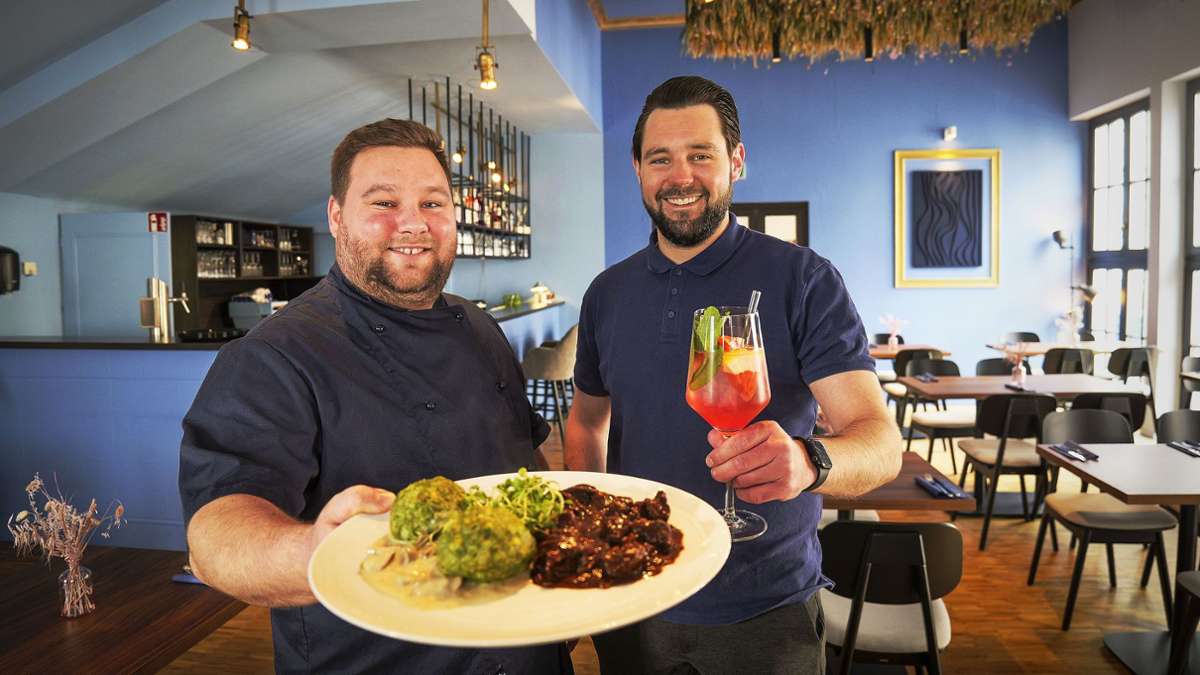
 Neustart in Esslingen: Sebastian Friederich (links) und Loris Wolpert Foto: /Simon Granville
Im früheren Tapas gibt es jetzt schwäbische Klassiker und fleischlose Gerichte statt Paella und Co. Die neuen Betreiber im ehemaligen Esslinger Kino Scala setzen nicht nur kulinarisch Akzente.
]]>
Ins frühere spanische Restaurant Tapas ist moderne Gemütlichkeit eingekehrt: Die bunt lackierten Stühle aus Sevilla und die spanischen Motive an den Wänden sind verschwunden. Jetzt ist der Raum im ersten Stock des ehemaligen Scala-Kinos in Blau getaucht, an der Decke hängt eine Wiese aus Trockenblumen. Bei einem Ausflug zur Grabkapelle war Loris Wolpert und Sebastian Friederich die Idee gekommen, die Farbe des Himmels und die Blütenpracht jenes Tages mit in ihr neues Restaurant zu nehmen und es „Blauer Wilhelm“ zu nennen – nach jenem König, der seiner Frau auf dem Württemberg ein Denkmal gesetzt hat.
]]>
]]> Weiterlesen mit 
Unsere Abo-Empfehlungen
Von hier, für die Region,
über die Welt.
*anschließend 9,99 € mtl.
- Zugriff auf alle Inhalte der EZ im Web
- Unkompliziert kündbar
*anschließend 9,99 € mtl.
Bereits Abonnent? Anmelden
div,
#paywall–offerlink span {
pointer-events: none;
}
#paywall–offerlink {
display: inline-block;
}
.article-body .mod-paywall {
margin-top: -119px;
}
@media only screen and (max-width: 550px) {
.article-body .mod-paywall {
margin-top: -210px;
}
.container-main .flexbox .offer .price {
font-size: 24px;
}
}
.container-main {
padding: 0 20px;
color: #1c1c1c;
line-height: 1.3;
background: var(–accent-paywall) var(–background-paywall) no-repeat left top;
text-align: center;
background-size: cover;
}
.container-main .read-more {
width: 350px;
height: 32px;
background-color: #fff;
border-bottom-left-radius: 26px;
border-bottom-right-radius: 26px;
text-align: center;
margin: 0 auto;
font-size: 18px;
font-weight: bold;
display: flex;
justify-content: center;
align-items: center;
}
.container-main .read-more img {
width: 54px;
margin-top: -2px;
margin-left: 4px;
}
.container-main p.title {
/* color: #fff; */
font-size: 18px;
margin-top: 20px;
}
.container-main h2.title {
font-size: 24px;
/* font-family: „Roboto Slab“; */
/* color: #fff; */
max-width: 380px;
margin: 8px auto 42px !important;
}
.container-main .flexbox {
display: flex;
justify-content: center;
align-items: flex-end;
gap: 10px;
}
.container-main .flexbox .offer {
width: 235px;
max-width: 253px;
background-color: #fff;
border: 3px solid #fff;
border-radius: 20px;
position: relative;
flex: 1 1 0px;
}
.container-main .flexbox .offertext {
width: 235px;
flex: 1 1 0px;
margin-top: 20px;
}
.container-main .flexbox .offer.active {
width: 245px;
background-color: var(–accent-paywall-highlight);
border-color: var(–accent-paywall-highlight);
}
.container-main .flexbox .offer .rabatt {
width: 60px;
height: 60px;
padding: 17px 0 0;
background-color: var(–accent-paywall-highlight);
color: #fff;
font-size: 18px;
position: absolute;
top: -38px;
right: -31px;
border: 2px solid #fff;
border-radius: 30px;
}
.container-main .flexbox .offer .head {
background-color: #fff;
height: 35px;
color: var(–accent-paywall);
font-size: 24px;
font-weight: bold;
text-align: center;
margin-top: 2px;
border-radius: 20px;
}
.container-main .flexbox .offer.active .head {
background-color: var(–accent-paywall-highlight);
height: 38px;
color: #fff;
margin-top: 4px;
}
.container-main .flexbox .offer .content {
background-color: var(–background-paywall-offers);
padding: 12px 10px 12px 10px;
width: 100%;
height: 165px;
font-size: 15px !important;
color: #4D555A !important;
line-height: 1.3;
text-align: center;
margin-top: 0px;
border-bottom-left-radius: 20px;
border-bottom-right-radius: 20px;
}
.container-main .flexbox .offer.active .content {
height: 182px;
padding-top: 30px;
}
.container-main .flexbox .offer .price {
color: var(–accent-paywall);
font-weight: bold;
font-size: 45px;
display: block;
margin-top: -4px;
}
.container-main .flexbox .offer .price>small{
font-size: 22px;
vertical-align: top;
}
.container-main .flexbox .offer.active .price {
color: var(–accent-paywall-highlight);
}
.container-main .flexbox .offer .raquo {
width: 34px;
height: 34px;
padding: 5px 0 0;
background-color: #fff;
color: var(–accent-paywall);
font-size: 46px;
line-height: 0.4;
/* font-weight: bold; */
position: absolute;
bottom: -17px;
border-radius: 17px;
left: 0;
right: 0;
margin-left: auto;
margin-right: auto;
}
.container-main .flexbox .offer.active .raquo {
background-color: var(–accent-paywall-highlight);
color: #fff;
}
.container-main .flexbox .offer::after {
color: #fff;
content: „Zum Angebot“;
font-size: 15px;
width: 100%;
text-align: center;
position: absolute;
left: 5px;
line-height: 20px;
bottom: -40px;
}
.container-main .flexbox .offer.active::after {
color: var(–accent-paywall-highlight);
}
.cd_stoerer .container-main .flexbox .offer.active::after{
color: #fff;
}
.container-main .benefits {
margin: 70px auto 25px;
display: inline-block;
}
.container-main .benefits ul {
padding-left: 0;
}
.container-main .benefits li {
padding-left: 32px;
text-align: left;
list-style: none;
line-height: 1.3em !important;
/* color: #fff; */
font-size: 16px !important;
list-style-type: none !important;
position: relative;
}
.container-main .benefits li:before {
content: „“;
width: 20px;
height: 20px;
display: block;
background-color: var(–accent-paywall-highlight);
position: absolute;
left: 0;
z-index: 0;
border-radius: 50%;
}
.container-main .benefits li:after {
content: url(/staticcontent/common/svg/Icon_Haken_white.svg);
width: 20px;
height: 20px;
display: block;
position: absolute;
left: 0;
top: 0;
z-index: 1;
}
.container-main .benefits li:first-child {
margin-bottom: 10px;
}
.container-main .tinytext {
padding-bottom: 5px;
text-align: center;
/* color: #fff; */
font-size: 12px;
}
.container-main .tinytext a {
color: #fff;
}
.container-main .tinytext a:hover {
color: #fff;
}
.container-login {
background-color: #fff;
font-size: 16px;
font-weight: bold;
height: 60px;
text-align: center;
padding-top: 20px;
line-height: 16px;
}
.container-login span {
cursor: pointer;
color: var(–accent-paywall);
}
.hidedesktop {
display: none
}
[data-layout=tablet] .hidemobile {
display: inline-block !important;
}
@media only screen and (max-width: 550px) {
.hidemobile {
display: none !important;
}
.hidedesktop {
display: block !important;
}
.mod-paywall {
margin-left: -20px !important;
margin-right: -20px !important;
width: calc(100% + 40px);
}
.container-main {
padding: 0 10px;
}
.cd_stoerer .container-main .offer-wrap{
margin-top: 30px;
}
.container-main p.title {
font-size: 16px;
margin-top: 0;
}
.container-main h2.title {
font-size: 20px;
margin-bottom: 23px !important;
}
.container-main .read-more {
width: 80%;
}
.container-main .flexbox {
gap: 5px;
}
.container-main .flexbox .offer,
.container-main .flexbox .offer.active,
.container-main .flexbox .offer {
width: unset;
max-width: 130px;
}
.container-main .flexbox .offer .price {
font-size: 24px;
margin-bottom: 2px;
margin-top: 0px;
}
.container-main .flexbox .offer .content {
padding: 12px 4px 12px 2px;
font-size: 14px !important;
line-height: 1.4;
height: 145px;
}
.container-main .flexbox .offer .head {
height: 30px;
font-size: 20px;
}
.container-main .flexbox .offer.active .head {
height: 32px;
}
.container-main .flexbox .offer .rabatt {
width: 45px;
height: 45px;
padding: 10px 0 0;
font-size: 15px;
top: -32px;
}
.container-main .flexbox .offer .raquo,
.container-main .flexbox .offer.active .raquo {
bottom: -19px;
}
.container-main .read-more img {
width: 58px;
margin-top: -3px;
}
.container-main .tinytext {
margin-top: 80px;
padding-bottom: 20px;
}
.mod-paywall .container-footer {
background: #fff;
padding: 1.5rem 1rem;
text-align: left;
font-size: 16px;
line-height: 24px;
}
.mod-paywall .container-footer p {
padding: 0;
font-size: 16px;
line-height: 24px;
margin-bottom: 12px;
}
.mod-paywall .container-footer .logo {
width: 78px;
margin-bottom: 15px;
display: block;
}
.mod-paywall .container-login {
background-color: #EEEDE9;
}
.container-main .flexbox .offer.active .content {
height: 159px;
padding-top: 25px;
}
}
.print p {
font-size: 14px;
line-height: 20px;
margin-top: 20px;
}
.print .compare {
margin-top: 5px;
}
.print .compare a {
border: 1px solid var(–accent-paywall);
background: transparent;
color: var(–accent-paywall);
padding: 9px;
box-shadow: none;
font-size: 18px;
max-width: 440px;
width: 84%;
display: block;
margin: 5px auto 0 auto;
cursor: pointer;
font-weight: bold;
text-decoration: none;
text-align: center;
line-height: 1.3 !important;
}
/* Countdown */
.countdown {
display: inline-block;
margin-bottom: 44px;
}
.countdown>p {
display: flex;
align-items: center;
border: 4px solid var(–accent-paywall-highlight);
border-radius: 50px;
background-color: #fff;
box-shadow: 1px 2px rgba(255, 255, 255, 0.25);
padding: 0px !important;
}
.countdown>p>.countdown-text {
background-color: var(–accent-paywall-highlight);
font-size: 17px;
line-height: 17px;
font-weight: 700;
padding: 5px 10px;
margin-right: 13px;
color: #fff;
border-radius: 10px 0px 0px 10px;
}
.countdown>p>span:not(.countdown-text) {
color: #1C1C1C;
font-size: 18px;
line-height: 21px;
padding-right: 4px;
}
.countdown>p>span.specialText {
padding: 10px !important;
}
.countdown>p>span.days-count,
.countdown>p>span.hours-count,
.countdown>p>span.minutes-count {
padding: 0px;
}
.countdown>p>span.minutes {
padding-right: 17px;
}
.countdown>p>span.days-count,
.countdown>p>span.hours-count,
.countdown>p>span.minutes-count {
color: var(–accent-paywall-highlight);
font-weight: 700;
}
[data-layout=“mobile“] .countdown>p>.countdown-text {
font-size: 13px;
line-height: 13px;
padding: 2px 6px;
}
[data-layout=“mobile“] .countdown {
margin-bottom: 23px;
}
[data-layout=“mobile“] .countdown>p>span:not(.countdown-text) {
font-size: 12px;
line-height: 14px;
}
[data-layout=“mobile“] .countdown>p>span.minutes {
padding-right: 8px;
}
]]]]>]]>
]]>