iframe[id^=“datawrapper“],
.is-empty + iframe[id^=“datawrapper“],
p + iframe[id^=“datawrapper“] {
margin-top: 20px;
}
/* CON-1897 Anpassung [mobil]: Umpositionierung Buttons Partner */
[data-layout=“mobile“][data-state=“is-loggedout“]
.m-menu.m-menu–bottom
> .m-icon–cleverpush-container,
[data-layout=“mobile“][data-state=“is-loggedin“]
.m-menu.m-menu–bottom
> .m-icon–cleverpush-container {
display: none !important;
}
[data-layout=“mobile“]
.mod-header
> .m-wrapper
.m-menu–bottom
> .m-item-abo {
height: 35px;
border-left: 1px solid rgba(255, 255, 255, 0.3);
border-right: none;
right: 18px;
position: relative;
}
[data-layout=“mobile“]
.mod-header
> .m-wrapper
.m-menu–bottom
> .m-item-abo
a {
padding-right: 2px;
padding-left: 2px;
padding-top: 26px;
}
[data-layout=“mobile“]
.mod-header
> .m-wrapper
.m-menu–bottom
> .m-item-abo
span {
background-color: #e5007d;
padding: 0px 9px;
border-radius: 64px;
color: #fff;
font-family: „Roboto Condensed“;
font-size: 18px;
}
@media only screen and (max-width: 550px) {
.mod-header > .m-wrapper .m-menu–top > .m-item.m-item–ok {
margin-right: 50px;
}
.mod-header > .m-wrapper .m-menu–bottom {
transform: translateX(0) !important;
top: 0;
right: 61px;
width: 44px;
padding-right: 0 !important;
border-top: none;
height: 45px !important;
background-color: transparent !important;
}
}
/* EGM-1104 [Google News] Folgen-Button einbauen */
.m-follow .social.gn a {
width: 100%;
height: 100%;
background-image: url(https://www.krzbb.de/staticcontent/common/img/social-google-news.png);
background-size: contain;
}
/* Anpassung Suche */
.search-form {
background: #fce5f2 !important;
}
fieldset.search-filter legend {
border-color: #e4007b !important;
}
/* Anpassung Decoy PW Logo */
[data-layout=“desktop“] .container-main .read-more img,
[data-layout=“tablet“] .container-main .read-more img {
margin-left: 6px;
}
/* DEV-1570 Bei uns daheim Anpassungen*/
[data-tags*=“Bei_uns_daheim“] .appetizer-kicker:before,
[data-tags*=“Bei uns daheim“] .appetizer-kicker:before,
[data-tags*=“Bei_uns_daheim“] .article-kicker:before,
.mod-ressort-bei-uns-daheim .header h4 a:before {
content: „“;
background-image: url(https://www.stuttgarter-nachrichten.de/staticcontent/stuttgarter_nachrichten/common-resp18/svg/bei-uns-daheim-logo.svg);
background-size: contain;
background-repeat: no-repeat;
position: relative;
top: 5px;
height: 22px;
width: 100px;
display: inline-block;
margin-right: 5px;
}
[data-tags*=“Bei_uns_daheim“] .appetizer-kicker:before,
[data-tags*=“Bei uns daheim“] .appetizer-kicker:before {
top: 6px;
}
.mod-ressort-bei-uns-daheim .header h4 a:before {
height: 30px;
width: 120px;
}
[data-layout=“mobile“] .mod-ressort-bei-uns-daheim .header h4 a:before {
height: 25px;
}
.mod-ressort-bei-uns-daheim .header h4 a,
.mod-ressort-bei-uns-daheim .header h4 a:hover {
color: #adc32b;
}
[data-alias=“/lokalnachrichten“] .mod-ressort-bei-uns-daheim {
margin-bottom: 20px;
}
/* Anpassung Navi + Bei uns daheim Ebenen*/
.mod-nav .m-menu–1 > .m-links {
z-index: 51;
}
[data-layout=“desktop“] .mod-nav .m-menu–3.is-open,
[data-layout=“tablet“] .mod-nav .m-menu–3.is-open {
left: 33%;
width: -webkit-fill-available;
width: -moz-available;
box-shadow: 0 0 50px -10px #454545;
}
[data-layout=“mobile“] .mod-nav .m-menu–3.is-open {
bottom: 0;
}
/* SALE-170 Anpassung Bündigkeit*/
[data-layout=“desktop“] .ad .item,
[data-layout=“tablet“] .ad .item {
padding-top: 10px;
}
/* SALE-188 MHS Digital zu swmn Logo umtauschen */
html:not([data-layout=“mobile“]) a.mhsd-partner-link:not([dark]):before,
html[data-layout=“mobile“] a.mhsd-partner-link:not([dark]):before {
content: url(/staticcontent/common/svg/swmn_80_dark.svg);
}
/* EGM-1451 SWMN-Logo reduzieren */
html[data-layout=“mobile“] a.mhsd-partner-link:not([dark]):before {
content: „“;
display: inline-block;
width: 41px;
height: 9px;
background-image: url(„/staticcontent/common/svg/swmn_80_dark.svg“);
background-size: contain;
}
[data-layout=“mobile“] .mod-header .m-wrapper li a.mhsd-partner-link {
position: relative;
}
iframe[src*=“youtube“] {
max-width: 100% !important;
width: 100%;
height: auto;
aspect-ratio: 16/9;
}
/* EGM-1718 – Themenlinks */
.art-tags {
border-top: 1px solid #cdcdcd;
border-bottom: 1px solid #cdcdcd;
padding-top: 16px !important;
margin: 16px 0;
max-width: calc(100% – 40px);
position: relative;
left: 20px;
}
.art-tags a {
color: var(–color-bodytext);
font-size: 16px;
line-height: 26px;
background-color: transparent !important;
margin: 0 20px 20px 0 !important;
padding: 0;
border-bottom: 3px solid var(–color-primary);
display: block;
float: left;
}
[data-layout=“mobile“] .art-tags {
max-width: 100%;
left: 0;
}
/* GROW-436 – Themenlinks */
.most-read {
gap: 14px !important;
margin: 30px 0 0;
display: flex !important;
flex-direction: column;
}
.most-read .appetizer-bottom-wrapper,
.most-read figure {
display: none;
}
.most-read .item {
width: 100% !important;
margin-bottom: 0 !important;
border-bottom: none;
padding-top: 0 !important;
padding-bottom: 0 !important;
}
.most-read .item:after,
.most-read .item + .item:before {
display: none !important;
}
.most-read .appetizer-title {
font-size: 18px !important;
line-height: 23px !important;
margin-bottom: 0 !important;
width: 100% !important;
padding-left: 0 !important;
padding-right: 0 !important;
}
.most-read .appetizer-kicker {
font-size: 17px !important;
line-height: 25px !important;
width: 100% !important;
padding-left: 0 !important;
padding-right: 0 !important;
margin-top: 0 !important;
}
.most-read h4 {
color: var(–color-bodytext);
font-size: 16px !important;
font-weight: 700;
line-height: 26px;
margin-bottom: 2px !important;
border-bottom: none;
padding-bottom: 16px;
border-bottom: 1px solid #cdcdcd;
display: block;
}
/* CON-3273 – BSFG */
[data-tags=“Verlagsangebot“] .appetizer-kicker {
color: #4d555a;
}
/* EGM-1936 – Abo-Button auf Impressum ausblenden */
[data-alias=“https://www.krzbb.de/impressum“] .snippet,
[data-alias=“https://www.krzbb.de/impressum“] .m-item-abo {
display: none !important;
}
]]]]]]]]]]>]]]]]]]]>]]]]]]>]]]]>]]>

a { display: inline-block; background: none; color: unset; -webkit-transition: none; display: flex; width: 85%; }]]]]]]]]]]>]]]]]]]]>]]]]]]>]]]]>]]>
Filderstadt/Leinfelden-Echterdingen Was wird im neuen Jahr auf den Fildern teurer?
Caroline Holowiecki und Philipp Braitinger 29.12.2025 – 19:00 Uhr
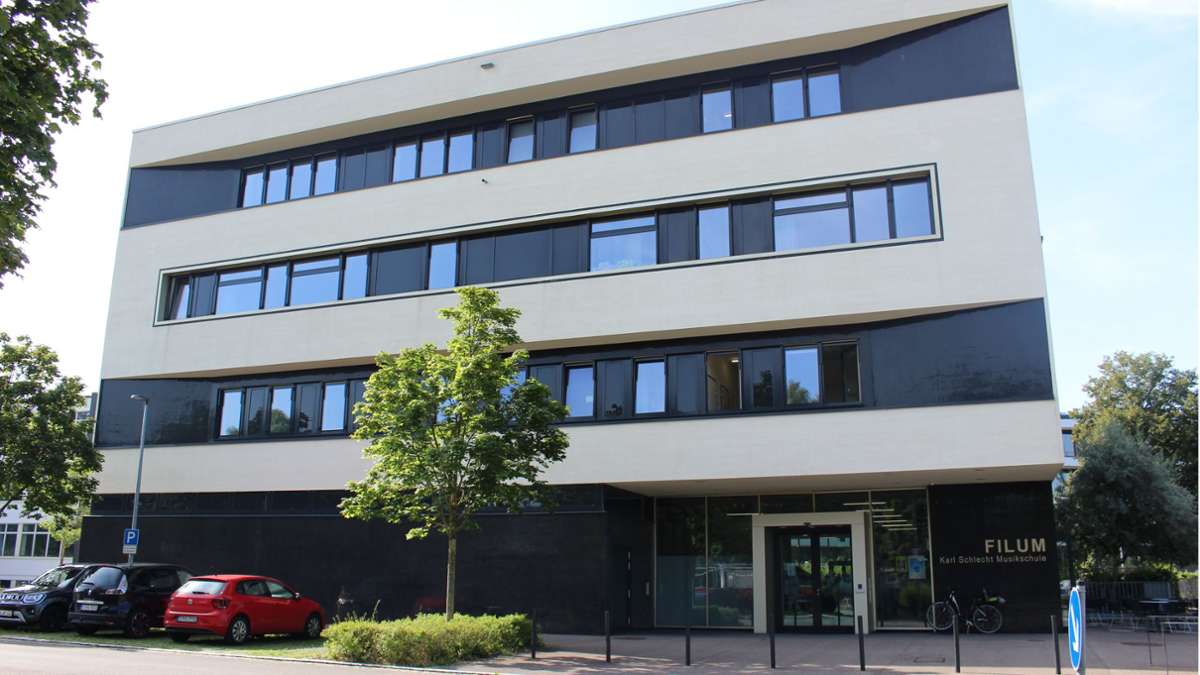
 Der Unterricht an der Filderstädter Musikschule wird zum April teurer. Die Gebühren für Abwasser steigen schon von Januar an. Foto: Caroline Holowiecki
Mit dem Rutsch ins neue Jahr wird es auf den Fildern an manchen Stellen teurer. Ein kleiner Überblick für Filderstadt und Leinfelden-Echterdingen.
]]]]]]]]>]]]]]]>]]]]>]]>
Der Musikunterricht in der Filderstädter Musikschule Filum wird im neuen Jahr etwas teurer. Die Tarife steigen zwar nicht gleich im Januar, sie werden aber zum 1. April um fünf Prozent erhöht.
]]]]]]]]>]]]]]]>]]]]>]]>
]]]]]]]]>]]]]]]>]]]]>]]> Weiterlesen mit 
Unsere Abo-Empfehlungen
Von hier, für die Region,
über die Welt.
*anschließend 10,99 € mtl.
- Exklusive Artikel, Serien und Abovorteile genießen
- Zugriff auf alle Inhalte der KRZ im Web
*anschließend 10,99 € mtl.
Bereits Abonnent? Anmelden
div,
#paywall–offerlink span {
pointer-events: none;
}
#paywall–offerlink {
display: inline-block;
}
.article-body .mod-paywall {
margin-top: -119px;
}
@media only screen and (max-width: 550px) {
.article-body .mod-paywall {
margin-top: -210px;
}
.container-main .flexbox .offer .price {
font-size: 24px;
}
}
.container-main {
padding: 0 20px;
color: #1c1c1c;
line-height: 1.3;
background: var(–accent-paywall) var(–background-paywall) no-repeat left top;
text-align: center;
background-size: cover;
}
.container-main .read-more {
width: 350px;
height: 32px;
background-color: #fff;
border-bottom-left-radius: 26px;
border-bottom-right-radius: 26px;
text-align: center;
margin: 0 auto;
font-size: 18px;
font-weight: bold;
display: flex;
justify-content: center;
align-items: center;
}
.container-main .read-more img {
width: 54px;
margin-top: -2px;
margin-left: 4px;
}
.container-main p.title {
/* color: #fff; */
font-size: 18px;
margin-top: 20px;
}
.container-main h2.title {
font-size: 24px;
/* font-family: „Roboto Slab“; */
/* color: #fff; */
max-width: 380px;
margin: 8px auto 42px !important;
}
.container-main .flexbox {
display: flex;
justify-content: center;
align-items: flex-end;
gap: 10px;
}
.container-main .flexbox .offer {
width: 235px;
max-width: 253px;
background-color: #fff;
border: 3px solid #fff;
border-radius: 20px;
position: relative;
flex: 1 1 0px;
}
.container-main .flexbox .offertext {
width: 235px;
flex: 1 1 0px;
margin-top: 20px;
}
.container-main .flexbox .offer.active {
width: 245px;
background-color: var(–accent-paywall-highlight);
border-color: var(–accent-paywall-highlight);
}
.container-main .flexbox .offer .rabatt {
width: 60px;
height: 60px;
padding: 17px 0 0;
background-color: var(–accent-paywall-highlight);
color: #fff;
font-size: 18px;
position: absolute;
top: -38px;
right: -31px;
border: 2px solid #fff;
border-radius: 30px;
}
.container-main .flexbox .offer .head {
background-color: #fff;
height: 35px;
color: var(–accent-paywall);
font-size: 24px;
font-weight: bold;
text-align: center;
margin-top: 2px;
border-radius: 20px;
}
.container-main .flexbox .offer.active .head {
background-color: var(–accent-paywall-highlight);
height: 38px;
color: #fff;
margin-top: 4px;
}
.container-main .flexbox .offer .content {
background-color: var(–background-paywall-offers);
padding: 12px 10px 12px 10px;
width: 100%;
height: 165px;
font-size: 15px !important;
color: #4D555A !important;
line-height: 1.3;
text-align: center;
margin-top: 0px;
border-bottom-left-radius: 20px;
border-bottom-right-radius: 20px;
}
.container-main .flexbox .offer.active .content {
height: 182px;
padding-top: 30px;
}
.container-main .flexbox .offer .price {
color: var(–accent-paywall);
font-weight: bold;
font-size: 45px;
display: block;
margin-top: -4px;
}
.container-main .flexbox .offer .price>small{
font-size: 22px;
vertical-align: top;
}
.container-main .flexbox .offer.active .price {
color: var(–accent-paywall-highlight);
}
.container-main .flexbox .offer .raquo {
width: 34px;
height: 34px;
padding: 5px 0 0;
background-color: #fff;
color: var(–accent-paywall);
font-size: 46px;
line-height: 0.4;
/* font-weight: bold; */
position: absolute;
bottom: -17px;
border-radius: 17px;
left: 0;
right: 0;
margin-left: auto;
margin-right: auto;
}
.container-main .flexbox .offer.active .raquo {
background-color: var(–accent-paywall-highlight);
color: #fff;
}
.container-main .flexbox .offer::after {
color: #fff;
content: „Zum Angebot“;
font-size: 15px;
width: 100%;
text-align: center;
position: absolute;
left: 5px;
line-height: 20px;
bottom: -40px;
}
.container-main .flexbox .offer.active::after {
color: var(–accent-paywall-highlight);
}
.cd_stoerer .container-main .flexbox .offer.active::after{
color: #fff;
}
.container-main .benefits {
margin: 70px auto 25px;
display: inline-block;
}
.container-main .benefits ul {
padding-left: 0;
}
.container-main .benefits li {
padding-left: 32px;
text-align: left;
list-style: none;
line-height: 1.3em !important;
/* color: #fff; */
font-size: 16px !important;
list-style-type: none !important;
position: relative;
}
.container-main .benefits li:before {
content: „“;
width: 20px;
height: 20px;
display: block;
background-color: var(–accent-paywall-highlight);
position: absolute;
left: 0;
z-index: 0;
border-radius: 50%;
}
.container-main .benefits li:after {
content: url(/staticcontent/common/svg/Icon_Haken_white.svg);
width: 20px;
height: 20px;
display: block;
position: absolute;
left: 0;
top: 0;
z-index: 1;
}
.container-main .benefits li:first-child {
margin-bottom: 10px;
}
.container-main .tinytext {
padding-bottom: 5px;
text-align: center;
/* color: #fff; */
font-size: 12px;
}
.container-main .tinytext a {
color: #fff;
}
.container-main .tinytext a:hover {
color: #fff;
}
.container-login {
background-color: #fff;
font-size: 16px;
font-weight: bold;
height: 60px;
text-align: center;
padding-top: 20px;
line-height: 16px;
}
.container-login span {
cursor: pointer;
color: var(–accent-paywall);
}
.hidedesktop {
display: none
}
[data-layout=tablet] .hidemobile {
display: inline-block !important;
}
@media only screen and (max-width: 550px) {
.hidemobile {
display: none !important;
}
.hidedesktop {
display: block !important;
}
.mod-paywall {
margin-left: -20px !important;
margin-right: -20px !important;
width: calc(100% + 40px);
}
.container-main {
padding: 0 10px;
}
.cd_stoerer .container-main .offer-wrap{
margin-top: 30px;
}
.container-main p.title {
font-size: 16px;
margin-top: 0;
}
.container-main h2.title {
font-size: 20px;
margin-bottom: 23px !important;
}
.container-main .read-more {
width: 80%;
}
.container-main .flexbox {
gap: 5px;
}
.container-main .flexbox .offer,
.container-main .flexbox .offer.active,
.container-main .flexbox .offer {
width: unset;
max-width: 130px;
}
.container-main .flexbox .offer .price {
font-size: 24px;
margin-bottom: 2px;
margin-top: 0px;
}
.container-main .flexbox .offer .content {
padding: 12px 4px 12px 2px;
font-size: 14px !important;
line-height: 1.4;
height: 145px;
}
.container-main .flexbox .offer .head {
height: 30px;
font-size: 20px;
}
.container-main .flexbox .offer.active .head {
height: 32px;
}
.container-main .flexbox .offer .rabatt {
width: 45px;
height: 45px;
padding: 10px 0 0;
font-size: 15px;
top: -32px;
}
.container-main .flexbox .offer .raquo,
.container-main .flexbox .offer.active .raquo {
bottom: -19px;
}
.container-main .read-more img {
width: 58px;
margin-top: -3px;
}
.container-main .tinytext {
margin-top: 80px;
padding-bottom: 20px;
}
.mod-paywall .container-footer {
background: #fff;
padding: 1.5rem 1rem;
text-align: left;
font-size: 16px;
line-height: 24px;
}
.mod-paywall .container-footer p {
padding: 0;
font-size: 16px;
line-height: 24px;
margin-bottom: 12px;
}
.mod-paywall .container-footer .logo {
width: 78px;
margin-bottom: 15px;
display: block;
}
.mod-paywall .container-login {
background-color: #EEEDE9;
}
.container-main .flexbox .offer.active .content {
height: 159px;
padding-top: 25px;
}
}
.print p {
font-size: 14px;
line-height: 20px;
margin-top: 20px;
}
.print .compare {
margin-top: 5px;
}
.print .compare a {
border: 1px solid var(–accent-paywall);
background: transparent;
color: var(–accent-paywall);
padding: 9px;
box-shadow: none;
font-size: 18px;
max-width: 440px;
width: 84%;
display: block;
margin: 5px auto 0 auto;
cursor: pointer;
font-weight: bold;
text-decoration: none;
text-align: center;
line-height: 1.3 !important;
}
/* Countdown */
.countdown {
display: inline-block;
margin-bottom: 44px;
}
.countdown>p {
display: flex;
align-items: center;
border: 4px solid var(–accent-paywall-highlight);
border-radius: 50px;
background-color: #fff;
box-shadow: 1px 2px rgba(255, 255, 255, 0.25);
padding: 0px !important;
}
.countdown>p>.countdown-text {
background-color: var(–accent-paywall-highlight);
font-size: 17px;
line-height: 17px;
font-weight: 700;
padding: 5px 10px;
margin-right: 13px;
color: #fff;
border-radius: 10px 0px 0px 10px;
}
.countdown>p>span:not(.countdown-text) {
color: #1C1C1C;
font-size: 18px;
line-height: 21px;
padding-right: 4px;
}
.countdown>p>span.specialText {
padding: 10px !important;
}
.countdown>p>span.days-count,
.countdown>p>span.hours-count,
.countdown>p>span.minutes-count {
padding: 0px;
}
.countdown>p>span.minutes {
padding-right: 17px;
}
.countdown>p>span.days-count,
.countdown>p>span.hours-count,
.countdown>p>span.minutes-count {
color: var(–accent-paywall-highlight);
font-weight: 700;
}
[data-layout=“mobile“] .countdown>p>.countdown-text {
font-size: 13px;
line-height: 13px;
padding: 2px 6px;
}
[data-layout=“mobile“] .countdown {
margin-bottom: 23px;
}
[data-layout=“mobile“] .countdown>p>span:not(.countdown-text) {
font-size: 12px;
line-height: 14px;
}
[data-layout=“mobile“] .countdown>p>span.minutes {
padding-right: 8px;
}
]]]]]]]]]]>]]]]]]]]>]]]]]]>]]]]>]]>
]]]]]]]]>]]]]]]>]]]]>]]>
]]]]]]]]>]]]]]]>]]]]>]]>
Weitere Themen
.m-wrapper {
padding-bottom: 30px;
}
]]]]]]]]]]>]]]]]]]]>]]]]]]>]]]]>]]>
]]]]]]]]>]]]]]]>]]]]>]]>