iframe[id^=“datawrapper“],
.is-empty + iframe[id^=“datawrapper“],
p + iframe[id^=“datawrapper“] {
margin-top: 20px;
}
/* CON-1897 Anpassung [mobil]: Umpositionierung Buttons Partner */
[data-layout=“mobile“][data-state=“is-loggedout“]
.m-menu.m-menu–bottom
> .m-icon–cleverpush-container,
[data-layout=“mobile“][data-state=“is-loggedin“]
.m-menu.m-menu–bottom
> .m-icon–cleverpush-container {
display: none !important;
}
[data-layout=“mobile“]
.mod-header
> .m-wrapper
.m-menu–bottom
> .m-item-abo {
height: 35px;
border-left: 1px solid rgba(255, 255, 255, 0.3);
border-right: none;
right: 18px;
position: relative;
}
[data-layout=“mobile“]
.mod-header
> .m-wrapper
.m-menu–bottom
> .m-item-abo
a {
padding-right: 2px;
padding-left: 2px;
padding-top: 26px;
}
[data-layout=“mobile“]
.mod-header
> .m-wrapper
.m-menu–bottom
> .m-item-abo
span {
background-color: #e5007d;
padding: 0px 9px;
border-radius: 64px;
color: #fff;
font-family: „Roboto Condensed“;
font-size: 18px;
}
@media only screen and (max-width: 550px) {
.mod-header > .m-wrapper .m-menu–top > .m-item.m-item–ok {
margin-right: 50px;
}
.mod-header > .m-wrapper .m-menu–bottom {
transform: translateX(0) !important;
top: 0;
right: 61px;
width: 44px;
padding-right: 0 !important;
border-top: none;
height: 45px !important;
background-color: transparent !important;
}
}
/* EGM-1104 [Google News] Folgen-Button einbauen */
.m-follow .social.gn a {
width: 100%;
height: 100%;
background-image: url(https://www.krzbb.de/staticcontent/common/img/social-google-news.png);
background-size: contain;
}
/* Anpassung Suche */
.search-form {
background: #fce5f2 !important;
}
fieldset.search-filter legend {
border-color: #e4007b !important;
}
/* Anpassung Decoy PW Logo */
[data-layout=“desktop“] .container-main .read-more img,
[data-layout=“tablet“] .container-main .read-more img {
margin-left: 6px;
}
/* DEV-1570 Bei uns daheim Anpassungen*/
[data-tags*=“Bei_uns_daheim“] .appetizer-kicker:before,
[data-tags*=“Bei uns daheim“] .appetizer-kicker:before,
[data-tags*=“Bei_uns_daheim“] .article-kicker:before,
.mod-ressort-bei-uns-daheim .header h4 a:before {
content: „“;
background-image: url(https://www.stuttgarter-nachrichten.de/staticcontent/stuttgarter_nachrichten/common-resp18/svg/bei-uns-daheim-logo.svg);
background-size: contain;
background-repeat: no-repeat;
position: relative;
top: 5px;
height: 22px;
width: 100px;
display: inline-block;
margin-right: 5px;
}
[data-tags*=“Bei_uns_daheim“] .appetizer-kicker:before,
[data-tags*=“Bei uns daheim“] .appetizer-kicker:before {
top: 6px;
}
.mod-ressort-bei-uns-daheim .header h4 a:before {
height: 30px;
width: 120px;
}
[data-layout=“mobile“] .mod-ressort-bei-uns-daheim .header h4 a:before {
height: 25px;
}
.mod-ressort-bei-uns-daheim .header h4 a,
.mod-ressort-bei-uns-daheim .header h4 a:hover {
color: #adc32b;
}
[data-alias=“/lokalnachrichten“] .mod-ressort-bei-uns-daheim {
margin-bottom: 20px;
}
/* Anpassung Navi + Bei uns daheim Ebenen*/
.mod-nav .m-menu–1 > .m-links {
z-index: 51;
}
[data-layout=“desktop“] .mod-nav .m-menu–3.is-open,
[data-layout=“tablet“] .mod-nav .m-menu–3.is-open {
left: 33%;
width: -webkit-fill-available;
width: -moz-available;
box-shadow: 0 0 50px -10px #454545;
}
[data-layout=“mobile“] .mod-nav .m-menu–3.is-open {
bottom: 0;
}
/* SALE-170 Anpassung Bündigkeit*/
[data-layout=“desktop“] .ad .item,
[data-layout=“tablet“] .ad .item {
padding-top: 10px;
}
/* SALE-188 MHS Digital zu swmn Logo umtauschen */
html:not([data-layout=“mobile“]) a.mhsd-partner-link:not([dark]):before,
html[data-layout=“mobile“] a.mhsd-partner-link:not([dark]):before {
content: url(/staticcontent/common/svg/swmn_80_dark.svg);
}
/* EGM-1451 SWMN-Logo reduzieren */
html[data-layout=“mobile“] a.mhsd-partner-link:not([dark]):before {
content: „“;
display: inline-block;
width: 41px;
height: 9px;
background-image: url(„/staticcontent/common/svg/swmn_80_dark.svg“);
background-size: contain;
}
[data-layout=“mobile“] .mod-header .m-wrapper li a.mhsd-partner-link {
position: relative;
}
iframe[src*=“youtube“] {
max-width: 100% !important;
width: 100%;
height: auto;
aspect-ratio: 16/9;
}
/* EGM-1718 – Themenlinks */
.art-tags {
border-top: 1px solid #cdcdcd;
border-bottom: 1px solid #cdcdcd;
padding-top: 16px !important;
margin: 16px 0;
max-width: calc(100% – 40px);
position: relative;
left: 20px;
}
.art-tags a {
color: var(–color-bodytext);
font-size: 16px;
line-height: 26px;
background-color: transparent !important;
margin: 0 20px 20px 0 !important;
padding: 0;
border-bottom: 3px solid var(–color-primary);
display: block;
float: left;
}
[data-layout=“mobile“] .art-tags {
max-width: 100%;
left: 0;
}
/* GROW-436 – Themenlinks */
.most-read {
gap: 14px !important;
margin: 30px 0 0;
display: flex !important;
flex-direction: column;
}
.most-read .appetizer-bottom-wrapper,
.most-read figure {
display: none;
}
.most-read .item {
width: 100% !important;
margin-bottom: 0 !important;
border-bottom: none;
padding-top: 0 !important;
padding-bottom: 0 !important;
}
.most-read .item:after,
.most-read .item + .item:before {
display: none !important;
}
.most-read .appetizer-title {
font-size: 18px !important;
line-height: 23px !important;
margin-bottom: 0 !important;
width: 100% !important;
padding-left: 0 !important;
padding-right: 0 !important;
}
.most-read .appetizer-kicker {
font-size: 17px !important;
line-height: 25px !important;
width: 100% !important;
padding-left: 0 !important;
padding-right: 0 !important;
margin-top: 0 !important;
}
.most-read h4 {
color: var(–color-bodytext);
font-size: 16px !important;
font-weight: 700;
line-height: 26px;
margin-bottom: 2px !important;
border-bottom: none;
padding-bottom: 16px;
border-bottom: 1px solid #cdcdcd;
display: block;
}
]]]]]]]]]]>]]]]]]]]>]]]]]]>]]]]>]]>

a { display: inline-block; background: none; color: unset; -webkit-transition: none; display: flex; width: 85%; }]]]]]]]]]]>]]]]]]]]>]]]]]]>]]]]>]]>
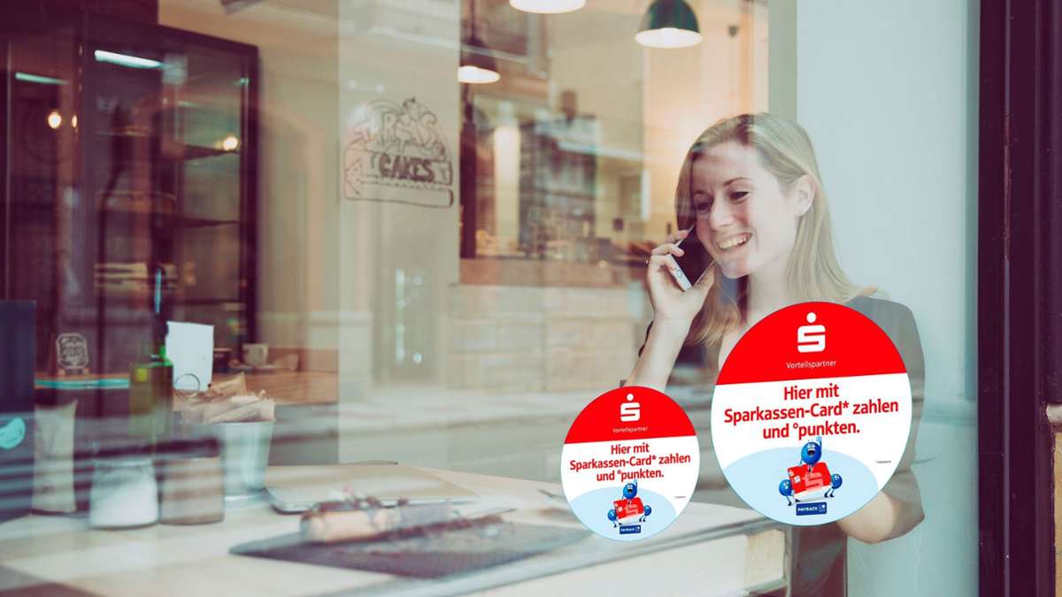
Stuttgarter Sparkassen und Payback Warum Tausende mit ihrer Sparkassen-Card keine Bonuspunkte sammeln können
Imelda Flaig 24.07.2025 – 15:03 Uhr
 Ohne App und Extra-Karte beim Bezahlen mit der Girocard Payback-Punkte sammeln – nicht für alle Sparkassenkunden ist das möglich. Foto: Payback
Seit Anfang Juli kooperieren die Sparkassen mit Payback. Aber Tausende Sparkassenkunden in der Region Stuttgart können nicht mit ihrer Girocard punkten.
]]]]]]]]>]]]]]]>]]]]>]]>
Millionen Sparkassen-Kunden können seit 1. Juli 2025 beim Bezahlen mit ihrer Girocard Payback-Punkte sammeln – ohne zusätzliche App oder Payback-Karte. Die Bonuspunkte werden automatisch gut geschrieben, wenn sie in bestimmten Geschäften mit ihrer Sparkassen-Card – also der Girokarte, die landläufig oft noch EC-Karte genannt wird – zahlen.
]]]]]]]]>]]]]]]>]]]]>]]>
]]]]]]]]>]]]]]]>]]]]>]]> Weiterlesen mit 
Unsere Abo-Empfehlungen
Von hier, für die Region,
über die Welt.
* anschließend 9,99 € mtl.
- Zugriff auf alle Inhalte der KRZ im Web
- Unkompliziert kündbar
* anschließend 9,99 € mtl.
Bereits Abonnent? Anmelden
div,
#paywall–offerlink span {
pointer-events: none;
}
#paywall–offerlink {
display: inline-block;
}
.article-body .mod-paywall {
margin-top: -119px;
}
@media only screen and (max-width: 550px) {
.article-body .mod-paywall {
margin-top: -210px;
}
.container-main .flexbox .offer .price {
font-size: 24px;
}
}
.container-main {
padding: 0 20px;
color: #1c1c1c;
line-height: 1.3;
background: var(–accent-paywall) var(–background-paywall) no-repeat left top;
text-align: center;
background-size: cover;
}
.container-main .read-more {
width: 350px;
height: 32px;
background-color: #fff;
border-bottom-left-radius: 26px;
border-bottom-right-radius: 26px;
text-align: center;
margin: 0 auto;
font-size: 18px;
font-weight: bold;
display: flex;
justify-content: center;
align-items: center;
}
.container-main .read-more img {
width: 54px;
margin-top: -2px;
margin-left: 4px;
}
.container-main p.title {
/* color: #fff; */
font-size: 18px;
margin-top: 20px;
}
.container-main h2.title {
font-size: 24px;
/* font-family: „Roboto Slab“; */
/* color: #fff; */
max-width: 380px;
margin: 8px auto 42px !important;
}
.container-main .flexbox {
display: flex;
justify-content: center;
align-items: flex-end;
gap: 10px;
}
.container-main .flexbox .offer {
width: 235px;
max-width: 253px;
background-color: #fff;
border: 3px solid #fff;
border-radius: 20px;
position: relative;
flex: 1 1 0px;
}
.container-main .flexbox .offertext {
width: 235px;
flex: 1 1 0px;
margin-top: 20px;
}
.container-main .flexbox .offer.active {
width: 245px;
background-color: var(–accent-paywall-highlight);
border-color: var(–accent-paywall-highlight);
}
.container-main .flexbox .offer .rabatt {
width: 60px;
height: 60px;
padding: 17px 0 0;
background-color: var(–accent-paywall-highlight);
color: #fff;
font-size: 18px;
position: absolute;
top: -38px;
right: -31px;
border: 2px solid #fff;
border-radius: 30px;
}
.container-main .flexbox .offer .head {
background-color: #fff;
height: 35px;
color: var(–accent-paywall);
font-size: 24px;
font-weight: bold;
text-align: center;
margin-top: 2px;
border-radius: 20px;
}
.container-main .flexbox .offer.active .head {
background-color: var(–accent-paywall-highlight);
height: 38px;
color: #fff;
margin-top: 4px;
}
.container-main .flexbox .offer .content {
background-color: var(–background-paywall-offers);
padding: 12px 10px 12px 10px;
width: 100%;
height: 165px;
font-size: 15px !important;
color: #4D555A !important;
line-height: 1.3;
text-align: center;
margin-top: 0px;
border-bottom-left-radius: 20px;
border-bottom-right-radius: 20px;
}
.container-main .flexbox .offer.active .content {
height: 182px;
padding-top: 30px;
}
.container-main .flexbox .offer .price {
color: var(–accent-paywall);
font-weight: bold;
font-size: 45px;
display: block;
margin-top: -4px;
}
.container-main .flexbox .offer .price>small{
font-size: 22px;
vertical-align: top;
}
.container-main .flexbox .offer.active .price {
color: var(–accent-paywall-highlight);
}
.container-main .flexbox .offer .raquo {
width: 34px;
height: 34px;
padding: 5px 0 0;
background-color: #fff;
color: var(–accent-paywall);
font-size: 46px;
line-height: 0.4;
/* font-weight: bold; */
position: absolute;
bottom: -17px;
border-radius: 17px;
left: 0;
right: 0;
margin-left: auto;
margin-right: auto;
}
.container-main .flexbox .offer.active .raquo {
background-color: var(–accent-paywall-highlight);
color: #fff;
}
.container-main .flexbox .offer::after {
color: #fff;
content: „Zum Angebot“;
font-size: 15px;
width: 100%;
text-align: center;
position: absolute;
left: 5px;
line-height: 20px;
bottom: -40px;
}
.container-main .flexbox .offer.active::after {
color: var(–accent-paywall-highlight);
}
.cd_stoerer .container-main .flexbox .offer.active::after{
color: #fff;
}
.container-main .benefits {
margin: 70px auto 25px;
display: inline-block;
}
.container-main .benefits ul {
padding-left: 0;
}
.container-main .benefits li {
padding-left: 32px;
text-align: left;
list-style: none;
line-height: 1.3em !important;
/* color: #fff; */
font-size: 16px !important;
list-style-type: none !important;
position: relative;
}
.container-main .benefits li:before {
content: „“;
width: 20px;
height: 20px;
display: block;
background-color: var(–accent-paywall-highlight);
position: absolute;
left: 0;
z-index: 0;
border-radius: 50%;
}
.container-main .benefits li:after {
content: url(/staticcontent/common/svg/Icon_Haken_white.svg);
width: 20px;
height: 20px;
display: block;
position: absolute;
left: 0;
top: 0;
z-index: 1;
}
.container-main .benefits li:first-child {
margin-bottom: 10px;
}
.container-main .tinytext {
padding-bottom: 5px;
text-align: center;
/* color: #fff; */
font-size: 12px;
}
.container-main .tinytext a {
color: #fff;
}
.container-main .tinytext a:hover {
color: #fff;
}
.container-login {
background-color: #fff;
font-size: 16px;
font-weight: bold;
height: 60px;
text-align: center;
padding-top: 20px;
line-height: 16px;
}
.container-login span {
cursor: pointer;
color: var(–accent-paywall);
}
.hidedesktop {
display: none
}
[data-layout=tablet] .hidemobile {
display: inline-block !important;
}
@media only screen and (max-width: 550px) {
.hidemobile {
display: none !important;
}
.hidedesktop {
display: block !important;
}
.mod-paywall {
margin-left: -20px !important;
margin-right: -20px !important;
width: calc(100% + 40px);
}
.container-main {
padding: 0 10px;
}
.cd_stoerer .container-main .offer-wrap{
margin-top: 30px;
}
.container-main p.title {
font-size: 16px;
margin-top: 0;
}
.container-main h2.title {
font-size: 20px;
margin-bottom: 23px !important;
}
.container-main .read-more {
width: 80%;
}
.container-main .flexbox {
gap: 5px;
}
.container-main .flexbox .offer,
.container-main .flexbox .offer.active,
.container-main .flexbox .offer {
width: unset;
max-width: 130px;
}
.container-main .flexbox .offer .price {
font-size: 24px;
margin-bottom: 2px;
margin-top: 0px;
}
.container-main .flexbox .offer .content {
padding: 12px 4px 12px 2px;
font-size: 14px !important;
line-height: 1.4;
height: 145px;
}
.container-main .flexbox .offer .head {
height: 30px;
font-size: 20px;
}
.container-main .flexbox .offer.active .head {
height: 32px;
}
.container-main .flexbox .offer .rabatt {
width: 45px;
height: 45px;
padding: 10px 0 0;
font-size: 15px;
top: -32px;
}
.container-main .flexbox .offer .raquo,
.container-main .flexbox .offer.active .raquo {
bottom: -19px;
}
.container-main .read-more img {
width: 58px;
margin-top: -3px;
}
.container-main .tinytext {
margin-top: 80px;
padding-bottom: 20px;
}
.mod-paywall .container-footer {
background: #fff;
padding: 1.5rem 1rem;
text-align: left;
font-size: 16px;
line-height: 24px;
}
.mod-paywall .container-footer p {
padding: 0;
font-size: 16px;
line-height: 24px;
margin-bottom: 12px;
}
.mod-paywall .container-footer .logo {
width: 78px;
margin-bottom: 15px;
display: block;
}
.mod-paywall .container-login {
background-color: #EEEDE9;
}
.container-main .flexbox .offer.active .content {
height: 159px;
padding-top: 25px;
}
}
.print p {
font-size: 14px;
line-height: 20px;
margin-top: 20px;
}
.print .compare {
margin-top: 5px;
}
.print .compare a {
border: 1px solid var(–accent-paywall);
background: transparent;
color: var(–accent-paywall);
padding: 9px;
box-shadow: none;
font-size: 18px;
max-width: 440px;
width: 84%;
display: block;
margin: 5px auto 0 auto;
cursor: pointer;
font-weight: bold;
text-decoration: none;
text-align: center;
line-height: 1.3 !important;
}
/* Countdown */
.countdown {
display: inline-block;
margin-bottom: 44px;
}
.countdown>p {
display: flex;
align-items: center;
border: 4px solid var(–accent-paywall-highlight);
border-radius: 50px;
background-color: #fff;
box-shadow: 1px 2px rgba(255, 255, 255, 0.25);
padding: 0px !important;
}
.countdown>p>.countdown-text {
background-color: var(–accent-paywall-highlight);
font-size: 17px;
line-height: 17px;
font-weight: 700;
padding: 5px 10px;
margin-right: 13px;
color: #fff;
border-radius: 10px 0px 0px 10px;
}
.countdown>p>span:not(.countdown-text) {
color: #1C1C1C;
font-size: 18px;
line-height: 21px;
padding-right: 4px;
}
.countdown>p>span.specialText {
padding: 10px !important;
}
.countdown>p>span.days-count,
.countdown>p>span.hours-count,
.countdown>p>span.minutes-count {
padding: 0px;
}
.countdown>p>span.minutes {
padding-right: 17px;
}
.countdown>p>span.days-count,
.countdown>p>span.hours-count,
.countdown>p>span.minutes-count {
color: var(–accent-paywall-highlight);
font-weight: 700;
}
[data-layout=“mobile“] .countdown>p>.countdown-text {
font-size: 13px;
line-height: 13px;
padding: 2px 6px;
}
[data-layout=“mobile“] .countdown {
margin-bottom: 23px;
}
[data-layout=“mobile“] .countdown>p>span:not(.countdown-text) {
font-size: 12px;
line-height: 14px;
}
[data-layout=“mobile“] .countdown>p>span.minutes {
padding-right: 8px;
}
]]]]]]]]]]>]]]]]]]]>]]]]]]>]]]]>]]>
]]]]]]]]>]]]]]]>]]]]>]]>
]]]]]]]]>]]]]]]>]]]]>]]>
Weitere Themen
.m-wrapper {
padding-bottom: 30px;
}
]]]]]]]]]]>]]]]]]]]>]]]]]]>]]]]>]]>
]]]]]]]]>]]]]]]>]]]]>]]>