iframe[id^=“datawrapper“],
.is-empty + iframe[id^=“datawrapper“],
p + iframe[id^=“datawrapper“] {
margin-top: 20px;
}
/* CON-1897 Anpassung [mobil]: Umpositionierung Buttons Partner */
[data-layout=“mobile“][data-state=“is-loggedout“]
.m-menu.m-menu–bottom
> .m-icon–cleverpush-container,
[data-layout=“mobile“][data-state=“is-loggedin“]
.m-menu.m-menu–bottom
> .m-icon–cleverpush-container {
display: none !important;
}
[data-layout=“mobile“]
.mod-header
> .m-wrapper
.m-menu–bottom
> .m-item-abo {
height: 35px;
border-left: 1px solid rgba(255, 255, 255, 0.3);
border-right: none;
right: 18px;
position: relative;
}
[data-layout=“mobile“]
.mod-header
> .m-wrapper
.m-menu–bottom
> .m-item-abo
a {
padding-right: 2px;
padding-left: 2px;
padding-top: 26px;
}
[data-layout=“mobile“]
.mod-header
> .m-wrapper
.m-menu–bottom
> .m-item-abo
span {
background-color: #e5007d;
padding: 0px 9px;
border-radius: 64px;
color: #fff;
font-family: „Roboto Condensed“;
font-size: 18px;
}
@media only screen and (max-width: 550px) {
.mod-header > .m-wrapper .m-menu–top > .m-item.m-item–ok {
margin-right: 50px;
}
.mod-header > .m-wrapper .m-menu–bottom {
transform: translateX(0) !important;
top: 0;
right: 61px;
width: 44px;
padding-right: 0 !important;
border-top: none;
height: 45px !important;
background-color: transparent !important;
}
}
/* EGM-1104 [Google News] Folgen-Button einbauen */
.m-follow .social.gn a {
width: 100%;
height: 100%;
background-image: url(https://www.krzbb.de/staticcontent/common/img/social-google-news.png);
background-size: contain;
}
/* Anpassung Suche */
.search-form {
background: #fce5f2 !important;
}
fieldset.search-filter legend {
border-color: #e4007b !important;
}
/* Anpassung Decoy PW Logo */
[data-layout=“desktop“] .container-main .read-more img,
[data-layout=“tablet“] .container-main .read-more img {
margin-left: 6px;
}
/* DEV-1570 Bei uns daheim Anpassungen*/
[data-tags*=“Bei_uns_daheim“] .appetizer-kicker:before,
[data-tags*=“Bei uns daheim“] .appetizer-kicker:before,
[data-tags*=“Bei_uns_daheim“] .article-kicker:before,
.mod-ressort-bei-uns-daheim .header h4 a:before {
content: „“;
background-image: url(https://www.stuttgarter-nachrichten.de/staticcontent/stuttgarter_nachrichten/common-resp18/svg/bei-uns-daheim-logo.svg);
background-size: contain;
background-repeat: no-repeat;
position: relative;
top: 5px;
height: 22px;
width: 100px;
display: inline-block;
margin-right: 5px;
}
[data-tags*=“Bei_uns_daheim“] .appetizer-kicker:before,
[data-tags*=“Bei uns daheim“] .appetizer-kicker:before {
top: 6px;
}
.mod-ressort-bei-uns-daheim .header h4 a:before {
height: 30px;
width: 120px;
}
[data-layout=“mobile“] .mod-ressort-bei-uns-daheim .header h4 a:before {
height: 25px;
}
.mod-ressort-bei-uns-daheim .header h4 a,
.mod-ressort-bei-uns-daheim .header h4 a:hover {
color: #adc32b;
}
[data-alias=“/lokalnachrichten“] .mod-ressort-bei-uns-daheim {
margin-bottom: 20px;
}
/* Anpassung Navi + Bei uns daheim Ebenen*/
.mod-nav .m-menu–1 > .m-links {
z-index: 51;
}
[data-layout=“desktop“] .mod-nav .m-menu–3.is-open,
[data-layout=“tablet“] .mod-nav .m-menu–3.is-open {
left: 33%;
width: -webkit-fill-available;
width: -moz-available;
box-shadow: 0 0 50px -10px #454545;
}
[data-layout=“mobile“] .mod-nav .m-menu–3.is-open {
bottom: 0;
}
/* SALE-170 Anpassung Bündigkeit*/
[data-layout=“desktop“] .ad .item,
[data-layout=“tablet“] .ad .item {
padding-top: 10px;
}
/* SALE-188 MHS Digital zu swmn Logo umtauschen */
html:not([data-layout=“mobile“]) a.mhsd-partner-link:not([dark]):before,
html[data-layout=“mobile“] a.mhsd-partner-link:not([dark]):before {
content: url(/staticcontent/common/svg/swmn_80_dark.svg);
}
/* EGM-1451 SWMN-Logo reduzieren */
html[data-layout=“mobile“] a.mhsd-partner-link:not([dark]):before {
content: „“;
display: inline-block;
width: 41px;
height: 9px;
background-image: url(„/staticcontent/common/svg/swmn_80_dark.svg“);
background-size: contain;
}
[data-layout=“mobile“] .mod-header .m-wrapper li a.mhsd-partner-link {
position: relative;
}
iframe[src*=“youtube“] {
max-width: 100% !important;
width: 100%;
height: auto;
aspect-ratio: 16/9;
}
/* EGM-1718 – Themenlinks */
.art-tags {
border-top: 1px solid #cdcdcd;
border-bottom: 1px solid #cdcdcd;
padding-top: 16px !important;
margin: 16px 0;
max-width: calc(100% – 40px);
position: relative;
left: 20px;
}
.art-tags a {
color: var(–color-bodytext);
font-size: 16px;
line-height: 26px;
background-color: transparent !important;
margin: 0 20px 20px 0 !important;
padding: 0;
border-bottom: 3px solid var(–color-primary);
display: block;
float: left;
}
[data-layout=“mobile“] .art-tags {
max-width: 100%;
left: 0;
}
/* GROW-436 – Themenlinks */
.most-read {
gap: 14px !important;
margin: 30px 0 0;
display: flex !important;
flex-direction: column;
}
.most-read .appetizer-bottom-wrapper,
.most-read figure {
display: none;
}
.most-read .item {
width: 100% !important;
margin-bottom: 0 !important;
border-bottom: none;
padding-top: 0 !important;
padding-bottom: 0 !important;
}
.most-read .item:after,
.most-read .item + .item:before {
display: none !important;
}
.most-read .appetizer-title {
font-size: 18px !important;
line-height: 23px !important;
margin-bottom: 0 !important;
width: 100% !important;
padding-left: 0 !important;
padding-right: 0 !important;
}
.most-read .appetizer-kicker {
font-size: 17px !important;
line-height: 25px !important;
width: 100% !important;
padding-left: 0 !important;
padding-right: 0 !important;
margin-top: 0 !important;
}
.most-read h4 {
color: var(–color-bodytext);
font-size: 16px !important;
font-weight: 700;
line-height: 26px;
margin-bottom: 2px !important;
border-bottom: none;
padding-bottom: 16px;
border-bottom: 1px solid #cdcdcd;
display: block;
}
/* CON-3273 – BSFG */
[data-tags=“Verlagsangebot“] .appetizer-kicker {
color: #4d555a;
}
/* EGM-1936 – Abo-Button auf Impressum ausblenden */
[data-alias=“https://www.krzbb.de/impressum“] .snippet,
[data-alias=“https://www.krzbb.de/impressum“] .m-item-abo {
display: none !important;
}
]]]]]]]]]]>]]]]]]]]>]]]]]]>]]]]>]]>

a { display: inline-block; background: none; color: unset; -webkit-transition: none; display: flex; width: 85%; }]]]]]]]]]]>]]]]]]]]>]]]]]]>]]]]>]]>
div {
flex: 1 1 100%;
width: 100%;
}
[data-layout=“mobile“] .snippet .mod-banderole .text-box .lnk-wrap {
display: flex;
justify-content: flex-end;
width: 100%;
}
[data-layout=“mobile“] .snippet .mod-banderole .text-box .lnk-wrap.hide-mobile {
display: none;
}
[data-layout=“mobile“] .snippet .mod-banderole .text-box .btn {
width: 100%;
padding: 14px 0;
margin: 20px 0 0 0;
border-bottom: 0;
height: 55px;
}
[data-layout=“mobile“] .snippet .mod-banderole .text-box .text {
font-size: 16px;
}
[data-layout=“mobile“] #snippet-bwvo.snippet .mod-banderole .btn {
font-size: 18px;
}
[data-layout=“mobile“] .snippet .mod-banderole .text-box .text.hide-mobile {
display: none;
}
[data-layout=“mobile“] .snippet .mod-banderole .text-box .text.hide-desktop {
display: block;
color: #25282A;
}
[data-layout=“desktop“] .snippet .mod-banderole,
[data-layout=“tablet“] .snippet .mod-banderole {
cursor: auto;
}
.snippet .mod-banderole .icon-box {
background: #fff;
padding: 14px 10px;
display: flex;
align-items: center;
width: 99px;
justify-content: center;
}
[data-layout=“mobile“] .snippet .mod-banderole .icon-box {
width: 78px;
}
.snippet .mod-banderole .icon-box img {
height: 27px;
}
.snippet .mod-banderole .logo-box {
background: #fff;
padding: 14px 15px;
display: flex;
align-items: center;
}
.snippet .mod-banderole .logo-box img {
width: 69px;
}
[data-layout=“mobile“] .snippet .mod-banderole .logo-box img {
width: 58px;
}
[data-layout=“desktop“] .snippet .mod-banderole .text-box,
[data-layout=“tablet“] .snippet .mod-banderole .text-box {
padding: 12px 39px 12px 20px;
}
[data-layout=“desktop“] .snippet .mod-banderole .text-box .hide-mobile,
[data-layout=“tablet“] .snippet .mod-banderole .text-box .hide-mobile {
display: block;
}
[data-layout=“desktop“] .snippet .mod-banderole .text-box .hide-desktop,
[data-layout=“tablet“] .snippet .mod-banderole .text-box .hide-desktop {
display: none;
}
[data-layout=“desktop“] .snippet .mod-banderole .text-box .lnk,
[data-layout=“tablet“] .snippet .mod-banderole .text-box .lnk {
border-bottom: 2px solid #4d555a;
text-decoration: none;
color: #4d555a;
}
[data-layout=“desktop“] .snippet .mod-banderole .text-box .btn,
[data-layout=“tablet“] .snippet .mod-banderole .text-box .btn {
padding: 10px 16px;
border-bottom: 0;
height: 41px;
}
[data-layout=“desktop“] .snippet .mod-banderole .text-box .text,
[data-layout=“tablet“] .snippet .mod-banderole .text-box .text {
padding-right: 25px;
}
#top-of-page .wtc-wg-plugilo-connector {
z-index: 2147483647 !important;
}
.snippet .mod-banderole .snippet-close {
height: 20px;
width: 20px;
position: absolute;
right: 0;
top: 0;
background: #fff;
display: block;
z-index: 3;
cursor: pointer;
}
[data-layout=“desktop“] .snippet .snippet-close,
[data-layout=“tablet“] .snippet .snippet-close {
height: 25px;
width: 25px;
}
[data-layout=“mobile“] .snippet .mod-banderole .text-box .title-wrap {
display: flex;
justify-content: space-between;
}
[data-layout=“mobile“] .snippet .mod-banderole .text-box .title-wrap .title {
display: flex;
flex-direction: column;
font-weight: 700;
align-items: flex-start;
font-size: 22px;
line-height: 24px;
margin-bottom: 5px;
width: 100%;
}
[data-layout=“mobile“] .snippet .mod-banderole .snippet-close {
position: relative;
background: 0 0;
width: 47px;
height: 44px;
display: flex;
align-items: center;
justify-content: center;
margin: -12px -12px 0 0;
}
[data-layout=“mobile“] .snippet .mod-banderole .snippet-close svg {
height: 30px;
width: 30px;
stroke-width: 2px;
}
[data-layout=“mobile“] .snippet .mod-banderole .snippet-close path {
stroke: #25282A;
}
[data-layout=“mobile“] .snippet .mod-banderole .icon-box,
[data-layout=“mobile“] .snippet .mod-banderole .logo-box {
display: none;
}
[data-layout=“mobile“] .snippet .mod-banderole .text-box .title-wrap .title img {
height: 22px;
width: auto;
margin-bottom: 15px;
}
[data-layout=“mobile“] .snippet.engagement .mod-banderole .text-box .title-wrap .title img {
margin-right: 10px;
}
[data-layout=“mobile“] .snippet.engagement .mod-banderole .text-box .title-wrap .title {
flex-direction: row;
margin-bottom: 0;
}
]]]]]]]]]]>]]]]]]]]>]]]]]]>]]]]>]]>
Das Beste aus Böblingen.
Mit KRZ Plus unbegrenzt Inhalte des Böblinger Boten lesen.
Das Beste aus Böblingen. Mit KRZ Plus unbegrenzt Inhalte
des Böblinger Boten lesen.
Baden-Württemberg Nach Unfall in Karlsbad: Kind verlässt Klinik
red/dpa/lsw 03.12.2025 – 11:44 Uhr
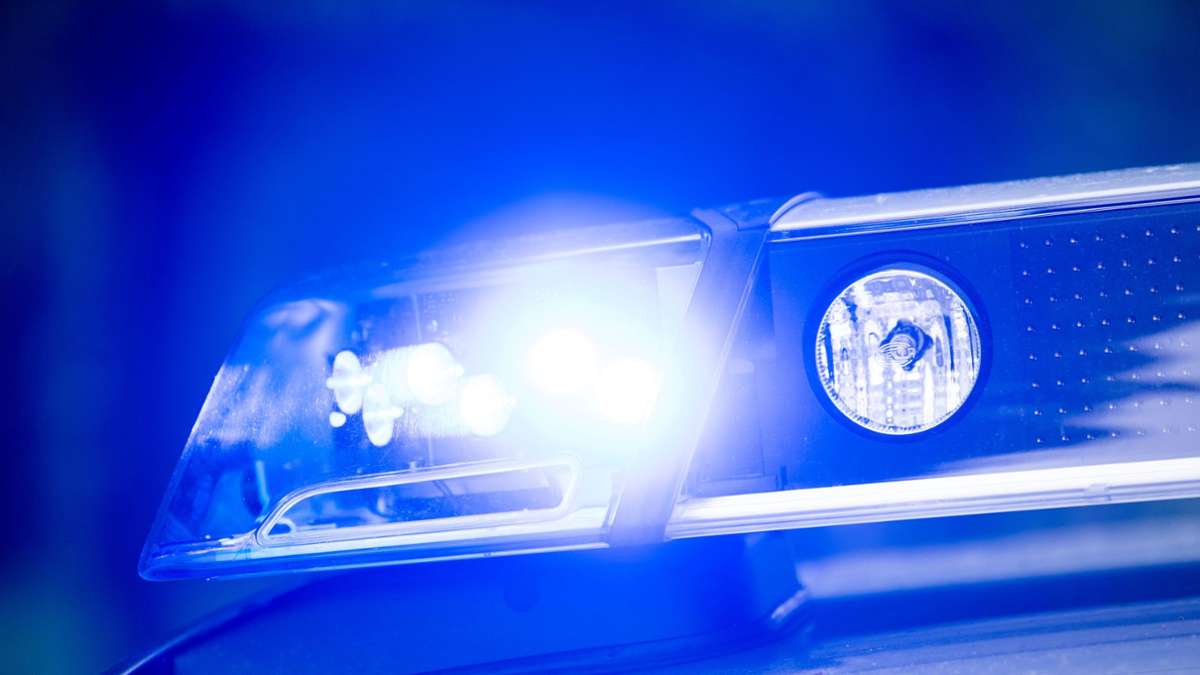
 Die genaue Unfallursache war laut Polizei noch nicht bekannt. (Symbolbild) Foto: Lino Mirgeler/dpa
Auf dem Gehweg erfasste ein Fahrer mit seinem Auto zwei Kinder. Die Polizei ermittelt, wie es dazu kam. Doch es gibt gute Nachrichten.
]]]]]]]]>]]]]]]>]]]]>]]>
Noch am Abend nach dem Unfall mit einem Auto auf einem Gehweg in Karlsbad (Kreis Karlsruhe) hat eine Achtjährige das Krankenhaus wieder verlassen. Eine verletzte Vierjährige befinde sich nach wie vor mit schweren Verletzungen in der Klinik, sagte ein Polizeisprecher. Lebensgefahr bestehe aber nicht.
Ein Fahrer hatte die beiden Kinder am Montag auf einem Gehweg mit seinem Auto erfasst. Beide waren zunächst mit schweren Verletzungen ins Krankenhaus gekommen. Der 36 Jahre alte Fahrer blieb unverletzt. Die genaue Unfallursache war laut Polizei noch nicht bekannt.
Unsere Empfehlung für Sie ]]]]]]]]>]]]]]]>]]]]>]]>
Nach ersten Erkenntnissen war der Autofahrer an einer Einmündung nach links von der Fahrbahn abgekommen und hatte die Kinder dort mit seinem Wagen erfasst. Danach prallte das Auto gegen eine Mauer.
]]]]]]]]>]]]]]]>]]]]>]]>
]]]]]]]]>]]]]]]>]]]]>]]>
Weitere Themen
.m-wrapper {
padding-bottom: 30px;
}
]]]]]]]]]]>]]]]]]]]>]]]]]]>]]]]>]]>
]]]]]]]]>]]]]]]>]]]]>]]>