iframe[id^=“datawrapper“],
.is-empty + iframe[id^=“datawrapper“],
p + iframe[id^=“datawrapper“] {
margin-top: 20px;
}
/* CON-1897 Anpassung [mobil]: Umpositionierung Buttons Partner */
[data-layout=“mobile“][data-state=“is-loggedout“]
.m-menu.m-menu–bottom
> .m-icon–cleverpush-container,
[data-layout=“mobile“][data-state=“is-loggedin“]
.m-menu.m-menu–bottom
> .m-icon–cleverpush-container {
display: none !important;
}
[data-layout=“mobile“]
.mod-header
> .m-wrapper
.m-menu–bottom
> .m-item-abo {
height: 35px;
border-left: 1px solid rgba(255, 255, 255, 0.3);
border-right: none;
right: 18px;
position: relative;
}
[data-layout=“mobile“]
.mod-header
> .m-wrapper
.m-menu–bottom
> .m-item-abo
a {
padding-right: 2px;
padding-left: 2px;
padding-top: 26px;
}
[data-layout=“mobile“]
.mod-header
> .m-wrapper
.m-menu–bottom
> .m-item-abo
span {
background-color: #e5007d;
padding: 0px 9px;
border-radius: 64px;
color: #fff;
font-family: „Roboto Condensed“;
font-size: 18px;
}
@media only screen and (max-width: 550px) {
.mod-header > .m-wrapper .m-menu–top > .m-item.m-item–ok {
margin-right: 50px;
}
.mod-header > .m-wrapper .m-menu–bottom {
transform: translateX(0) !important;
top: 0;
right: 61px;
width: 44px;
padding-right: 0 !important;
border-top: none;
height: 45px !important;
background-color: transparent !important;
}
}
/* EGM-1104 [Google News] Folgen-Button einbauen */
.m-follow .social.gn a {
width: 100%;
height: 100%;
background-image: url(https://www.krzbb.de/staticcontent/common/img/social-google-news.png);
background-size: contain;
}
/* Anpassung Suche */
.search-form {
background: #fce5f2 !important;
}
fieldset.search-filter legend {
border-color: #e4007b !important;
}
/* Anpassung Decoy PW Logo */
[data-layout=“desktop“] .container-main .read-more img,
[data-layout=“tablet“] .container-main .read-more img {
margin-left: 6px;
}
/* DEV-1570 Bei uns daheim Anpassungen*/
[data-tags*=“Bei_uns_daheim“] .appetizer-kicker:before,
[data-tags*=“Bei uns daheim“] .appetizer-kicker:before,
[data-tags*=“Bei_uns_daheim“] .article-kicker:before,
.mod-ressort-bei-uns-daheim .header h4 a:before {
content: „“;
background-image: url(https://www.stuttgarter-nachrichten.de/staticcontent/stuttgarter_nachrichten/common-resp18/svg/bei-uns-daheim-logo.svg);
background-size: contain;
background-repeat: no-repeat;
position: relative;
top: 5px;
height: 22px;
width: 100px;
display: inline-block;
margin-right: 5px;
}
[data-tags*=“Bei_uns_daheim“] .appetizer-kicker:before,
[data-tags*=“Bei uns daheim“] .appetizer-kicker:before {
top: 6px;
}
.mod-ressort-bei-uns-daheim .header h4 a:before {
height: 30px;
width: 120px;
}
[data-layout=“mobile“] .mod-ressort-bei-uns-daheim .header h4 a:before {
height: 25px;
}
.mod-ressort-bei-uns-daheim .header h4 a,
.mod-ressort-bei-uns-daheim .header h4 a:hover {
color: #adc32b;
}
[data-alias=“/lokalnachrichten“] .mod-ressort-bei-uns-daheim {
margin-bottom: 20px;
}
/* Anpassung Navi + Bei uns daheim Ebenen*/
.mod-nav .m-menu–1 > .m-links {
z-index: 51;
}
[data-layout=“desktop“] .mod-nav .m-menu–3.is-open,
[data-layout=“tablet“] .mod-nav .m-menu–3.is-open {
left: 33%;
width: -webkit-fill-available;
width: -moz-available;
box-shadow: 0 0 50px -10px #454545;
}
[data-layout=“mobile“] .mod-nav .m-menu–3.is-open {
bottom: 0;
}
/* SALE-170 Anpassung Bündigkeit*/
[data-layout=“desktop“] .ad .item,
[data-layout=“tablet“] .ad .item {
padding-top: 10px;
}
/* SALE-188 MHS Digital zu swmn Logo umtauschen */
html:not([data-layout=“mobile“]) a.mhsd-partner-link:not([dark]):before,
html[data-layout=“mobile“] a.mhsd-partner-link:not([dark]):before {
content: url(/staticcontent/common/svg/swmn_80_dark.svg);
}
/* EGM-1451 SWMN-Logo reduzieren */
html[data-layout=“mobile“] a.mhsd-partner-link:not([dark]):before {
content: „“;
display: inline-block;
width: 41px;
height: 9px;
background-image: url(„/staticcontent/common/svg/swmn_80_dark.svg“);
background-size: contain;
}
[data-layout=“mobile“] .mod-header .m-wrapper li a.mhsd-partner-link {
position: relative;
}
iframe[src*=“youtube“] {
max-width: 100% !important;
width: 100%;
height: auto;
aspect-ratio: 16/9;
}
/* EGM-1718 – Themenlinks */
.art-tags {
border-top: 1px solid #cdcdcd;
border-bottom: 1px solid #cdcdcd;
padding-top: 16px !important;
margin: 16px 0;
max-width: calc(100% – 40px);
position: relative;
left: 20px;
}
.art-tags a {
color: var(–color-bodytext);
font-size: 16px;
line-height: 26px;
background-color: transparent !important;
margin: 0 20px 20px 0 !important;
padding: 0;
border-bottom: 3px solid var(–color-primary);
display: block;
float: left;
}
[data-layout=“mobile“] .art-tags {
max-width: 100%;
left: 0;
}
/* GROW-436 – Themenlinks */
.most-read {
gap: 14px !important;
margin: 30px 0 0;
display: flex !important;
flex-direction: column;
}
.most-read .appetizer-bottom-wrapper,
.most-read figure {
display: none;
}
.most-read .item {
width: 100% !important;
margin-bottom: 0 !important;
border-bottom: none;
padding-top: 0 !important;
padding-bottom: 0 !important;
}
.most-read .item:after,
.most-read .item + .item:before {
display: none !important;
}
.most-read .appetizer-title {
font-size: 18px !important;
line-height: 23px !important;
margin-bottom: 0 !important;
width: 100% !important;
padding-left: 0 !important;
padding-right: 0 !important;
}
.most-read .appetizer-kicker {
font-size: 17px !important;
line-height: 25px !important;
width: 100% !important;
padding-left: 0 !important;
padding-right: 0 !important;
margin-top: 0 !important;
}
.most-read h4 {
color: var(–color-bodytext);
font-size: 16px !important;
font-weight: 700;
line-height: 26px;
margin-bottom: 2px !important;
border-bottom: none;
padding-bottom: 16px;
border-bottom: 1px solid #cdcdcd;
display: block;
}
]]]]]]]]]]>]]]]]]]]>]]]]]]>]]]]>]]>

a { display: inline-block; background: none; color: unset; -webkit-transition: none; display: flex; width: 85%; }]]]]]]]]]]>]]]]]]]]>]]]]]]>]]]]>]]>
div {
flex: 1 1 100%;
width: 100%;
}
[data-layout=“mobile“] .snippet .mod-banderole .text-box .lnk-wrap {
display: flex;
justify-content: flex-end;
width: 100%;
}
[data-layout=“mobile“] .snippet .mod-banderole .text-box .lnk-wrap.hide-mobile {
display: none;
}
[data-layout=“mobile“] .snippet .mod-banderole .text-box .btn {
width: 100%;
padding: 14px 0;
margin: 20px 0 0 0;
border-bottom: 0;
height: 55px;
}
[data-layout=“mobile“] .snippet .mod-banderole .text-box .text {
font-size: 16px;
}
[data-layout=“mobile“] #snippet-bwvo.snippet .mod-banderole .btn {
font-size: 18px;
}
[data-layout=“mobile“] .snippet .mod-banderole .text-box .text.hide-mobile {
display: none;
}
[data-layout=“mobile“] .snippet .mod-banderole .text-box .text.hide-desktop {
display: block;
color: #25282A;
}
[data-layout=“desktop“] .snippet .mod-banderole,
[data-layout=“tablet“] .snippet .mod-banderole {
cursor: auto;
}
.snippet .mod-banderole .icon-box {
background: #fff;
padding: 14px 10px;
display: flex;
align-items: center;
width: 99px;
justify-content: center;
}
[data-layout=“mobile“] .snippet .mod-banderole .icon-box {
width: 78px;
}
.snippet .mod-banderole .icon-box img {
height: 27px;
}
.snippet .mod-banderole .logo-box {
background: #fff;
padding: 14px 15px;
display: flex;
align-items: center;
}
.snippet .mod-banderole .logo-box img {
width: 69px;
}
[data-layout=“mobile“] .snippet .mod-banderole .logo-box img {
width: 58px;
}
[data-layout=“desktop“] .snippet .mod-banderole .text-box,
[data-layout=“tablet“] .snippet .mod-banderole .text-box {
padding: 12px 39px 12px 20px;
}
[data-layout=“desktop“] .snippet .mod-banderole .text-box .hide-mobile,
[data-layout=“tablet“] .snippet .mod-banderole .text-box .hide-mobile {
display: block;
}
[data-layout=“desktop“] .snippet .mod-banderole .text-box .hide-desktop,
[data-layout=“tablet“] .snippet .mod-banderole .text-box .hide-desktop {
display: none;
}
[data-layout=“desktop“] .snippet .mod-banderole .text-box .lnk,
[data-layout=“tablet“] .snippet .mod-banderole .text-box .lnk {
border-bottom: 2px solid #4d555a;
text-decoration: none;
color: #4d555a;
}
[data-layout=“desktop“] .snippet .mod-banderole .text-box .btn,
[data-layout=“tablet“] .snippet .mod-banderole .text-box .btn {
padding: 10px 16px;
border-bottom: 0;
height: 41px;
}
[data-layout=“desktop“] .snippet .mod-banderole .text-box .text,
[data-layout=“tablet“] .snippet .mod-banderole .text-box .text {
padding-right: 25px;
}
#top-of-page .wtc-wg-plugilo-connector {
z-index: 2147483647 !important;
}
.snippet .mod-banderole .snippet-close {
height: 20px;
width: 20px;
position: absolute;
right: 0;
top: 0;
background: #fff;
display: block;
z-index: 3;
cursor: pointer;
}
[data-layout=“desktop“] .snippet .snippet-close,
[data-layout=“tablet“] .snippet .snippet-close {
height: 25px;
width: 25px;
}
[data-layout=“mobile“] .snippet .mod-banderole .text-box .title-wrap {
display: flex;
justify-content: space-between;
}
[data-layout=“mobile“] .snippet .mod-banderole .text-box .title-wrap .title {
display: flex;
flex-direction: column;
font-weight: 700;
align-items: flex-start;
font-size: 22px;
line-height: 24px;
margin-bottom: 5px;
width: 100%;
}
[data-layout=“mobile“] .snippet .mod-banderole .snippet-close {
position: relative;
background: 0 0;
width: 47px;
height: 44px;
display: flex;
align-items: center;
justify-content: center;
margin: -12px -12px 0 0;
}
[data-layout=“mobile“] .snippet .mod-banderole .snippet-close svg {
height: 30px;
width: 30px;
stroke-width: 2px;
}
[data-layout=“mobile“] .snippet .mod-banderole .snippet-close path {
stroke: #25282A;
}
[data-layout=“mobile“] .snippet .mod-banderole .icon-box,
[data-layout=“mobile“] .snippet .mod-banderole .logo-box {
display: none;
}
[data-layout=“mobile“] .snippet .mod-banderole .text-box .title-wrap .title img {
height: 22px;
width: auto;
margin-bottom: 15px;
}
[data-layout=“mobile“] .snippet.engagement .mod-banderole .text-box .title-wrap .title img {
margin-right: 10px;
}
[data-layout=“mobile“] .snippet.engagement .mod-banderole .text-box .title-wrap .title {
flex-direction: row;
margin-bottom: 0;
}
]]]]]]]]]]>]]]]]]]]>]]]]]]>]]]]>]]>

Das Beste aus Böblingen.
Mit KRZ Plus unbegrenzt Inhalte des Böblinger Boten lesen.
Das Beste aus Böblingen. Mit KRZ Plus unbegrenzt Inhalte
des Böblinger Boten lesen.
Störung im S-Bahnverkehr Stuttgart Defekte Weiche bringt alle S-Bahnlinien aus dem Takt
Matthias Kapaun 05.05.2025 – 08:50 Uhr , aktualisiert am 05.05.2025 – 09:36 Uhr
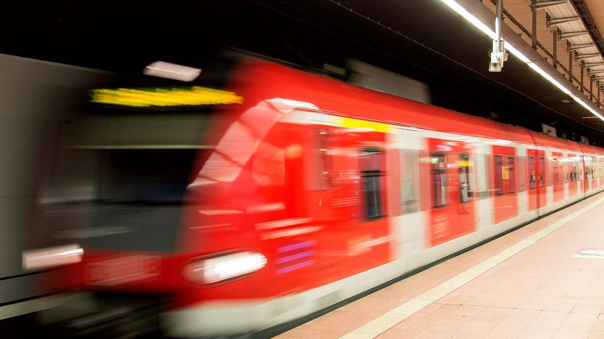
 Der S-Bahnverkehr in Stuttgart war am Montagmorgen gestört. (Symbolbild) Foto: dpa
Eine defekte Weiche am Stuttgarter Hauptbahnhof hat am Montagmorgen alle S-Bahnlinien aus dem Takt gebracht. Was bekannt ist.
]]]]]]]]>]]]]]]>]]]]>]]>
Am Montagmorgen hat den Reisenden und Pendlern eine defekte Weiche am Stuttgarter Hauptbahnhof zu schaffen gemacht.
Wie die S-Bahn Stuttgart auf ihrem X-Account berichtet, kam es dadurch zu Fahrtabweichungen auf allen Linien im innerstädtischen S-Bahnverkehr.
Gegen 9 Uhr war laut S-Bahn Stuttgart die Störung behoben.
Wie viele S-Bahnen welcher Linie aktuell verspätet sind oder ausfallen, zeigt unsere Tabelle. Wir werten dafür Echtzeitdaten aus, die Tabelle aktualisiert sich automatisch alle zehn Minuten. Klicken Sie auf eine der Linien, um Details zu erfahren:
Reisende und Pendler wurden gebeten, auf die Durchsagen und Anzeigen am Bahnsteig zu achten und die Fahrt rechtzeitig online zu prüfen.
]]]]]]]]>]]]]]]>]]]]>]]>
]]]]]]]]>]]]]]]>]]]]>]]>
Weitere Themen
.m-wrapper {
padding-bottom: 30px;
}
]]]]]]]]]]>]]]]]]]]>]]]]]]>]]]]>]]>
]]]]]]]]>]]]]]]>]]]]>]]>