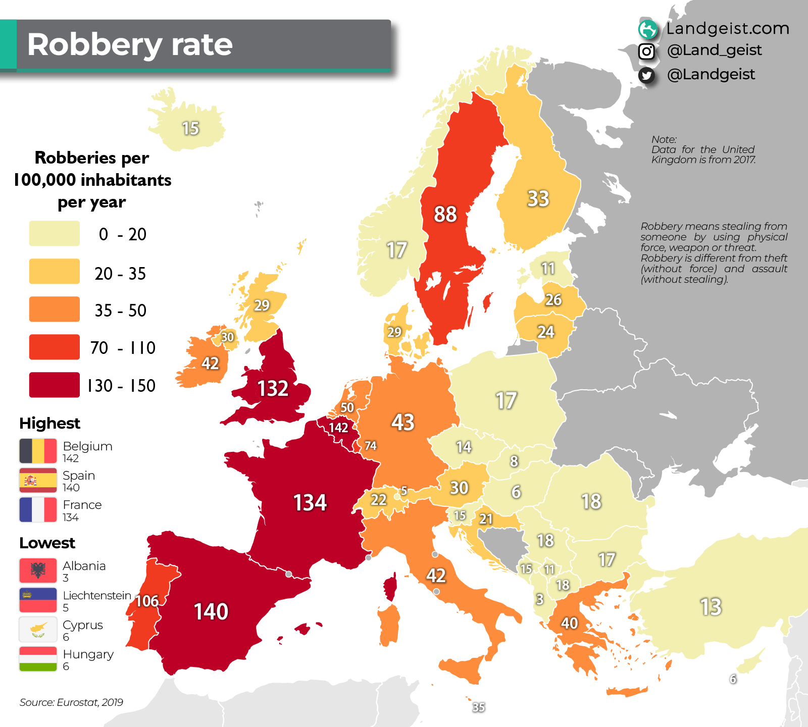
Show the murders or serious crimes statistics please
Madrid, Barcelona, Paris, London, Bruxelles. these cities are doing the heavy lifting
And that’s without even considering the government, which would need to be multiplied.
I wonder why :s
This graphic is deeply misleading: it does **not** show how dangerous a country is, but merely how often a very specific crime (*robbery with violence or threat*, as defined differently by each legal system) is reported. Presenting this as “risk” is statistical sleight of hand. Spain’s higher figure reflects broader legal definitions and a higher propensity to report crimes, not a society three times more dangerous than Italy’s. The map ignores severity, context, underreporting, urban concentration, and all other indicators of real personal safety—many of which place Spain among the safest countries in Europe. Framed this way, the chart doesn’t inform; it **distorts**, and its author should know better.
Link to source?
2019?
Esta estadística es de hace 7 años, gobernaba Rajoy y todo
Down to criminal syndicate migration, nothing more. UK is working hard on suppression and deportations.
Computer, show me the biggest foreign community in each country, their place of residence and the criminality index in those places.
Mucho amor enviado desde Bélgica tíos <3
It also highly depends on reporting rate and legal definitions of what robbery is, like in that “chateau vs castillo” map
Ahora es cuando dices “y porqué no vemos también la procedencia de los delincuentes”? porque tener datos siempre ayuda a hacer la foto correcta para abordar el problema, pero por algún motivo siempre se está en contra de mostrar la procedencia de los criminales…
14 comments
Highest recorded*
I highly doubt f. E. Albania being so low.
Show the murders or serious crimes statistics please
Madrid, Barcelona, Paris, London, Bruxelles. these cities are doing the heavy lifting
And that’s without even considering the government, which would need to be multiplied.
I wonder why :s
This graphic is deeply misleading: it does **not** show how dangerous a country is, but merely how often a very specific crime (*robbery with violence or threat*, as defined differently by each legal system) is reported. Presenting this as “risk” is statistical sleight of hand. Spain’s higher figure reflects broader legal definitions and a higher propensity to report crimes, not a society three times more dangerous than Italy’s. The map ignores severity, context, underreporting, urban concentration, and all other indicators of real personal safety—many of which place Spain among the safest countries in Europe. Framed this way, the chart doesn’t inform; it **distorts**, and its author should know better.
Link to source?
2019?
Esta estadística es de hace 7 años, gobernaba Rajoy y todo
Down to criminal syndicate migration, nothing more. UK is working hard on suppression and deportations.
Computer, show me the biggest foreign community in each country, their place of residence and the criminality index in those places.
Mucho amor enviado desde Bélgica tíos <3
It also highly depends on reporting rate and legal definitions of what robbery is, like in that “chateau vs castillo” map
Ahora es cuando dices “y porqué no vemos también la procedencia de los delincuentes”? porque tener datos siempre ayuda a hacer la foto correcta para abordar el problema, pero por algún motivo siempre se está en contra de mostrar la procedencia de los criminales…