Hey!
I’ve been tinkering with a small side project here in Riihimäki.
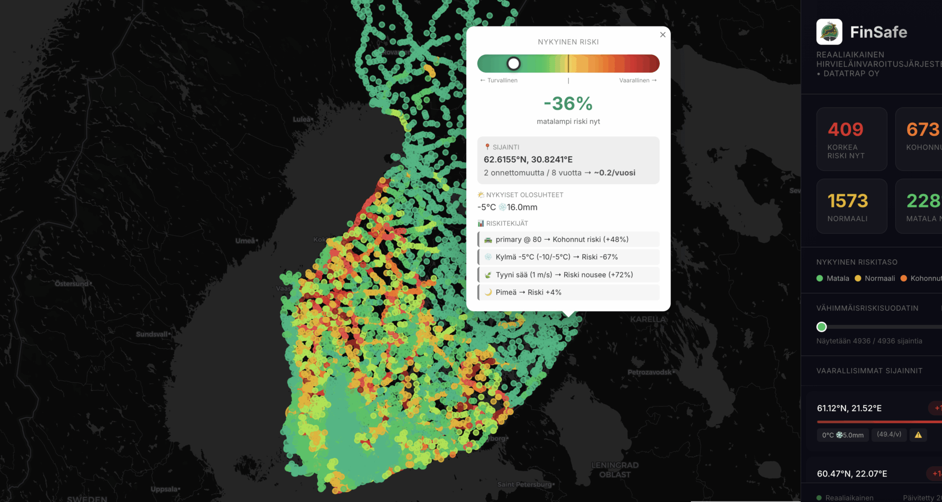
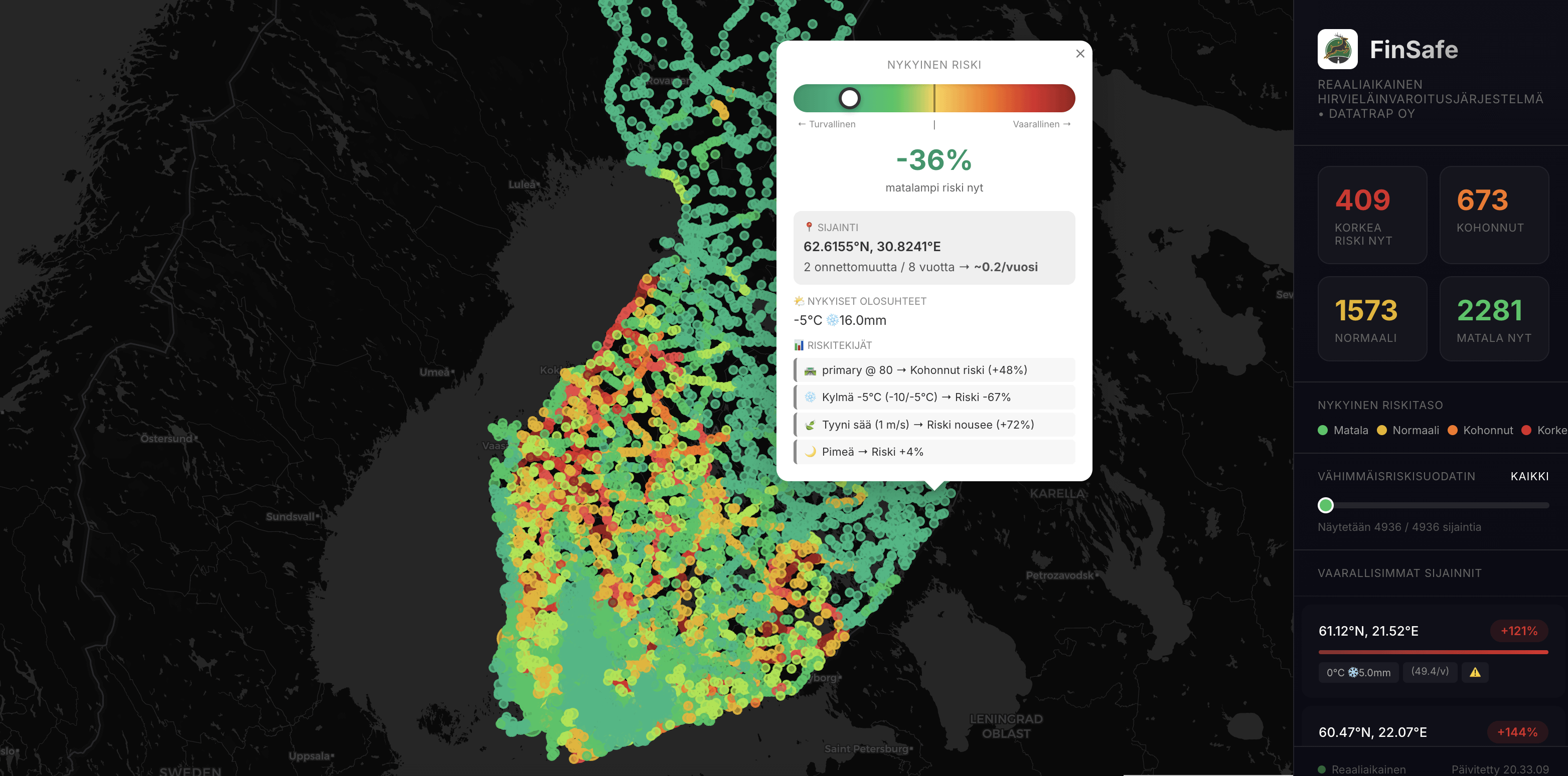
Basically, I’m trying to visualise when and where wildlife collision risk briefly spikes, not just where accidents happened historically.
After the feedback last time (about “why is everything red?” 😅), I reworked the colour scale so most of Finland stays normal/green unless something genuinely unusual is happening.This version now includes:
-traffic-normalized accident data
-live weather + daylight + snow condition
-10-minute risk shifts (only shows deviations, not absolute danger)
-more reasonable color thresholds
Here’s the updated map, does it look more readable now? Would this kind of thing make sense as a background alert in navigation apps, or is it still too noisy? Curious to hear what you think. I’m not trying to sell anything just trying to make it actually useful.
—
orhangazikaramanoglu