
For many interior designers, your living room feels like your home’s calling card — it’s one of the only places that many will see. A living room is often created in a way to ensure it makes a great first impression, even moreso than areas like an entryway, porch and front yard, or even exterior features.
At their best, living rooms are warm, welcoming, and laid out to support all the ways you work and live in the space. But what sets the tone for all of this? Your wall paint color.
“We all spend a lot of time in the living room either lounging, watching TV, or entertaining guests,” interior designer Antoinette Allande Anderson says. “Therefore, it should be a color that helps us relax, restore, and enjoy each other’s company. Nobody likes to hang out in a room with ugly wall colors.”
Subscribe to Apartment Therapy!
Unfortunately, though, it’s not always as simple as just picking your favorite hue. It’s key that your color choice communicates with other areas in the home. “Color is so important to contributing to how a space feels,” says designer Jennifer Carter of Studio Envie. “A living room, whether an open floor plan or not, often touches so many other rooms, so choosing a color that can coordinate with the color palettes of other rooms is important.”
So how do you zero in on the best color for a living room? I tapped five leading designers to learn the best color for living rooms. And not to scoop myself, but I was surprised to learn over half of them said the same exact shade, so read on for that and more color advice, including runners-up shades and foolproof color palettes.
 The Best Living Room Color
All the designers I spoke with had an opinion on the best color for a living room — but it’s good to remember that, regardless of your chosen color, your own selection should reflect how you spend time in the space.
“When designing your living room, you need the space to convey what type of activity occurs there. If you want people to get very cozy and comfortable, you may opt for a darker wall color,” says designer Emma Beryl, author of the upcoming book titled House Rules: 100 Ways to Feel at Home. “However, if the space is more formal, using a light paint color might be more appropriate. You need to choose the color to help achieve the desired feeling in the space.”
However, after interviewing five different designers, they all agreed that the best color for a living room is white.
It all comes down to white’s neutrality. Not all white paints are created equally, though, and designers seem to favor those with warmer undertones for this social space in the home. “I consistently gravitate toward warm whites because of their inviting, adaptable nature,” says designer Antonio DeLoatch, who works with New York Design Center.
“Unlike cool whites, warm whites offer a subtle softness that evolves beautifully with changing light, making a room feel cozy and expansive all at once. They serve as the perfect canvas for showcasing favorite art pieces, quirky collections, or statement rugs, striking a balance between a gallery-like feel and a warm embrace.”
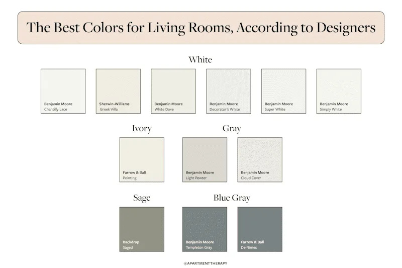
While all the surveyed designers agreed white was the best shade for a living room, they did have mixed reviews on specific colors — except for one. Three of the designers cited Benjamin Moore’s Chantilly Lace as their favorite warm white for living rooms. “This hue subtly warms up a room, making it feel cozy and inviting,” says designer Marina Hanisch, who also works with New York Design Center.
Hanisch also recommends Benjamin Moore’s Simply White and Benjamin Moore’s Super White, while Anderson has used the brand’s White Dove and Decorator’s White in previous projects. DeLoatch himself is personally fond of Sherwin-Williams’ Greek Villa.
White has earned its place as a designer favorite for reasons beyond its versatility. Beryl maintains that it’s a great practical choice to brighten up a dark room and a smart pick for someone still figuring out their interior style. “I believe that a living room is such a universal space — serving clients for so many different purposes day-to-day and as families grow — that a neutral color palette is best,” Carter adds.
“Neutral colors in living rooms provide a serene base for richer, deeper hues in upholstery, accent pillows, rugs, and art — some of which can be switched out seasonally.”
Before committing to any wall color, designer-approved or otherwise, it’s always a good idea to swatch your walls and look at those samples during different times of day to see how the shade will change in appearance, as fluctuating natural (and artificial) light levels factor into the equation. If you’re white feels a little too stark or boring, don’t worry. The designers also shared alternative living room colors for people who want a bit more drama or saturation.
Credit: Design: Apartment Therapy
5 Other Great Living Room Colors
While white was the designers’ top pick for a living room color, it’s understandable that this snowy shade might not work for every home. That’s why I asked designers to share their runners-up paint colors for living rooms.
 Ivory or Beige
If you still want a light and bright look but would appreciate a little bit more pigment and even more warmth, ivory or a light beige might be your best bet. DeLoatch loves Farrow & Ball’s Pointing, a creamy off-white, because of its classic ivory hue and warm undertones. “For a more organic feel, a creamy white color with a marble-like effect such as [Portola’s Brooks] instantly elevates a living room with beautiful texture and depth,” Hanisch explains of her runner-up color. “In a minimalistic living room, this color adds a layer of complexity without overwhelming the space, allowing other design elements to shine.”
 Gray
Gray
Gray is a timeless paint color choice for living rooms, probably because it’s a mix of white and black, and as such, tends to go with everything. So it’s no surprise Beryl and Carter also recommend this shade family. “We used the color Benjamin Moore’s Cloud Cover in a living room with southern-facing windows; it’s a really deep space, so we needed to bounce the light into the back of the space,” Beryl shares. “This was perfect, since it was light and bright but felt warm and cozy.”
Carter has used Benjamin Moore’s Light Pewter in the past, which, as her favorite gray, is the perfect balance between cool and warm. “[It’s] a warm neutral that is a great backdrop for both warm and cool color palettes,” she explains.
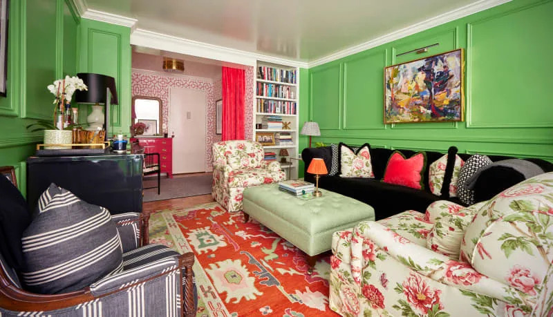 Green
Green
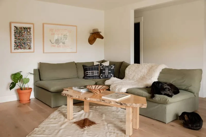
Looking for a richer color to paint your living room? Beryl suggests going with a green for a nature-inspired touch that can be surprisingly low-maintenance as compared to white. Looking for an exact hue here? Beryl used Backdrop’s Saged in a recent project. “It is a muted sage green, which was perfect for the space since we were bringing in a bunch of powerful jewel colors, and we wanted the walls to stay relatively neutral but not white, since it can be hard to maintain white walls with young children running around,” she says.
 Blue Gray
Blue paint has always been a crowd-pleaser. Designers rely on it as a great alternative to white for a living room where you want more saturation than a gray or beige can supply. Carter recommends two colors that are a perfect mix between blue and gray.
“For those color-loving clients, I love Benjamin Moore’s Templeton Gray, which is a deep color that has both green and blue undertones,” Carter shares. “Farrow & Ball’s De Nimes is also a beautiful blue-gray that is a wonderful background color to a cozy space.”
The Best Living Room Color Palettes
Now that you know what shade families our designers think are best for living rooms, it’s time to see them in action so you can pick your supporting cast of furnishings and accessories. It can be overwhelming to paint a room and then figure out what colors, like those found in your textiles, decor, and artwork, will work well with the wall paint — so we’ve got you covered with some inspiration.
 Neutrals With Bold Colors
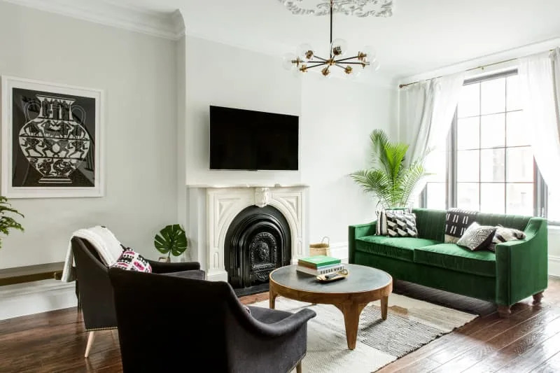
Several of the designers mentioned how warm whites provide the best backdrop to allow a mix of other colors, whether it’s in artwork or furniture, to shine without feeling chaotic. Beryl goes as far to say you can “incorporate almost any color into the space” with a white backdrop. Anderson’s personal number one pairing? “My favorite color combination is a mix of warm neutrals, a sapphire blue, blush or peachy tones, and a little bit of black,” she shares.
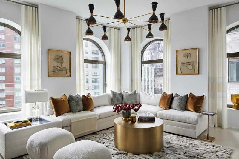
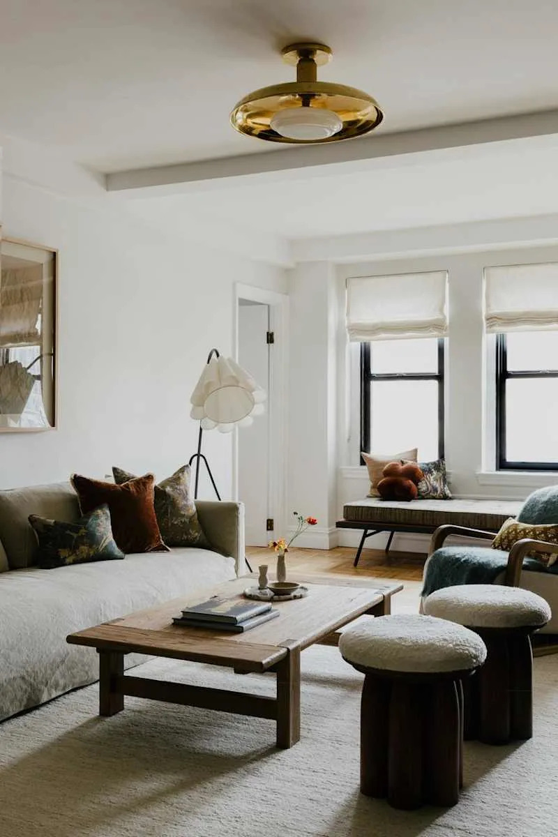 Create Tranquility With Neutral Creams, Taupes, and Browns
“Warm hues, such as cream, taupe, and browns, paired with mellow textures and metals, create a calming environment when set against these white shades,” Hanisch explains. “Additionally, I love incorporating pops of deeper-toned hues such as graphite to create a visually appealing contrast.”
 White with Earth Tones Like Deep Green or Terracotta
If you’re looking to create a living room that feels “inviting, layered, and full of character,” DeLoatch recommends pairing a warm white with earth tones (think: a deep green or terracotta) and metals like antique brass or gold.
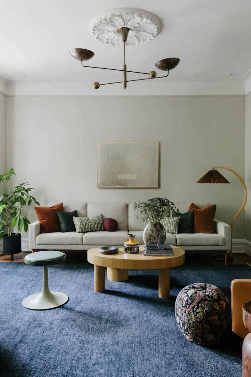
 White with Rich Jewel Tones Like Plum and Dark Green
“We are really gravitating toward rich, warm colors in pillows, drapery, and upholstery,” Carter explains. “Dark greens, plums, warm woods, and golds pair so nicely with a soft, warm neutral and by painting the walls a lighter hue, it allows us to layer these rich, darker colors without weighing down the room.”
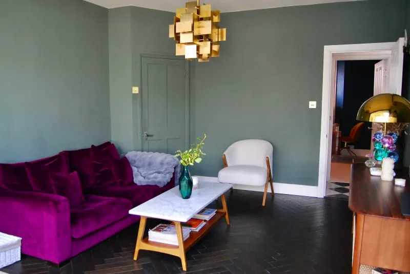 Green Adds Drama and Coziness to a Room
In this London living room, Farrow & Ball’s Green Smoke provides a deep rich wall color while also letting the jewel-toned purple couch stand out. It feels cozy and exciting all at once.
Further Reading
Create Your Own Interior Design Mood Board | Apartment Therapy
11 Beautiful Hanukkah Decor Finds to Make All 8 Nights Sparkle