Color is one design element that can be the most intimidating to apply in your home. But although it’s high risk, it sure offers a high reward. When you find the perfect palette that suits the space and aligns with your personal style and current trends, everything else falls into place.
Interior designers have an eye for color combos, and they also happen to have a great pulse on what’s trending. We asked three of them to share which color palettes they’ll be using the most in their 2026 designs, and they welcome you to copy them.
-
Patti Woods is the principal designer at Patti Woods Interiors in Birmingham, Alabama.
-
Darlene Molnar is an interior designer based in Virginia.
-
Joy Lynskey is the founder and CEO of Jewel Toned Interiors in Florida.
Credit:
JAMES RANSOM; STYLING: Veronica Olson
Blue and Yellow
Designer Sarlene Molnar is currently obsessing over one complementary color duo, and that’s blue and yellow. These contrasting colors appear more vibrant when viewed side by side versus alone.
“I’m excited to work some unexpected pops of color into my 2026 projects,” she says. “For example, I am planning on doing a bright sunny yellow pocket door in a dark blue kitchen.”
When working with blue and yellow paint, the key is to select versions that don’t compete too much in intensity. So if you’re going with a saturated yellow, opt for a darker, muted blue.
You can also play with this color trend through patterns and textiles in your home. Since blue and yellow play so well together, it’s a relatively easy color combo to find on wallpaper, drapes, and art.
Black and White
In 2026, designer Joy Lynskey is going back to basics with black and white. Lately, she’s really been loving this color combo for kitchens. “A black and white color palette is a proven choice for a kitchen,” she says. “It offers a timeless foundation that can set the stage for family memories through the seasons. It never goes out of style and delivers a crowd-pleasing look for resale.”
One of her favorite ways to apply black and white in a kitchen is via marble countertops. White and black marble complements most wood-toned or painted cabinets. If you want more drama in your kitchen, opt for predominantly black marble with white veining. If crisp and inviting is the look you’re going for, she says to stick with white marble with subtle black veining.
If you’re worried that black and white will feel a bit too cold, Lynskey says to offset the look with elements from nature, like warm wood tones and botanicals.
Alison Gootee; Styling: Page Mullins.
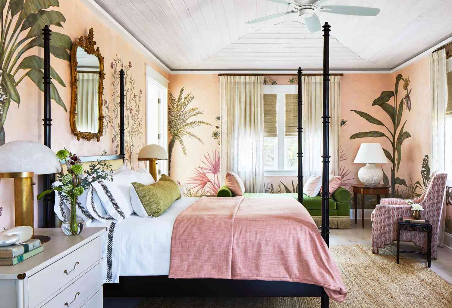
Blush and Forest Green
Another color palette that Molnar will be using quite a bit in 2026 draws inspiration from a rose.
“I love the way forest green anchors blush in a room,” she says. “Just imagine a blush-patterned lampshade next to a forest green sofa.”
A true blush is a more muted and refined take on pink, and its warm beige undertones really bring out the yellow ones in green. This keeps the overall color palette leaning warm and cheerful.
Credit: Photo: Hector Manuel Sanchez; Styling: Buffy Hargett Miller
Warm Earth Tones
Designer Patti Woods is looking at nature’s color palette in her upcoming projects. You’ll find lots of muted and calming colors in her 2026 designs.
“Our go-to palette for 2026 is warm earth tones,” she says. “Think colors like rich browns, warm whites, terracotta, and varying shades of olive and ochre.”
She’s currently in the process of updating a kitchen with warm neutrals, but she’s not straying away from color entirely. The cabinets show off a buttercream tone, which is a color that she believes is positioned to keep trending in the coming years.
Powder Blue and Burgundy
Powder blue sometimes gets a bad rep for being associated with a juvenile baby blue, but one way to give it a more grown-up and sophisticated appearance is by pairing it with a bold and serious color. That’s why burgundy is a great color pairing for it, and this color combo is one that has been inspiring Molnar as of late.
“Powder blue throw pillows on burgundy upholstery is currently in one of my design plans, and I am tying the two contrasting tones together with a vintage rug,” she says.