When Apple introduced the Apple Watch Ultra, it broke a rhythm that had been carefully refined for years. The familiar Watch silhouette, elegant and compact, gave way to something larger, heavier, and unapologetically functional. This was not a refinement. It was a pivot.
Apple treated the Ultra as a separate statement rather than a variation. It was designed from the outside in, with the understanding that performance, endurance, and reliability demand physical space.
A Different Approach to Design
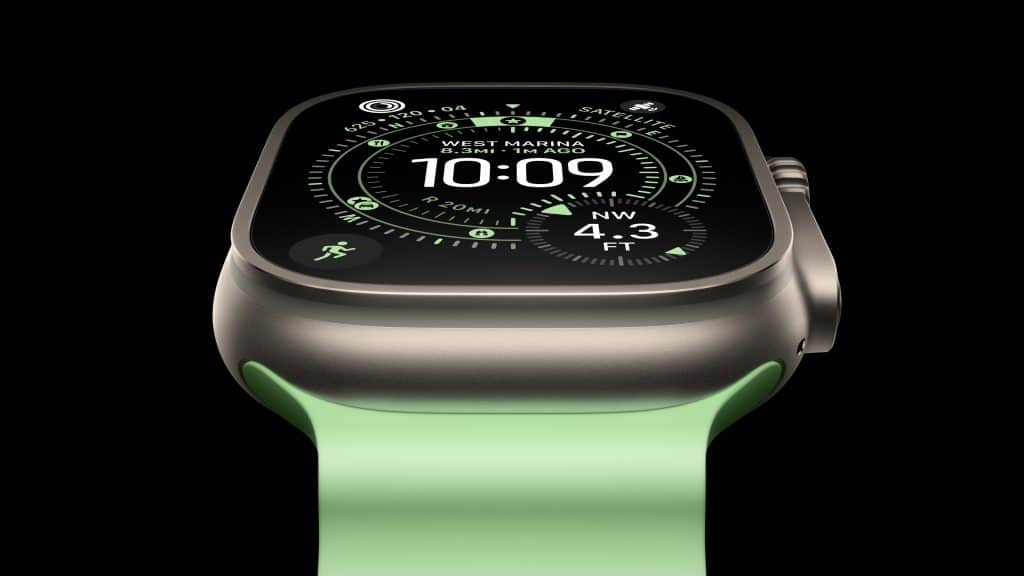
The Ultra’s case immediately sets it apart. Titanium replaces polish with purpose. The flatter sapphire crystal, raised edges, and visible crown guards communicate durability before the screen even lights up. This design is not about disappearing on the wrist. It is about presence.
Apple leaned into a tool-like aesthetic, prioritizing grip, visibility, and protection. Buttons are larger. The Digital Crown is easier to operate with gloves or wet hands. The Action button adds a physical layer of control that feels deliberate and fast.
The result is a Watch that looks and feels built for demanding environments, not just daily notifications.
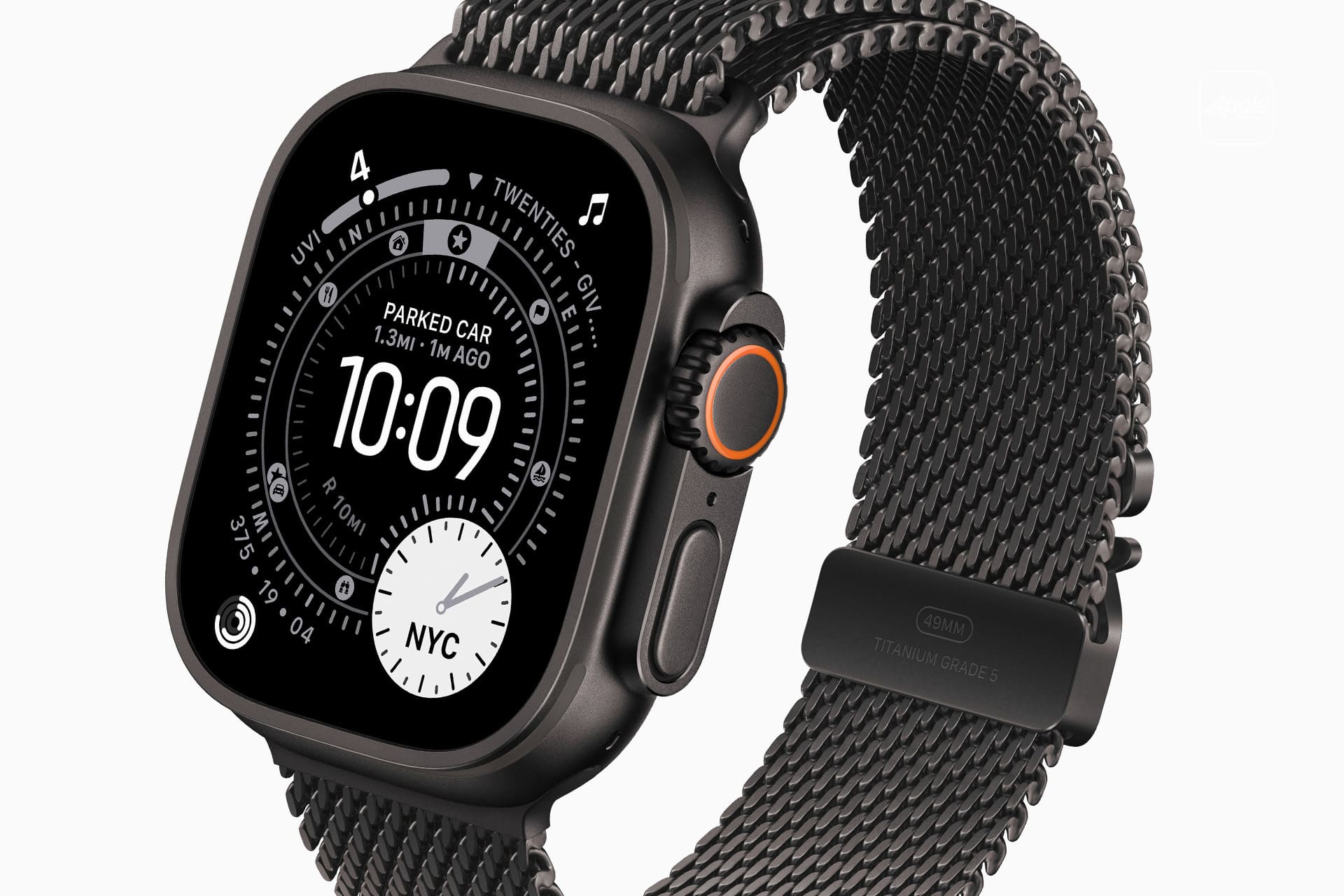
Image Credit: Apple Inc.
Space as a Feature
The most important change with the Ultra is invisible. The larger case creates room for a significantly bigger battery, enabling longer use across workouts, outdoor activities, and multi-day wear. That space also allows Apple to integrate more advanced components without compromise.
Dual-frequency GPS improves precision in dense cities and remote terrain. A depth gauge and water temperature sensor extend the Watch into scuba diving territory. The louder speaker improves safety and communication outdoors. These are not software tricks. They are hardware-driven gains made possible by size.
In this case, bulk becomes an advantage rather than a tradeoff.
From Extreme Use to Everyday Appeal
The Apple Watch Ultra was introduced with climbers, divers, and endurance athletes in mind. But its appeal quickly expanded beyond those boundaries. The bold design carries a visual language associated with strength, preparedness, and active living.
Worn daily, it signals a preference for capability over discretion. The Ultra does not try to blend in, and that confidence has become part of its appeal. It feels equally at home on a trail, in a gym, or paired with casual everyday wear.
That shift transformed the Ultra into something more than a specialized device.
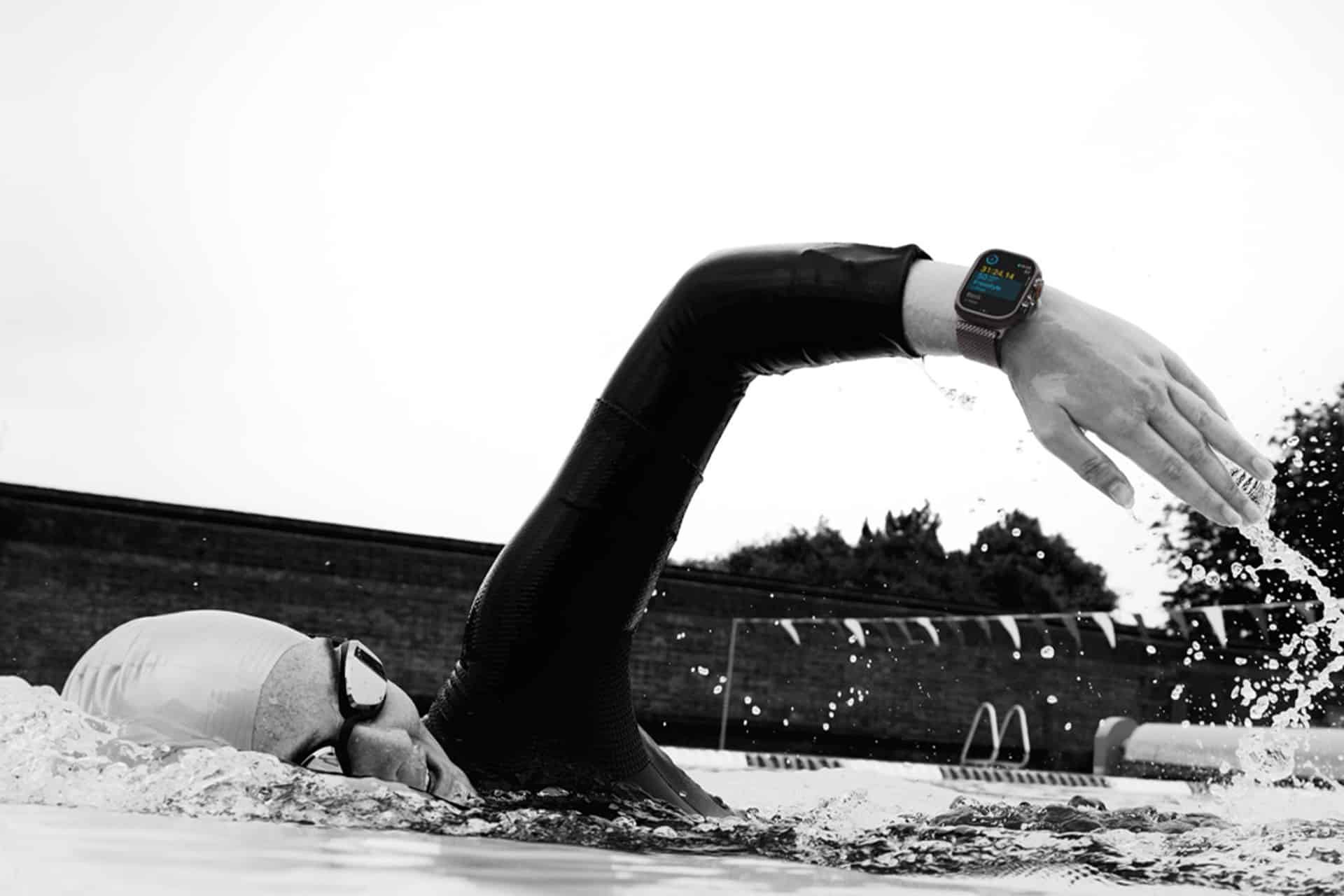
Image Credit: Apple Inc.
Health, Safety, and Control
Despite its rugged exterior, the Ultra remains deeply aligned with Apple’s health focus. Heart tracking, blood oxygen, sleep analysis, temperature sensing, and emergency features continue to operate quietly in the background.
What changes is accessibility. The Action button allows instant access to workouts, waypoints, or safety tools. The brighter display improves visibility in harsh light. The overall experience feels more direct, less dependent on menus, and more responsive in real-world conditions.
The Watch feels ready before it is asked to be.
A Design Philosophy That Spread
The success of the Apple Watch Ultra appears to have influenced Apple beyond the Watch lineup. The iPhone 17 Pro introduced a noticeable shift in exterior design, favoring stronger lines, bolder materials, and a more assertive physical presence.
While serving a different purpose, the iPhone 17 Pro reflects a similar idea: that performance-focused users are willing to embrace a more pronounced design when it delivers real benefits. In both cases, Apple chose to move away from universal minimalism and toward differentiated products with clear intent.
The Ultra demonstrated that breaking from tradition, when done with purpose, can strengthen a product’s identity rather than dilute it.