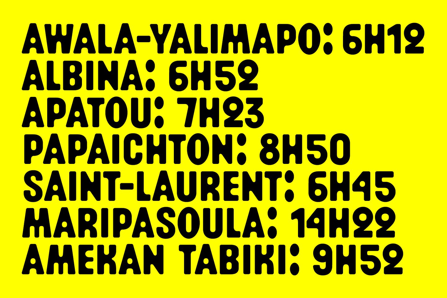
Two core concepts define the type designer Arthur Calame’s practice. One, always creating unique tools for each project , and two taking influence for his work from wider culture, things “that everyone can experience in their daily lives, whether they are typographers or not”. The designer, who studied typeface design at Brussels’ visuals arts university La Cambre, now has a series of typefaces under his belt that are testament to this two pronged approach.
Take Maroni, for instance, a typeface created for the Marronnage exhibition shown at Paris’ Maison de l’Amérique latine in 2022. The custom design was inspired by a “slightly clumsy design,” Arthur says. Its edges are webbed and each letter bleeds into one another, and it was applied onto exhibition material with meandering curves, granting the lettering an added organic feel. Arthur is drawn to design that feels human and imperfect, “which feels even more important in our age of hyper-digitisation”, he says.
Arthur’s Bobine typeface is inspired by the LED display on train screens. Dotted with pixels, it’s a build up of functional letters with characterful curves. Arthur likes to see “letters and textual objects as soft material to be sculpted, like clay” and views the role of a type designer as a one of a craftsman.
Like Maroni’s lettering, Arthur’s many disciplines (professional and non-professional) bleed into one another, as he moves between wood carving, cooking, and baking to feed his design handiwork. Allowing his hobbies to flourish in their own right “allow[s] you to always come back to type with a fresh, and sometimes childlike eye,” Arthur ends.
