AD100 designers chip on the best ways to bathe your space in the colour of the year, proving that off-white interiors need not boring.
When Minimal was announce the Pantone Colour of the Year for 2026, the design world didn’t receive another bold directive to drench homes in a single shade. Instead, it was handed something more nuanced: an invitation to reconsider off-white not as a default neutral, but as a material with depth. To understand what that looks like in practice, we spoke to AD100 designers about how they’re using off-white today, from texture and light to scale and restraint.
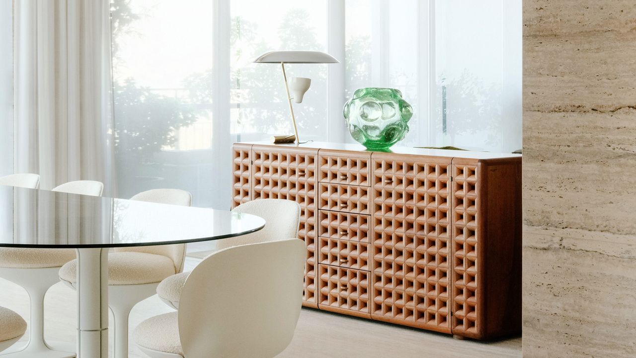
Think of Off-White as a Material, Not Just a Colour
%20-%20SUFFREN%20-%20PARIS%20(COPYRIGHT%20CARL%20GERGES%20ARCHITECTS)%202.jpg)
AMBROISE TEZENAS
The distinction matters. Paint is flat, passive, a backdrop. But when off-white reads as stone, plaster or linen, it becomes an active participant in a room’s atmosphere. This shift, from colour to material, is where the real potential lies.
“Off-white is a colour found in nature through stone, light woods, pale plaster, limewash and in the way daylight settles on mineral surfaces,” says Lebanese designer and architect Carl Gerges. “Across Mediterranean and Middle Eastern architecture, these tones have long been used for their sustainability, durability, and ability to age gracefully.”
The key is to think beyond the paint swatch. Consider what the shade looks like when it’s embodied in raw linen that catches light differently at every angle, or in unlacquered wood that reveals its grain through tonal variation. These materials carry memory and texture in ways that paint, no matter how expertly applied, simply cannot replicate.
%20-%20ABDEL%20WAHAB%20-%20BEIRUT%20(COPYRIGHT%20CARL%20GERGES%20ARCHITECTS)%204.jpg)