“It really gained traction during the broader shift back towards maximalism a few years ago,” says Natale. “People began embracing colour again, but in a more nuanced, contemporary way, and pink naturally became part of that conversation. Rather than feeling overtly feminine or juvenile, softer, more muted shades like millennial pink are modern, flattering and surprisingly versatile.”
These days, it can be found in almost any room in the house, from bedrooms and living spaces to kitchens and bathrooms, with soft pink tiles, cabinetry and soft furnishings now readily available.
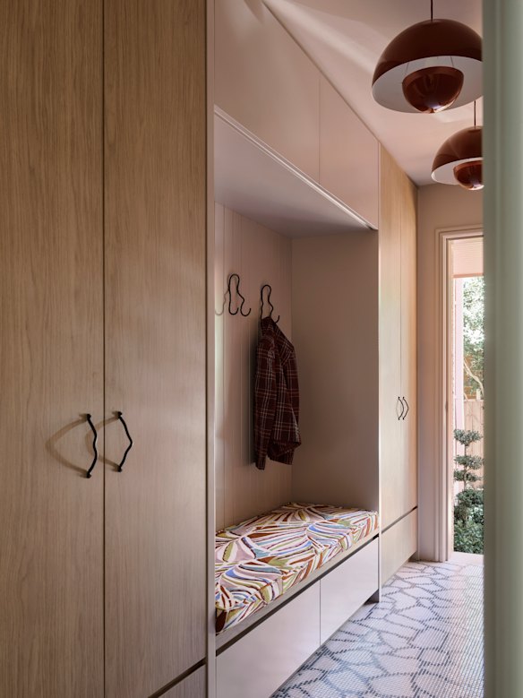
Teamed with warm timbers and black detailing, soft pink cabinetry and floor tiles in this Sydney home designed by Greg Natale created an inviting entry.Credit: Anson Smart
Natale says its appeal is unsurprising given the sense of warmth and quiet comfort it embodies.
“It brings a youthful, almost sunset-like glow to a space,” he says. “There’s something inherently joyful about it, like cotton candy or sherbet. It’s hard to have a bad time in a pink space.
“It has an uplifting quality that makes a room feel more alive.”
Its enduring presence can also be attributed to its adaptability, says Fleming, as it pairs well with changing palettes over the past 20 years.
It’s hard to have a bad time in a pink space, says Greg Natale. He designed this charming entry in soft pink tones to this Sydney home.Credit: Anson Smart
“Back in 2016, millennial pink was often paired with sage greens, white, and lots of texture,” he says. “Today, it’s sitting more comfortably alongside chocolates, olives, and dirtier, dustier tones that soften it and give it more depth. When paired with darker accents like charcoal, espresso, or deep green, it becomes sophisticated and architectural rather than sweet.”
As a result, Fleming says it has transcended trends, becoming synonymous with the human desire for comfort.
“Millennial pink never really went away, it simply evolved. Its longevity reflects a desire for interiors that feel comforting, lived-in, and emotionally supportive,” he says. “In that sense, millennial pink has become one of the defining, enduring colours of the last decade, not because it was loud, but because it adapted.”
Loading
While millennial pink is considered a contemporary colour, colour and design manager at Dulux, Lauren Treloar, says it also represents a nod to the past, a source of comfort for many in turbulent times.
“The popularity of millennial pink reflects broader societal themes, particularly our collective desire for comfort and security during uncertain times,” Treloar says. “This muted blush tone taps into a soft, warm nostalgia, yet does so with a grown-up, design-savvy sensibility that feels unmistakably modern. [It] evokes a sense of safety and calm, offering an emotional refuge as people seek comfort and stability within their homes.”
Treloar says the colour was ideal for colour drenching – a technique where walls, trims and ceilings are painted the same hue – but it can also be added in smaller doses.
“It works particularly well through textiles and soft furnishings, cushions, throws, or an accent chair, where it adds warmth without overwhelming a space,” says Fleming.
But there are limits, says Treloar.
“Any colour can be overdone if it’s done without intention [but] thoughtful integration with varied tones and textures can prevent potential overindulgence.”