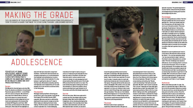
The colourists of four recent standout TV and film productions – Adolescence, Black Bag, Ballerina and Gangs of London S3 – explain what it took to create a grade that made the story shine through. Jon Creamer reports
For Netflix’s hit drama, Adolescence, Harbor’s senior colourist, Dan Moran, worked closely with production to complete the grade made complex by the project’s famed one-shot production process.
Phil [Barantini, director] grew up loving ‘80s films, the dreamy combination of anamorphic Panavision glass and 35mm – a world filled with rich colours and grain. We wanted to stay away from desaturated or harsh, so built initial ideas on a classic film print. Film emulations can be subjective, but our main look was based on the tonal profile of Kodak 5219 Negative and Vision 2383 print stock, and we leaned into the warmer white point. We rolled off the highlights to deal with the lack of dynamic range from the Ronin. I had the film stock emulation as isolated components, so I could manipulate that highlight and look behaviour to serve the creative needs of each episode. I’m a big believer in getting the show LUT close to the final look. We tested constantly starting with Episode 3 and tweaked the LUT for each episode so on-set monitors could look close to the final grade.
Share this story
Share Televisual stories within your social media posts.
Be inclusive: Televisual.com is open access without the need to register.
Anyone and everyone can access this post with minimum fuss.