Be sure to cast your votes in the poll below; but first, let’s check out the box art designs themselves.
North America / Europe
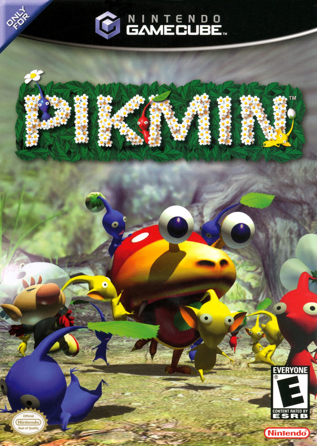 Image: Nintendo / Launchbox
This is a classic cover design, right? It just perfectly encapsulates the gameplay of Pikmin. It showcases Captain Olimar chucking his Pikmin toward a giant Bulborb, while others are seemingly fleeing in fear. It’s Pikmin! This is the gameplay, through and through. And are there really any Pikmin enemies as iconic as the Bulborb? We think not.
Japan
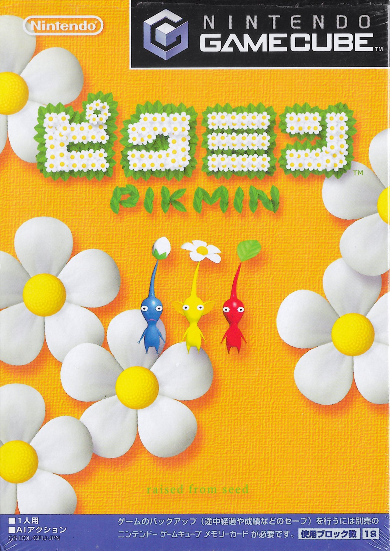 Image: Nintendo / Launchbox
Japan’s design, like many similar first-party releases from back in the day, is a bit more abstract in its approach. It displays the three main Pikmin in the centre: blue, yellow, and red. Meanwhile, the background is a yellowy-orange colour with a curous texture to it, while flowers take up some of the empty space. We love the logo design here, and that little ‘raised from seed’ sub-title at the bottom is adorable in its simplicity.
Which region got the best Pikmin box art? (1,503 votes)
North America / Europe74%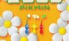
Japan26%
Thanks for voting! We’ll see you next time for another round of Box Art Brawl.
- Related Games
- See Also