![]()
While AI’s chatbot UI and prompt-based nature showcases the natural-language prowess of LLMs, I think a text field is daunting for most people. I see last year’s Pixel 9 Pro as very much belonging to that initial wave of AI features where LLM capabilities are something you seek out by opening an app. In 12 months, Google has more naturally integrated AI into the core Pixel 10 Pro experience.
This is our software and AI-focused review of the Pixel 10 Pro. For more on the camera and other hardware, stay tuned for our Pixel 10 Pro XL later this week.
Hardware
This past year, my daily driver situation strayed from the norm. I stopped using the Pixel 9 Pro after eight months and have been all-in with the Pixel 9a for the past four months. The takeaway is that I don’t need everything a flagship phone offers. The mid-range model more than sufficed.
In going back to a (Pixel 10) Pro this past week, the hardware upgrades are noticeable and nice, but not mandatory. It’s akin to buying the luxury option.
Advertisement – scroll for more content
For starters, the minimal bezel feels premium and heightens the “floating window” effect. The screen brightness boost to 3,300 nits is also appreciated – one can never have enough when outdoors in direct sunlight. The accuracy of the optical fingerprint sensor on the Pixel 9a never annoyed me, but the white flash sure did. Ultrasonic is the way to go and that’s been a welcome change going back to a Pro.
I’ve mostly made my peace with Google’s belief that a premium design requires more staid colors and a polished frame. As someone who went from the gray (fine, “Hazel”) 9 Pro to the Iris 9a, I can say that this Moonstone 10 Pro feels like a regression. It once again feels like a shade of gray, especially when there’s not much light. This vaguely blue-tinted blue is not as fun, and I value a little bit of whimsy from what’s likely the object I most interact with every day. At least the cool feel of the glass back panel is premium-feeling and conveys a sense of rigidity.
![]()
The color can be a non-factor in the grand scheme, but the shiny frame certainly isn’t. It will never not be a fingerprint magnet as somebody that goes case-less. The smudges that build up feel grimy. Anything and everything is attracted to it, necessitating more frequent cleanings than other devices. This is a prime example of negatively valuing form over function, and feeling like the Pro model needs something premium/jewelry-esque when the base design is more practical.
One small visual change that I appreciate is how the bottom edge is now symmetrical. When looking at the screen, the left grill is the speaker and the right one masks a microphone. It’s cleaner this way, with Google moving the SIM card slot to the top outside the US. Personally, I’ve stuck to physical SIMs until this launch because it’s just faster.
I’ve thoroughly enjoyed not having to wipe the dust, pocket lint, etc. that collects on the raised Camera Bar, but that annoyance has unfortunately returned.
Compared to the 9a, the Pixel 10 Pro’s haptics are remarkably strong in Gboard. I’m certainly in the minority, but I applaud Google keeping the thermometer for three generations now. It’s convenient when you’re away, though my usual is mostly in the winter months.
![]()
Here’s a rather formulaic observation after five generations of Tensor: Each Google chip is better than the last one. However, what should be clear at this point is that Google’s definition of “better” prioritizes AI above anything else.
There will be traditional gains every year, like Tensor G5’s CPU being 34% faster — an improvement that’s not really noticeable in day-to-day usage, but what Google really cares about is making possible more on-device generative AI.
So far, it feels like any improvements made by the move to TSMC and the latest 3nm process have predominately been used for AI rather than those traditional improvements or even battery. This highly anticipated switch does not vault Tensor to the leaderboards that those with performance-based complaints, like mobile gamers, care about. That being said, Google met the threshold for performance ages ago and Tensor is good for the vast majority of people, myself included.
In terms of Google’s priorities, Gemini Nano is 2.6x faster and 2x more efficient for Pixel Recorder and Screenshots, while the TPU is 60% more powerful. One improvement I was looking for was never seeing “processing paused” in Screenshots. Again, I haven’t used the app daily for the past four months, but that so far looks to be unchanged.
A smartphone is more than its chip, but Tensor does not exist in a vacuum. It does feel like the really good Android competition will force Google to put traditional performance gains on its roadmap sooner rather than later.
![]()
Meanwhile, our recommendation is to opt for the 256 GB model or higher to get the speed and efficiency benefits of UFS 4.0. It should have been standard on the smaller capacity after all this time, with device longevity being as important a reason as performance. At the very least, a “Pro” should have that specification.
I realize I’m a power unicorn in that I predominantly change my phone once per day. It’s placed on the 2nd-gen Pixel Stand, which I’ve been using since launch, before I go to sleep and that’s it. The Pixelsnap Charger with Stand has replaced the 2021 accessory, and it’s been straightforward enough. My one hang-up that I’m still adjusting to is how I can no longer just grab-and-go. Rather, it’s a very conscious angled pull due to the magnets.
Meanwhile, I feel that Stand owners will find the 1-meter cable too short, with Google absolutely needing to make a 2-meter version.
I would have liked it if Google made a true 3rd-gen Pixel Stand because a fan (and standalone cable) always provides peace of mind during hot summer nights and the occasions where a fast wireless top-up is needed. By the time my 10 Pro reached 100% after two hours on Pixelsnap in an 81-degree (27.2 C) room, it was consistently north of 105 degrees (40.5 C) according to the built-in Settings app utility, or just within the boundaries of “Normal.” I never had these issues with my old Pixel Stand.
My normal schedule as of late sees me use my phone for 15-16 hours after taking it off the charger in the morning. With 3.5-4 hours of screen time, I end the day with over 30% of battery life on the Pixel 10 Pro.
![]()
We’ll have more to say about the camera in the coming days, but there are a few things to highlight. Pro Res Zoom is a worthy next-generation successor to Super Res Zoom that kicks in at 30x. It’s the ultimate tourist camera. You might have one shot at a photo and a blurry mess is not something that you’ll be happy with when looking back.
There is an element of “is it me or the AI” that took this photo, but it is ultimately a way to preserve something by helping out a small smartphone camera sensor using software. The added details are less pronounced than on other phones, but it gives you the confidence that you’re covered no matter where you’re taking photos. Does it matter if AI has sharpened it up or improved? I am really not sure.
Meanwhile, you should absolutely play with zoom in-between the 30x and 100x, with that middle ground providing something that’s surprisingly usable.
10x vs. 100x

Meanwhile, the Pixel Camera app now shows 10x zoom alongside 0.5, 1, 2, and 5x above the shutter button. With the 10 Pro featuring improved optical image stabilization, those 10x shots are noticeably sharper and more usable than last year. It has quickly become my default zoom range.
9 Pro vs. 10 Pro


Camera Coach is something I’d use if I had more time to snap a photo. Fortunately, you can turn off the button in the top-right corner.
Software
Operating systems and their apps should get visual updates every so often to stay fresh.
On the Android (16 QPR1) front, Material 3 Expressive does very well. Customizable Quick Settings with the option for smaller Tiles meaningfully reduces the need to swipe to another page. I doubt most people will have more than two at this point, while being able to see up to eight Tiles with the notifications shade might mean you don’t need to expand Quick Settings as often.
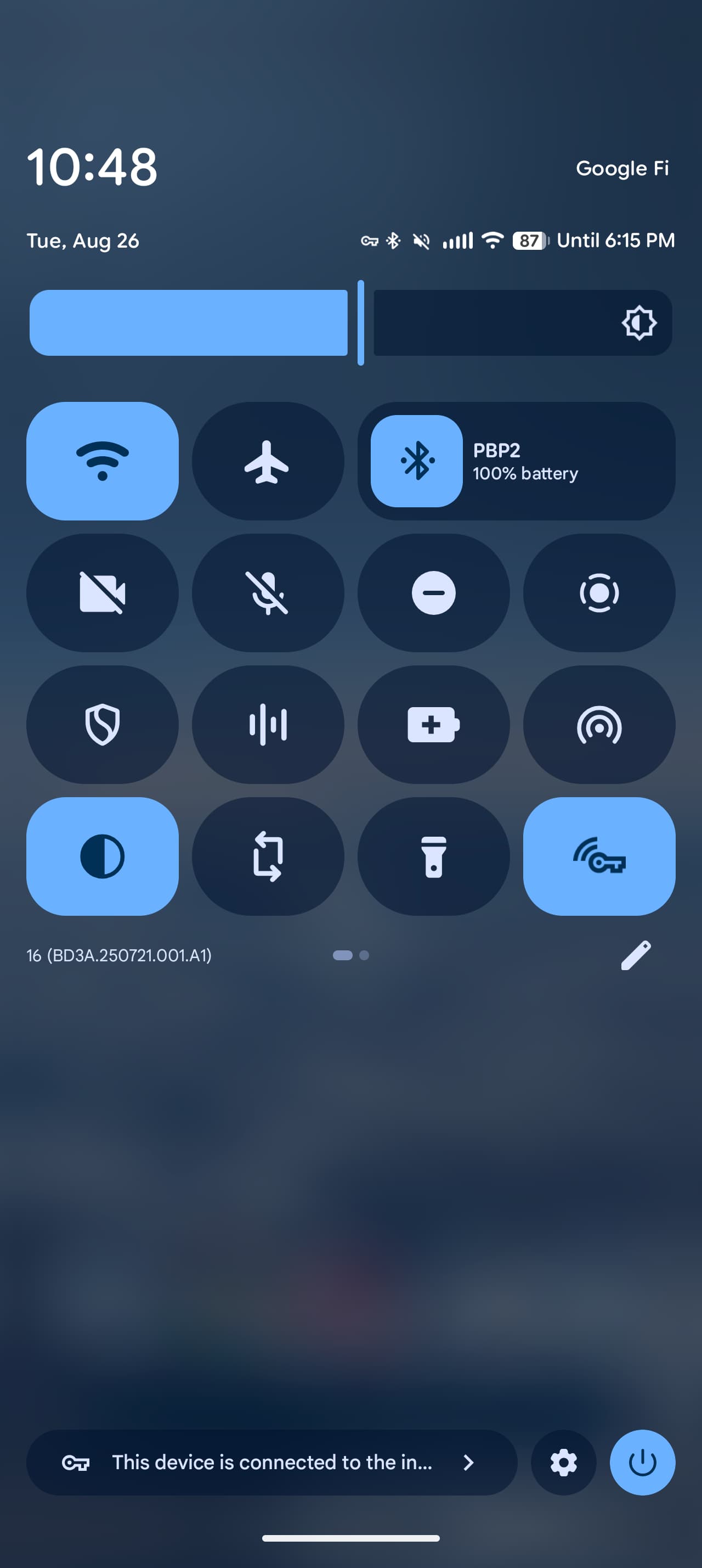
For me, that functional update has greatly made using my phone more efficient, while I greatly appreciate the consistency that a full redesign brings. After major Android redesigns, Google updates various parts of the interface in a piecemeal manner. That results in some inconsistent UIs, like how, as of Android 16’s June release, there are three different slider designs for volume:
What you get when you use the volume rocker is different from the slide-up panel and Settings > Sound & vibration. Material 3 Expressive brings a consistent design that’s also shared with the brightness slider:
People will appreciate that the Pixel Launcher allows for one more line of apps, while Live Effects results in fun lockscreen wallpaper customization. The Pixel 10 Pro allows you to see your background on the always-on display. It’s a bit too busy for me and it’s like there’s a screen smudge with my wallpaper, but I’m sure most will like the persistence.
Meanwhile, yes, Google for some reason made the gesture navigation area around the actual bar on the Pixel 10 series noticeably taller (9 Pro vs. 10 Pro below).
In all, Android feels modern and consistent on the Pixel 10 Pro. It’s a good foundation for what’s to come (AI).
![]()
![]()
However, the app side of Material 3 Expressive is more of a mixed bag. I think 5-10 years is the right timeframe for design language updates. Material (3) You is only four years old. In many ways, M3 Expressive can be thought of as Material 3.5 and a mid-cycle refresh for app designs.
I’d say the biggest aspect of M3E is the use of containers to group together information and common actions, as well as make obvious what can be tapped. I agree with the principle, but do think it makes for unnecessarily cluttered interfaces with too many full-width containers for list views. I wouldn’t mind if containers were used more sparingly.
Some decisions like circles becoming rounded squares and going from tall to short bottom bars feel like rearranging deck chairs, especially when components like search bars are becoming universally bigger.
![]()
Of the apps I use daily, few feel significantly more “expressive” than before. The exceptions are the new Google Photos upload header and the animated carousel in Files by Google that also functionally benefits by providing larger previews. Otherwise, apps look different but layouts are mostly unchanged — Phone by Google aside — and there’s not much more motion. If animation is not actually the be-all and end-all of M3 Expressive, Google — for the third design language in a row — should really tone down the initial teaser videos showing hypothetical apps.
As of the retail launch, most apps should have Material 3 Expressive, but there are some stragglers that Google should have really pushed harder to update. That’s hopefully resolved by Android 16 QPR1’s public launch.
AI
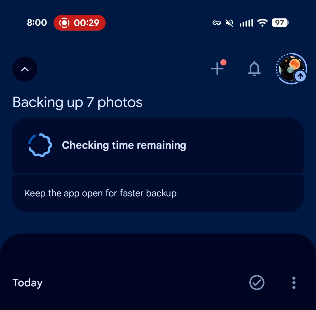
For the most part, using the AI features introduced last year required opening Pixel Screenshots or Studio. My usage of the latter app was quite minimal, with stickers being the primary appeal that only ticked up when it was integrated into Gboard this June.
Meanwhile, my ability to switch to the Pixel 9a is somewhat an indictment of the Screenshots app not having enough utility or stickiness. For the past four months, I turned to Google Photos search and bluntly used favoriting to keep track of things I want to return to. Being able to make collections and tagging captures immediately from the corner preview is so much better.
On the Pixel 10 Pro, AI’s utility is no longer locked inside an app, and that increases the likelihood of you using it is an appreciable difference.
![]()
![]()
Speaking of the corner screenshot UI, tapping the edit pencil brings up a new experience powered by Pixel Studio. It has all the same tools as Markup (crop, caption, draw, and highlight) with AI tools like generating stickers, erasing objects, and prompt-based additions. I’m now finding myself trying these gen AI much more, even though most of this functionality has been present for the past year. (You can also access this editor by opening an image in Pixel Studio or using the system share sheet target.)
Magic Cue is AI done right. It’s contextually aware of what you’re doing on your phone and naturally surfaces information instead of you having to seek it out. This convenience is very much the promise of technology, and a culmination of the “ambient” tech goals Google has had over the past 10 generations of Pixel.
Suggestions above the Google Messages text field and in Gboard feel natural and like a natural progression of what you’ve already been getting there. Besides being offered direct reply options like what time and where an upcoming event is, I’m finding the Magic Cue for “View calendar” (which opens the app) to be rather convenient.
In practice, it does rely on you logging your schedule a bit more judiciously and far in advance using Google Calendar or Keep.
![]()
AI doesn’t have to be providing a suggestion every interaction to be useful. It just takes one or two AI suggestions per day for AI to feel pretty magical. Google made a point of saying how if Magic Cue doesn’t find anything relevant it won’t disturb the user, which is probably the right call. It could easily feel overwhelming or annoying if it were constantly butting in with information that isn’t helpful.
From my experience with Magic Cue so far, I see the utility and — philosophically — think Google found the right UI and UX for bringing AI suggestions to people. However, I do feel that it will take a few weeks for you to appreciate this new feature on their Pixel 10. That’s both in how it surfaces and how you have to interact with it, as well as in the fact that it takes at least a few days to start reliably populating data. This isn’t something you’ll turn on the phone and immediately start using.
![]()
![]()
Another interface for Magic Cue is Daily Hub, with your upcoming calendar and knowledge (from Gmail and Keep) that you should be aware of. There’s also media recommendations and suggested Gemini prompts based on your interests.
It is very much the company’s latest take on Google Now, but with an underlying technology (LLM) that should allow for actual smarts. A centralized feed makes so much sense given how data is siloed in various apps. Giving people one place to see what’s on their calendar and relevant information in emails and notes. It’s an alternative to the information of notifications and having to go into individual apps.
![]()
![]()
As somebody that has tried (and failed) to get into journaling several times, I like how much of a guided experience Google’s take provides. It prompts you on what to write based on past topics, photos you’ve taken, Health Connect activity, and the Journal goal you set, like Mindfulness, Daily reflections, or Productivity.
Meanwhile, the Pixel Journal app always opens to the entry page to make input as frictionless as possible. I think I need this heavy-handed experience.
![]()
Voice translate in the Google Phone app is really an impressive demo of Tensor G5 running on-device translation that’s adjusted to sound like the speakers. The utility, unfortunately, is not too broad. The Call Assist feature I’ve been using is the upgrade to Notes that generates “Next steps” that can be easily saved to Google Tasks. It’s much more useful and actionable than a call summary. The ability to automatically enable Call Notes for certain numbers (or non-contacts) is also a time saver.
Lastly, the highlighted visual guidance in Gemini Live launching with the Pixel 10 series and coming soon to all devices is pretty great, and fulfills a capability Google first talked about in 2022. It’s incredibly natural and straightforward and great for supermarket shelves.
![]()
Asterisk
Anyways, that movie-inspired asterisk is all about how the cloud-based Gemini app is not integrated enough with the Pixel 10 Pro’s local AI features. This is very much an AI phone, but not necessarily a Gemini (app) phone.
First off, a clarification is required due to how Google branded its AI offerings. There’s a difference between the on-device Gemini models that power the new features and the Gemini app, which has the stated goal of being a personal, proactive, and powerful assistant.
Daily Hub has very little to do with the broader Gemini app right now (save for prompt suggestions mixed in with YouTube videos). That summary of my day should be on the Gemini app’s homepage, so I get a glanceable reminder before I start prompting. Meanwhile, its current location at the top of the Discover feed to the left of Pixel Launcher is not good.
I do feel that the Gemini app eventually gets a feed like that since it can already tap into your Gmail and Calendar on demand. When it does – with availability on both the desktop web and mobile app – will it replace the Daily Hub version? I’m absolutely asking a forward-facing question, but I don’t want to go all-in on a Pixel-specific version (with slower on-device processing hang-ups) only for the Gemini app to roll out something broader and more powerful.
Meanwhile, I should be able to ask the Gemini app what my 30-minute phone conversation that Call Notes automatically transcribed and summarized was about, or tell me about a particular Recorder session.
The Pixel 10 Pro’s AI features end up being siloed in a different way this year and don’t really connect to the Gemini app, which as an AI assistant should be able to serve as the connective tissue, if not interface.
![]()
Conclusion
My future-facing concerns should not take away from the fact that the Pixel 10 Pro is what any AI phone should aspire to be. It very much feels like the first integrated AI mobile device that Google is uniquely in the position to build given Pixel, Android, and Gemini.
In one year, Google has naturally placed AI in drastically more surfaces across the Pixel 10 Pro. The new Pixel Studio editor has been my unexpected standout for bringing powerful gen AI capabilities to something people do everyday. Magic Cue has the right unintrusive user experience out of the gate, while Daily Hub should be something Google and Gemini commit a large amount of effort to.
AI should have an interface beyond a prompt box. That is how you’ll actually get people to experience it, and Google’s next wave of applied AI is nailing it. The Pixel 10 Pro’s AI features are thoughtfully integrated to be actually useful in day-to-day life.
Where to buy the Pixel 10 Pro
![]()
FTC: We use income earning auto affiliate links. More.
![]()