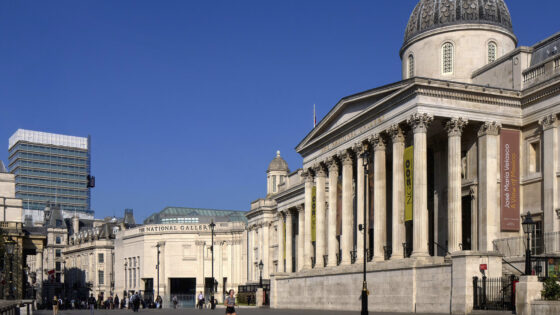
‘I feel really proud seeing the building across Trafalgar Square now: it has a sort of renewed presence,’ says Annabelle Selldorf of her practice’s reconfiguration of the National Gallery’s Sainsbury Wing, which reopened in May. Selldorf Architects, known for high-end commercial art galleries and responsible too for the recent refurb of the Frick art museum in New York, won the competition in 2021 to refit the entrance to the Sainsbury Wing and transform it into the main entry point to the gallery. The project is part of the £85 million NG200 Welcome building programme, set up to mark the gallery’s 200th anniversary.
The scheme reworks the space designed by Venturi, Scott Brown and Associates in 1991. This, together with a rehang of the whole collection and a new education centre designed by Lawson Ward, is intended to help the gallery cope with the growing demands placed on a 21st-century museum: increased visitor numbers, greater security requirements and improved accessibility.
While the project passed relatively smoothly through planning, it has not been without its critics – notably Denise Scott Brown, the surviving half of the Sainsbury Wing’s design practice, who in 2023 said the proposals looked like ‘a circus clown wearing a tutu’. ‘I don’t know what exactly she was getting at,’ says Selldorf: ‘I wondered even if she meant me? I mean I did dress as a clown for carnival as a child in Cologne [her home city] but that’s about it.’ Was she surprised by Scott Brown’s intervention? ‘Well, I didn’t think that ultimately it was helpful or productive how she behaved.’
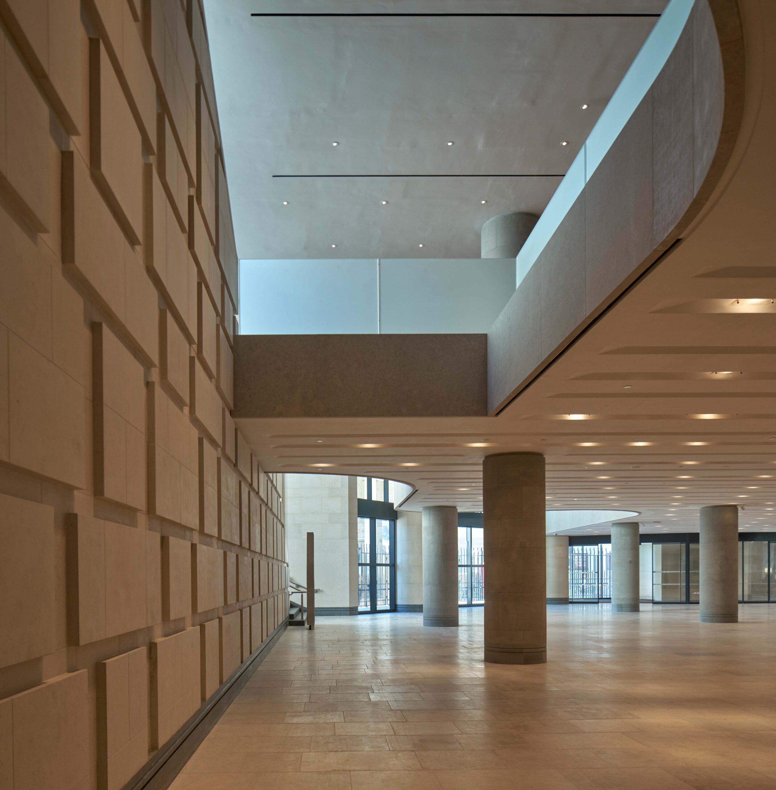
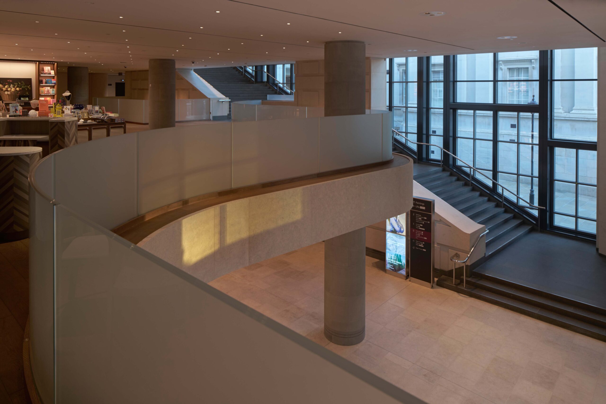
Foyer looking north
Still, the National Gallery extension has long been a touchpaper for architectural Sturm und Drang. In 1984, a rather English architectural culture war was lit between Modernism and traditional (read Classical) architecture when, at the RIBA’s 150th anniversary dinner, the guest of honour, Prince Charles, unexpectedly castigated the earlier competition-winning design for the extension by Ahrends Burton and Koralek (ABK) as a ‘monstrous carbuncle on the face of a much-loved and elegant friend’.
His speech not only provided ammunition for those blaming Modernist architecture for many of society’s ills, but more immediately led to ABK’s design being refused planning permission and shelved.
A second competition for the extension followed in 1986, with a revised brief that no longer needed to incorporate commercial office space to help pay for it, due to the backing of the Sainsbury supermarket family. Against Postmodern-heavy competition, this contest was won by Venturi, Scott Brown, and the Sainsbury Wing, as it became known, finally opened in 1991.
Foyer looking north
Its design pleased no one in particular, its relatively bloodless, etiolated PoMo exterior having none of the throaty, jokey inventiveness of Venturi, Scott Brown’s earlier work. But it effectively drew a literal veil over the earlier Classical vs Modernist controversy by playing a restrained mannerist game, mimicking the stonework and Neoclassical detailing of the adjacent main National Gallery building designed by William Wilkins in 1838. Its façade of pastiche columns and capitals, clustered to one side as though drawn-back, like a curtain, allowed space for a series of contrastingly undecorated entrance portals, punctured through the stone, the pure façadism further emphasised by a glazed, gridded steel side-elevation.
Inside, the gallery spaces were judged more successful – ‘almost perfect’, as the gallery’s current director, Gabriele Finaldi, describes them. Tasked with housing the Early Renaissance collection, Venturi, Scott Brown created a grid of lofty spaces connected by elongated arched portals, which, with their slightly stage-set feel, echo the stretched architectural forms and mini-cityscapes seen in the paintings they house. The gilded frames and colours of these are beautifully set off and intensified by moody-coloured walls and the blue-grey of the pietra serena limestone columns.
Foyer looking south
These galleries, and a basement exhibition gallery, are reached by wide flights of stairs, lined, satisfyingly, with exuberant PoMo details: oversized sections of hanging cornice and, on the upper flight, a chunky steel grid of glazed wall.
‘It has been described as Mies meets Palladio,’ says Purcell’s head of design, Alasdair Travers, who acted as both heritage and executive architect on the project. ‘But it’s way more complicated than that. Venturi, Scott Brown never plays it straight. The challenge has been calibrating the level of change versus conservation: whether to go toe-to-toe with PoMo, to overtly not play the game, or something in-between.’
Foyer looking northeast
The entrance spaces below the main galleries were always rather less satisfactory, in part because Venturi, Scott Brown had to include a mezzanine to accommodate all the necessary service functions.
‘It was a relatively small volume that was always overloaded with requirements, due to the constraints that produced the building,’ says Selldorf. ‘It needed to provide a connection up to the gallery level. But this acted like a lid, below which there was only so much space to accommodate a restaurant, bookstore, conference rooms, cloakroom and ticket desk. And then there were more and more visitors. As a result, it was packed and wasn’t welcoming at all.’
View from new bar Giorgio looking northeast
The relatively low, tightly-bounded and heavily columned entrance hall that resulted certainly always felt more like an undercroft. Venturi, Scott Brown described it as ‘compressed’, making a virtue of this in contrast to the release of space in the galleries above. When the Sainsbury Wing was listed at Grade I in 2018, it was likened to ‘the crypt of an Italian church, or basement level of a Palladian villa’. The relative gloom was augmented, too, by the dark glass fitted in the stairwall, intended to help rest visitors’ eyes before the contrasting brilliance of the paintings above.
It was the dispelling of this gloomy quality – by what Selldorf describes as a series of ‘surgical’ interventions to make the gallery more ‘open and welcoming’ – that, in particular, provoked the small storm of criticism among a handful of architects, critics and heritage organisations such as The Twentieth Century Society. They warned that the changes threatened the spirit of the original design, and the furore culminated in Scott Brown’s ‘circus clown wearing a tutu’ comments.
Sainsbury Wing bar Gorgio looking southeast
‘I have enormous respect and admiration for her work and that of her husband,’ says Selldorf. ‘But she thought that could hold up the process. And the real issue was that she didn’t recognise contemporary needs – and couldn’t recognise them, because she hasn’t been here in 30 years. We did a very, very large survey of how people experienced this museum and identified what wasn’t working for visitors and why they didn’t find it welcoming at all. I mean, I wasn’t making it up or proposing changes for my own ego. Every single thing we’ve done was considered on the basis of public benefit.’
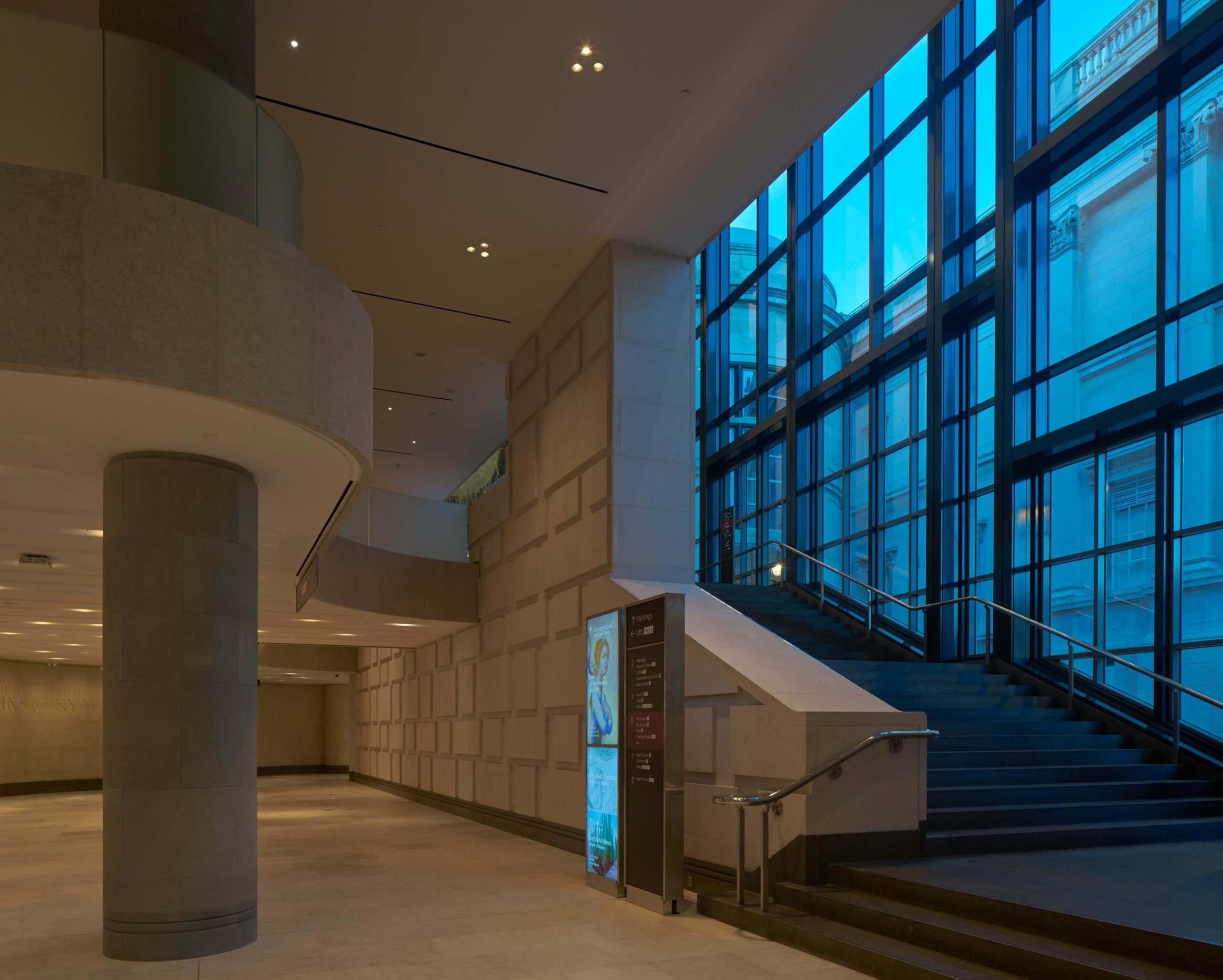
In particular, Selldorf’s design has reduced and peeled back the mezzanine floor, so it reads much more like a mezzanine gallery, creating double-height space to either side, in order to increase the visibility of the main stair. Columns (two of which were non-structural) were moved and reduced in number to open up the space and increase natural light levels. The dark glass of the stair wall was replaced by clear, which allows for more visible interaction between inside and outside, too. ‘People want to know where they are in the building and to see in and see out,’ says Selldorf.
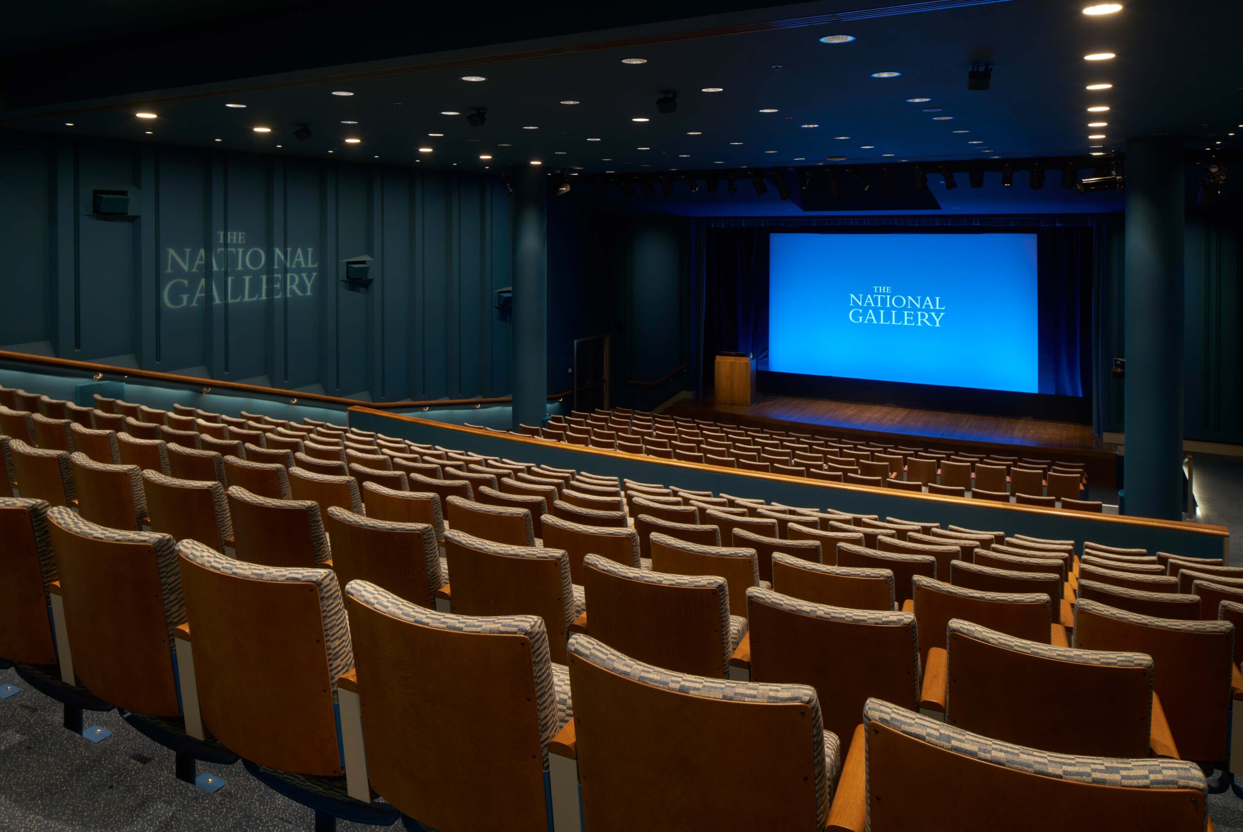
The Pigott Theatre below
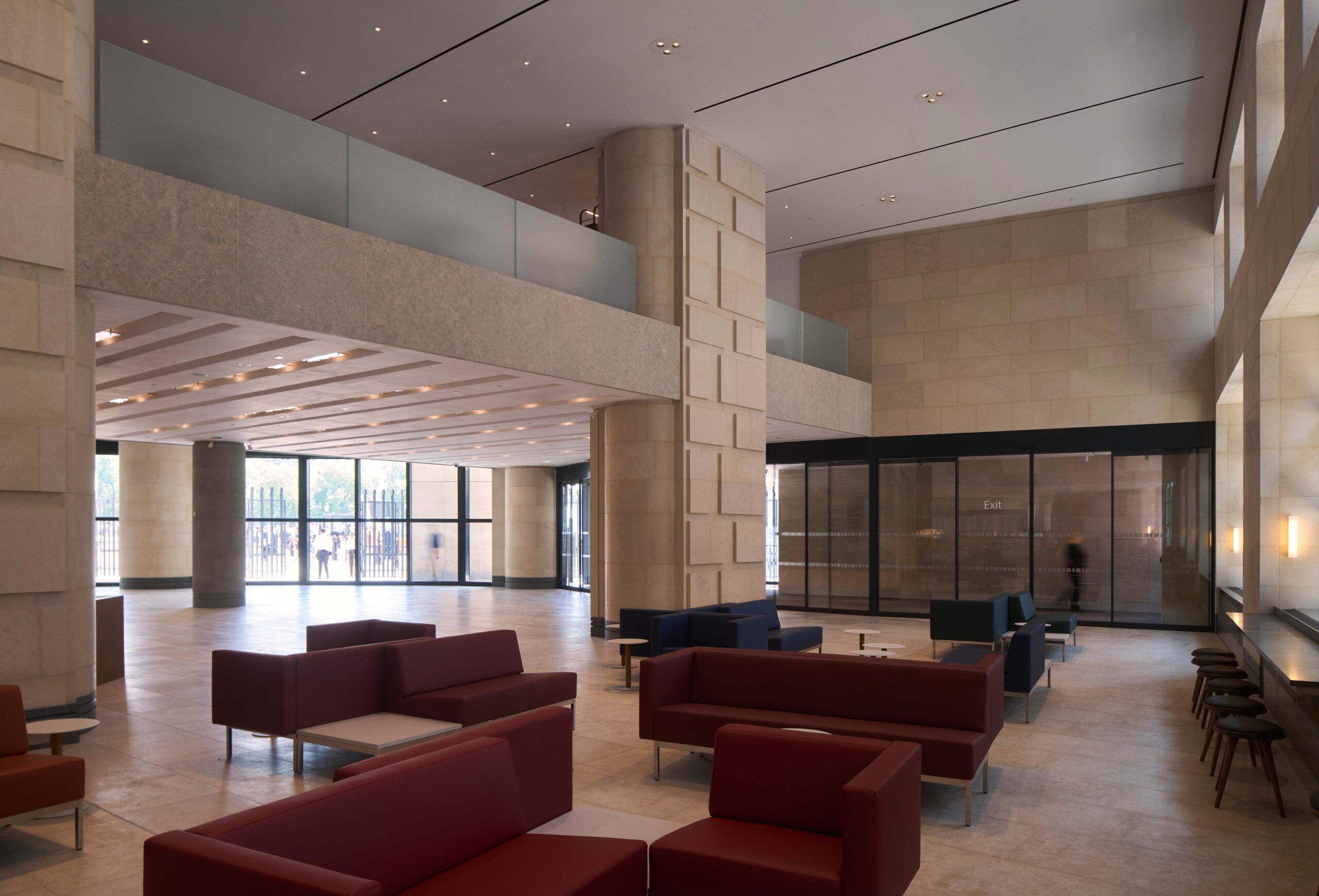
One key interior move, to be completed in a future phase, is a new underground link that connects through to the Wilkins Building off the main stairs where they lead down at the rear of the entrance lobby, rather cul de sac-like at present, serving only the theatre and temporary exhibition gallery below. This link will not only enable a much better connection between the two, but has also incrementally created space for a new cloakroom and toilets.
Selldorf admits that the series of interventions ‘together amount to a significant change’ but insists they have not ‘taken away the original sensibility’. So is the PoMo spirit preserved? And how do these interventions measure up on first view?
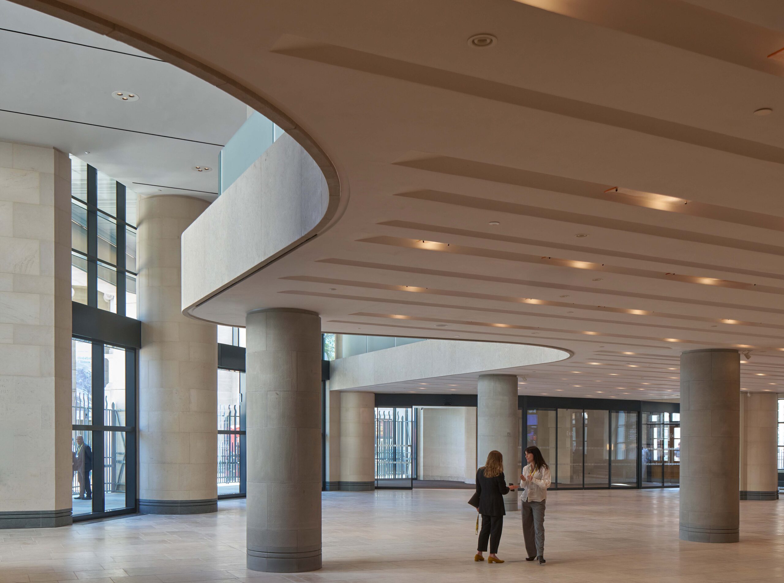
Foyer looking south
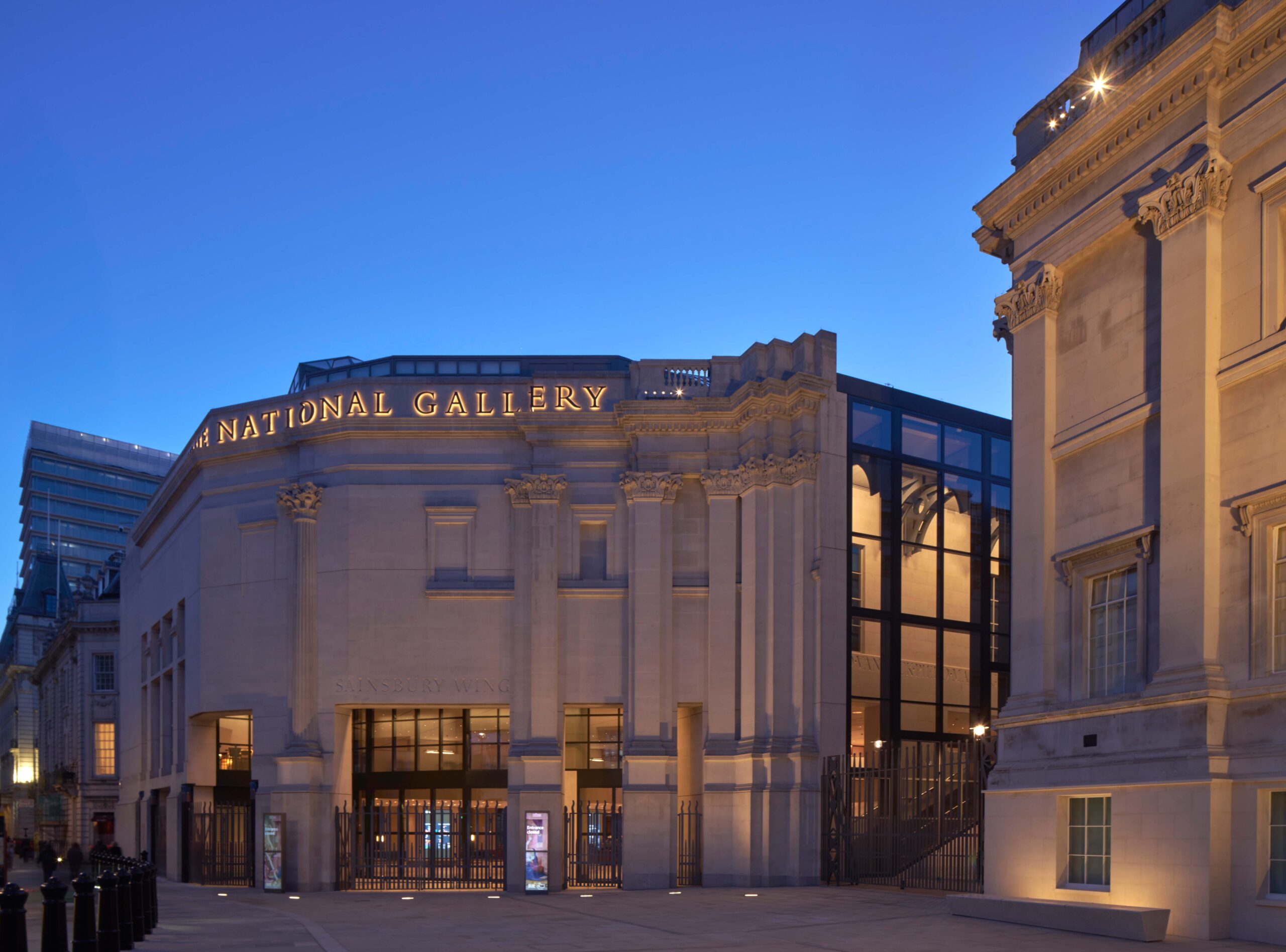
From the outside, the most significant change is the removal of the west end of the raised terrace in front of the Wilkins Building, creating a new forecourt in front of the Sainsbury Wing entrance. This serves to open up and emphasise the cut-through pedestrian route of Jubilee Walk, which connects indirectly through to Leicester Square under the Venturi, Scott Brown-designed ‘Bridge of Sighs’ link between the Sainsbury Wing and the Wilkins Building. It also clarifies the relationship between the symmetrically like/unlike façades and features of the two buildings, emphasising the mannerist play of Venturi, Scott Brown’s architecture. A frieze of large metal lettering now runs along the cornice of the Sainsbury Wing, spelling out ‘The National Gallery’, while the newly clear glazing to the internal staircase serves to animate the façade from within. Together, all these moves successfully reinforce the presence of the Sainsbury Wing from afar and help it hold the corner of Trafalgar Square.
On entering, slim vertical scanners – no doubt benefiting from technology seen at airports – mean visitors’ bags can be security checked without being unpacked. ‘It’s all designed to help make a good start to their visit,’ says Travers.
View from mezzanine looking northeast
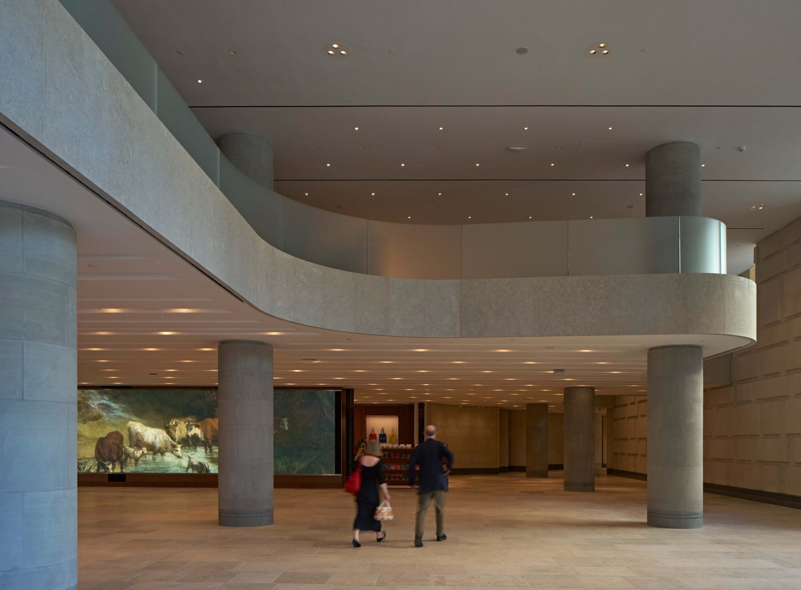
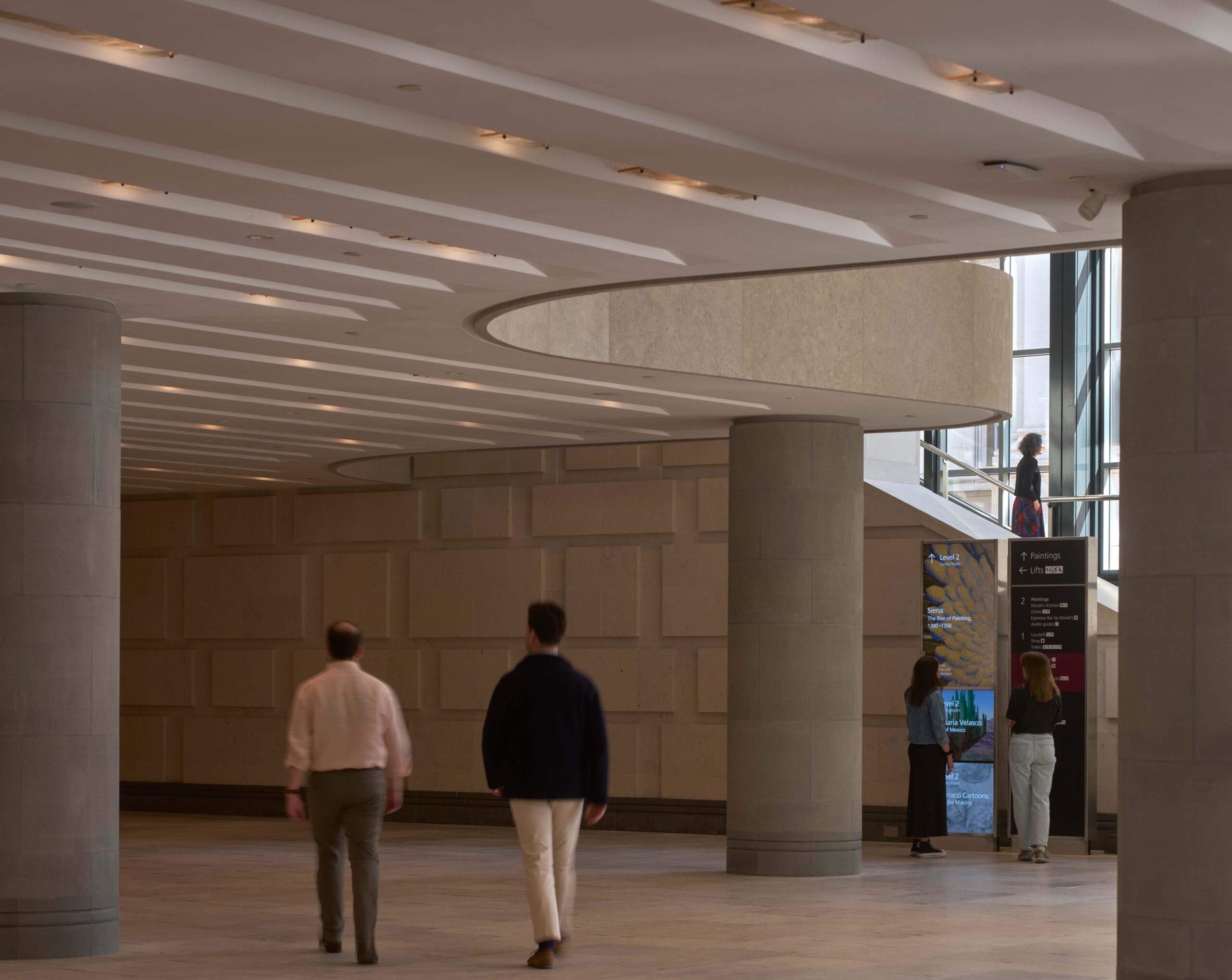
But inside, it’s a more mixed picture. The original low ceiling of the lobby now reads as a mezzanine between two double-height spaces – one creating a defined seating space adjacent to a small espresso bar and the other foregrounding the foot of the stairs up to the galleries. ‘You are now much more led by light as to how it works,’ says Travers.
The columns that used to almost randomly populate the space have been thinned out and more clearly define the mezzanine’s edge. Meanwhile, large video signage and screens can be programmed to assist wayfinding or showcase works from the collection. ‘Before, you had to get quite deep into the plan before you knew where you were going,’ says Travers. ‘Everything is now much clearer from the point that you enter.’
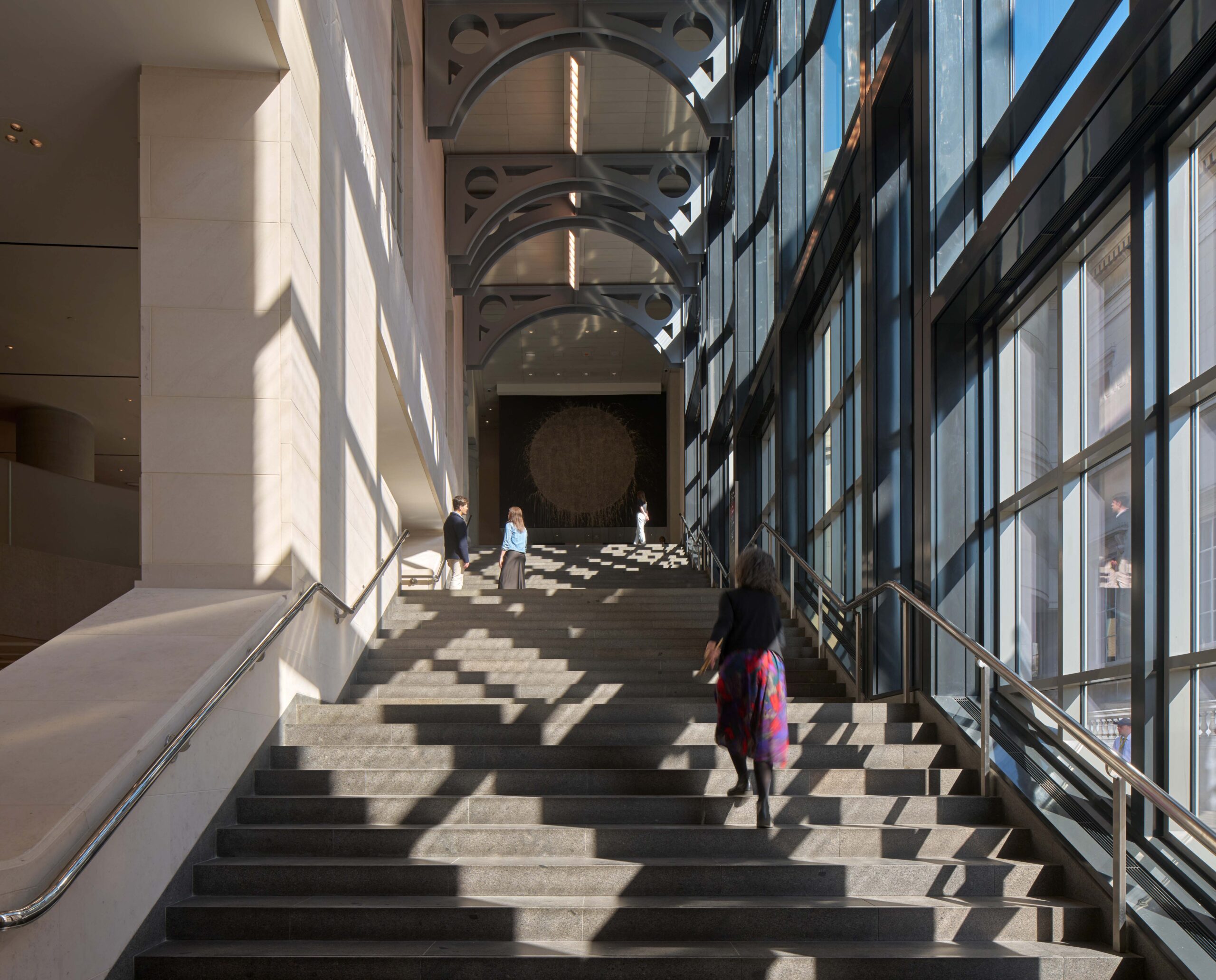
Sainsbury Wing grand staircase
These big moves succeed in what they aim to do, emphasising the stair and wayfinding and bringing light into the lobby – helped by an increase of 60 per cent in publicly accessible space.
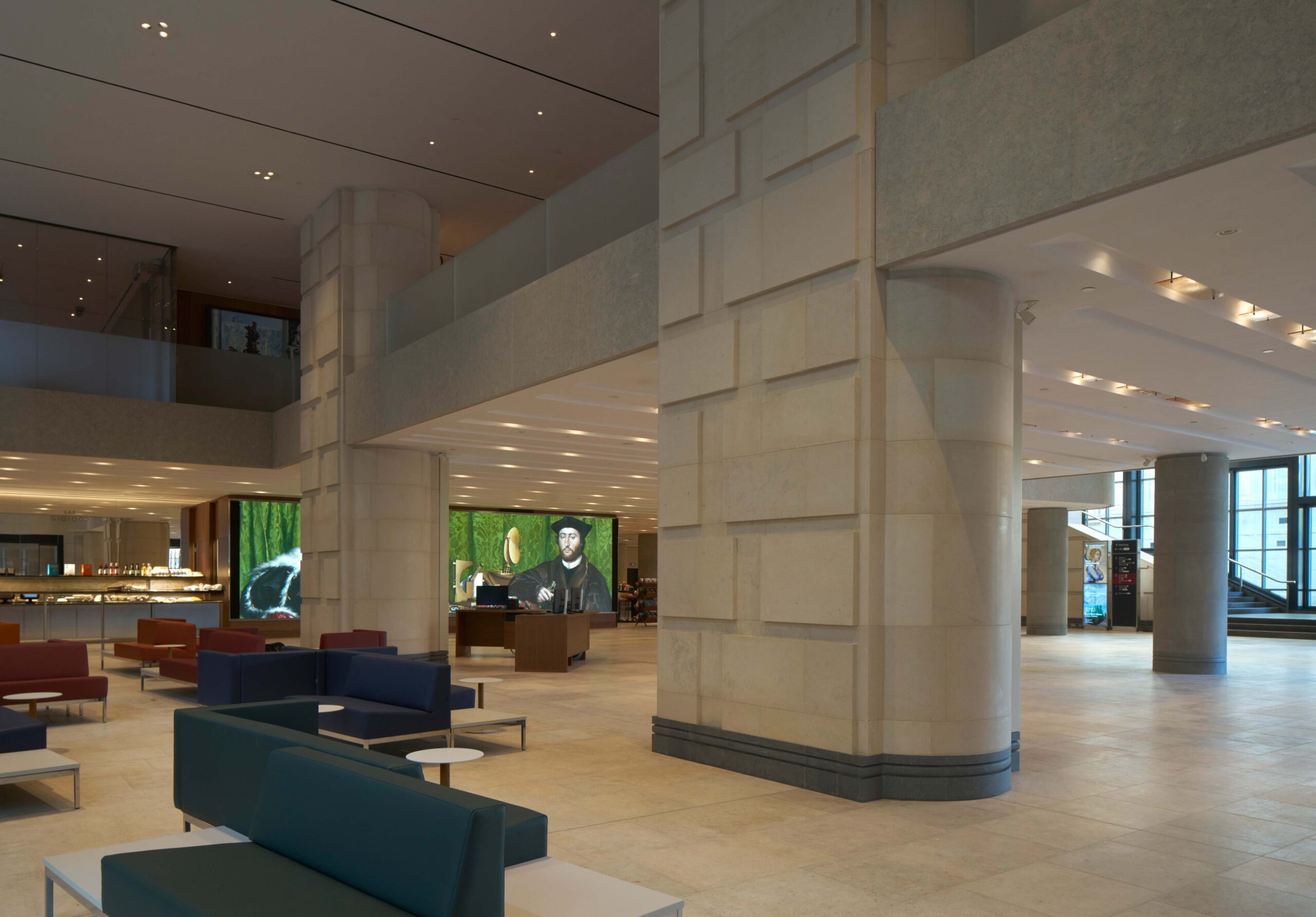
Above, the mezzanine is now more open too and houses a bookshop, event space and reconfigured WCs, as well as a higher-end restaurant, culminating in a de-rigueur cocktail bar with views over Trafalgar Square, designed, presumably, to allow late opening and/or private hire. All in all, it replaces the previously moody, slightly chthonic experience of the Venturi, Scott Brown original, with a bright, tasteful neutrality that’s a bit hotel lobby-like. The design falls down on smaller moves and strangely wilful details: the original grey gridded flooring changed to a blander limestone, and the ceiling coffers reworked as randomly diagonal coved striations with slim rectangles of Murano glass acting as lightshades, elegant but strangely domestic in scale. Above, obscured glass balustrades effectively cut out much of the claimed visual connection between the two levels, while the randomly curved edge of the mezzanine speaks a different architectural language to the rest.
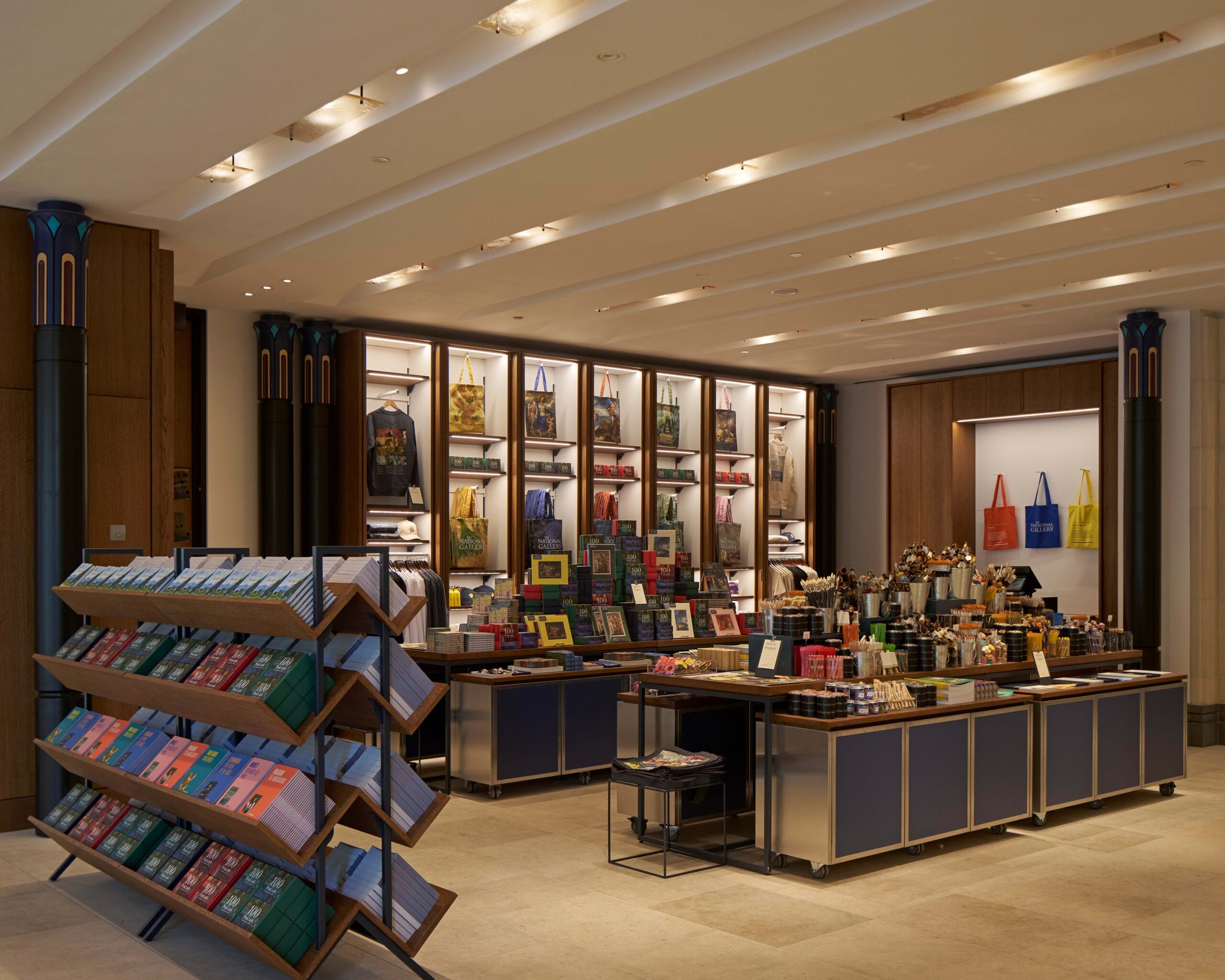
View of the bookshop designed by Ryder Architecture
Delightfully, last summer a letter from one of the original funders, the late Simon Sainsbury, was found buried in one of the false columns when it was removed, stating: ‘I believe that the false columns are a mistake of the architect and that we would live to regret our accepting this detail of his design’. Selldorf, asked if she feels this vindicates her rework of the space, sidesteps the question, saying what interested her most was ‘how much civility this patron had to let the architects prevail, despite his very strong objections. It’s pretty remarkable.’
What the letter served to show is how all built spaces are ultimately compromises, the result of competing visions and not set in aspic. For all the praise for the ‘rich and complex’ architecture of Venturi, Scott Brown’s lobby, ‘dark’ and ‘confusing’ have also been epithets used to describe it.
It’s clear which side Selldorf, the go-to architect for limpid white art spaces, is on. The result is a space that’s undoubtedly more functional and welcoming, but more generic and corporate – and less moodily memorable, too.
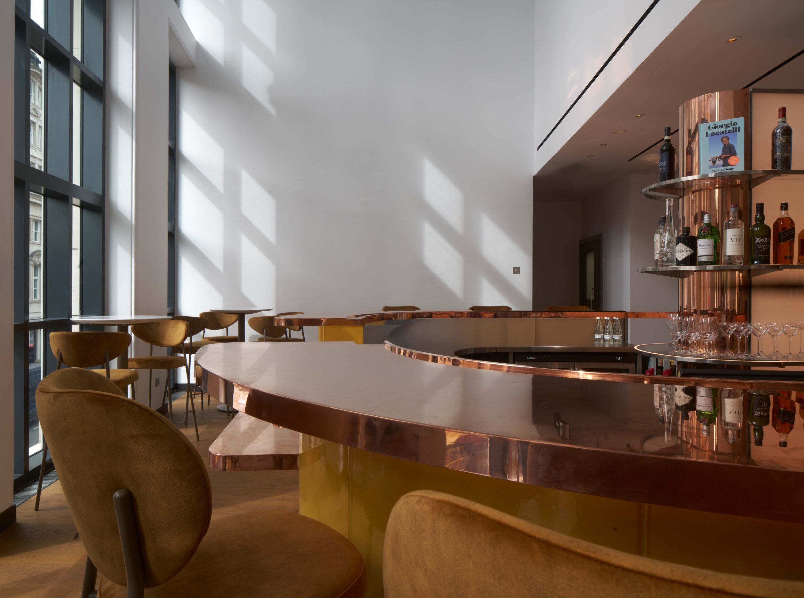
New bar at Locatelli on the mezzanine
Heritage architect’s view
Purcell’s involvement with the project dates to the early 1990s. As heritage architects, we brought conservation expertise, technical knowledge and a deep understanding of the historic context.
An early conservation management plan identified the Sainsbury Wing’s architectural significance and recommended it for separate listing, which was carried out in 2018. Our role in NG200 began at competition stage, when Jon Wright, our 20th-century heritage expert, wrote an essay articulating the Wing’s significance as Venturi, Scott Brown’s only UK project. We undertook extensive archival research at the University of Pennsylvania, where the Venturi, Scott Brown & Associates (VSBA) archives are located and visits to key VSBA-designed buildings in the US. We also undertook thorough investigations into the origins and development of the Sainsbury Wing design to establish which parts carried greatest significance in terms of VSBA’s design philosophy. This gave the design a conservation focus that continued through planning. We engaged with Historic England, The Twentieth Century Society and heritage groups to ensure an informed and sensitive approach.
The design evolved in response to this dialogue, with adjustments made to preserve character-defining features. For example, the multicoloured columns at the former bookshop entrance, originally proposed for removal, were retained and thoughtfully integrated into the new scheme. Our analysis of VSBA’s design intentions ensured that interventions respected the building’s original philosophy while supporting the gallery’s future needs.
Alasdair Travers, design partner, Purcell

Client’s view
When we embarked upon the project to reimagine the Sainsbury Wing entrance, the overriding objective was to provide a welcome that reflected the excellence of our collection and the needs of the 21st century visitor. The result from Annabelle Selldorf and her team has delivered against this and provided so much more.
There was much to like about the existing Sainsbury Wing building that didn’t need altering: the external façade; the step-free access from Trafalgar Square; the grand staircase; and the perfect picture galleries. All these elements were untouched as part of the remodelling.
However, the project has transformed the arrival experience. The new public realm space and large ‘National Gallery’ lettering on the building now gives a much clearer signal that this is the main entrance to the museum. Once inside, the amount of increased space and light provides a new welcome that is greatly improved. Now, the millions of visitors that we receive each year have plenty of room to orientate themselves and make use of the new facilities. This includes a new catering outlet on the ground floor, where people can relax, plan their visit, meet friends and even work. And the spectacular new media wall shows details of paintings that cannot be seen with the naked eye. The new bookshop, restaurant and bar complete the remodelling.
We couldn’t be happier with the result and the positive response from our visitors has vindicated our decision to make the changes.
Paul Gray, deputy director, National Gallery
Engineer’s view
The National Gallery’s vision for NG200 is to deliver ‘an environmentally responsible, world-class gallery for the benefit of the planet, our collections and the public, now and in the future’. Social sustainability is central to the gallery’s mission and was embedded in the project brief. The project enhances a historic asset, activates under-used back-of-house areas, improves user experience and fosters a more inclusive, welcoming environment.
Sustainability has been integral throughout design development, with emphasis on air quality, ventilation, lighting, and acoustics. Designs were tested for climate resilience to ensure long-term conservation standards and user comfort.
Reducing carbon impact was a major focus. The project achieved a 29 per cent reduction in baseline embodied carbon through lean design and a circular economy approach, including extensive material reuse. During construction, all waste was diverted from landfill. All new materials were responsibly sourced and all timber FSC-certified. Materials were also selected to minimise emissions and promote a healthy indoor environment.
The gallery is aiming to reduce energy consumption by 20 per cent and progressing towards elimination of fossil fuel use. These efforts position NG200 as a key step in the gallery’s broader environmental goals. The project is on track to achieve a BREEAM Excellent rating, underscoring its comprehensive, environmentally driven design and delivery strategy, shaped through planning, community consultation, and innovation in construction.
Stephen Hill, associate director, Arup
Working detail
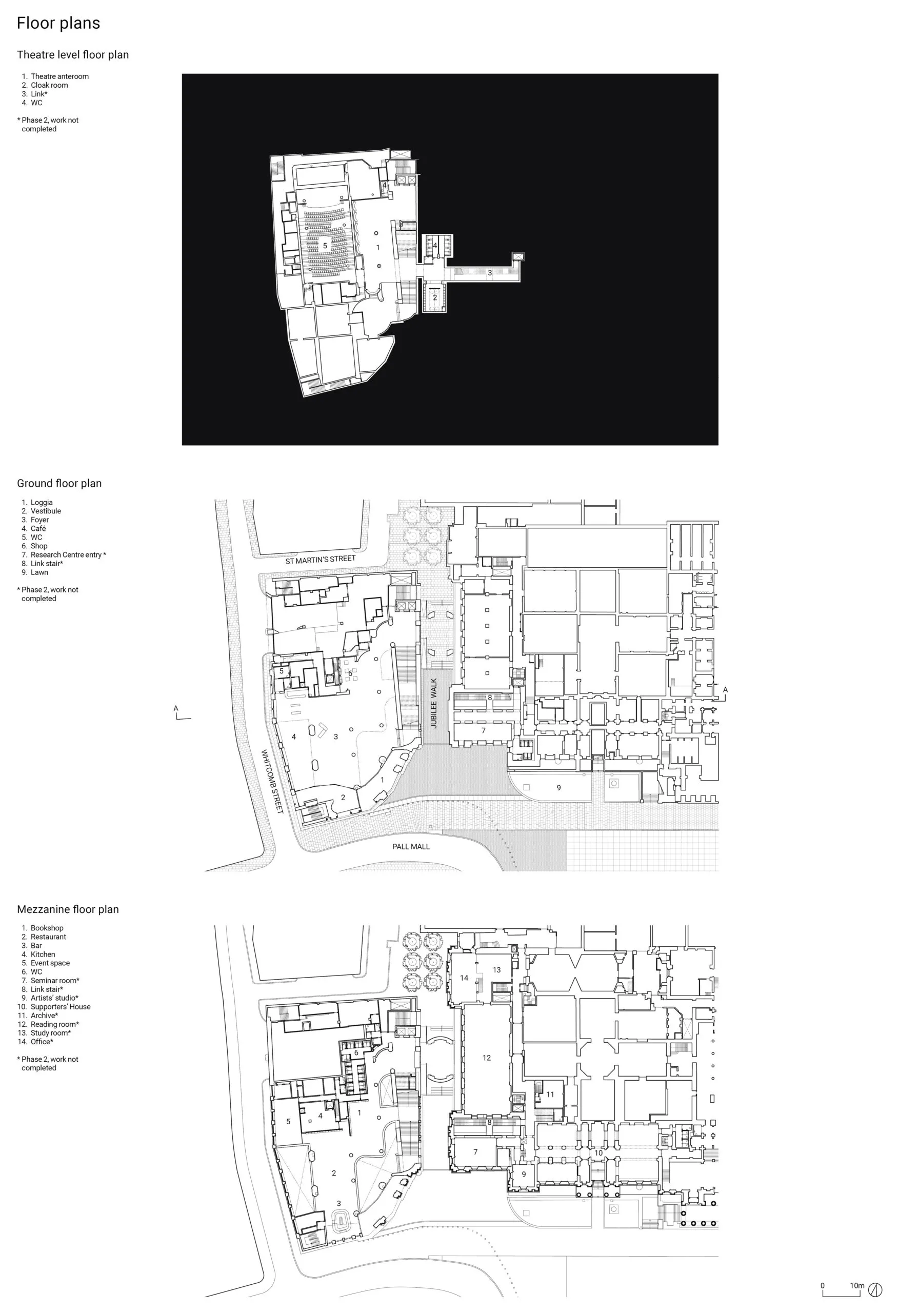
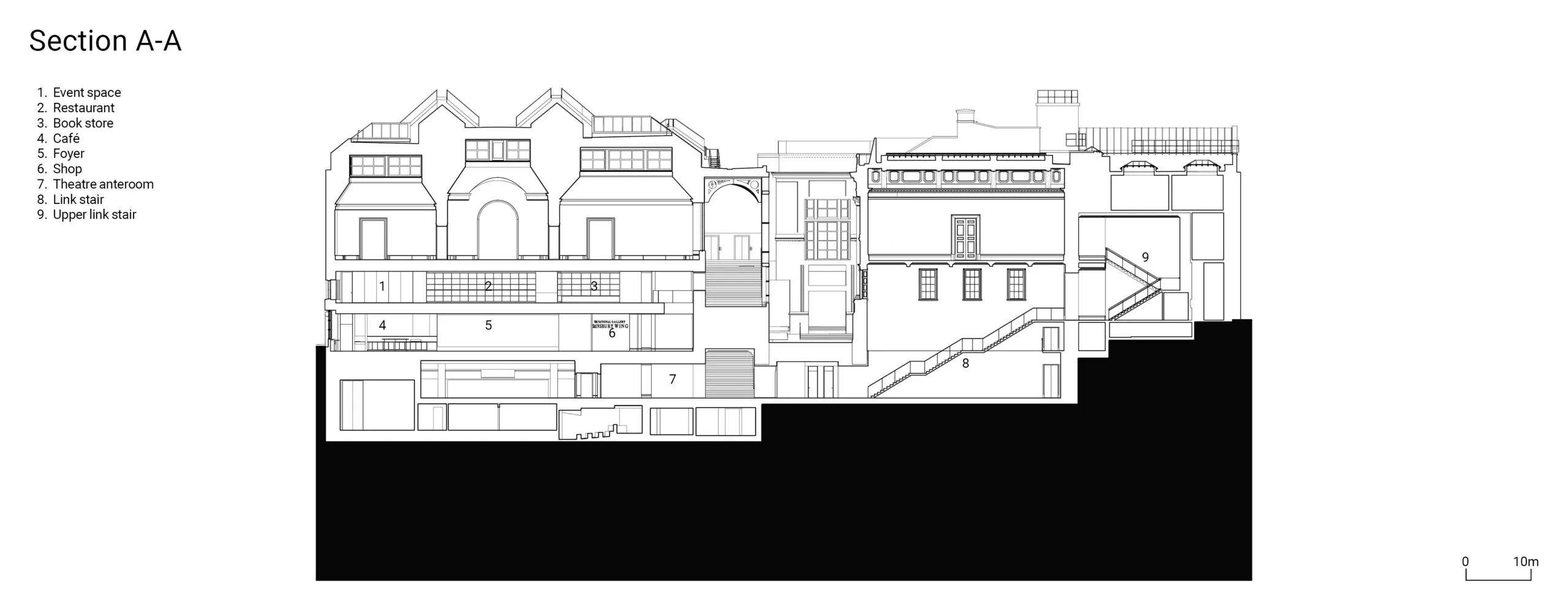
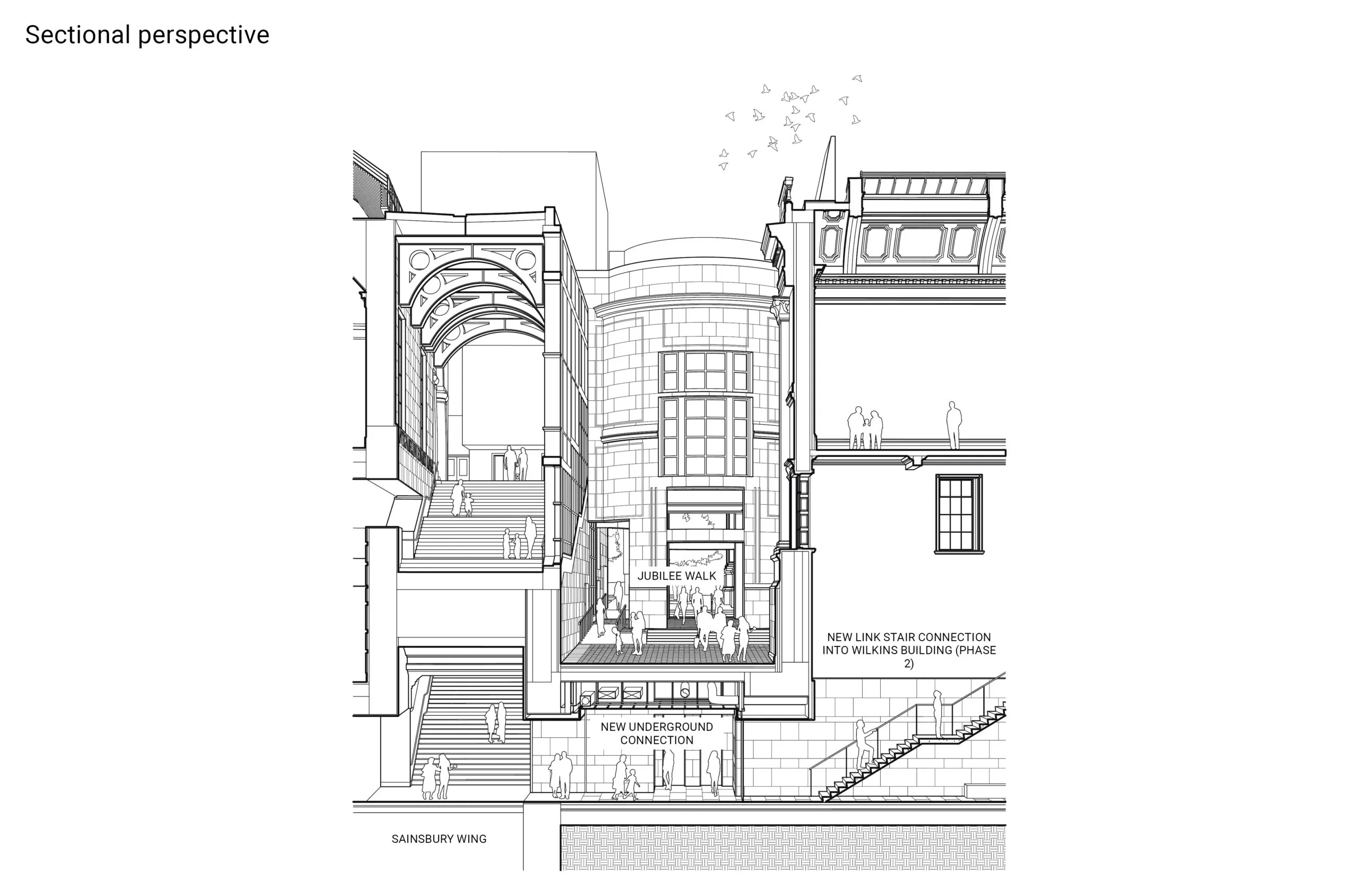
A new link below Jubilee Walk will enhance the circulation between the Sainsbury Wing and the Wilkins Building, as it is currently only possible for the public to move between the buildings at the upper gallery level. The sectional perspective drawing above shows the improved interior and exterior connections across the estate, providing for greater access to the refurbished Research Centre, which will be completed as part of Phase 2. Both the Research Centre and the Supporters’ House will be accessible via the new at-grade entry made possible by the design of the ‘square within a square’ which removed the courtyard on the south-western corner of the Wilkins Building.
Michael Baskett, project manager, Selldorf Architects
Project data
Location: Trafalgar Square, London WC2
Completion: May 2025 (Phase 1)
Gross internal floor area: 4,500m2 (Phase 1)
Construction cost: Undisclosed
Construction cost per m2: Undisclosed
Design architect: Selldorf Architects
Client: National Gallery (The NG200 Project)
Heritage architect: Purcell
Structural engineer: Arup
MEP consultant: Arup
Cost consultant: Gardiner & Theobald
Project manager: Gardiner & Theobald
Principal designer: Annabelle Selldorf
Approved building inspector: AIS Chartered Surveyors, Assent
Landscape designer: Vogt
Planning consultant: The Planning Lab
Civil engineer: Arup
Acoustic consultant: Arup
Sustainability engineer: Arup
Daylight consultant: Arup
Lighting consultant: L’Observatoire International
Catering consultant: Kendrick Hobbs
Access consultant: Jane Simpson Access, David Bonnett
Wayfinding and graphics: Pentagram, Thomas Matthews
Community engagement: Kaizen
Fire engineer: OFR Consultants
Security consultant: MFD, Thornton Tomasetti
Vibration consultant: Bickerdike Allen
Construction manager: Gardiner & Theobald
Main contractor: Sir Robert McAlpine
CAD software used: Revit, AutoCAD, Rhino

Sustainability data
Percentage of floor area with daylight factor >2%: Sainsbury Wing public areas (ground floor, mezzanine and grand stair, excluding gallery spaces): 53%, Members’ rooms: 3%
Percentage of floor area with daylight factor >5%: Not supplied
On-site energy generation: Not supplied
Heating and hot water load (predicted): 59.6 kWh/m2/yr
Total energy load (predicted): 158.89 kWh/m2/yr
Carbon emissions (all): 342 kgCO2/m2
Annual mains water consumption: 7.25 m3/occupant
Airtightness at 50Pa: 3 m3/hr/m2
Overall thermal bridging heat transfer coefficient (Y-value): Not supplied
Overall area-weighted U-value: 0.74 W/m2K
Embodied/whole-life carbon: 317 kgCO2/m2
Predicted design life: 100 years