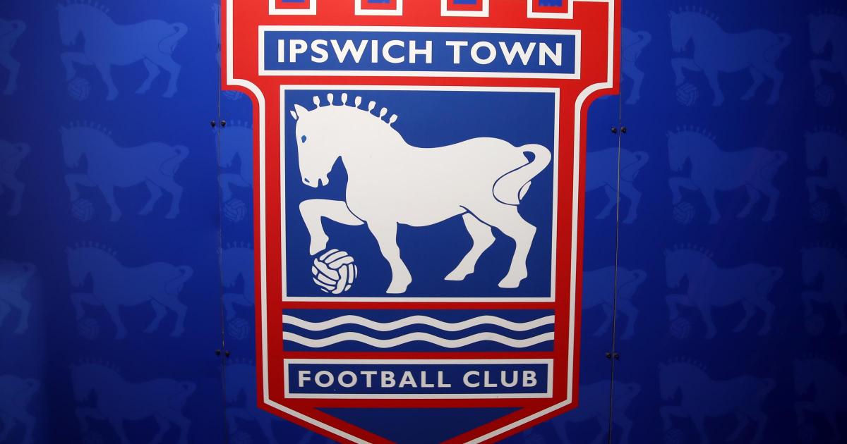
While we are not calling for Ipswich Town to change their badge, nor do we think they should, this little experiment was both a test of AI and a little bit of fun to mark the 30th anniversary of the current crest.
The third design, which had the brief to make a more ‘modern’ design (Image: Newsquest) That being said, one reader, David Swan said: “Number three is the stand out one for me. We shouldn’t live in the past and have a new and exciting future ahead of us so why not a new and exciting badge?
“Also the Orwell Bridge causes the town of Ipswich a load of grief on a regular basis so don’t need any reminders.”
Linda Nixon, however, wants to see some changes to the final design, in which we told ChatGPT to take all of the designs into account and get creative.
The final design, where ChatGPT was told to get creative (Image: Newsquest) She said: “I like the final design best but would like to see some modifications:
- Make the horse look more bulky like a Suffolk Punch
- Get rid of the Willis building as it looks as though it is a burden on the horse
- Then move the horse up the design and make the Orwell Bridge more prominent like other designs.
- Add the date at the bottom – 1878
“I am now 70 years old and miss my teaching career where I taught both computer science and art and design.
“I am still very technology minded and love the progression of AI (except on all those ridiculous Facebook Reels).”
Personal favourite of both myself and a fellow readers, the second design (Image: Newsquest) Nick Lay, who has been a blues fan since 1967, said his favourite was the second design.
However, not everyone shared love of the designs, specifically the mighty Suffolk Punch, with many saying that the designs of the horses are too small in stature.
Jo Grant said: “I prefer the original I suppose, I don’t like most of the horses because they don’t represent the Suffolk Punch.
“I also think it should include the football and keep the castle design.”
The fourth design (Image: Newsquest) Similarly, one reader Rikk, was not a huge fan of any of the designs.
He said: “I would prefer the original 1995 iconic Suffolk Punch crest, the others are a poor substitutes to this long standing crest.
“If I had to choose I would pick number 4.”
Thank you to all those who got in touch with your thoughts of the designs via email or social media, if you wish to get in touch you can send an email to oliver.picton@newsquest.co.uk
