The Canterbury-Bankstown Bulldogs have unveiled a brand new logo that has divided fans. The Australian rugby club claims that the design is rooted in the team’s 90-year heritage, but loyal supporters are unconvinced, calling it “awful” and “embarrassing”.
As with any rebrand, trying to please everyone is next to impossible, but sports fans tend to be particularly opinionated when it comes to their favourite teams. Rooted in nostalgia and team spirit, rebranding sports logos is much more than a redesign – it’s an evolution of identity.
(Image credit: Canterbury-Bankstown Bulldogs)
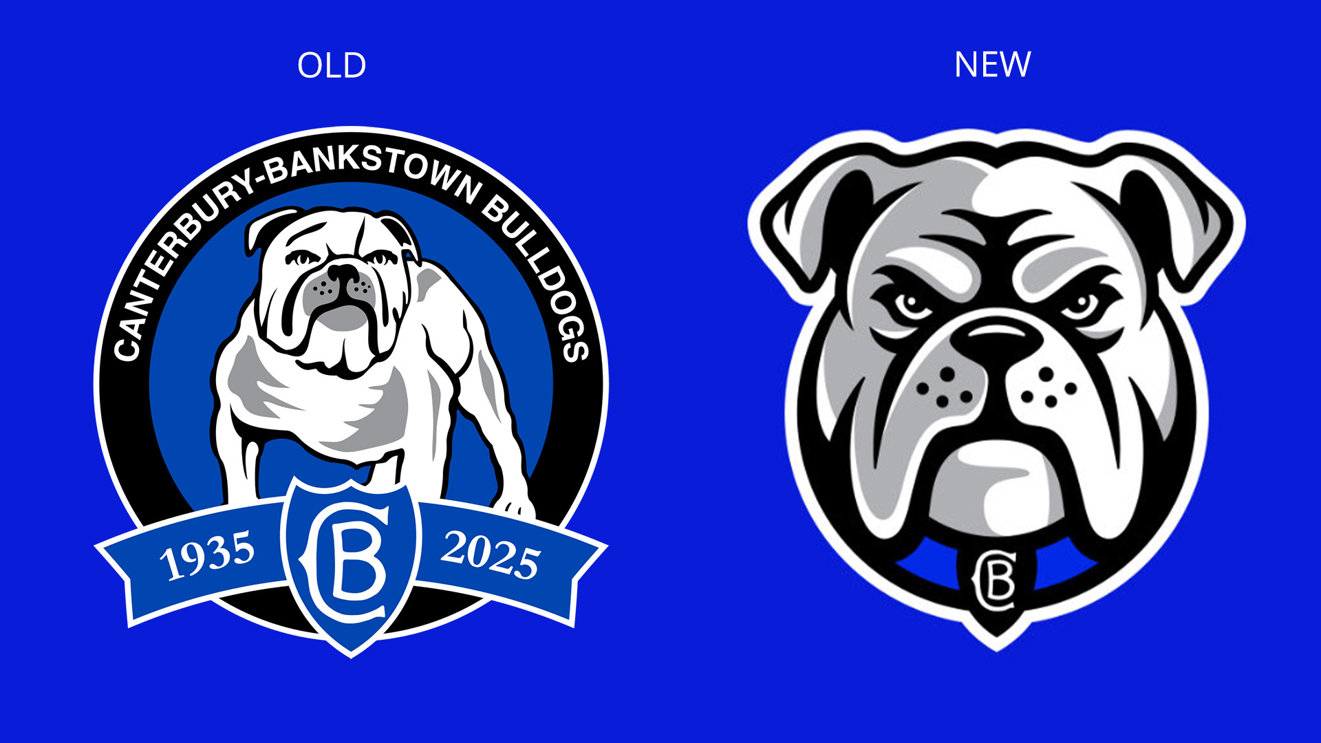
Since 1978, the Canterbury Bulldogs’ logo has featured an iconic illustration of a staunch-looking pooch against a shield emblem. Despite a slightly altered design between 1998-2004, the full-body bulldog logo has been the prominent look for decades.
You may like
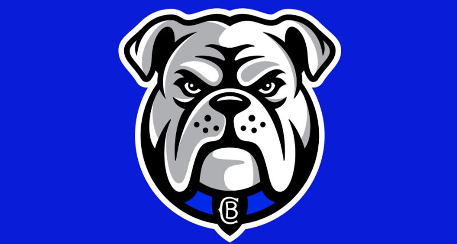
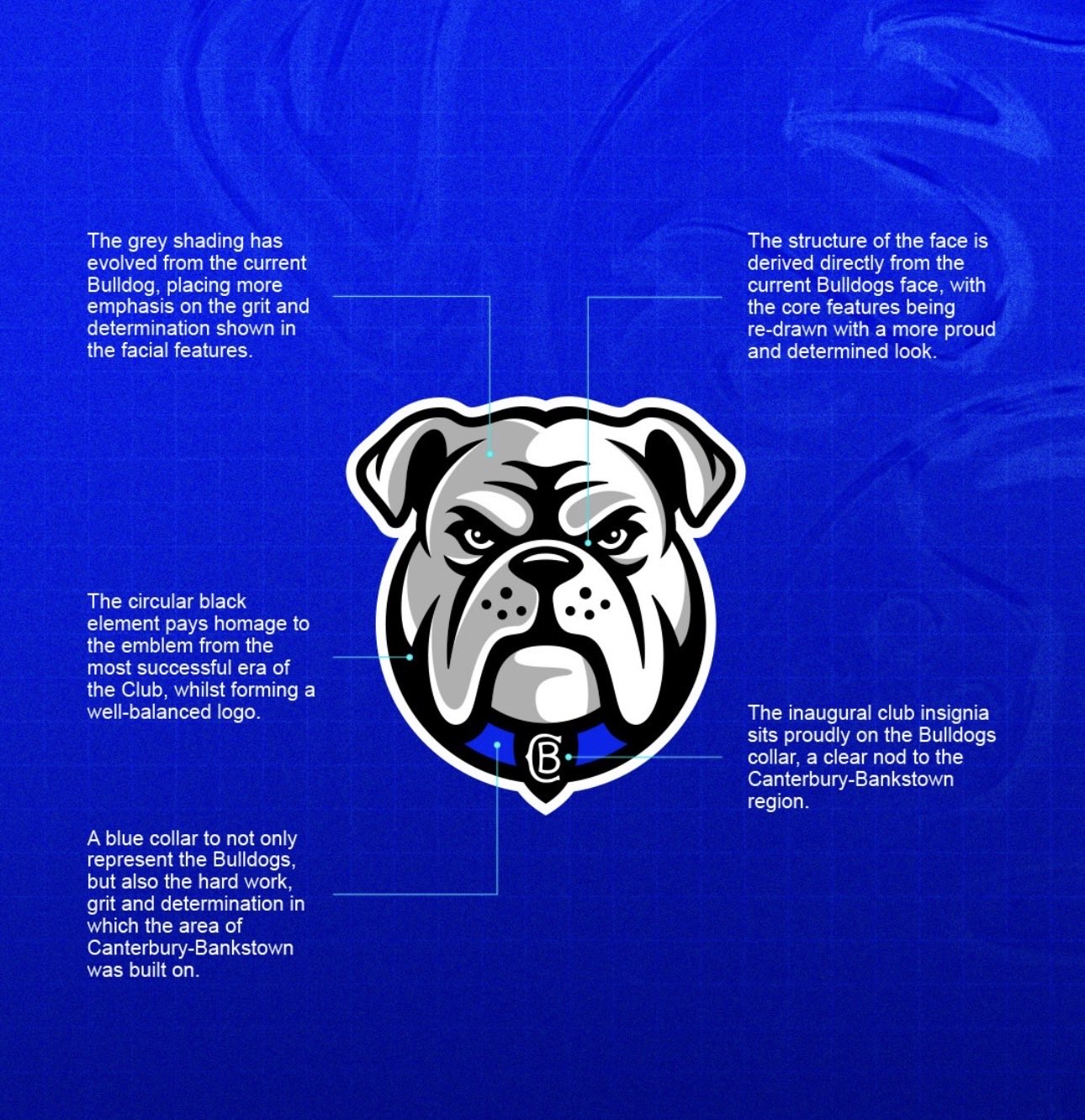
The new logo takes inspiration from the ’98 design, featuring the head of the bulldog. With a modernised feel, the cartoon-style look is replaced by a clean illustration of a fierce-looking hound subtly sporting the club’s insignia on its collar.
(Image credit: Canterbury Bulldogs)
“We’re incredibly proud of the design and believe it strikes the right balance between paying tribute to our 90-year legacy and capturing the energy, ambition and unity that will define our future,” says Bulldogs Chief Executive Officer Aaron Warburton in the team’s official press release.
Despite the confident reveal, fans were unconvinced by the idea, with many claiming that the design appeared AI-generated. “I just made the new Bulldogs logo on ChatGPT, and yes, I know it’s not identical, but I’m sure with one more prompt I could get it looking the same,” one fan wrote. “The new Bulldogs logo is the generic dog logo you scroll past when you make your own team on Rugby League 2,” another fan wrote.
I just made the new bulldogs logo on ChatGPT and yes I know it’s not identical but I’m sure with one more prompt I could get it looking the same 😂If you need a new graphic designer hit me up @NRL_Bulldogs #NRL #Bulldogs pic.twitter.com/u4BifZsJoWOctober 16, 2025
For more creative inspiration, check out our logo design tips or test your skills with our ultimate logo design quiz.