It’s one of the moments when you realise the World Cup is coming up faster than you think: when the first kits are unveiled.
Adidas has launched its ‘home’ jerseys for the 2026 tournament, and there is a lot to digest. Not only all 22 shirts, but also the colours, the intricate designs, and, well, just whether they work or not. Of course, some of the teams are yet to confirm their qualification.
The Athletic will, of course, bring you a further rundown of all the kits when they are released, but for now, our writers have given their verdict — without squabbling too much — on Adidas’ offerings.
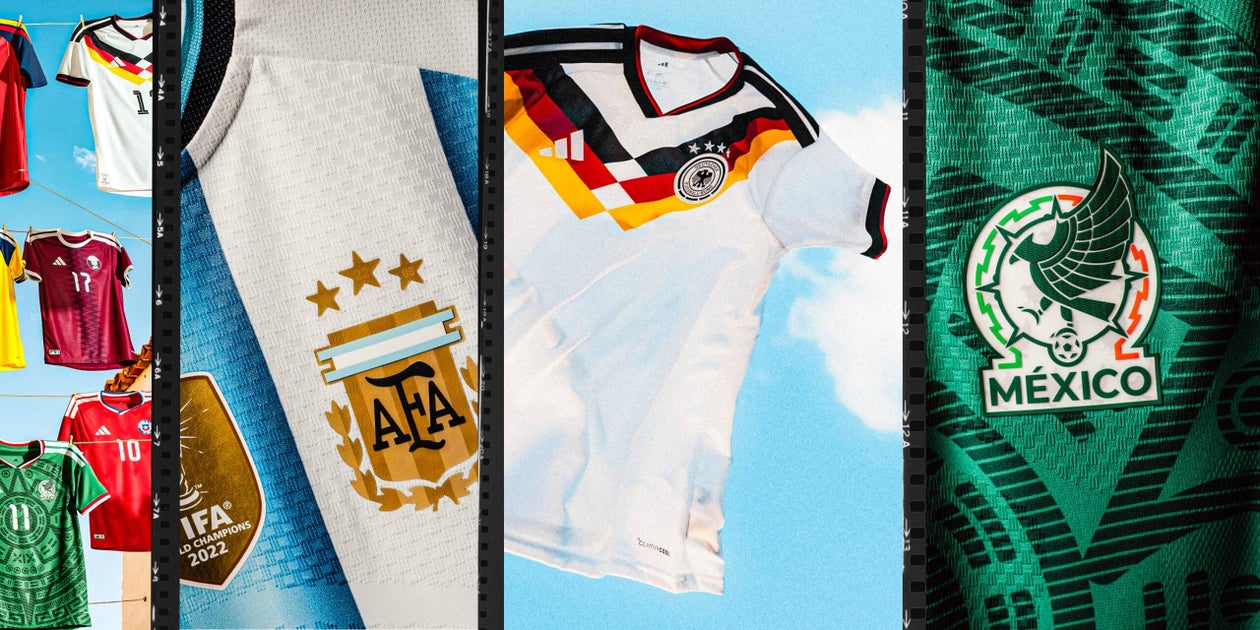
Here are the shirts in one, simple picture, and if you have a strong opinion, let us know what you think in the comments…
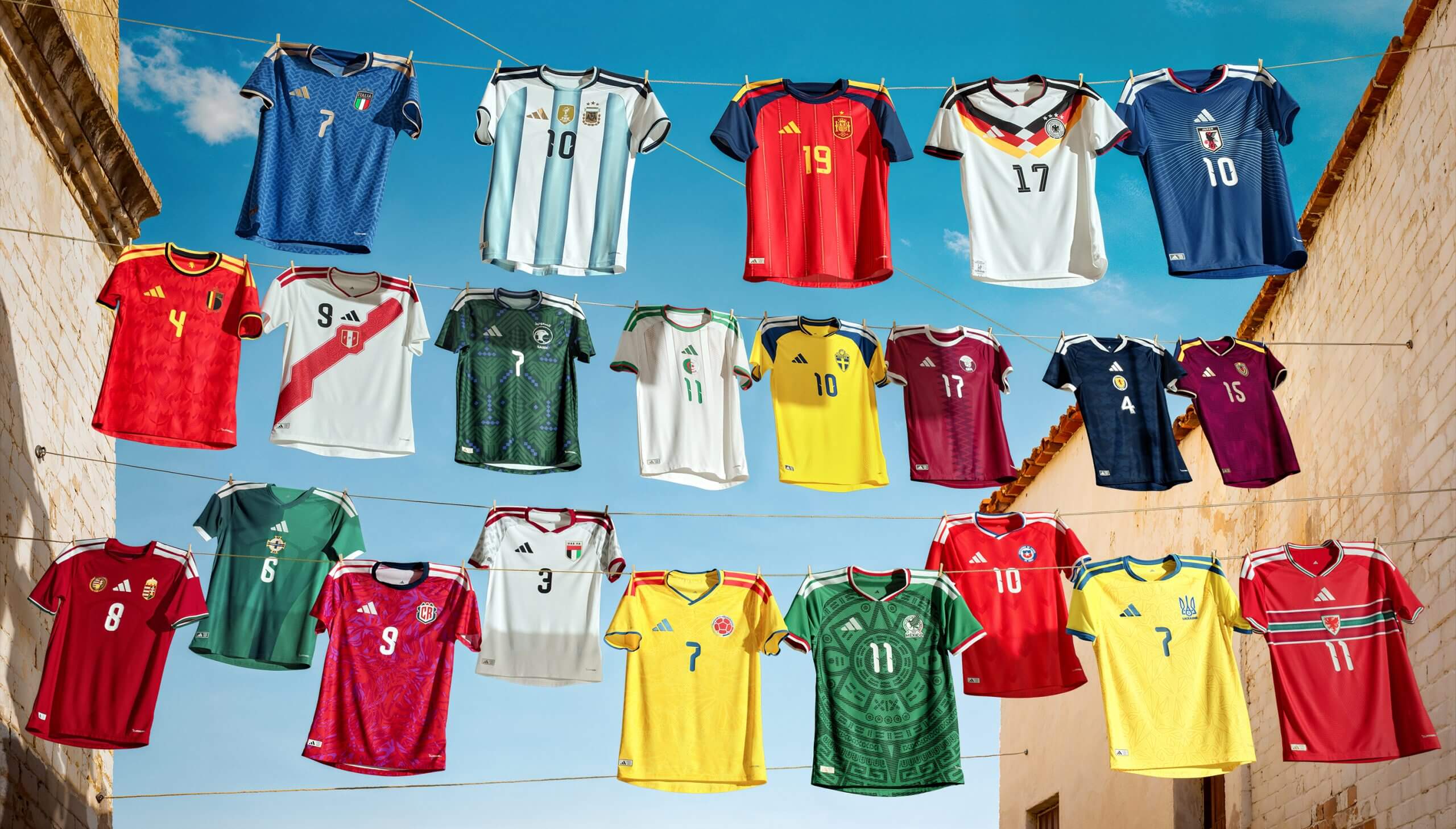
From top left: Italy, Argentina, Spain, Germany, Japan, Belgium, Peru, Saudi Arabia, Algeria, Sweden, Qatar, Scotland, Venezuela, Hungary, Northern Ireland, Costa Rica, UAE, Colombia, Mexico, Chile, Ukraine and Wales.
Carl AnkaFavourite: Mexico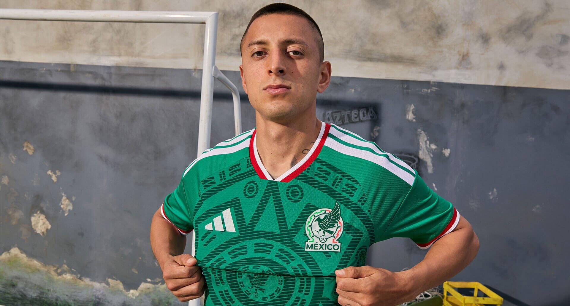
Roberto Alvarado models the Mexico kit (Adidas)
My favourite is Mexico, which looks to have taken inspiration from their World Cup 1998 shirt and carries an eye-catching Aztec design. The recent push to minimalism in football badges and kits (probably to help with social media and “at a glance” viewing) means we get enough intricate pattern work on kits, so this is refreshing.
The back of the shirt carries the words “SOMOS MÉXICO”, meaning “We Are México” – a fun message for an interesting time for the national team.
Adidas has not yet released what the goalkeeper kit will look like, but we look forward to seeing Guillermo Ochoa strut his stuff once again.
Least favourite: Germany![]()
Florian Wirtz models the Germany kit (Adidas)
I’m going to buck the common consensus here and say the Germany 2026 kit is a misfire. There are kits that catch the eye less (Spain has too much navy blue, making it dull to look at). Some kits have clearly been given the template treatment (Scotland, Northern Ireland, and Japan), and there are some kits that are one alteration away from greatness (the three stripes on Argentina’s kit should be gold, rather than black).
Yet Germany feels like a swing-and-a-miss. It’s attempting to take cues from their famous 1988 Euro kit, but the interpretation of the flag has a chevron that doesn’t quite work. Maybe this one will grow on me. Maybe it’ll look better when it is moving, but it doesn’t create the same forboding atmosphere that so many brilliant German kits of the past have done.
Melanie AnzideiFavourite: Argentina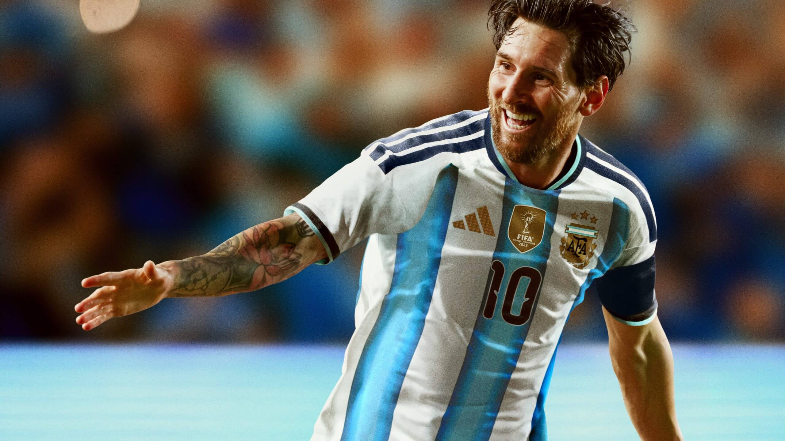
Messi in the Argentina shirt (Adidas)
What I love about the Argentina kit is what others might hate: its simplicity. The design is a subtle nod to the three World Cups won by the team, with the trio of blue tones found on the kit’s stripes representing a shade from their three championship-winning kits. This jersey is all about heritage. This next World Cup will likely be Lionel Messi’s last. Designing a kit that is rooted in tradition and pays respect to the players who came before him? It feels like the perfect blend of past and present.
My second favorite kit has to be Mexico’s. The Aztec design is simple, yet powerful. The textured fabric only makes the design pop even more. It makes sense that Adidas pulled out all the stops for this home kit, as Mexico is the only host nation the brand represents. Adidas delivered a design that will look beautiful on the pitch, as well as be a hot commodity off it.
I’m already fast-forwarding in my head decades from now: walking through a vintage kit store and seeing this one displayed on the walls as the owner’s prized possession. One they’d never dare sell.
Least favourite: Japan![]()
Joel Chima Fujita models the Japan kit (Adidas)
Something about this kit just doesn’t sit right with me, and it’s hard to pinpoint why. Simply put, it feels more like a dull design than a clean or classic one. Adidas described the linear details on this jersey as representing the “famed haze found on the horizon” where sky meets sea in Japan. But the design serves as more of a distraction and leaves me wanting much, much more.
The colour, of course, remains true to Japan’s classic blue shade, which is an easy win. Maybe there’s a silver lining in hoping for a better design for Japan’s away kit?
Matt SlaterFavourite: Mexico
The temptation is to choose a shirt in a colour I like, but that would defeat the purpose of this incredibly serious exercise. We are not just picking something we might wear on a summer holiday, at a festival, or the gym, oh no — The Athletic’s most fashionable writers have spent days debating the design concepts, colour choices and clever details on display in these shirts.
So, my favourite, sorry, the best expression of a nation’s football heritage and hopes for the future is… the Mexico shirt. Which is coincidentally the one I would pick to wear on holiday, at a festival, or in the gym.
Least favourite: Italy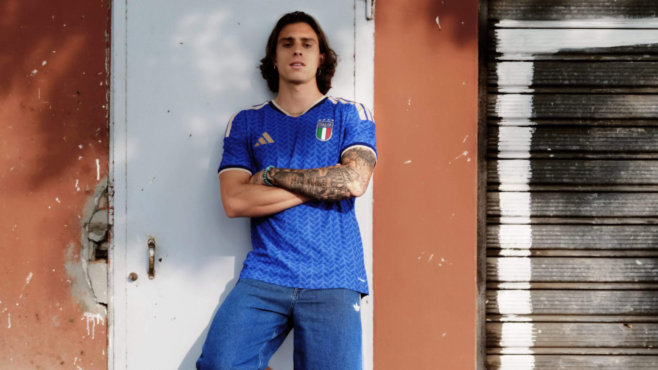
Riccardo Calafiori in the Italy shirt (Adidas)
If I take the same objective approach to deciding which of these designs has failed to capture the essence of the country in question, I cannot just pick Costa Rica’s shirt because it is bloody awful and reminds me of the curtains in my primary school. If the designers only had “leaves, toucans and smiles in red, blue and pink” to work with, the end result is what it is.
So, the shirt I want to get in the bin is Italy’s. No, “tradition” has not met “innovation”, Adidas. It looks like several lorries have driven over it, the blue is too light, the four stars are hard to spot, and where is the green, white and red on the sleeves and collar? You had a classic and you’ve New Coked it.
Caoimhe O’NeillFavourite
If you are asking me which shirt I want to buy and wear immediately, then the answer is Mexico’s. I am a sucker for a Mexico shirt and always have been. This green machine with the red and white trim is fit and fiery, perfect for the World Cup hosts. The philosophy of “look good, feel good” will not be a problem for anyone wearing it. So this edges it as my favourite.
But I’d like to give special mention to Wales. The Welsh dragon roars in a red that is bold and not bashful. The green and white band around the middle with the word “Cymru” (Wales) gently patterned in feels like it was tailored for a World Cup. The hope for Wales now is that they will make it there. This kit deserves it.

Brennan Johnson models the Wales kit (John Smith/FAW – Adidas)
Least favourite: Costa Rica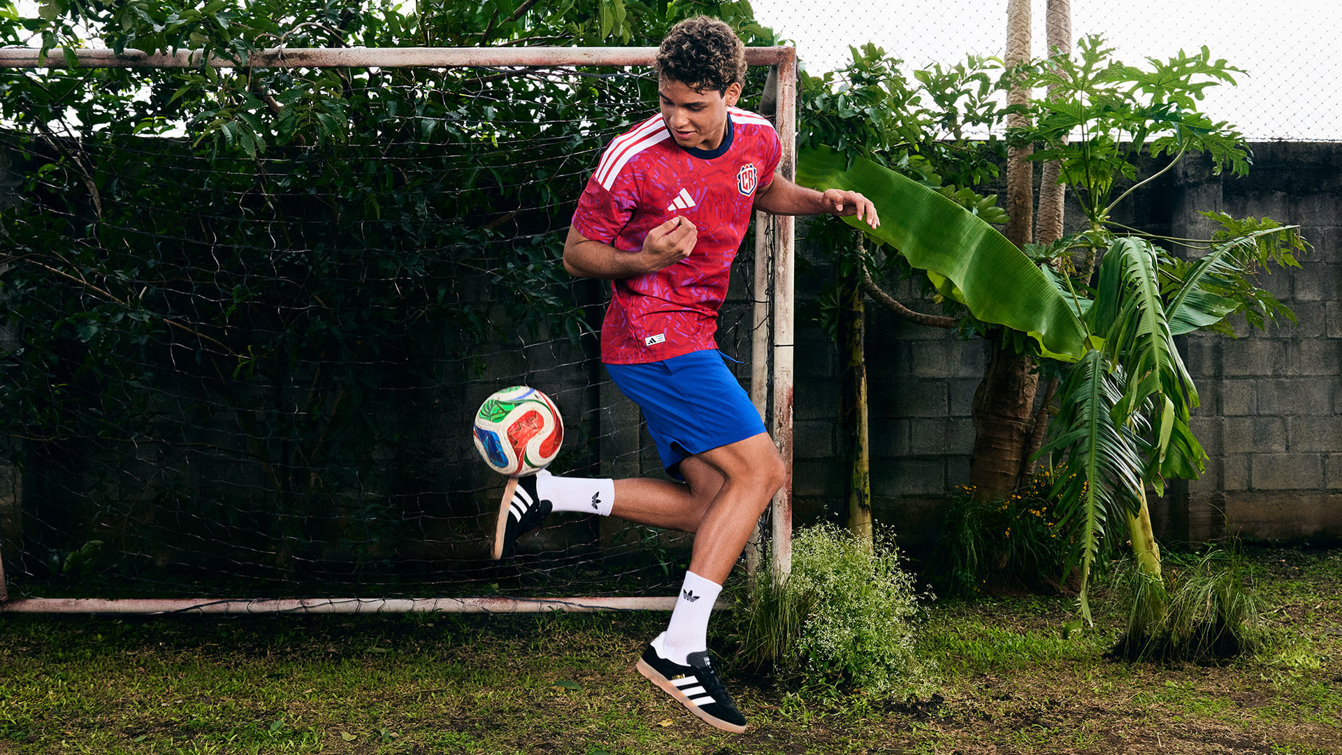
Andy Rojas in the Costa Rica shirt (Adidas)
I guess if I had to pick the one that I’m least sure about, it’s Costa Rica. The jury is definitely still out on that shirt. It is an optical illusion in that I look at it one way and think it’s OK, then I look at it again and change my mind. It certainly wins the award for the brightest and most intriguing colour combo of the set. I look like the meme of the woman doing algebra looking at it because there is so much to decipher between the colours and the pattern. Even if it gets it wrong, at least it is an attempt at something, I suppose.
And just a word on Argentina — just hear me out. How can it be the frontrunner if it always kind of looks the same? I guess continuity is key and I am not saying it is bad at all. It looks like it belongs in a frame or sat behind the glass at a museum. It is always special, a bit like Lionel Messi, who will likely be wearing it for the last time ever at this World Cup.
Jordan HalfordFavourite: Germany
As usual, “Die Weltmarke Mit Den 3 Streifen” save the best for their own. The German Football Association’s decision to allow U.S brand Nike to make Die Mannschaft’s kits from 2027 caused uproar in Germany, but Adidas’ parting gift is unsurprisingly a stunner.
Evoking memories of that famous Italia ’90 strip, alongside a similar pattern to the 2014 World Cup-winning shirt, Julian Nagelsmann’s side will again look the part in 2026, correctly paired with black shorts and white socks after recent tournaments that saw them in an unfamiliar all white.
The pink shirt for Euro 2024 became the fastest-selling away shirt in the national team’s history, and the new home strip features a special hem to celebrate 70 years of tradition and partnership.
The only blemish, perhaps, is the thicker three stripes, inspired by the brand’s running attire, but this will be a feature across all kits next year. Enjoy it for one more tournament; the Germans just won’t look as dazzling after next summer wearing Nike.
Quite simply, wunderbar!
Least favourite: Italy
This was a toss-up between Spain and Italy, but I am going with the latter. It just does not look like an Azzurri kit.
It has taken a while to adjust to Italy wearing adidas after 20 years with rivals over the road Puma — including the 2006 World Cup triumph — and the previous two iterations have been solid if not spectacular.
But the 2026 home shirt doesn’t have the right blue, the pattern is horrible, and the new FIGC badge also looks far too modern. Italy kits should be classic and made by Italians: your Diadora, your Kappa, even your Ennerre.
Italy haven’t had a truly great kit since the Kappa Kombat days in 2002, but judging by their form in qualifying, we might not get to see this in the U.S., Canada or Mexico at all.