We may earn revenue from the products available on this page and participate in affiliate programs.
Sign Up for Domino’s Newsletter
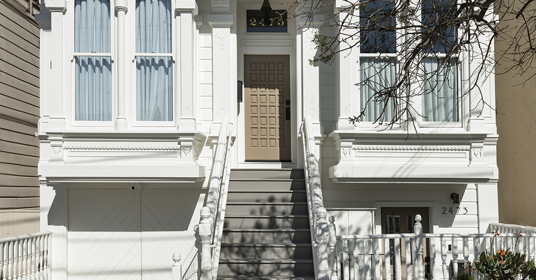
When Julia Miller first heard from her San Francisco-based client, it was actually to get names of other designers. “She was like, I love your work but I’m in San Francisco, do you have anyone local you can recommend?” recalls Miller, who runs her firm Yond Interiors out of Minneapolis. “I was like, I can do your project!” After all, it was the height of the pandemic and most designers were doing their jobs remotely. Plus, it would be a very long time before Miller was picking out sofa fabric samples anyway—first, it’d take about two years just to make sense of the Victorian home’s layout and tack on a small addition to the second level. “They’re a family of five, so every square inch was important to maximize,” says Miller.
Yond Interiors worked closely with architect Killian O’Sullivan and Larkspur Builders to preserve what remained of the home’s original charm (it had seen many unfortunate renovations in the past that washed away its historical details). In the front of the house, they were able to maintain or, in some instances, recreate the original trim profiles. But they saw the back half of the house as an opportunity to go a little more contemporary, working in a steel office door, a carbonated water dispenser, and built-in wardrobes galore courtesy of Workhorse Cabinetry.
Ahead, we asked the designer to recap the four-year-long project and share what it took to create an airy, calming space for a busy family of five.
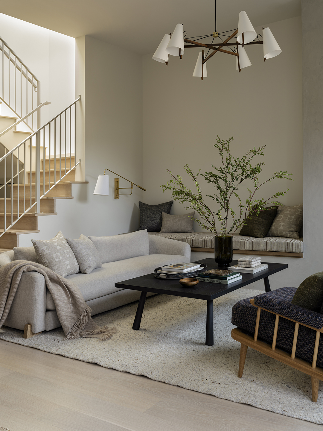 Sofa, Lawson-Fenning; Chandelier, Ravenhill Studio; Wall Light, O’Lampia.
What was the biggest design challenge you faced?
Respecting the front half of this Victorian house, because the clients loved the architecture but they also didn’t need a full-on Victorian house. They liked clean lines. For us, it was an effort to bring together both their aesthetic and their needs, while also trying to respect the home’s roots.
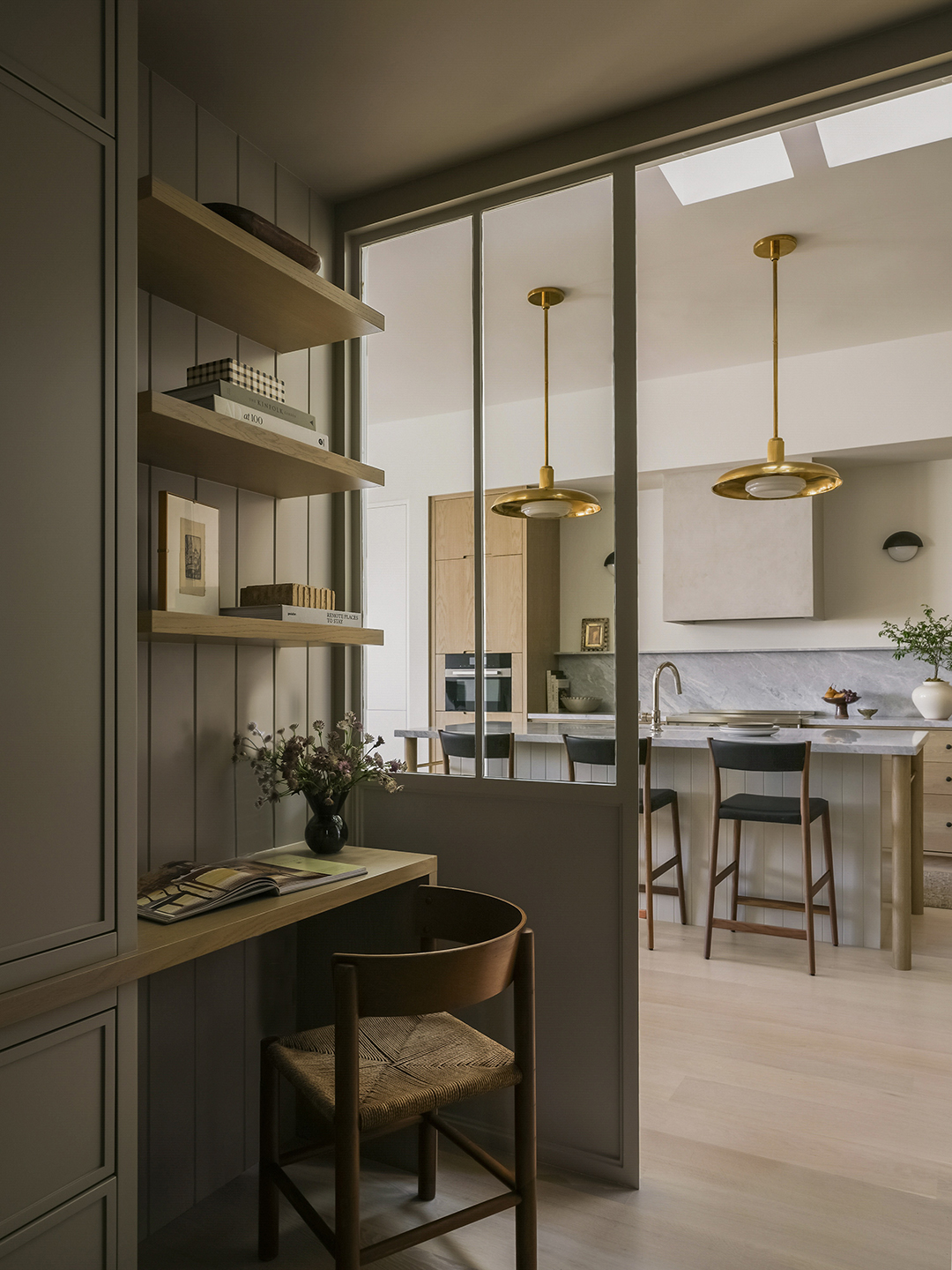
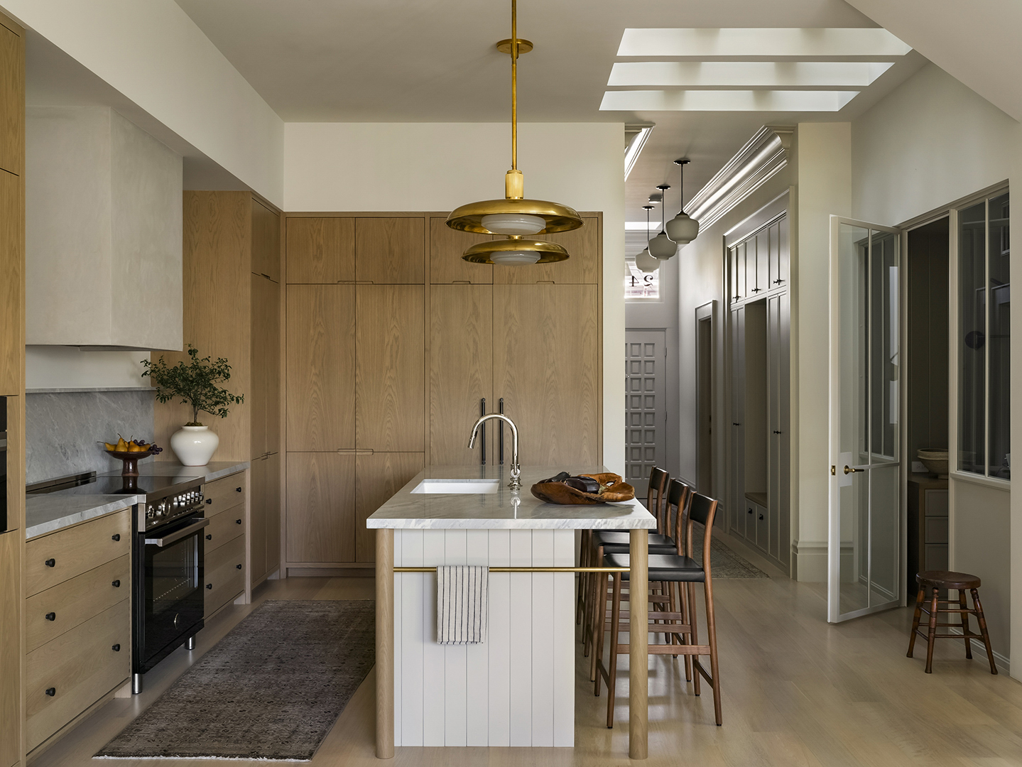 Stools, Pinch; Pendants, RW Guild; Faucet, Waterworks; Range, Bertazzoni; Runner, Biev.
What were their kitchen must-haves?
The kitchen was the space we agonized over the most in terms of layout. We cleaned things up and gave them quite a bit more storage with full height pantries next to the fridge and freezer. We also gave them a good amount of breathing room by not having uppers right near to the stove. Instead, we designed a wall of cabinetry in the adjacent dining area. We were even able to get a nine-foot-long island in there, too.
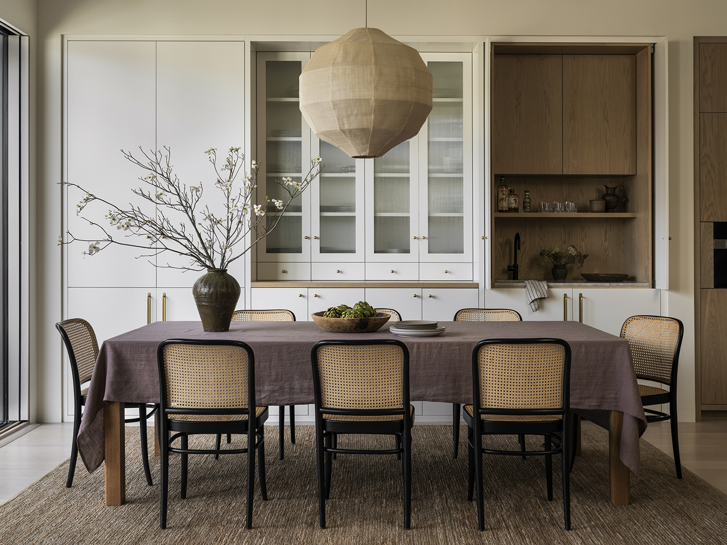
 Ceiling Lights, RW Guild; Runner, Brass Anchor Collective.
 Paint Color, Farrow & Ball Light Gray; Light, Ravenhill Studio.
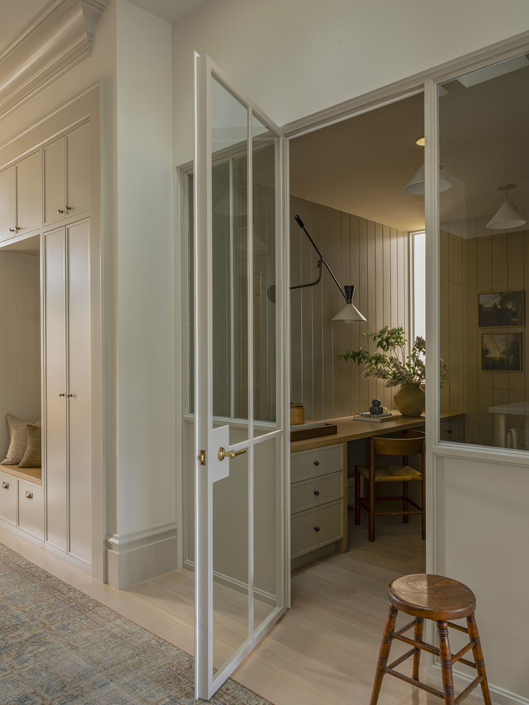
We’re most proud of the office. The wife wanted a workspace that was close to the family, so we came up with this greenhouse-like room off the kitchen. She can shut the door and have a private conversation but she can also be seen. Situating that under the stairs maximized the footprint pretty amazingly.
What storage addition felt like the biggest game-changer for your clients?
In the entryway, there’s a little bench with storage that serves as the mudroom. It gives them a place to hang their coats and drop backpacks, which was our biggest challenge with this footprint—when you entered the house, you walked right into the living room.
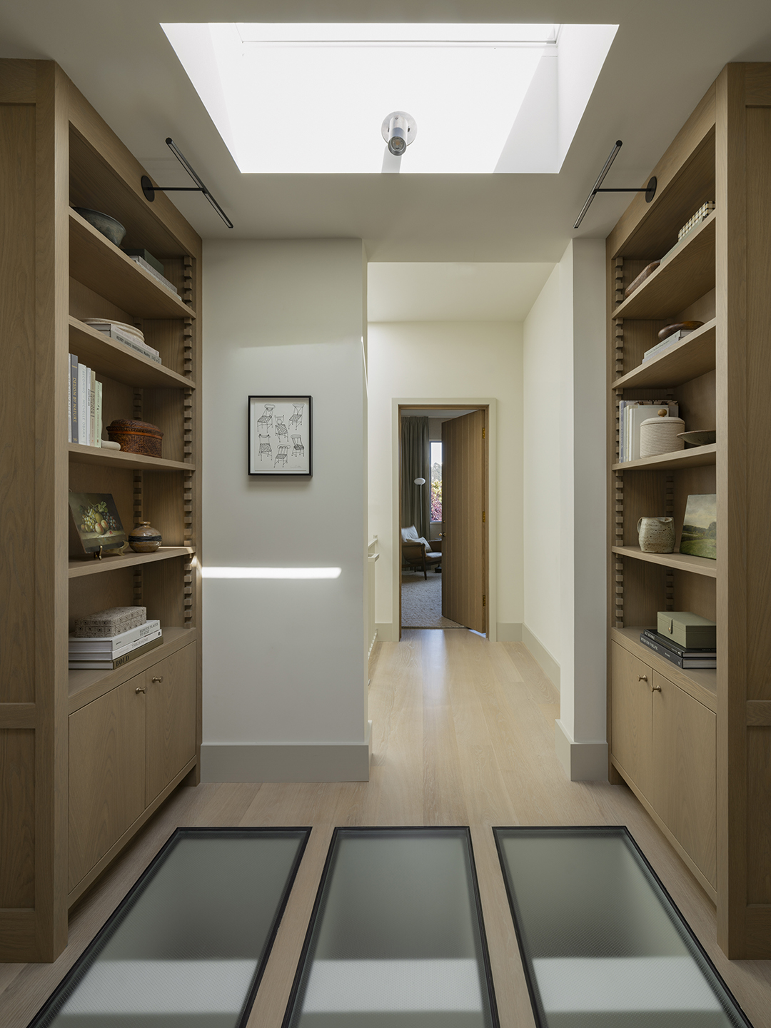
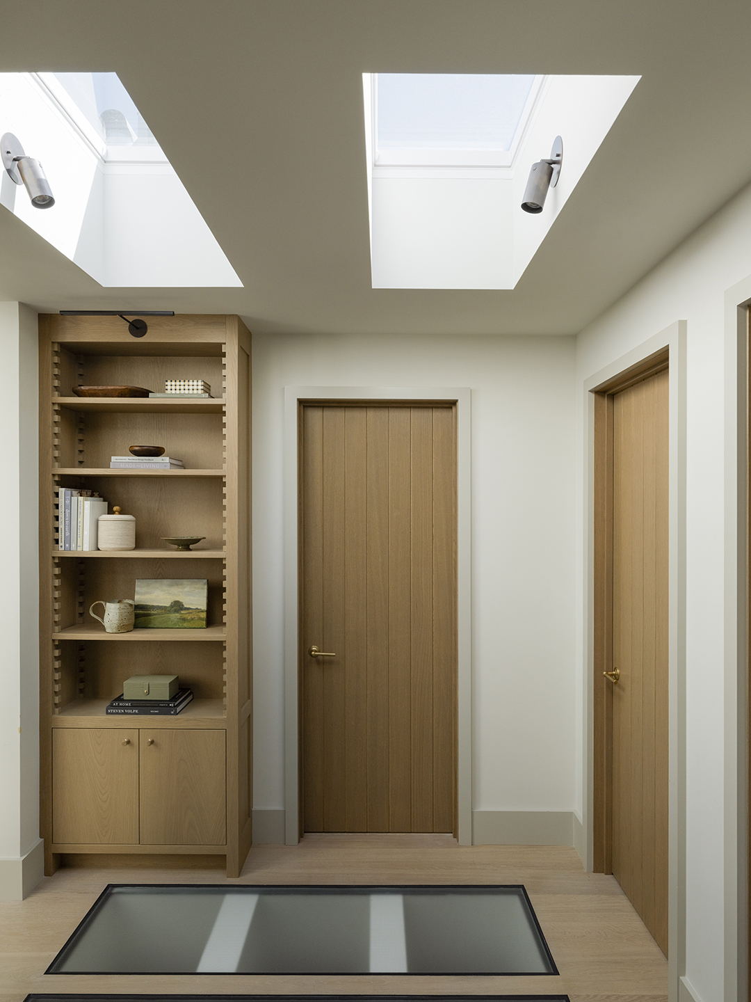
Can you really walk on those skylights upstairs?
This was the genius of the architect. It’s a hallway between the kids’ bedrooms, bathroom, and laundry area. There are houses so close to them on either side, so there’s not a lot of natural light coming in. The architect and the client worked closely to create these opportunities where more light could get through to the main level.
The clients wanted as much flexibility as they could for the future. Typically, adjustable shelves are not something to write home about; they have little holes on the sides and pins…they’re not cute. We try to avoid those at all costs when we can. We designed these with little teeth so the shelves can just slide in and out. But in the meantime, they have a lot of texture and interest—they add something to the design.
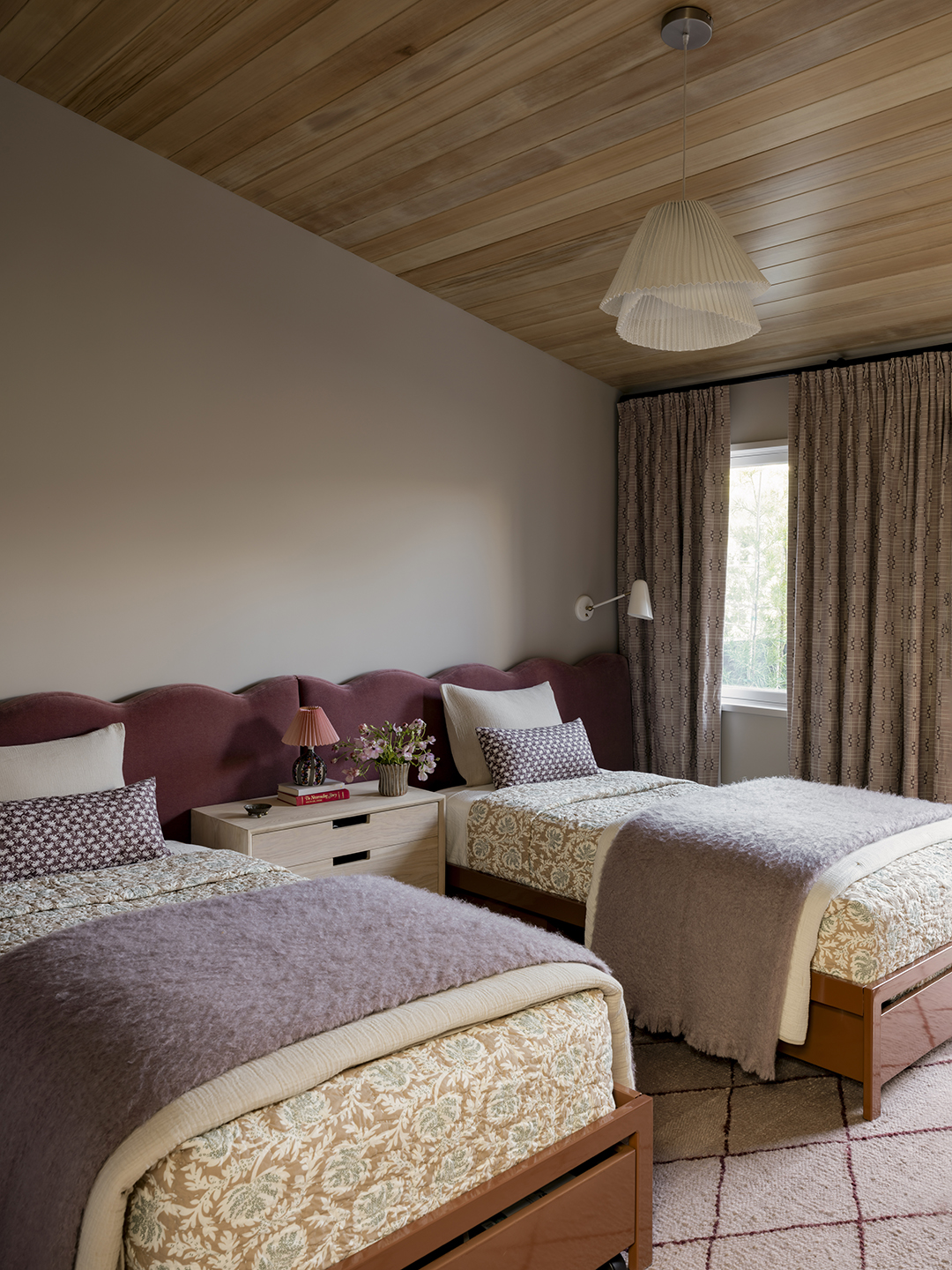 Headboard Fabric, Maharam; Nightstand, 57st.; Pendant, Lightology.
 Chair, Norm Architects; Rug, Coral and Hive.
Did their kids have any say in their bedrooms?
We talked about bunk beds but at the end of the day the girls wanted their own beds. Our idea was for it not to feel like two individual spaces, so we created a single headboard to connect them. They have a large nightstand that they can share and it makes the room feel cohesive. And under each mattress is even more storage!
 Rug, Passerine; Sconces, Workstead; Mirror, Renwil; Faucets, House of Rohl; Floor Tile, Castelli Marble Inc.
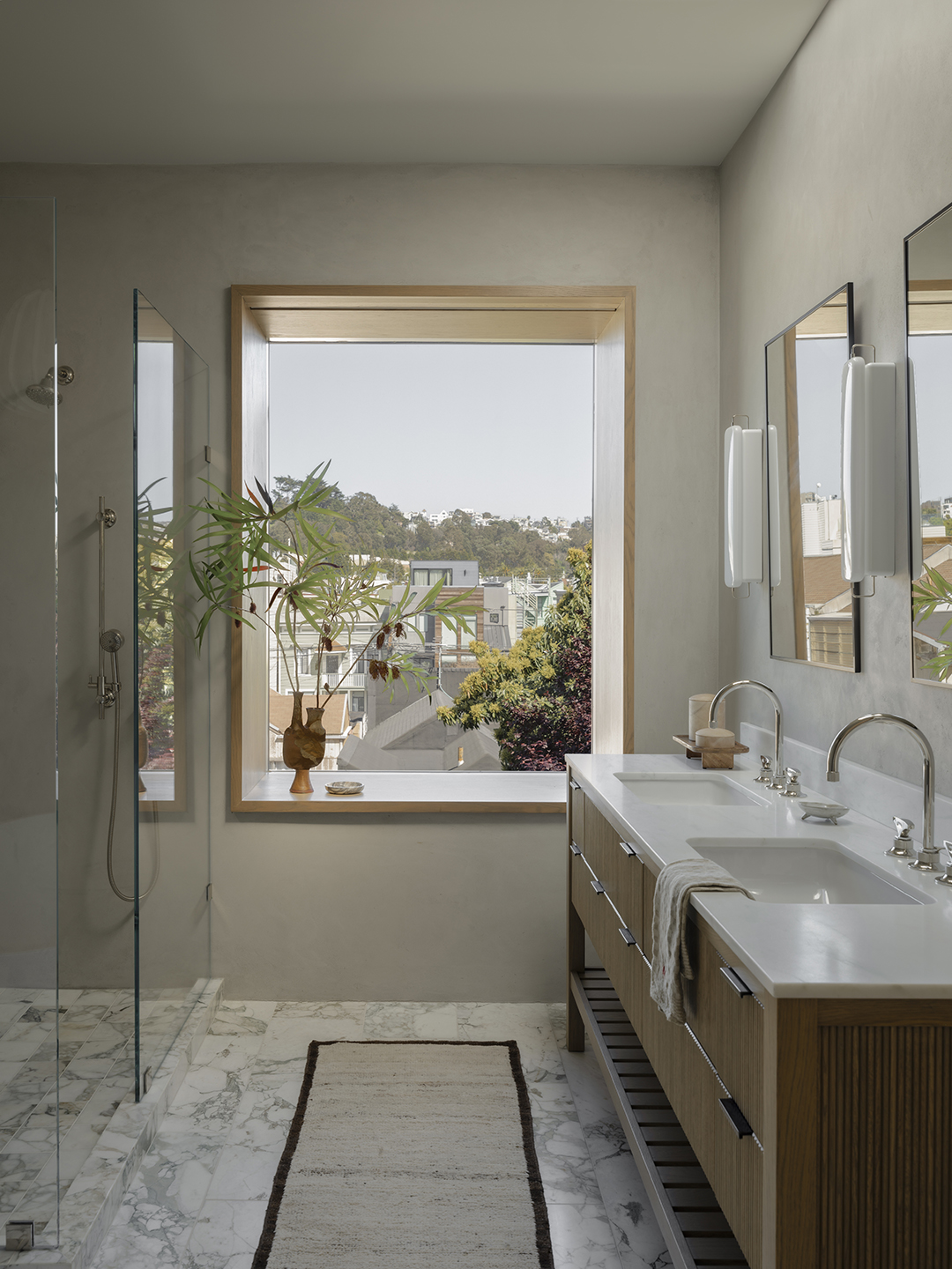
What was the vision behind the primary bathroom?
The clients wanted a space that felt grown-up with a soaking tub, a large shower, and not a ton of complicated finishes. The walls are all Tadelakt plaster and the floors are marble. They also really loved white oak. They wanted a calm, quiet place to kind of enjoy themselves.
What was the most exciting material or finish you used in this home?
Mohair is probably one of our favorite fabrics for families. It shows up in a lot of different places in this project (sofas, poufs, the girls’ headboard). It adds a lot of texture and some color without a lot of pattern.
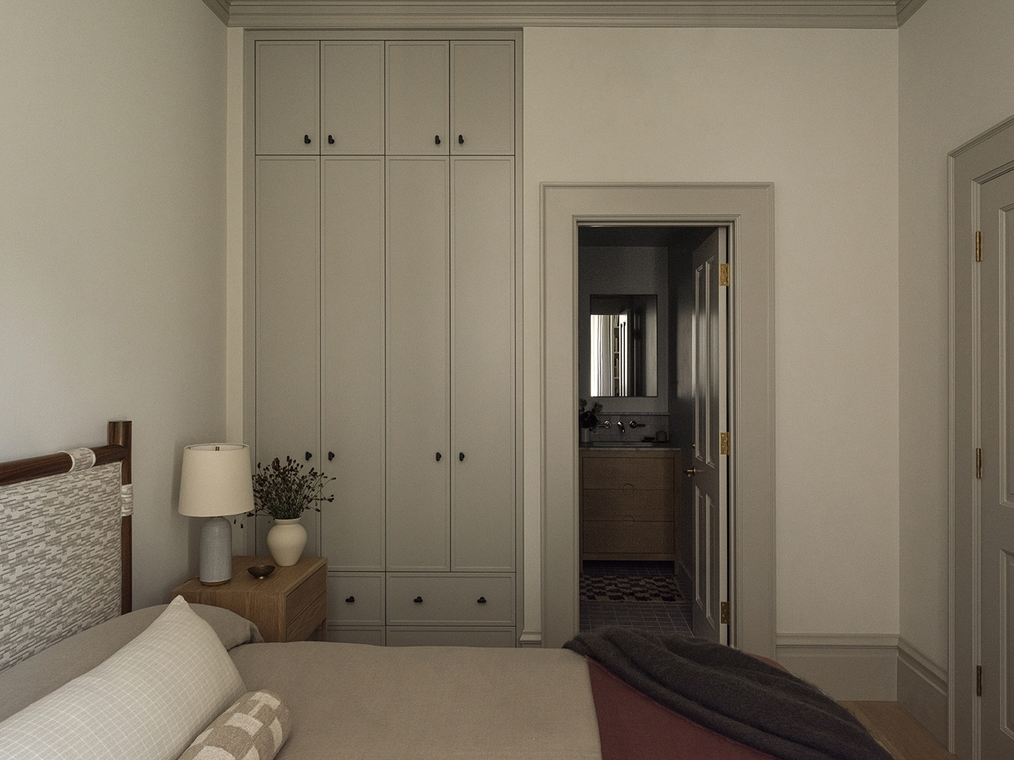 Paint Color, Pewter by Benjamin Moore.
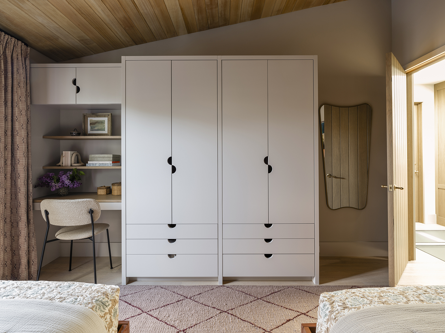
You went above and beyond with storage in the guest room—why?
Having a closet with big swinging doors was not going to work in this small room, and we couldn’t fit something with pockets within the wall, so we proposed this built-in cabinetry. It brought in the storage they needed without taking up a huge amount of space.
 Rug, Armadillo; Chairs, DWR; Light, Pinch.
What was your favorite paint color that you used in this house?
Choosing what we call the “whole house color” is a critical decision. We didn’t want to give them just a crisp white box so we tried to find a color that had depth. The main wall color, Benjamin Moore’s Seapearl, is a beautiful, nuanced white. It felt like a big success.
Lydia Geisel has been on the editorial team at Domino since 2017. Today, she writes and edits home and renovation stories, including house tours, before and afters, and DIYs, and leads our design news coverage. She lives in New York City.