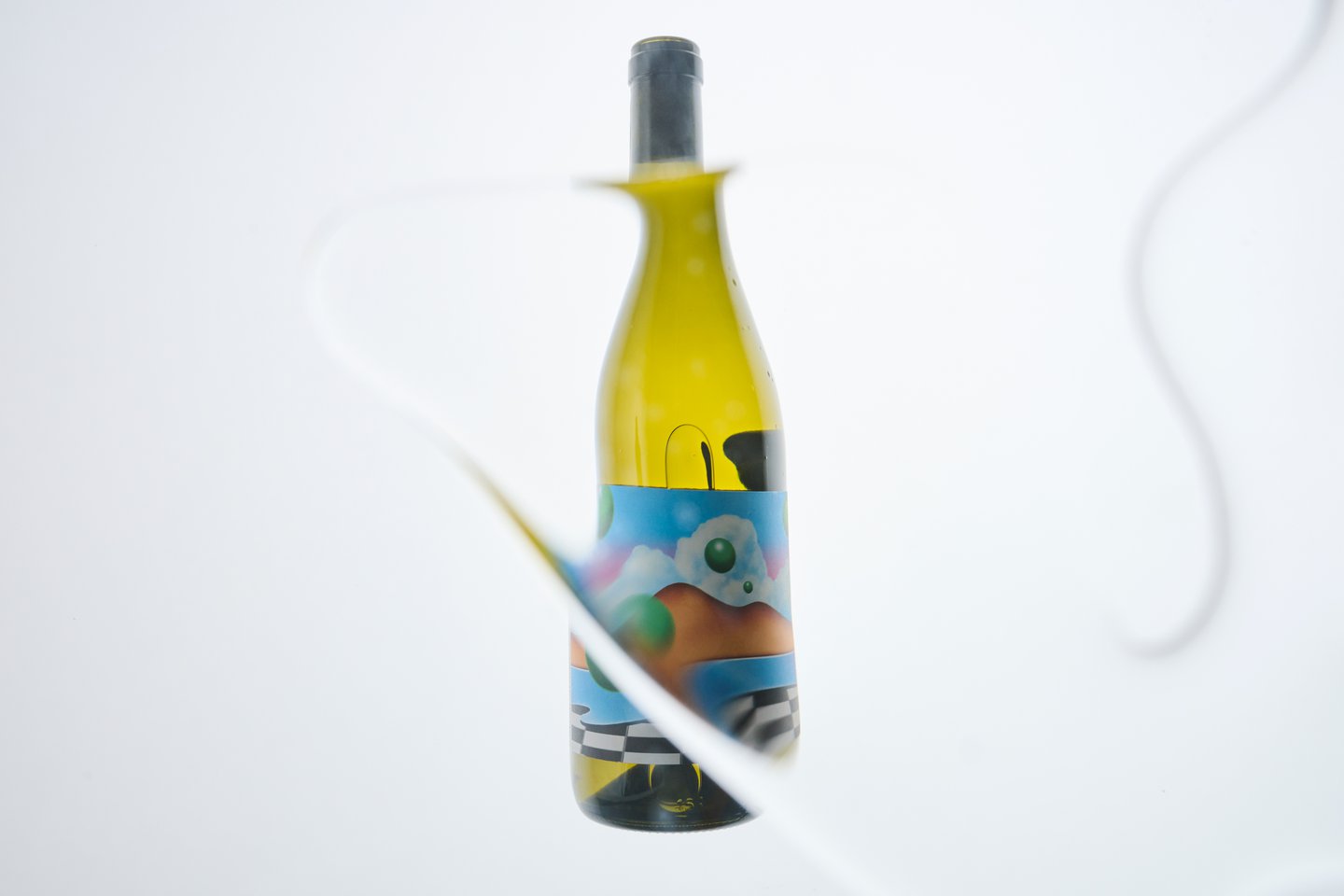
When in motion – and particularly when it’s also flipped on its head – the wordmark mirrors the flow of a bottle of wine, matching its seesaw pour and liquid body. As the wordmark holds such character, Beatriz says that they decided to pair it with a “very complete but fairly clean type family that didn’t feel overpowering, complemented the logo well, but still has a level of interest to it to allow us to make type-only applications”.
As a companion to the fresh identity, Beatriz and the team recently created a zine, something that felt like a “natural progression” for the brand, says Beatriz, reflecting its spirit of connection. With a core tri-colour palette of red, blue and yellow, finished on an off-white backdrop, the zine has an earthy, down-to-earth feel compared to other “luxury” alcohol supplements. This is ensured by the zine’s production, being printed via Risograph. Usually a “self-funded artist” print method, Beatriz found it refreshing to use the medium for a client project, especially in the context of “a design world that is going more and more corporate and digital”.