Taste is cultural, money is contextual, and none of this is a moral verdict.
Think of the list below as a translation guide: why certain elements still feel luxe in one context but stale in another—and how to get the feeling you want without overspending or chasing trends that age in dog years.
1. High-shine marble-look everything
Glossy, veined porcelain tile and polished marble-look quartz scream hotel lobby glam (and they photograph like a dream). For a lot of us, they’re the closest we’ve come to “stone.”
Why it feels outdated upmarket: the glare, the uniformity, the “perfect” printed veining all telegraph mass-production. In wealthier homes that prize patina, you’ll see honed, matte, or even imperfect stone—materials that soften with age rather than reflect every ceiling light.
Try this instead (on any budget): go lower sheen. A honed or matte finish on porcelain immediately reads calmer and more expensive. Mix in a single slab shelf or stone ledge rather than cladding entire walls. And break up the “slab look” with natural textures—wood, linen, a woven shade—so the space doesn’t feel like a showroom.
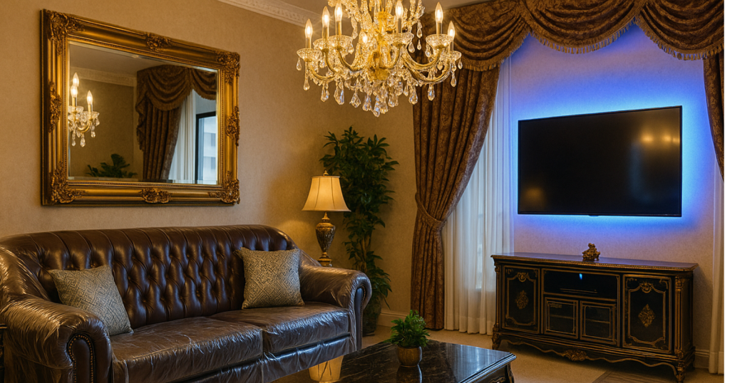
2. Mirrored furniture and crystal chandeliers in every room
Mirrors and crystals feel luxurious because they multiply light and sparkle (and who doesn’t want sparkle?). Mirrored nightstands were a whole era of “I made it.”
Why it feels outdated upmarket: once the mass market saturates a look, the wealthy pivot. Today’s high-end lighting leans toward linen shades, alabaster, bronze, and artisan glass with soft diffusion. Mirrored case goods scratch easily and reflect clutter; they also broadcast “2010 Pinterest.”
Try this instead: one statement shimmer, not four. A single glass pendant over a table, a vintage mirror with real depth to the glass, or a small chandelier in an entry. Then surround it with matte companions—plaster, wood, ceramic—to keep the room grounded.
3. Speckled granite countertops (the busy kind)
Uba Tuba, Baltic Brown—if you know, you know. These granites were the dream upgrade for a generation: durable, real stone, and often the first “luxury” purchase a family made for the kitchen.
Why it feels outdated upmarket: the heavy contrast and yellow-brown flecks fight with everything. High-end kitchens moved toward quieter stones (soapstone, honed marble, limestone) or super-subtle quartz with little to no pattern.
Try this instead: if replacing isn’t in the cards, paint the walls and cabinets to harmonize—darker lowers (deep green, charcoal) can make busy granite look intentional. Use large cutting boards and a runner to calm visual noise. Swap shiny hardware for warm, matte metals (brushed brass, burnished nickel) to pull the eye away from the speckles.
4. Feature walls in the “it” color
A single bright wall—teal, charcoal, greige—feels like drama on a budget and can transform a basic room quickly.
Why it feels outdated upmarket: the one-wall approach now reads “starter move.” Wealthier homes tend to wrap color, carry it onto trim, or layer tone-on-tone for depth. The statement is less “look at me” and more “I’ve always belonged here.”
Try this instead: paint the whole room (or at least the walls and trim) in a desaturated color two shades lighter than your bold choice. Or use architectural paint moves—color-drenched half walls, painted window casings, a ceiling a shade lighter than the walls—to feel designed, not decal-ish.
5. Barn doors and shiplap everywhere
The farmhouse wave democratized interior architecture; a sliding barn door solved real space issues and felt custom. Shiplap made bare walls feel intentional.
Why it feels outdated upmarket: ubiquity. The expensive version is quiet millwork—applied paneling, limewash plaster, fluted details—done with restraint and good proportions. Barn doors also leak sound and light; function loses to look.
Try this instead: a flat-panel pocket door (cheap hardware, big payoff) or a classic swing door with a beefier casing. For texture, try beadboard a third of the wall height with a proper cap, or a single limewash wall for movement without theme-park vibes.
6. Matching furniture sets
Bed, nightstands, dresser—all in the same finish; living room sofa, loveseat, armchair in one bundle. It feels efficient and put-together, which is why so many of us did it.
Why it feels outdated upmarket: sets flatten personality. Layered homes mix wood tones, fabric textures, silhouettes, and eras. The rich-looking trick is contrast and curation, not homogeneity.
Try this instead: keep one or two pieces from your set and swap the rest over time. Pair a traditional bed with mismatched wood nightstands. In the living room, trade the loveseat for two chairs in a different fabric. Add one vintage accent table with real patina—Facebook Marketplace is your friend.
7. All-stainless everything
Stainless appliances were the badge of a serious kitchen for two decades. They still make a rental look ten times nicer.
Why it feels outdated upmarket: luxury kitchens camouflage appliances. You’ll see panel-ready fridges, integrated dishwashers, and matte ranges in soft colors or enamel. Stainless stays, but as an accent—hardware, a vent hood—rather than the whole orchestra.
Try this instead: if integration isn’t happening, soften the shine. Add warm materials adjacent to stainless—wood cutting boards stacked, a pot rail in aged brass, linen café curtains. Even swapping harsh daylight bulbs for warmer LEDs takes the clinical edge off.
8. Vessel sinks and waterfall faucets
They felt spa-like when they first hit big box stores—sculptural bowls, water arcing from a sleek spout. For small baths, they were an instant “boutique hotel” upgrade.
Why it feels outdated upmarket: water spots, ergonomics, and a lot of visual fuss. High-end baths moved to undermount sinks, stone aprons, chunky edges, and hardware with pleasing heft (cross handles, unlacquered brass, nickel that ages).
Try this instead: an undermount or drop-in oval with a substantial deck and a widespread faucet in a living-finish metal. If you love “special,” let the mirror or sconces do the talking; they’re easier to update later than plumbing.
9. Word-art signs and staged vignettes
“Live, Laugh, Love.” Kitchen rules on a plaque. Tiered trays with seasonal doodads. They signal effort and care—which is why they took off—especially when a house needed personality fast.
Why it feels outdated upmarket: the sentiment is fine, the literalness is not. Wealthier spaces let materials, proportions, and art do the mood work. Words go in books, not on every wall.
Try this instead: one real piece of art (thrifted, flea-market, your kid’s drawing in a serious frame) and negative space around it. A big bowl with fruit. A vase with a branch. Let emptiness be part of the composition—it reads confident and costs nothing.
10. Blue LED accent lighting and color-cycle strips
Under-cabinet and ceiling cove lights went mainstream, and the remote with 16 colors felt futuristic. In a dark den, it was a vibe.
Why it feels outdated upmarket: novelty lighting ages faster than paint. Wealthy homes hide the tech—warm 2700–3000K LED strips you never see, just feel. The color is in the art and textiles, not the baseboards.
Try this instead: warm, dimmable strips tucked behind a lip, plus two or three lamps with layered shade materials (linen, parchment). Put everything on inexpensive smart dimmers. The effect is cocoon-y, not clubby.
Why “quiet” reads rich (and how to get it without the budget)
-
Fewer, better focal points. One hero (a light, a rug, a piece of art) carries more weight than five shouty pieces.
-
Texture beats gloss. Linen, wool, limewash, wood with grain—these materials catch light softly and age well.
-
Warmth over whiteness. Lighting around 2700–3000K, off-white walls, natural woods; the room photographs less “crisp” but feels far better to live in.
-
Scale and proportion. Bigger lampshades, wider curtain panels, a coffee table that actually reaches the sofa—these things whisper custom.
-
Evidence of time. A vintage side table, a framed family photo printed on matte paper, a slightly dented brass bowl—signs of life beat showroom-new.
Affordable swaps that move you forward now
-
Replace three builder knobs with three memorable ones (front door, main bath, kitchen sink).
-
Hang curtains high and wide; even inexpensive panels look richer with better proportions.
-
Change your light bulbs to warm, dimmable LEDs and put lamps on switched outlets.
-
Frame one meaningful thing professionally (or DIY a large mat); retire three signs that tell people what to feel.
-
Layer one natural textile (jute runner, wool throw, linen shade) for instant depth.
Bottom line:
What reads “luxury” isn’t static; it’s a moving conversation between materials, light, and restraint. The features above still feel aspirational in working-class homes because they deliver immediate sparkle and function. In upper-class homes that have seen the cycle a few times, the same features can scan as dated because the eye has moved toward quieter, time-friendly choices.
Skip the status sprint. Choose calm, texture, proportion, and a few truly loved pieces. Your place will feel richer—not because you spent like the upper crust, but because you edited like them. And that’s a luxury you can afford.